Life-sized handmade solid oak art puzzle (Limited Edition of 7)
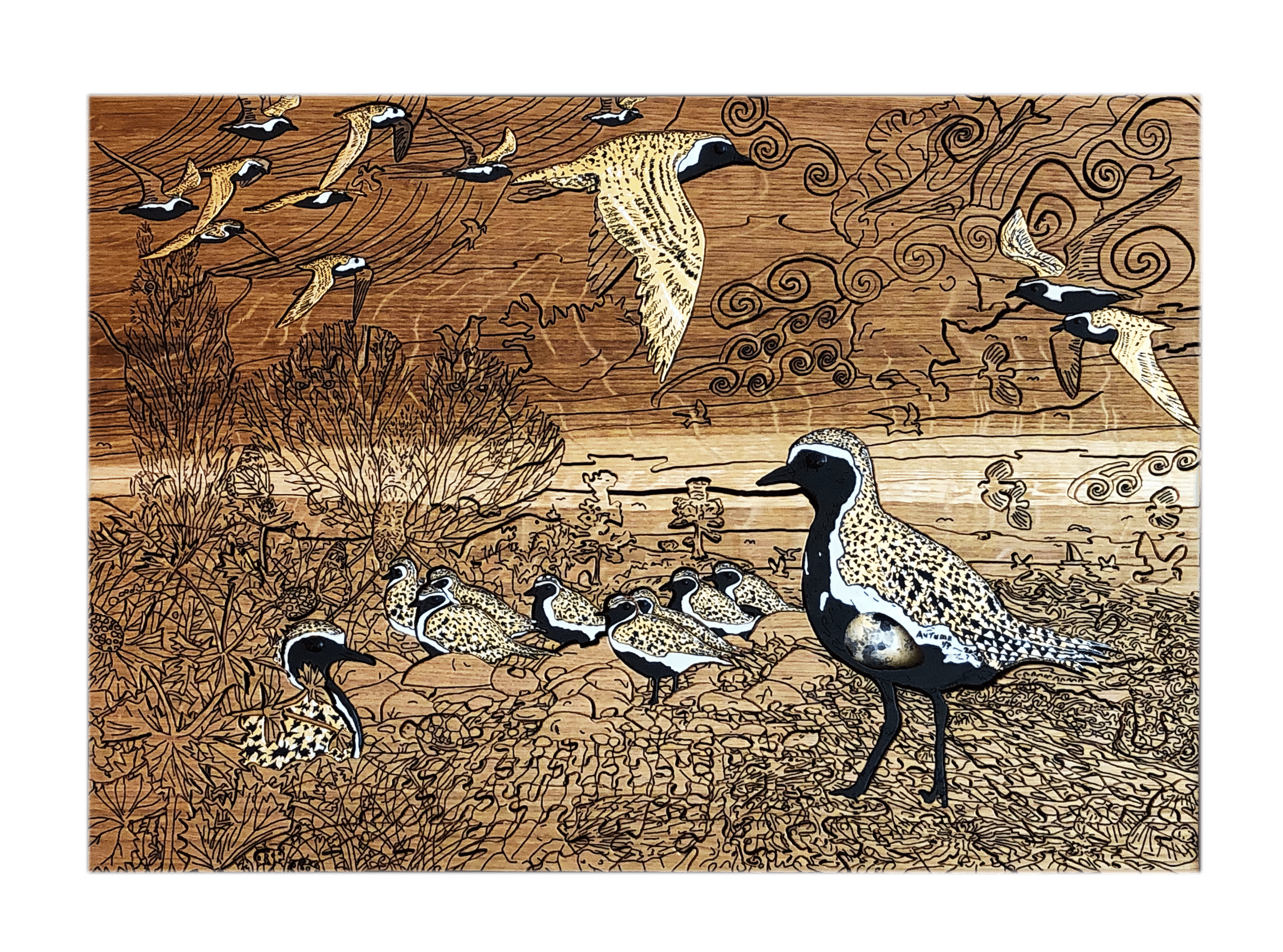
Golden Plover with Egg (Art Puzzle): Full image Size: 59cm (W) x 41.5cm (H) x 4.4cm (depth) @ 9kg weight Medium: Solid European Oak, hand-cut, hand-engraved, jigsaw puzzle with inset full-size replica golden plover egg. Date: 2020Golden Plover in artist’s dining room (click on image to see artists’ home studio, workshop, and gallery).
First and foremost I want to mention that the eggs used in my work are not real – for obvious ethical reasons (it is also illegal to take wild birds eggs). They are life-size replicas made of a plaster resin composite and hand-painted – not by me, but by a very reputable leading replica birds eggs maker.
Golden Plover
Following on from Guillemot with Egg (Jigsaw Puzzle) (see https://michaelautumn.wordpress.com/2020/03/01/guillemot-with-egg-art-puzzle/), I thought I would pay homage to another favourite bird of mine – the Golden Plover (Pluvialis apricaria). In winter plumage these birds are lovely, but unremarkable. However, in summer plumage they are absolutely stunning. The males are slightly more outstanding than the females, however, both are very distinctive and eye-catching. The spring transformation of the Golden Plover from winter to summer plumage is one of the most extreme, and beautiful, I know of. The word “dandy” comes to mind. They become the most striking of all the waders I know of.
Golden Plover in summer plumage
In summer their coal black bellies and faces, fringed with a slim cotton white mantle or fringe, and their “golden” upper parts – are a bold, brilliant sight to behold. But golden they are not! They are “buff”, ochre, or sandy brown – like most wading birds – who feed predominantly on mudflats and shorelines – and thus gain good overhead camouflage – so as not to draw attention to predators such as peregrine falcons, marsh harriers, etc.
To highlight this golden misnomer I thought it would be fun to actually make them golden – 24 carat gold gilt to be precise! Gold is an incredibly beautiful and mysterious metal – mysterious both in terms of its physical properties and appearance, and its hold over us. Gold, with its density of 19.3 (over 19 times that of water), is the absolute nemesis of flight! Gold, with it strikingly bright, mirroring, shimmering sheen – is the nemesis of camouflage!
24 carat gold gilded Golden Plover
I hope the metallic gold of the Golden Plover in the above pictures is clear. Being metallic the light reflects differently according to the angle being viewed and the available light.
Migration
In summer Golden Plover breed in the tundra – countries such as Iceland, Greenland, Scandinavia, and northern Russia – where the days are very long indeed – and over-winter in warmer climes – and where there isn’t perpetual winter darkness – such as here in the UK (some go as far south as northern Africa). The migration to and from Iceland is no mean feat for such a small bird. The main bird in the picture is life-sized: they are approximately 20cm tall, and 28cm long. Many bird migrations follow land masses with hops over the shortest water expanses. For example many of our summer visitors, like the warblers, coocoos, hobbys, etc. come from Africa – where the largest stretch of water they have to fly continuously across is the English Channel – a mere 20-odd miles – less than a hour’s flight (the Straights of Gibraltar – the sea hop from Morocco to southern Spain is less than ten miles).
In contrast, the non-stop shortest bird flight distance from Iceland to the UK is 850 miles. Golden Plover can fly at speeds up to 60 mph, but for long distances they are more likely to cruise at speeds more like 40 mph. So the non-stop flight from Iceland to the UK would take them a minimum of 21 hours. To salute this feat I have added an Icelandic reference in the picture – see if you can find it…
The phrase limited edition in this case is a bit of a misnomer. These are all individually handmade by me from my original design. I really wish there was, but there is no mechanical or chemical process I know of by which these can be reproduced – like screen printing, lithographs, card puzzles (using a die and jigsaw press), etc. (for more details please see the aforementioned post).
There are many different types of artist and many types of journeys in creating a work of art. Much art in the last century is what I call utter rubbish – slipshod, slapdash – made within minutes to a few hours or a day or two. And it shows. For example Pollock’s drip “paintings”, or Hirst’s “spin” “paintings”. Most of it is utter contemptible rubbish in my humble opinion. Even many of the Impressionist’s work was done in a day – often outside with a portable easel and done in a single sitting (however, purely aesthetically, I do like a lot of work from that period from that art movement).
I’m certainly not saying that the more time and effort spent on an art work the better it will be – and vice se versa. I’m saying that the more effort an artist puts into their work the more I will respect it and the more I will try to understand and appreciate it – and the better quality it is likely to be. This seems obvious to me…?
Consider a book of a handful of words compared to one of 100,000 words… The latter usually is expressing much more than the former. But a 100,000-word book is not necessarily saying more that a 10,000-word book. The former could be very waffly and poorly structured. Whatever one is trying to express there is usually some minimum or ideal way of expressing it (for the target audience)… My general point is that something expressed very briefly or quickly is usually not expressing very much – compared to something where a lot more time and effort has gone into it…
I’ve been working on a piece called “Golden Plover with Egg” (Jigsaw puzzle) for over ten weeks now, and I’m coming to the final stages – where things are finally starting to take shape – and, at last, I’m beginning to feel good about it. Often through the long arduous hours – many of which have been physically very demanding – I’ve been deeply anxious. Why am I doing this? Why is it taking so long? Am I wasting my time? Will anyone appreciate it?
Not that I am doing it for money (more on this later), but will the work be worth anything? Will it have a value that is reflective of the effort I have put into it ? I’ve worked in I.T. for many years where I was paid quite a high hourly rate. What I would earn in three months (because I have about another two weeks work to go on my current piece) was a not inconsiderable sum. What might my hourly rate be for this piece…? (Not that I will sell it, but I will hopefully sell other editions of it…)
The peculiar thing about art is that some art created in a slapdash fashion sells for thousands, if not tens – or even hundreds – of thousands, of pounds (£) – making the hourly rate absolutely ridiculous. Picasso made about 46,000 works of art in his lifetime – many of which were created well within a day. So his hourly rate was in excess of £100,000!
Some art takes hundreds of hours – and sells for a pittance – making the paid hourly rate utterly pitiful – and puts a contemptible value on the artist’s time/life. Clearly there is no relationship between an art work’s value and the amount of time and effort that went into making it. Yet, for most other goods in society, the more time taken to make them the more expensive they are. It’s a very strange world we live in…?
Why do I do art – I keep asking myself?! I don’t have to. Unlike some artists, there are plenty of other things I could do – and have done – for a living. The simple answer is: I don’t really know! I just know that I like making things and commenting on things that interest me.
Yesterday, while working on “Golden Plover with Egg”, I was thinking why I do art – and this piece in particular? It’s so much work, effort, and cost (the raw materials and special tools are expensive)?! Mahler’s beautiful Symphony No. 4 was playing in the background, and I thought of the effort he must have put into composing that sublime masterpiece – the trials and revisions that it must have gone through. I wonder what emotions and motivation drove him to do it, the frustrations he experienced, the ups and downs he went through, the anxiety he felt of what others might think of it…? He was a fellow artist, so I thought I must share some of his emotions and anxieties…?
Malher didn’t have to compose that symphony. No one asked him to do it (as far as I know). Possibly something inspired him, but, like many great works or inventions, inspiration is one thing, implementing it is quite another… Something in his deep psyche drove him to do it. No one told him how long it must take. He just set about doing it, and didn’t stop until he was satisfied with it. And all through the journey he will have applied his skills as a musician, and his heart and sense of aesthetics to evaluate and refine it. He would have been striving for a level of quality acceptable to him – and only him.
There are no rights and wrongs with art – so there are no objective ways to judge it, or to know if the objective has been achieved. Well that’s not strictly true. In each form of art there are usually a few ground rules. Like music for Mahler, I guess he ruled out discordances, wanted to use (or felt he should use) certain instruments, and he possibly wanted four movements – because that was the standard Western classic symphonic tradition he was raised in?
He had to figure out how to make the sounds he wanted – or at least make sure it was practically possible – i.e. playable and audible. So finding a practical solution to each and every note, phrase, passage – were upmost in his mind. He possibly followed other music rules that we don’t know about (because he didn’t write them down), and those I’m not competent to know or understand.
However, the vast majority of the huge number of decisions that go into the artistic creative process are entirely subjective. Do I like everything? Do all the pieces “go” together? Do they “gel” together and create some form of harmony? If not, what can I change so that they do? Is it good enough? How can I improve it? What am I trying to say or communicate with this? Is what I want to communicate interesting and/or important? Have I achieved my goal/s? Is it finished? (I certainly don’t believe all, or even most, artists think like this – but the best ones do…)
I think Edison’s phrase: “Genius is 1% inspiration and 99% perspiration” is a gross understatement. I think it’s much more like 0.0001% inspiration – or even less – and the rest perspiration!
Back to my thoughts yesterday and Mahler’s Symphony No 4. While listening to all four movements, I thought how each was utterly sublime, perfect, and complete on their own – yet Mahler created a unified whole with them all. A staggering and wonderful achievement that enhances and enriches anyone who listens to it. It occurred to me that possibly only artists fully appreciate other artists – because they will have some insight into, or empathy for, the effort and emotion that has gone into the creative process…
I don’t know what drives artists to create unnecessary, uncalled for, unusable, works of art, but listening to Mahler’s Symphony No 4 I thought: “thank god they do”…
I think back to my last piece – “Guillemot with Egg” (http://michaelautumn.wordpress.com/2020/03/01/guillemot-with-egg-jigsaw-puzzle/) – which took a similar amount of time and effort as my current piece – and I forget all the effort, trials and tribulations that went into designing and making it. It may seem strange, but I love to look it, and I’m just so glad I did it! It’s such a huge sense of achievement – of fulfilling something that was such a tall order. If it was easy many people would do it – and it wouldn’t be such a sense of achievement…?
It’s very nice that other people seem to like it, but that’s not why I did it. And they will have no idea of the amount of work, sacrifice, and emotion that went into it. But hopefully it communicates something to them – about the ideas I was trying to express – that no other form of expression could achieve…
But why, oh why…? And does anybody apart from me really care…?
From henceforth I will sign all my works simply as “Autumn”. There are extremely few “Autumn”s in the world, it’s smaller and easier to sign, and from a marketing perspective – something all artists need to be savvy about – single names seem to have a certain cachet…
Life-sized handmade solid oak jigsaw puzzle (Limited Edition of 6)
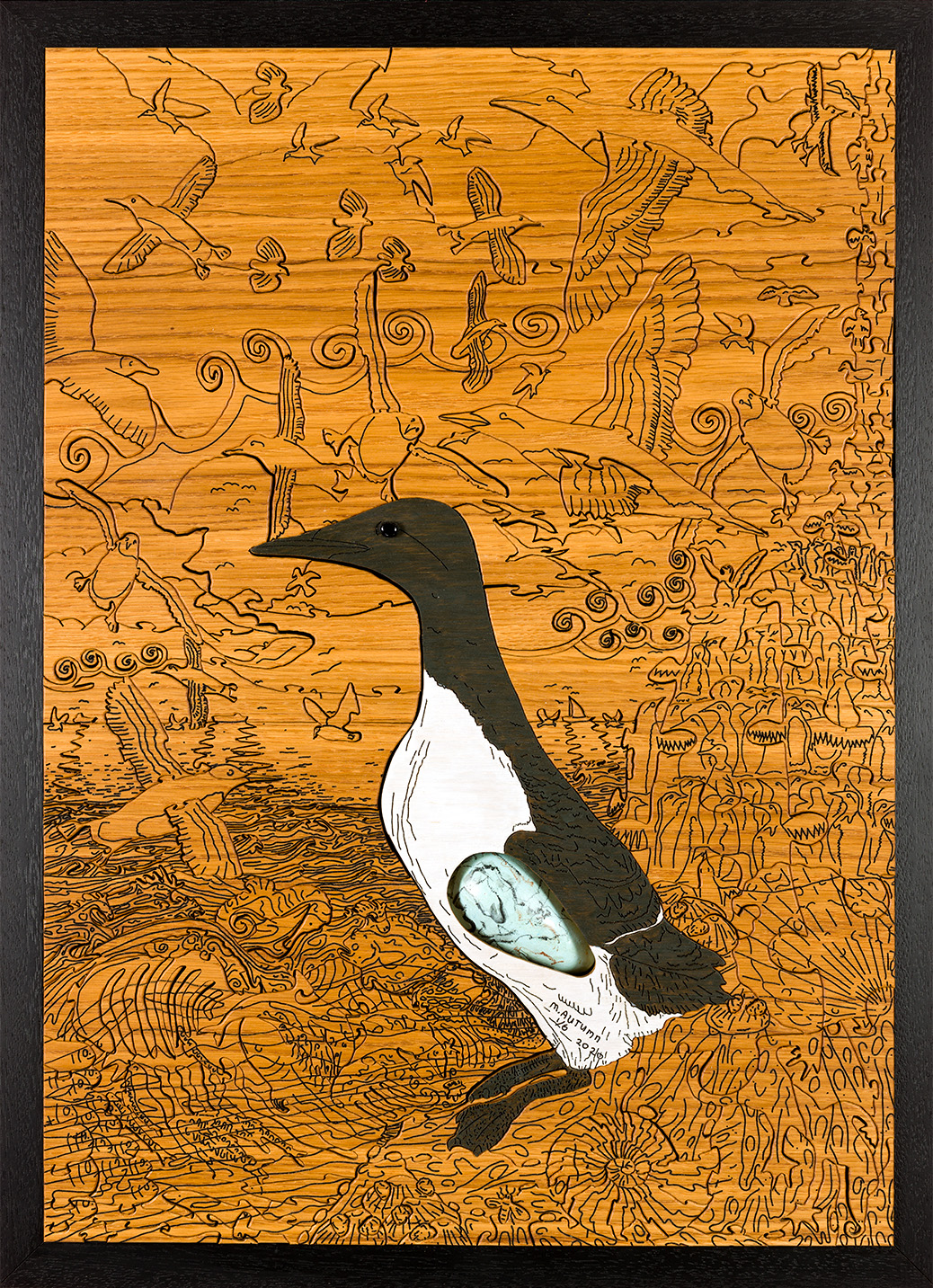
Guillemot with Egg (Art Puzzle): Full image Size: 59cm (H) x 42cm (W) x 4.4cm (depth) @ 8kg weight Medium: Solid European Oak, hand-cut, hand-engraved, art puzzle with inset full-size replica guillemot egg. Date: 2020 Guillemot with Egg in artist’s dining room (click on image to see artists’ home studio, workshop, and gallery).
First and foremost I want to mention that the eggs used in my work are not real – for obvious ethical reasons (it is also illegal to take wild birds eggs). They are life-size replicas made of a plaster resin composite and hand-painted – not by me, but by a very reputable leading replica birds eggs maker.
“Limited Edition” of 6
The phrase limited edition in this case is a bit of a misnomer. These are all individually handmade by me from my original design. I really wish there was, but unfortunately there is no mechanical or chemical process by which these can be reproduced – like screen printing, lithographs, card puzzles (using a die and jigsaw puzzle press), etc.
I never intended to make this jigsaw puzzle myself! I researched for weeks into using CNC (Computer Number Controlled) engineering techniques, laser, and waterjet cutting. For my puzzle design I wanted 1 ½” – 2” (40 – 50mm) thick oak wood, and I wanted the thickness of the wood cut to be less than 1mm – ideally about ½mm. I realised that CNC would not work because the drill bits would be too weak to cut that deep – something less than 1mm to cut through very hard oak nearly 2” deep using side pressure alone – no way.
I don’t like the idea of laser cutting because it burns and leaves the edges of the cuts black – something very unappealing – and very un-puzzle like! Indeed there is a very real risk that a wooden puzzle this thick could catch fire if cut by laser!
For a long time I thought I had found the solution in waterjet cutting. From fairly extensive research I believed it could have a cutting width of about ½mm. So I went ahead and designed the most intricate puzzle drawing – down to about 1mm curves and circles! I thought I could use shallow cut lines to show extra detail – like a drawing or carving on top of a puzzle – and full cut-through lines obviously for the jigsaw puzzle pieces. I, extremely naively, thought all I had to do was to supply the design to a waterjet cutting company and they would do the rest! And I could have hundreds produced. If only…!
What I don’t want is to have just one of these. I want one for myself and I need to make a living… I have invested a considerable amount of time and effort into this and would like to be able to continue to create work of this standard or better.
At the moment I am not famous enough to make and sell just one of these and earn enough money to make it worth my while – so I have to make a few. Six feels like a reasonable compromise – and not so many that I become a sweatshop jigsaw maker…!
Birds
My love of birds dates back to my mid-teens – after a new boy arrived at school whom I befriended and who happened to be a “twitcher” (a fanatical bird ticker-off-er!). I went with him on many trips and continued my interest after we went our separate ways (we went to different universities to study different subjects). As time has gone by, I have become more and more enthralled by bird’s beauty, abilities, resilience, and tenacity. I have photographed birds, filmed them (I built a special camera incorporating a telescope specifically for this purpose and I built a bird hide in my garden!), recorded their sounds with and without film (see my YouTube video channel – https://www.youtube.com/channel/UCcNBRvK_RcVoj6WFm2z8GRg), and have painted some.
As an artist I realise I can’t compete with photography (including film) in terms of capturing the beauty and detail of birds, and I don’t want to even try to compete with the likes of Audubon and other great bird artist and illustrators (Peter Hayman for example). However, I have been hoping to do something different and personal with them – something that I hope will show off some of their majesty, beauty, surroundings, habitat – and hopefully to do them justice.
Chunky Wood JigsawPuzzles
My interest in chunky wooden puzzles (well over an inch thick and that can stand up on their own) arose from a simple tree puzzle I stumbled on in a Swiss airport souvenir shop about twenty years ago. (When I travel I like to buy at least one nice item of art from the country.) I loved it’s smoothness, heaviness, tactileness, simplicity, beauty, and it’s differentness. It was expensive (about an average person’s day’s pay (£200 in today’s money)), but I just had to have it. I still have it to this day. I also just love solving puzzles of any kind. I liked the way the tree puzzle had unexpected shapes – that, when taken out of context, you had no way of knowing what part of the tree they occupied! About two years ago (2018) I had the idea of trying to design and make my own wooden puzzles and started to look into how to make them and to see what others had done…
M.C. Escher Influence
About two years ago I had the idea of trying to design and make my own puzzles. This coincided with my renewed interest in M.C. Escher’s work. As an artist, I don’t want to copy anyone and wondered if I could blend my interest in chunky wooden puzzles with Nature – and include ideas that fascinate me – like camouflage – particularly shape and textural camouflage – and the geometry of the line… I share this interest of the line with Escher, and he has most definitely inspired me.
Lines
For most practical purposes the visual world consists entirely of coloured dots (or pixels). Lines are a fundamental visual unit. They are a two-sided shape. (We can’t see a one-sized shape because it would have no length or depth – and so it is invisible.) Even a dot is a line – albeit a very short one! A triangle is obviously three lines, and all 2 & 3D shapes can be made from triangles. A square is four lines (or two triangles), and a circle is a line that changes direction in a precise and regular way. A circle is also an infinite number of very narrow triangles (I deduced a formula for pi from this simple idea as a mathematical thought experiment/exercise many year ago). 2D becomes 3D by simply adding the height dimension in the form of lines or triangles sticking out from a flat shape. But the central raw material for any shape is always the line.
What have lines got to do with puzzles? Well they are the cuts in the wood and any additional detail in the form of those that appear in the picture the puzzle is printed on, or any carved lines on the puzzle. My main interest is to only use lines – cut or carved – in my puzzles – as opposed to conventional puzzles where an image stuck to wood or board is cut with a puzzle cutter (known as a puzzle dye).
Boundaries
Real things have boundaries. In a sense that is what makes them a thing. An apple is a plump, sphere-like collection of organised cells with an outer red, green, or red and greed outer skin. We can see the apple because we have learned that a tennis-ball sized smooth green, red, or green and red thing is very likely to be an apple. It’s not just its’ colour that is key to our identifying it, it is it’s shape or boundary as well. We would not think that a sheet of apple-coloured paper or item of clothing was an apple – we might say it is apple-coloured – but that is not sufficient to categorised it as an apple. Likewise, we would not think that an outline of an apple was an apple if it didn’t look three-dimensional and wasn’t apple coloured.
Lines and Perception
Lines are the primary means by which we detect or perceive things. In Nature or reality there are very few actual lines – as in a thin strip of different colour or shade compared to the background – i.e. a simple pencil line. From a distance a tree without leaves can look like a series of lines. And the horizon between sea and sky can look like a line. A line can simply be a colour change boundary. A green leaf against a blue sky (or any other colour sky) can be thought to have a line around the edges of the leaf. But green leaves against other green leaves still have a boundary – or lines – because there is a perceptible difference between them. In fact it is fair to say that if there isn’t a perceptible difference between two edges then there is no line. If we were to put a cut-out of a green leaf onto an exact same green piece of paper it would appear to disappear.
Animal senses seem pre-disposed to detecting changes or boundaries. Visually that means detecting colour boundaries and movement (movement is just changes in colour boundaries over time). This is what vital to animals’ survival. The things that matter to them have to be detected and acted on. Changes in the animals’ visual environment can mean a threat – like a predator or dangerous boundary – like a cliff or fire – or simply something to avoid – like not to walk or run into. Other changes in the animal’s environment can be positively sough after – like food, a mate, somewhere to safe shelter and sleep.
Eyes have evolved to convert a vast stream of a narrow spectrum of electromagnetic radiation into a stream of real-time pixelated colour data to the brain from coloured rays of light. Light from the animal’s environment enters through the cornea (lens) and excites the rods and cones in the retina – which in turn transmit electro-chemical signals about the light rays to the visual cortex and beyond into other parts of the brain. But it is the mind that makes sense (pun intended) of all this data. The mind seems predisposed to “see” patterns and forms – especially from boundaries – because these are highly suggestive of something different and potentially important and/or useful.
Visual perception is an amazing feat of form recognition from lines and colours (texture as well – but this is a form of line and/or colour). This incredible capability can sometimes be mistaken but my interest is to highlight this by having some fun with it. We “see” elephants in the sky, horses in the sea, etc. – but of course no such things exist!
The brain is always looking for patterns to match up with its growing database to quickly identify things in the environment.
A line (or boundary) can be represented as something drawn – what I call a positive line (because something has been deliberately added) – or is can be a cut or carved – what I call a negative line. A line is anything that shows a boundary (including simply a colour change).
I decided to have some fun with this puzzle. With just cuts and carved lines I wanted to capture a busy seabird colony with a life-sized guillemot (Uria aalge) as the central focus. I mixed carving and cuts because if everything was a cut the pieces would be too small and would be nearly impossible to make them to join together – as real puzzle pieces – i.e. with interlocking lugs.
Art (Jigsaw) Puzzle
What is a jigsaw puzzle? Classical wooden/cardboard jigsaw puzzles are usually pictures cut up into small interlocking pieces – where the puzzle is more of a challenge or exercise, and the picture is the end goal. So in a sense the puzzle is a journey and the picture is the destination. In my case, in the case of this work, the puzzle is both the journey and the destination. The puzzle is the picture.
Classical wooden/cardboard jigsaw puzzle pieces usually have two to four structurally interlocking lugs to hold it together. The number of lugs usually depends on where the piece is: corner pieces usually interconnect with two other pieces, the side pieces usually interconnect with three other pieces; and the inside pieces usually interconnect with up to four other pieces.
This work is a jigsaw puzzle within a jigsaw puzzle.
Showing some jigsaw puzzle pieces
It is in part a camouflaged jigsaw puzzle. It starts at the right more or less as a conventional puzzle (the “cliff”) – albeit I’m using the size and angle of the pieces as a perspective device – but as the scene progresses to the left I slowly morph the puzzle shapes into natural shapes (animals, fish, waves, etc) to camouflage the lines of the puzzle pieces themselves.
I use a plethora of shapes and sizes of puzzle pieces and lug and devices – and many decoys and deflections – to make a picture-less jigsaw puzzle naturalistic and fun…! 🙂
All birds are amazing, but guillemots (Uria aalge) are among the most amazing. The Guillemot chick’s first and only time of leaving the “nest” – a few square inches of bare rock(!) where it’s parents incubated it on their feet – could be as much as a 300m plunge off the ragged cliff edge – into the sea (hopefully!). The chick can “fly” on this maiden voyage, but obviously they are not proficient, and it is more of a clumsy glide. Often it is not a straight flight/glide into the sea. If the chick crashes into rocks before it reaches the sea – and if it survives that – it has to navigate over what is often very hostile terrain – and it may encounter predators en route to the sea – where it’s parents will be calling from. A small chick can be quite feisty and hold it’s own against common predators like artic fox (but many do fall prey).
East coast of the UK Guillemot chicks, if and when they reach the sea on their maiden flight, swim with their parents all the way to Norway – a considerable task in and of itself.
Other fascinating facts about guillemots. They are one of the few animals that can inhabit land, air, sea surface, and underwater (a bit of a misnomer?!). They can swim underwater practically as well as they can fly in the air – and that means they can swim as well as most fish! Indeed they swim after fish to catch them – this is their primary source of food. It could be said that they fly underwater. They can dive up to 150m – indeed the deepest known dive by any bird is Brünnich’s guillemot (Uria lomvia) at 210m!
The Life-sized Guillemot
Detail of life-size guillemot
Why life-sized? I have a penchant for life-sized natural history art because it does the subject justice, it is honest, and most people don’t know the size of many animals because they never get close enough to them. Perhaps a better question is: why not life-sized…?
Working journey of the making of the main guillemot jigsaw piece…
The guillemot is not painted. I love oak – and wood in general – and think it sacrilegious to paint it. I only allowed myself to use a light and a dark wood stain to achieve the hopefully realistic coloured effect of the main bird. The whole work has had two coats of Danish oil to bring out the wood grain, give it a warmth, and to give it protection. It should last hundreds, if not thousands, of years…
Another challenge was to try to capture the smoothness and aerodynamism of this most perfect of birds – supremely designed for flight in the air and flight “under” water. I hope that by placing the main guillemot in the centre of the jigsaw puzzle as single smooth life-sized piece among dozens of other smaller pieces – accentuates it’s majestic shape and form…
I had a eureka moment for the eye (albeit after thinking about it for days!). A key visible feature of any animal are it’s eyes. They give so much of the essence of the personality and behaviour of the animal, they give it life and vitality. I thought long and hard how I could bring my guillemot life – and am extremely pleased with the solution I came up with.
Guillemot eye detail
The Embedded Life-size Egg
Birds eggs are extraordinarily beautiful, the shells are extremely strong (relative to the amount of material they consist of), and they are amazingly complex, but highly functional, creations that have their own lifecycle and incredible journey. For example, when the shell-less egg growing inside the parent reaches full size the hard shell is slowly secreted around it from calcium carbonate (CaCO3) crystals from the parent (who has to have enough of this in their diet otherwise the eggs will be soft and break).
Eggs have a complex structure, but obviously the main function is to protect and facilitate the growth and birth of a young bird. All the nutrients the growing foetus requires are contained within the egg, however, the egg has to be strong enough to protect the embryo through all the knocks and bumps – and being stood or sat on by the parents; it has to be porous to allow oxygen in and carbon dioxide (poisonous waste) out; and has to protect from bacterial infection. If the egg is laid, and spends time, on bear rock– as is the case with guillemots – then the shells have to be particularly strong. However, near the time of hatching an amazing metamorphosis takes place: the embryo absorbs some of the calcium of the eggshell to form an egg tooth. This is a double strategy to help the young emerge from the shell: after the shell has fulfilled it’s purpose it is weakened by the young bird absorbing some of it, and at the same time the young bird gains a sharp hard tool by which to chop itself out.
The blunt end of the egg is the weaker part of the egg (that is due to mechanical geometric properties: the shallower the curve the weaker it is). The embryo’s position in the egg seems designed to exploit this weakness when it comes to hatching. The orientation of the developing embryo is such that the legs are usually at the “pointed” end and the head is usually at the “blunt” end – so the head is in the ideal position to start the hatching in what is obviously a very tight space…
With the main interest of this work being a life-sized guillemot in it’s busy natural surroundings, and working with thick oak, it occurred to me from the outset of this long project that I could incorporate a life-size egg into the design somewhere. I bought some eggs to test the idea and after several trials I worked out how I could do it.
Eggs are generally developed in the parent “pointed” side down and are rotated prior to laying so they emerge “blunt” side first. It seems unclear why this is so, but I wanted to highlight this phenomenon in the work.
I wanted to create a mystery of how the egg got into the body of the guillemot – and how it comes out – hence I made the egg opening (front and back) smaller than the egg itself – with no way for the egg to have got in or out… The Guillemots’ eggs are relatively large in proportion to the mother’s size, and I wanted to highlight the fact that the mother has to fly and dive with this huge thing inside her abdomen. I have made a guestimate of where the egg would be in the mother (which, as mentioned above, has to be turned in situ before it is laid).
Full-size egg inside the main Guillemot puzzle piece
Epilogue
It has been an enormous relief to finish this work(!) – so much so that I needed a few days to recuperate. The intense concentration and sheer physical effort in handling this 8kg block of solid oak wood for highly accurate cutting through the most intricate and precise twists and turns – has taken it’s toll on my arms, back, eyes, and brain. (It measures 59cm x 42cm x 4.4cm thick. This work is two pieces of oak I have hopefully invisibly joined. I would have used one piece if I could have sourced such a wide piece of oak.)
Design – 6 weeks (plus many tests, trials and errors!) over a 16 months period; carving the approximately 2mm deep detail black “lines” – four days; cutting the 44mm (1 ¾”) deep oak jigsaw pieces – 4 days – both with a full face mask most of the time and with the noise of an air filter (industrial hoover) running all the time (I used ear plugs); 1 day to carve out the egg opening and incorporate the full-size egg into the body of the main central guillemot (and the stress and strain associated with that!); 1 day finishing – this included rounding off jigsaw pieces (front), sanding (back), and applying finishing oil to all the convoluted surfaces; 1 day framing.
Work in progress
This project started back in September 2018 and finished (under a great deal of time pressure (largely due to the non-arrival of a faster-cutting fret saw ordered on 3rd January)!) on 17th February 2020 – just in time for submission to the 2020 Royal Academy Summer Exhibition…
I’m quite keen on chess, but I’m no expert by any means. Quite randomly I was looking into the history of chess (I often look up stuff just out of curiosity) and stumbled on the beautiful Isle of Lewis Chessmen.
Attribution: National Museums Scotland
I was intrigued by the pieces and thought they looked wonderful, intriguing, and tactile. They conjure up a real mediaeval battle – quite unlike any other chess set I’ve seen, and the detail on them is very impressive – especially considering they’re 12th century – 800 years old – and carved out of walrus ivory! (Ethically I’m not impressed with the material but I am impressed with the craftsmanship.)
I love to have beautiful things in my house, and if they’re functional that’s even better – so I set about seeing how expensive a set would be. I was pleasantly surprised to discover that a full-sized resin set costs under £100 (2018 price). There were more expensive sets but they were out of my budget at the time (and didn’t look much better). The set came with a rather disappointing, unbefitting, cardboard chessboard, but I thought I could get (or make) a better one later…
As chess pieces go they were quite big – about 3½” (9cm) high – and reassuringly heavy (the heaviest piece, the king, was 98g – a little less than the official replica copies from the original National Museum of Scotland’s set @ 126g). The pieces were very nice but there was a plasticky look and feel to them. Nevertheless, I liked them and played a few games on the board that they came with.
Why choose a wall-mounted chess board?
The board that came with my chess set was quite big (about 19″ (47cm) – with the squares about 2″). Devoting a table to a chess match for several days is a bit of a problem in most households, and obviously there is a risk of pieces being accidentally knocked over – with the serious additional problem of not knowing where the pieces were before. An intense chess battle of several days could be obliterated by someone simply bumping into the table – and so I started to think of alternative ideas…
I considered a wall-mounted chessboard – because this would be out of the way, would take up no floor or table space, and in theory would be far less prone to accidents. How often do people bump into wall-mounted pictures…?
I’d never seen a real wall-mounted chessboard before – only pictures – and started looking online to see what was available. Obviously it would have to be quite big because each square would have to be big enough for the tallest of the Isle of Lewis Chessmen pieces – the King (at nearly 3 ½”) – so about 4″ (10cm) squares are required…
I looked high and low but couldn’t fine a nice large enough wall-mounted chessboard. The main thing I disliked about most of the chessboards I found was that the squares weren’t square – they were rectangular – taller than they were wide! I thought this was very strange indeed and really didn’t like the look of them – they grated with my sense of aesthetics! So I parked the idea and thought of making my own some day…
Thoughts about making my own wall chessboard
I wanted to buy a nice wall-mounted chessboard but couldn’t find one I liked. I have to really like something for it to get room in my house…! I didn’t want to design and make my own – that would take a lot of time and money! (I make lots of things and I know that the first time you make anything it takes a lot more time and effort than expected because you usually have to buy and/or make tools and templates to help you make the thing with – as well as research and purchase all the materials – and possibly learn new techniques.)
Months passed. I had some ideas about buying pre-cut square pieces of two different types of wood (in contrasting light and dark shades) – but this didn’t particularly inspire me. Also I didn’t think the chess pieces would stand out very clearly because their colour is quite woody… And I couldn’t think how I could do the shelves – I just felt that they should be transparent/clear…
I decide to try to make a beautiful wall-mounted chessboard
I thought over a period of several weeks about the squares – I felt these were crux of the problem – and the cornerstone of the design. Out of thin air it came to me: ceramic tiles! Black and white square ceramic tiles! It was so obvious! They are naturally square and their colour and texture wonderfully contrasts with the chess pieces. Naturally I had technical challenges: what to mount the tiles on, how to make shelves (or compartments), letters and numbers around the edge, etc. Nevertheless, I felt the urge and inspiration to make a beautiful wall-mounted chessboard – and I had a very inspiring starting point…
I saw symmetry, maths, patterns in the chessboard, and I wanted to incorporate twelfth/thirteenth-century ideas into it – as if the board was designed when the Lewis Chessmen were made…
This is my first attempt :-
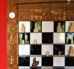
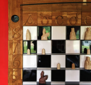
First attempt at ceramic tile wall-mounted chessboard
So far so good. It’s nice, functional, but it’s just a chessboard… While there is nothing more that can be done to the squares themselves, somehow it needs to be made special/beautiful…
I feel it should have letters and numbers around the border (A-H & 1-8) – and here I can try to add some nice design… I thought about typefaces, materials, and size/scale around the edge of the board – but also about the structural strength of it – because the board is already quite heavy (about 30kg) – being tiled on some very heavy deep plywood (so it won’t warp) – and the border will be the only practical way of lifting it…
So, while there was a serious practical/structural challenge, thinking about the aesthetics preoccupied me for a long time. I plumped for a solid oak boarder – exactly the width of a chess square – for it’s strength and beauty – with raised letters and numbers made of the same material. The oak I chose is from sustainable sources (as is the deep plywood base) and has (for me at least) a lovely block grain structure that adds a wide variety of tones, and contrasts beautifully with the typeface.
Here is the finished first design :-
Solid oak carved numbers & letters 12th/13th century font border
Also I had the idea of adding a large-ish toughened glass shelf for putting taken pieces on.
3rd Draft with shelf for putting taken pieces on.
It’s not perfect but I’m very happy with this design. It’s total weight is about 50kg and so it needed a very strong bracket to mount it on the wall!
Typeface Tribute
I chose a font which I believe may have been in use in 12th – 13th century Scotland – when my imaginary chessboard was designed.
It’s not until you cut, carve, and smooth every curve of all the letters and numbers – and orientate, glue, and oil all the facing sides – that you appreciate all the work and aesthetics that goes into designing a typeface. And to think they had this skill and artistry all those years ago beggars belief…
We will probably never know who designed this typeface, but whomsoever it was, they have my deepest respect and thanks. This typeface is at the core of my chessboard design. I’ve added a tiny personal touch by literally adding a dimension – to give it depth (and existence…). This accentuates the typeface’s delightful sensual shapes and curves – and changes with light arriving from different directions. In some very real sense the board – with the typeface being at it’s core – takes on many different forms depending on the light…
It’s curious to think that my implementation of the typeface doesn’t really exist! It exists only in the shadows from directional light – and is helped by the subtle contrast between the oak grain pattern of the letter and number cut-outs – and the background timber. My alphanumerics primarily owe their visibility to the shadows they cast…
Whose turn is it?!
With a wall-mounted chessboard games can readily take as long as is required because there is no pressure on space. With this in mind I started to think how best to show who’s turn it is? Surprisingly this took a couple of months to solve (off and on – not solidly!) – during which I thought of many different ideas: pointers, sliders, etc. But I wanted something simple, beautiful, “mathematical”, and easy to make – and something perhaps befitting of the 12/13th century. In the end I came up with the simple idea of a black and white disc (with black on one side and white on the other) – and a tight-cut hole to display and hold it – tight enough for it to stay in by itself – and can be easily taken out and turned around to indicate whose turn it is (see below).
White’s move
Black’s move
So here is the final signed Artist Proof (1 of 2) black and white version :-
Might others like to have one of these Chessboards?
It was never my intention to make a chessboard – let alone for other people. But why not, I thought…? Many people who have seen it have said how much they like it. I make art for other people. Is my chessboard art…? Does art have to be completely non-functional…? I thought of putting the whole set in clear resin – so that the pieces couldn’t be moved – and call it: “This is not a Chess set” (or chessboard?). Perversely that probably would be acceptable as art – but is a functional chessboard art…?
Duchamp said if an artist calls something art then it is art – hence his urinal – called “Fountain” (1917) – a completely un-made-by-an-artist artefact. Whether you agree with him or not is an entirely different matter…! I think of myself as an artist so I can call my chessboard “art”… I suppose that if an artist designs and hand-makes something – as opposed to a factory or sweatshop making it – then that qualifies as art…? But that is not to say that everything an artist makes is art…
This chessboard for me is an object of beauty and I have put as much thought, time, and effort into designing and making this as I have put into most of my other (unequivocal) art works. But it doesn’t really matter to me if they are considered art or not, I have decided to share them… At the very least it is a chessboard designed and made by an artist…
And I will submit it to next years’ Royal Academy Summer Exhibition to see what my peers think of it…
Upgrade of the Chess set + change the board colours
I thought: if I’m going to sell my chessboards then I really should sell them with chess sets befitting of them. And the best – in my humble opinion – are the sets from the Scottish National Museums. So I bought a set.
The “white” pieces are ivory/cream coloured – and show up very well against the while or black tiles. However, it struck me immediately that the dark/black pieces of this new set were really dark – much darker than the cheaper set I originally bought (see photo below) – and they don’t show up very well at all against the jet-black squares of my chessboard! This got me thinking about having a different colour for the “black” squares – because I can’t change the colour of the pieces…
Testing tile colours
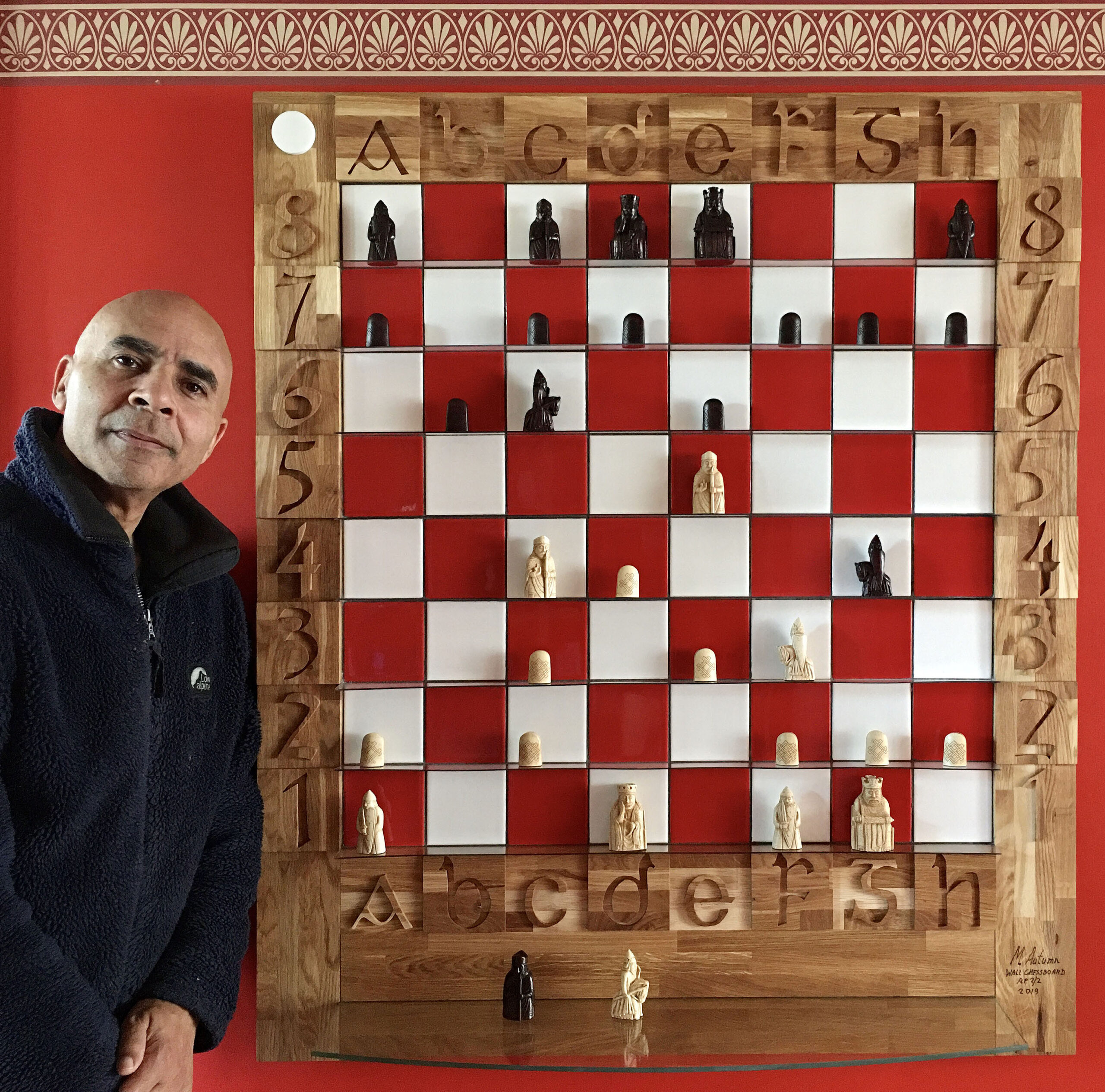
Choosing a colour is a very difficult challenge – especially of tiles! Feeling red would be the best substitute for black squares, I searched for what must have been weeks, and had various sample tiles sent to me – because the web and a computer screen is not the ideal way to see colours accurately. Eventually I found a red I liked and that worked well with the rest of the colours. (Getting the tiles in quantity was a whole different challenge…!)
Black pieces against red and white ceramic tiles
White pieces against red and white ceramic tiles
Another minor change was to have the glass shelve at the bottom (the original shelf was put at the top more of as afterthought because I had space there). This is the 2nd and final signed artist proof (with the Scottish National Museums‘ Isle of Lewis Chess pieces) :-
Finished article: Isle of Lewis Chessboard (Isle of Lewis Chessmen inspired)Signed & dated detail
I will not be submitting to this year’s RA Summer Exhibition (2008). No time. Focused on earning a living and iz2u development (link). Sometimes there is as much creativity in trying to provide the economic foundations for the freedom to be artistically creative…
Recorded music is ubiquitous and omnipresent: you can play it on a huge and growing number of devices, you can download it from millions of sites on the web, you can amplify it to play it as loud as you like, and you can choose the quality of the reproduction by the device you play it on (although quality of reproduction seems to be getting better all the time and at a more affordable price).Listening to music on the web in no way detracts from the quality of the reproduction or the pleasure you get from listening to it. Musicians and composers will generally not feel misrepresented if you listen to their creations via the web or on various players. There is something extra to be gained by going to a live performance or gig – which has much more to do with atmosphere and ambience – and this will probably always be the case. I would like art and photography to be as ubiquitous, omnipresent, and as accessible as music. Until now, to really appreciate art or photography (or any other two, three, four (video/animations) – dimensional images) you had to go and see them “in the flesh” as it were. This is very unsatisfactory for a number of reasons :-
It is severely limited by the number of people who can see the work.
It limits the times people can see the work (e.g. only during gallery opening times).
Access to close inspection is usually restricted for reasons of security or simply politeness (e.g. not wanted to get the the way of others!).
Lighting is generally difficult to control and so work may be viewed in less than idea conditions.
Some precious works may actually deteriorate by being exposed to light and uncontrolled atmospheric conditions.
I set myself the challenge of creating a new web application to display still images on the web in the best possible way and to be accessible to as wide an audience as possible :-
It should work on anyweb browser.
The web browser should automatically maximize to fill the whole screen (where the browser permits this).
The images should automatically fill the whole browser display area.
It should have the option to fill the whole screen – without any browser clutter (e.g. toolbars, menus, scrollbars, status bars, address bars etc.) – so you can see the images as large as physically possible without any other distractions.
The image should “intelligently” fill the available space (initially – until you start zooming) in respect to its aspect ratio and the aspect ratio of the web browser or screen – without distortion.
There should be no limit on the size of the image – in terms of resolution (MBs/GBs) or physical size (H x W).
The image should be displayed at the highest possible quality or resolution for any given viewing scale.
There should be optional data about the image – i.e. you should be able to choose whether or not to display this information – easily and quickly. This should have the ability to display hyperlinks and other interactive web content.
There should be optional controls and navigation – i.e. you should be able to choose whether or not to display these.
To harness the full potential of the virtual gallery.
I have been working towards this solution for the last 2 years (with a background of 25 years in computer architecture and software design), and, with a really big push in the last few months (and a huge sigh of relief!) – I have finally achieved my goal. The web application/tool is called iz2u™, and all the images you see in my portfolio and blog (Blog) use it. I have also started a new blog devoted to its’ development iz2u and feedback. (Please do not leave feedback about it on this (MA) blog as this is devoted to art and photography). Viewing images on the web with this new technology could actually be better in some respects than seeing them “in the flesh” : –
You can spend as long as you like studying the work.
You can zoom in to any part of the work (try doing this to the Mona Lisa in the Louvre!).
In principle you can supply any amount of supporting multi-media information.
You have the convenience of seeing the work any time and from any location.
Lighting conditions can be better controlled (art work can be scanned or photographed in perfect conditions, digital images remain in their native format).
There is no limit to the size of the images (you are however restricted to looking at them through the window of your computer screen).
There is no limit to the number of viewable images.
You can gain access to artwork and manuscripts etc. that are too fragile or precious to make accessible to the general public – thereby increasing the number of works available to show.
There are some obvious drawbacks I can think of :-
There is nothing quite like seeing the image/artifact “in the flesh” – even though you may not be able to see it as well.
There is no replacement for the social experience and ambience of a gallery – similar to the real experience of going to a live performance or band.
The is no replacement for actually being inside a beautiful building and enjoying art in the context of architecture and history.
The role of the curator – in terms of juxtaposition, chronology, themes, aesthetics, etc. is missing. Having said that, there is a curatorial role in pure virtual galleries, for example, where the whole virtual space and experience has to be designed…
Having developed this solution, I can see that there are many uniquely web-technology-based art projects waiting to be born. Watch this space…
Today I made my first approach to a top commercial art gallery to see if they are interested in representing me. This must be something akin to an author approaching a book publisher to try to get their work published. I am sure that, like novels, some will like your work and some will not…
I selected them very carefully on the basis that they deal with famous contemporary artists – including those working in photographic and digital mediums, and I know of them indirectly through a buyer of one of my works.
It will be interesting to see if they consider my work on merit or whether they are more interested in the CV – i.e. something which tells them you are good – or not – as the case may be…
This endeavour has been slightly delayed due to the RA Summer Exhibition – where one of my three pieces was damaged and the insurance claim has taken some time to be settled. It has meant that some of my work has been sitting in their vaults awaiting collection. I did not want to arrange for more than one collection – preferring to await the outcome of the insurance claim. The RA has been very good in dealing with the damaged picture, has resolved it amicably, and they have returned all my work at their own expense.
I am still struggling with the catch22 situation I am in – of trying to get financial security to do more art. I have to support my family and home, and somehow I have to break out of non-art work. Family life is precious, and there can be no better creation than children. However, they do sap art time…
After waiting nearly two months I finally got the bad news:
“Dear Michael Autumn
Summer Exhibition 2007
11 June – 19 August
Thank you for entering this year’s Summer Exhibition. With nearly 12,000 entries the competition was extremely strong. On this occasion, I am sorry to inform you that your works were not hung in the exhibition; two of them however were shortlisted, which is a fine achievement.
…
[ collection details]
…
I very much hope that you will submit work in future years.
Yours sincerely
Sir Nicholas Grimshaw CBE
President”
I can consider myself extremely unlucky to have had two of my three works shortlisted, put into one or two gallery rooms to be assessed for hanging with other works in those rooms – and for them both not to be selected! This could have been because there was not enough space or they didn’t make up the hanging aims of the gallery hanger – in terms of symmetry, size, balance, or some other aesthetics.
My work is high risk in terms of the RA Summer Exhibition: it is big – with limited wall space smaller works have a better chance; digital – for a conservative institution this is not universally understood and appreciated; and they look photographic – for a conservative institution this is not universally understood and appreciated.
It is high time the RA elected digital artists and photographers to better represent the diversity of art being produced today. Currently the Academy’s rules are that there must always be at least 14 sculptors, 12 architects, and 8 printmakers; the balance being made up of 46 painters. Things have moved on since 1769…
It is a bit misleading to call it an “open” exhibition when the 80 Royal Academicians making up its membership can each submit up to six works as of right. With room for approximately 1000 works, up to 480 places – nearly half – are clearly not open. Moreover, the Academician’s work can be, and often is, very large, and sometimes huge – like Hockney’s “Bigger Trees Near Water“: it takes up a whole huge wall (about a third of a room allowing for doorways)! Last year, 2006, the Summer Exhibition included two memorial galleries (from a total of thirteen) dedicated to the late Members Sir Eduardo Paolozzi and Patrick Caulfield…
With these “special privileges” I estimate the Royal Academicians take between 30-70% of the available hanging space. I am not criticising the RA as such: it is their club and they can have whatever rules they like. I just question the use of the term “open exhibition” – because clearly is it not entirely that.
I would like there to be a really open annual art exhibition held in London, somewhere prestigious, where the selections were made by a large cross-section of artists (from all fields) – who couldn’t select their own work.
I am not disheartened. I will try again next year because I like the spectacle, and I just accept that there is a large element of luck and a huge element of subjectivity. This is after all representative of art in general…
I have been extremely busy recently – working away from home for weeks on end and naturally very busy when I come home to my family. On Saturday (17th March) I realised that I didn’t have an application form. I quickly fired up the internet and to my horror discovered that I could no longer order one on-line! Bugger! However, according to the RA web site I could order one over the phone Monday to Friday between 10 am and 5 pm. Knowing that Friday 23rd was the last day for application form submissions, I anxiously tried calling the RA at 10 am this morning (19th) – only to hear from a machine saying that it was no longer possible to get application forms over the phone and that you had to come into the RA and collect the forms in person. “Oh dear” I said to myself – NOT! I said something altogether stronger and completely unrepeatable!
What on earth is wrong with their technology? One of the huge benefits of the internet is that you can let people self-serve and save a lot of time and money – and give a better customer experience. Why on earth would they stop allowing people to order on-line and force them to use a labour-intensive, cumbersome, technology – like a phone and a human at the other end? It was so annoying. There was no way to speak to a human. The call just hung up after the message.
Quickly considering my options, I thought: “I’m a Friend, I’ll ring up the Friends department and surely they will be able to help me?” They couldn’t or wouldn’t. I pleaded with them. It was somehow impossible for someone in the Friends’ department to walk over to the information section, put a form in the post and sent it to me! Despite pleading with them that I have been a Friend for over twenty years, and the alternative is that I come in from over a hundred miles away just to pick up a form – they said they couldn’t help me. This is the problem with charities and other non-commercial institutions – they don’t do customer service, and they can’t bend a rule here and there and user their initiative. Bloody infuriating!
I pondered the possibility of getting a biker to pick up the form and either post it Special Delivery or bring it up to the Fens. I thought better of it. Too much to go wrong. I resigned myself to make a fleeting journey into London and pick the darn thing up myself…