Category: Museum Framing

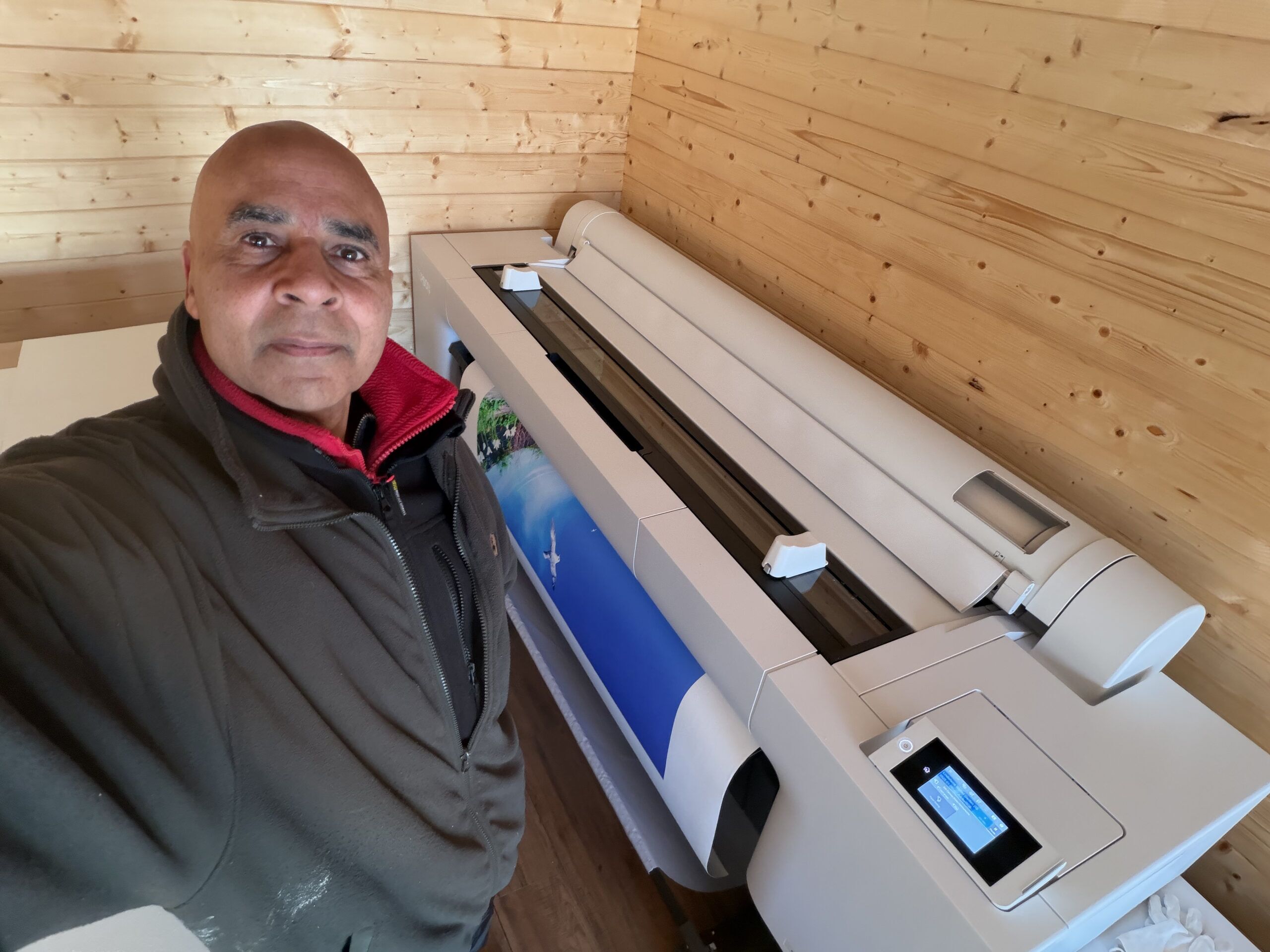
  • My new 64″ giclée printer delivered and installed

    My new 64″ giclée printer delivered and installed

    Why don’t I use a commercial professional printing service to produce giclée prints for me – like most people?

    Believe me – I wish I could! I searched high and low, but I couldn’t find a printing company that met all my exacting requirements – and I wasn’t prepared to compromise and accept what random permutation of my requirements individual companies happened to offer. My art is too important to me. Most companies were only offering two or three, out of my seven, requirements – which are as follows :-

    1. Using verified archival pigment inks from a highly reputable ink maker (this is currently only Epson UltraChrome PRO inks as far as I’m concerned)
    2. Using a 12-colour printer. None were offering this! This is because 12-inks is new on the market and most printing companies are using older generations of printer.
    3. Minimum of 60 inches wide. Most only offered 44”. 60”+ is quite niche.
    4. Printing on Hahnemühle Smooth Fine Art 370 canvas. I want the texture of the canvas to be as inconspicuous as possible, and this canvas is the smoothest, most archival, canvas that I know of. It also has the brightest natural white (without using the completely non-archival – and therefore completely unacceptable – optical brightening agents (OBAs)). It also has a matt finish – which looks better from all viewing angles and preserves colours best with random, background lights. Most companies use their own preferred canvas and weren’t prepared to use this!
    5. Mount the canvas on aluminium stretchers. Aluminium stretchers will never twist or warp – unlike with wooden stretchers – something that is especially important with large canvases. No canvas printing companies I researched offered this.
    6. Stretch the canvas leaving a precise specified white margin (aka museum wrap – which I use for limited editions – where I add a title, edition number / edition size, and signing in pencil. No canvas printing companies I researched offered this.
    7. Finish the canvas with a completely invisible, waterproof, archival UV-protective varnish (only one offered this).

    Sometimes in life if you want to have a job done well (because you know what well means) then you have to do it yourself…

    Why did I want a 60″+ Giclée Printer?

    Getting the best 60″+ giclée (pronounced “zhee-clay“) printer (as considered by most in the know) was a big decision for me – not only because of it’s expense (and the twelve 1.6 litre inks for it are half as much again!), but also because it needs quite a lot of working space. That’s the room required to handle, cut, stretch (canvases), mount, and frame the huge prints it produces. I didn’t have anywhere near enough dust-free, clean, space where I live, so before buying the printer I bought space for it – in the form of a new 6m x 6m log cabin (see My new big printer requires a new shed!).

    Why did I want such a big printer? I’m an artist, I want to make a big impact. I see big, I think big. I love Nature, and a lot of the time I try to capture or say something about Nature. I don’t like big things being unnecessarily shrunk. Small is easy. Everybody and anybody does small. Point a camera (or more likely a smartphone these days), click, small print. It’s all too quick and too easy, has little or no value, and doesn’t stand out in  the crowd. Small doesn’t have a big impact. Large does. Small is not special. Large is much more likely to.

    Much, though by no means all, of my art is large and photo-realistic – and is intentionally made to look like photographs (although they are not simply photos – very far from it). In relation to this genre of my art, you could say that I attempt to make “photos” – rather than simply take photos. Unlike photos, I don’t want my art to fade – I want them to last as long as possible – hundreds of years – hence why I got interested in giclée printing and museum framing techniques many years ago.

    I’ve been doing this form of art for quite a long time – since the noughties in fact (prior to the that I was doing high-end conventional analogue photography, however, I’ve always conventionally manually drawn and painted as a separate passion). It seemed like a god-given opportunity to me in the beginning of the digital age – and, with my background in computing and photography, I took to it like a duck to water.

    Some twenty years ago I bought what was then the best large format 44″ giclée printer. I started producing and framing large scale, highly detailed, and archival artworks (using museum-grade inks, materials and framing techniques) – some of which were accepted by the Royal Academy of Art in London (although I never got around to other galleries or outlets at the time).

    My life took an absolutely terrible turn (details of which I needn’t go into) and effectively my creativity was put on hold for about a decade and a half. After fifteen years in the wilderness, I am largely recovered, re-motivated, and re-energised.

    Size isn’t everything.

    What about quality? What is a giclée printer? A giclée printer is an uncompromisingly high quality, very high resolution, printer that uses archival pigment inks on archival papers and canvases – and produces superb prints that will keep their pristine colours and vibrancy for at least 200 years under normal indoor lighting conditions. First and foremost a giclée printer uses pigment inks. Pigment inks used by giclée printers are among the purest forms of water insoluble colour substances we know of – which we get from rocks (including clays), plants, metals, and some we synthesize – and are the most lightfast colourants generally available. The key word is colourant, because every printing technology tries to change the colour of the surface it is printed on. The crucial question for me – as it should be for all artists and photographers – is how long will the colours remain as vibrant and pure as the day they were originally printed? In addition to the inks used, a key determinant of lightfastness is the material it is printed on – how stable it is over time, and how well does it present (reflect) colours printed (or painted) on it? In this respect cotton – in the form of papers and canvas – is one of the most colour stable and colour faithful print surfaces we know of and use extensively in high end art and printing.

    Colour Gamut

    Another crucial aspect of giclée printers is called colour gamut. What is the range of colours it can print – and how vibrant are they? Put simply, this is how many colours and tonal ranges a printer can reproduce. In theory only four colours are required to make any reflected colour – Cyan, Magenta, Yellow, and blacK (CMYK). But there is much more to printing than this. Basic CMYK cannot directly produce all the colours we can see, and many colours are achieved quite crudely by the placement of small dots of CMYK colour next to each other – to give the impression of the other colours – like red (from yellow and magenta), blue (from cyan and magenta), and green (from yellow and cyan). However, this effect looks pixelated close-up because you can literally see the patches of dots – so effectively the resolution of basic simple four-colour CMYK printing is low. Also, the vast number of shades of blue and green in nature cannot be reproduced very well with this basic approach.

    My printer has twelve colours – the most currently available on any pigment inkjet printer – to give the widest possible range of colours. The set includes dedicated colours for those particularly difficult hues to reproduce by combining other colours – orange, green, and violet. It also has two greys (mid and light), and two blacks – a matte black (for matt surfaces) and a photo black (which reproduces blacks better on a glossy surface) – so it is exceptional at black-and-white prints also.

    So, wanting to make as big an art impact as I can, I thought: if I don’t do it now, I probably never will… This new printer is the best of what is available today – and is really only a continuation of where I left off fifteen years ago…

    Installation was forced on me!

    The steps I went through to get this printer was, firstly, deciding what printer I wanted (back in April 2025), and finding out how much it would cost; secondly, realising I needed to build a log cabin to put it in and researched the options; thirdly, realising I needed a concrete base, researched that, and got one built; fourthly, buying and then building the log cabin, fitting it out, treating the wood inside and out, making a path and building two very large workbenches (I finished in late September 2025); fifthly, revisiting the market to see what the best deal I could get now.

    However, in the six months between the first and fifth steps, something very impactful happened: the company who I originally planned to buy the printer from said back in April that the price included delivery, unpacking, removing all the packaging, installation, and training. Great, I thought – that’s a lot of work and worry avoided. However, when I came to ordering it in late September, that delivery deal was no longer available because the third-party company who provided that service decided, for whatever reason, not to do it anymore – and it turned out they were the only company in the country providing that service… So, I was left with the daunting prospect of doing everything myself…!

    The printer was hands down the biggest and heaviest thing I have ever had to handle – (and I have handled quite a few large machines in my time – including big CNC machines, a big industrial laser, and other big woodworking machines).

    Using my heavy-duty pallet jack, my neighbour and I managed to roll the huge 3.5m x 1.5m x 1m printer box from the driveway (where the tractor forklift took it as close as it could), along my newly built path, into the log cabin (over a carefully designed double ramp I built). We managed to get all the surrounding cardboard and most of the polystyrene off it. There was a daunting number of pieces in bags and boxes of various sizes, and labelled bags of nuts and bolts.

    With the main printer chassis propped up on big dense blocks of polystyrene resting on the huge pallet, we set about assembling all the other pieces as much as we could – including the stand (which also had to be assembled). It was by no means straightforward, and some parts were incredibly confusing as to where they were supposed to go – or how they were supposed to be fixed in position. The instructions were far from clear, and the order some things should have been done was utterly confusing at times. Anyway, after about three hours, all that was left to do was to lift the printer on to the wheeled stand. And, because this required at least five people, we stopped working on it that day – and I was left with trying to rope in a couple of other near neighbours to help. I did manage to get their commitment, and we scheduled a day (the following week) where the five of us could do it.

    It required four guys to lift/move the printer onto the nearby stand – and two people to guide us on to the stand and pull the big pieces of polystyrene out from underneath it. The whole 6m by 6m log cabin felt full to the brim with all the packaging it came in, and the pallet it was transported on was so heavy that it took four of us to carry it out of the log cabin afterwards!

    It was quite a mammoth effort to move and assemble the printer – something that was never even discussed in the sales process – nor even mentioned on the manufacturer’s website…! In hindsight I don’t think this printer should ever be sold without a full installation commitment by an experienced dedicated team. Leaving it to the customer is a huge ask, and, with so much difficult and delicate assembly required by the customer, it begs the question how the manufacturer can offer any warranty – let alone two years…

    Then there was the clean-up of all the packaging. It was one hell of a job fitting all the polystyrene in my hatchback – to take it to the recycling centre. And there were huge sheets and boxes of thick cardboard that I just dumped in my large shed for the time being – until I decide what to do with it.

    Installing the inks was no simple matter either! The instructions were useless, and I couldn’t find any clearer instructions or videos online. The 1.6 litre flimsy-looking flexible plastic bag ink pouches are extremely expensive – at nearly £500 each – so you really want to put them in properly – and not leak or tear them…!

    Ink charging

    The printer comes completely empty of ink, and filling the required system components with ink known as ink-charging. What I don’t understand is why doesn’t the printer come with a small sized set of starter inks for this purpose – like every printer has that I have ever bought up until this one…? And why does this ink-charging process take a whopping 45 minutes – and require two- and a-bit maintenance tanks to be filled with “waste” ink?! The printer came with six maintenance tanks – three of which were already in the printer, however, two of these – exactly as explained in the instructions – were completely filled – and needed to be discarded and replaced with new ones – during this initial ink-charging!

    I compared the weight of a used, full (and therefore needing to be disposed of), maintenance tank, with a new empty one, and I estimate there was about a half a kilo of weight difference. A kilogram is roughly the weight of one litre of liquid (with a similar density to water), and so this means that, over and above the ink used to fill the many metres of tubing in the printer, the ink charging squirted out a total of well over a litre ( spread over all twelve ink pouches) straight into the waste maintenance tanks! That’s about 10% of the £6,000 worth of ink – straight into the bin – including two maintenance tanks…!

    Colour-Proofing

    With the printer all set up, the next task was to load it up with some canvas and do some test prints. A crucial step was to calibrate my new proofing computer monitor with the inks and the Hahnemühle canvas in the printer. Having done a lot of colour proofing before, this should have been quick and easy to do. Was it heck! There turned out to be a completely unexpected red herring in the form of Hahnemühle’s Fine Art Smooth Canvas ICC colour profile. This is the ICC colour profile I should be using: it’s made specifically for this canvas and this printer’s inks – and is supplied by Hahnemühle! However, it consistently produced weird small black streaks on the same parts of the print. Over four days I tried absolutely everything I could think of to get rid of these disastrous black streaks – wasting lots of canvas and ink in the process. In the end, by a process of elimination, it turned out to be a weird fault with Hahnemühle’s ICC colour profile -because when I tested the same print with Epson’s Matt Canvas ICC colour profile for this printer, it printed perfectly every time. I’m really annoyed with Hahnemühle about this because it wasted so much of my time, ink and canvas. What kind of testing did they do – if any – because the very first time I tried to use it, I ran into this problem…?!

    Final Thoughts

    The cost of getting top-quality commercial prints done is very high – often running into hundreds of pounds each – which is okay if you have confirmed sales (or a lot of money). During the creative process there is no guarantee for most artists that any artwork will sell, so the individual cost of experimental or test prints can be quite off-putting, and stifling of creativity.

    By owning such a versatile and brilliant printer as this one, I can experiment with different sizes and media – and can simply re-do prints if I’m not happy with them. So, although the up-front cost (and effort!) was enormous, I don’t have to worry much about each print individual I do…

    The printer is an extremely versatile and power tool, and by owning it I can explore all its capabilities – creative and technical opportunities that would otherwise be completely unavailable to me.

    As an artist, it’s a dream come true to have such a printer – to have such a fabulous creative instrument in my toolbox. And I bought it for that reason alone. However, some companies make good money printing for clients who want the best. This commercial opportunity, coupled with the potential I have for selling my own limited and unlimited edition prints, could mean I will reap financial rewards with it. Indeed, it is far from impossible or improbably that, in time, it will comfortably pay for itself – and more…

    Finally, from a providence and buyer’s perspective, it is surely much better for customers to know that I, the artist, printed and handled the artworks – as opposed to a random commercial printer…?

  • A Proposal for the Museum (FATG Level 1) Framing of Wooden Puzzles – and Other Thin, Flat, 2.5D Artefacts  – by Michael Autumn

    A Proposal for the Museum (FATG Level 1) Framing of Wooden Puzzles – and Other Thin, Flat, 2.5D Artefacts – by Michael Autumn

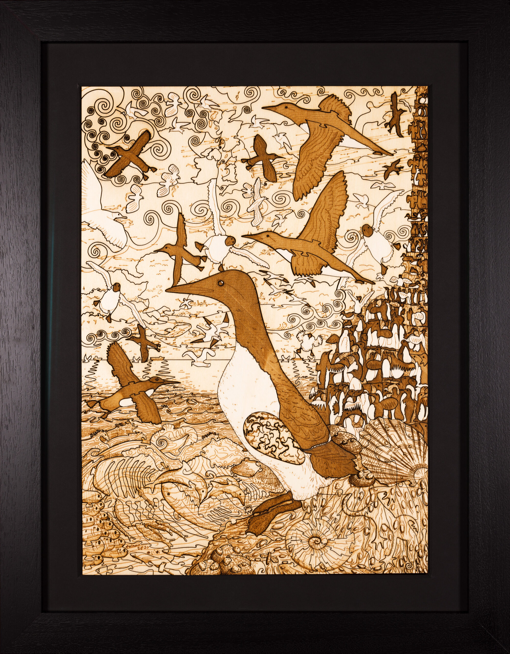
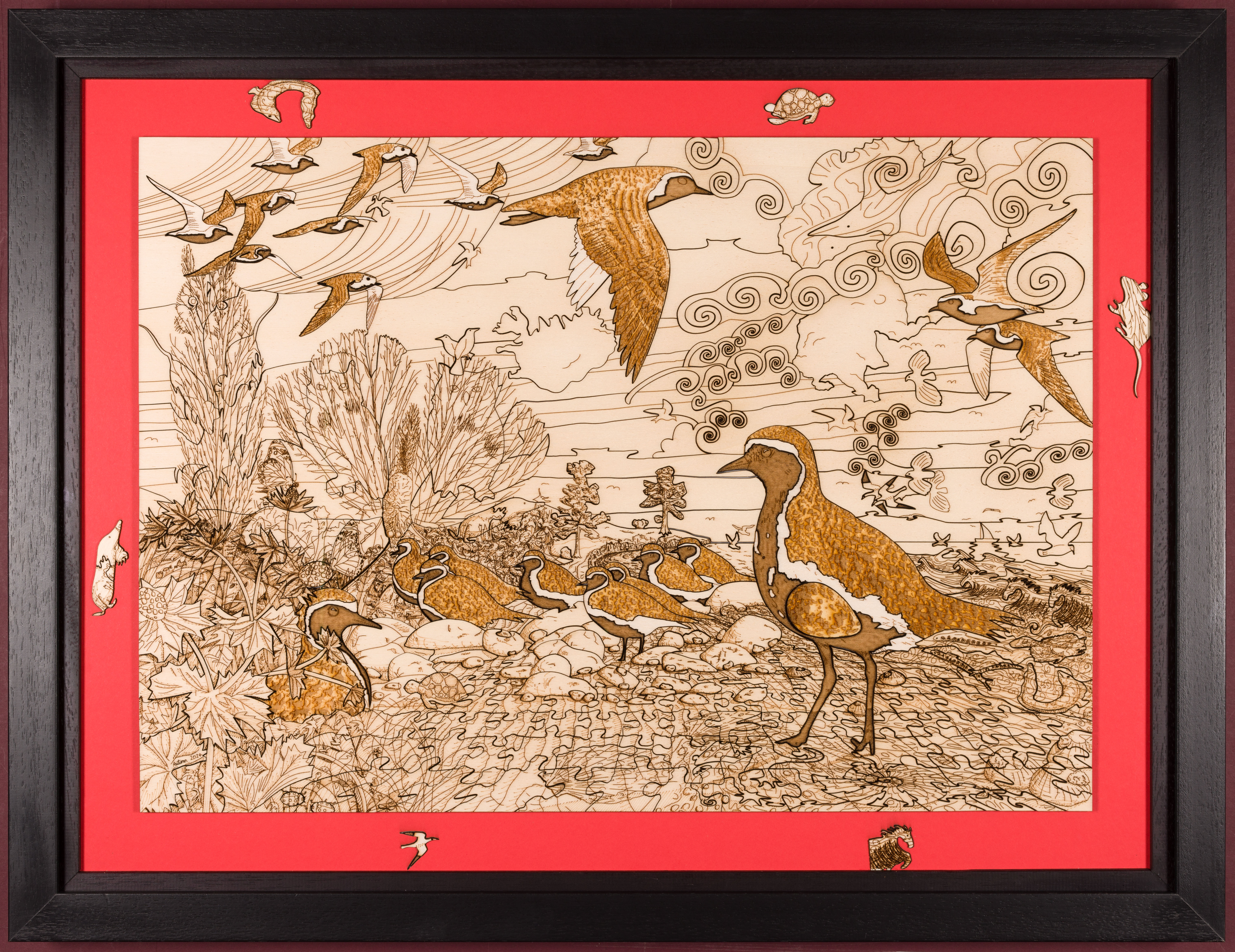
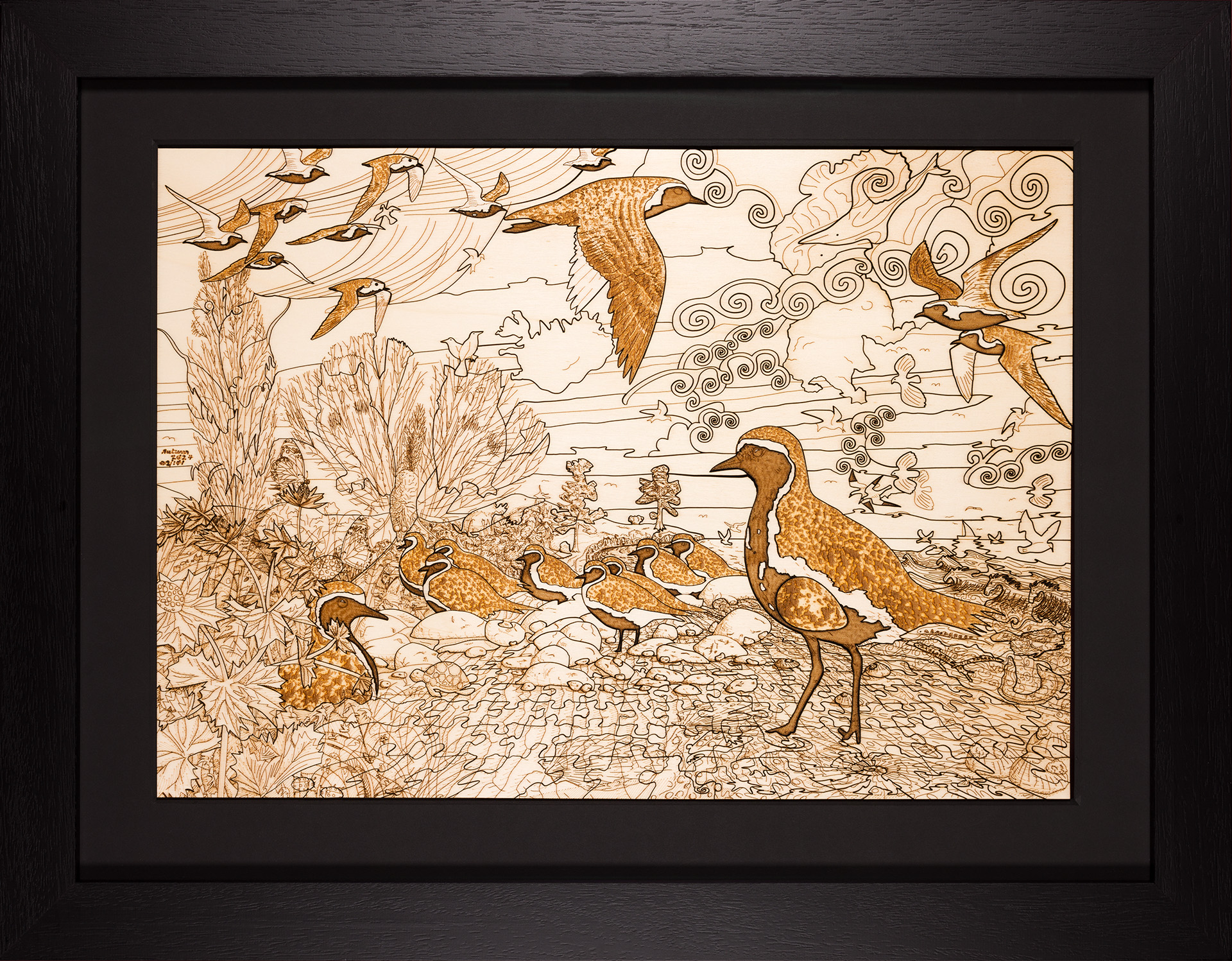
    I don’t claim to be an expert in framing by any means, but, as an artist making a lot of original artists prints – in the form of intricately cut and engraved wooden puzzles and engravings – that, crucially, I hope, will survive in pristine condition for hundreds of years – just like my Giclée prints – I have some very demanding or exacting framing requirements. Having made a special study, there seems to be very little published literature on this subject (which is not surprising because it is quite a niche topic) – and what little I have found doesn’t completely fulfil my goals.

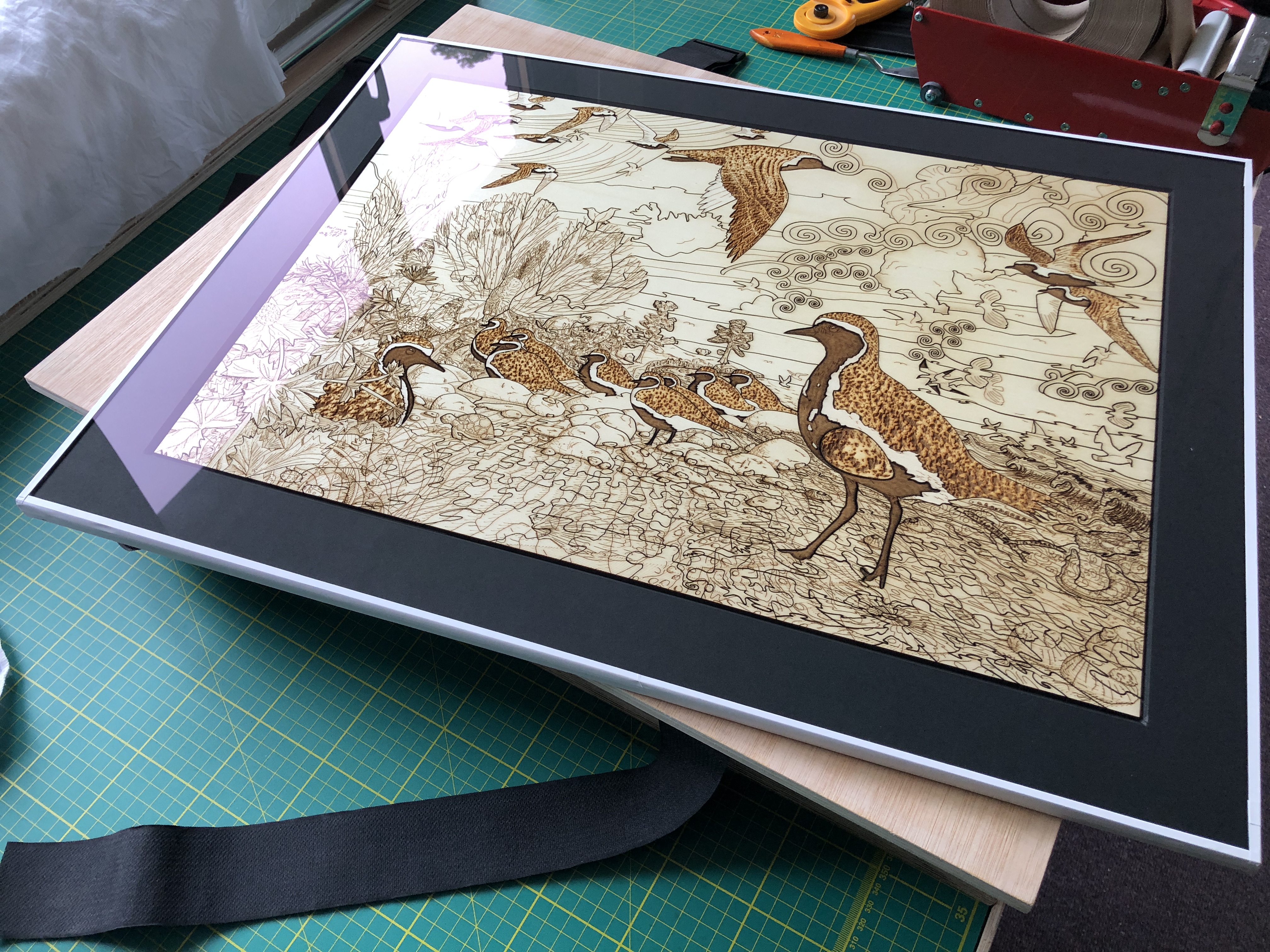
    An example of the 6mm wooden puzzles I make and want to frame to museum (FATG level 1) standard

    Before getting into what my requirements are, let me start by setting the scene. Framing is a compromise between conservation (or preservation/protection) and public display. At the extreme, one could wrap the artefact in something chemically inert and pH neutral (6.5 – 7.5) – like cotton rag or archival tissue paper – and keep it in a microbe-proof, insect-proof, light- and air-tight, container – in a temperature- and humidity-controlled environment. This is precisely how the vast majority of precious museums’ and galleries’ artefacts are kept all over the world – in storage, and out of public view (can be as much as 95% of their collection!) – the reason being that the vast majority of these heritage institutions simply do not have the space to display all their (often growing) collections.

    At the other extreme, the artefact could be displayed as-is – giving the viewer a completely unhindered view – as if it were right in front of them. For example, imagine seeing and handling a precious 14th century illuminated manuscript. How long would that survive…?!

    Attribution: Katie Hunt from St Albans, UK, Public domain, via Wikimedia Commons

    Unfortunately artefacts demonstrably deteriorate from the effects of ultraviolet (UV) radiation, airborne and material-contact acids (like the acids produced from the degrading lignin in wooden frames), temperature fluctuations, consumption and decomposition by the FBI (fungi, bacteria, and insects), water/moisture, etc. – and so valuable and/or irreplaceable items need to be protected from these harmful forces.

    A balance needs to be struck between making the artefacts accessible – and this invariably means viewable by the public at close distance – and protection/conservation. Conservation is a special and vital consideration because it involves maintaining the artefacts in their current condition for as long as practically possible – and this invariably mean hundreds of years. The publicly viewable conserved artefact is invariably achieved by encasing it in a display frame – i.e. a completely fixed and controlled internal and external environment – using materials and techniques that demonstrably preserve and protect – and which have passed the test of time.

    What are my special requirements of framing wooden puzzles? Well, it stems from the fact that they are not completely flat (2D) – like a lot of conventional flat art is. They are not what is conventionally considered 3D, however, they do have thickness or depth because of what they are made of – and this is conventionally called “2.5D”. And what they are made of, and how thick the material is, is relevant to their aesthetic, heritage, and value – and so I feel strongly that this should be visible in a frame. To display a wooden puzzle simply as a flat, 2D, object makes it virtually indistinguishable from a conventional print or drawing, it’s impossible to see what it’s made of – and I feel something vital is lost. If you look at my conventionally framed “Long-eared Owl with Oak Foliage (Art Puzzle)” (2023) – this is scored and cut plywood (see below),


    the cut lines and score lines are intentionally indistinguishable from each other (to trick the viewer – a metaphor for camouflage) – and so one could easily mistake this for a drawing on paper – rather than something which is made of 3mm plywood and has been extremely intricately cut and scored by a very high precision laser (see below for an “exploded” view)…!

    I think it’s important to see what material the puzzle is made of, and how thick it is – and this means being able to see the sides as well as the back. So this means, at the very least, there has to be unobstructed glass at the front, sides, and back…

    As a frame of reference (pardon the pun!), here’s a diagrammatic cross-section of a simple frame (without a windowmount) :-

    Obviously the sides and back of the puzzle cannot be seen, and the frame rebate obscures part of the front.

    One option I considered is a double-sided version of the framing method called direct contact overlay (DCO) or encapsulation – which involves holding the artwork down flat with a very thin sheet of clear polyester film such as Mylar®/Milenex® or Reflex®, or extremely fine mesh fabric like nylon tulle or silk Crepeline® – stretched over a sink mat (inlay mountboard). At the very least this approach would involve a sheet of polyester film or fine mesh fabric on both front and back, with window mounts on the front and back, and it would look something like this :-


    This is unsatisfactory because, firstly, neither polyester sheet nor fine mesh fabric is are strong enough to hold flat reasonably heavy loose artefacts – especially from both front and back – or for transportation (puzzle pieces could easily become dislodged with the vibrations and shocks that would inevitably occur during transportation). Secondly, the polyester’s reflectivity detracts from the overall aesthetic for the viewer. While Reflex® is the least reflective I know of, no clear sheet polyester film that I have come across comes close to the non-reflectivity of museum glass. When we consider the lengths and cost of developing non-reflective acrylic museum glass, I feel it would be a travesty to additionally layer a sheet of Mylar®/Milenex® or Reflex® in front of a valuable artwork if we don’t have to… And no fine mesh – even silk Crepeline® – is completely invisible on close inspection – and so it’s better not to use them unless there is no viable alternative.

    Finally, it would be very difficult to maintain the required tautness across the full width and height of large and heavy puzzles (some of mine measure approximately 600mm by 400mm) – so some pieces could easily tilt forwards, or even become completely dislodged – and potentially get damaged – when the frame is hung. And with a sealed frame package it would be very time-consuming, and not without danger, to take apart, fix, and re-seal…

    Another issue with this method is that the sides of the puzzle (or other 2.5D artefacts) cannot be seen because the sink mat and windowmount – both being made of opaque mount board – obscures a side-on view. So I looked for another solution.

    So why not simply stick the puzzle between two sheets of glass – with enough gap beyond the side edges so that the sides can be seen as well – as in the diagram below…?

    Some fundamental rules of conservation framing are that the artefact should be preserved as-is/intact, should not be damaged/deteriorated or altered in any way, and any glue must be non-permanent and completely (and easily) reversible. So sandwiching the artefact between two sheets of glass is fraught with all sorts of problems.

    Let’s consider the impact of the glue on the wood. It would have to be a starch-based (water reversible) glue that would have to adhere to both the rear sheet of glass and the puzzle wood. Whilst starch-based glue would probably work (I have successfully done some testing), the issue of reversing it would be incredibly cumbersome; and separating all the puzzle pieces without damaging them would be a nightmare! So starch-based glue is very much not easily reversible and carries a high risk of damage when removing the puzzle from the frame. No, gluing is not a viable option.

    Moreover, many framers and conservators would balk at the idea of even having glass touching the artefact! The reasons being that condensation can form on the inside of the frame and it is completely unacceptable to have moisture come into contact with artefact, mould could develop on inside of the glass and on the artefact, the artefact could stick to the glass (thereby making separation difficult and dangerous), and there could be a “ghosting” effect on the glass – which, at the very least, is an irreversible loss (transfer) of pigment from the artefact to the glass.

    So if we can’t glue the puzzle to the glass, how can we fix it between two pieces of glass and show the front, sides and back…? One solution would be to snugly surround the artefact with with a sink mat (obviously it should not be a tight fit in order to allow for expansion and contraction with temperature fluctuations) with enough thickness of mountboard so that the artefact is completely held in place at all sides – and the glass sandwiches it top and bottom . Let’s called this the naïve glass sandwich solution so we can refer back to it later on. It is shown below :-

    As stated from the outset, framing is a compromise between preservation/conservation and visual public display – displaying the artefact to its best advantage. A compromise I am suggesting (and do myself) is to have a glass sandwich – very much like the naïve glass sandwich – but crucially not to have full and direct contact pressure between the artefact and the glass.

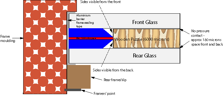
    In the naïve glass sandwich solution, glass would be in full and direct contact with an artefact to the extent that it would be pressing down on the whole surface of the flat object. But what if we introduced a thin shim into the sink mat of the framing package so that the glass is not pressing down on the whole surface of the artefact – instead it is pressing down on the surrounding sink mat mountboard – which has been made very slightly deeper than the artefact? This will take the full and direct pressure off the artefact – resulting in the slightest possible, non-pressured, contact – as shown below :-

    Like the sink mat mountboard, the shim should also be 100% cotton card (I used 280gsm [approximately 360 microns] card – the same colour as the 3000 micron mountboard). The net effect of this shim is to give approximately 180 microns of space front and back, between the artefact and the acrylic glass. The artefact can, and will, come into contact with the acrylic, but it will not be under any pressure (pressured contact is not acceptable as previously discussed). Moreover, the artefact has ample room to expand and contract with temperate fluctuations – with no adverse effects.

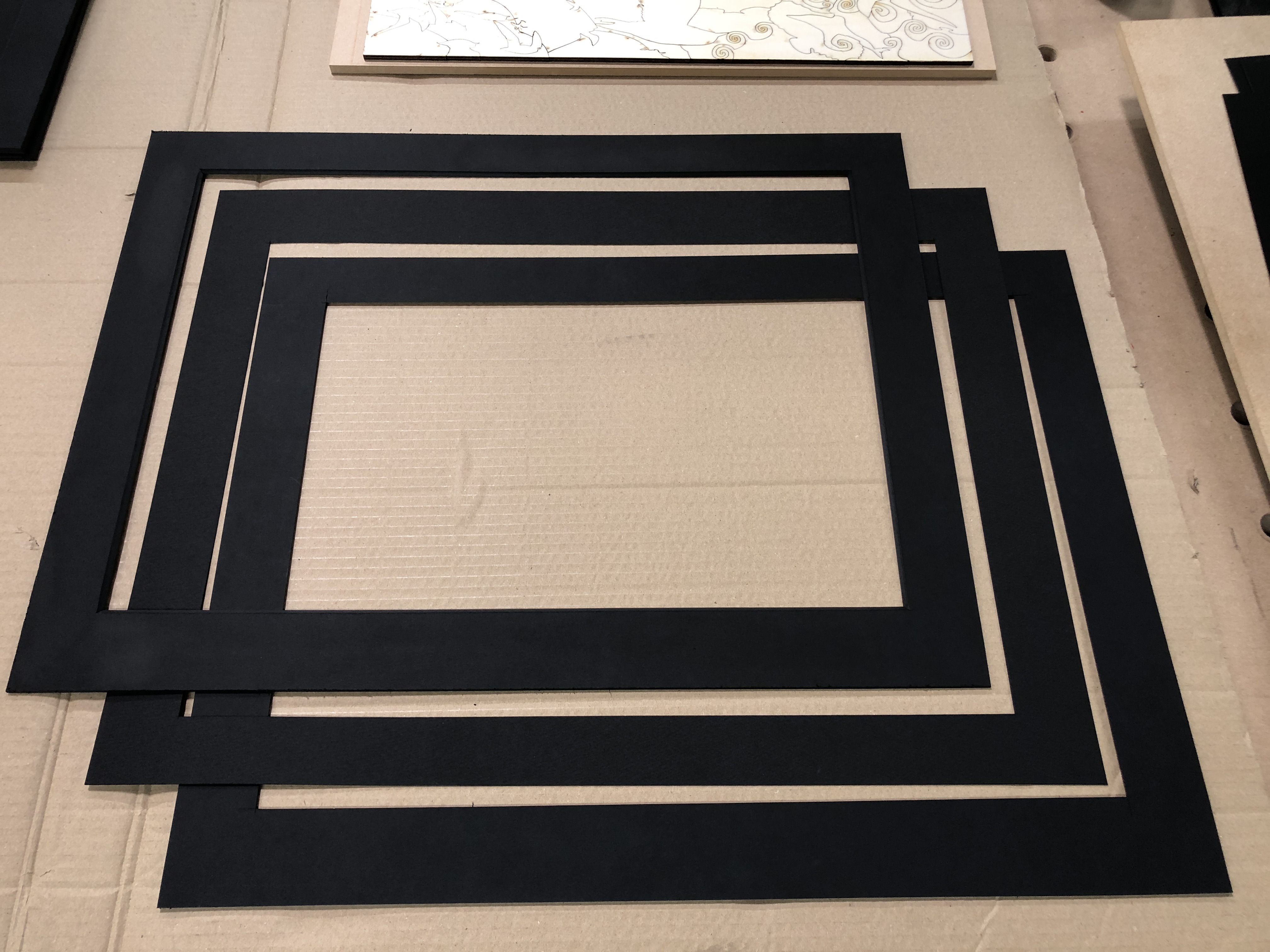
    The front and back 3000 micro bevel-cut window mountboards and the thin shim in the middle

    If acrylic is used instead of silica-based glass, it is far less prone to condensation formation. This is due to the fact acrylic is a far better insulator (and therefore poorer conductor) than silica-based glass, will therefore not fluctuate so quickly to temperature changes, and therefore is less likely to present a cold enough surface temperature upon which moist air can reach the dew point and condense.

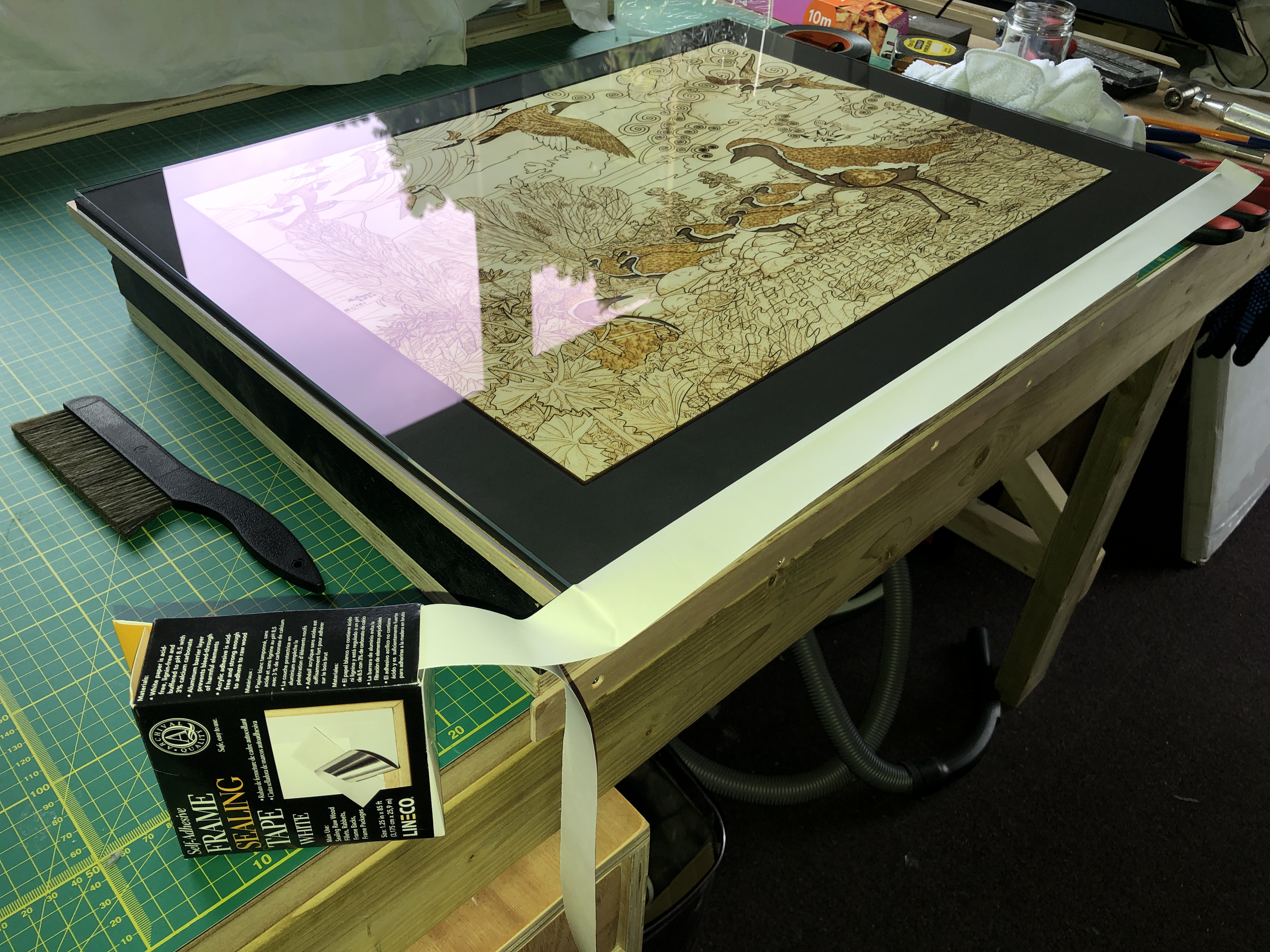
    Moreover, if the whole frame package is sealed completely air-tight with an impervious tape (like aluminium barrier frame-sealing tape), and assuming there is only normal humidity in the artefact before sealing, the risks of internal condensation formation should be so negligible as can be discounted.

    Frame sealing with aluminium barrier tape
    Completed frame sealing with aluminium barrier tape

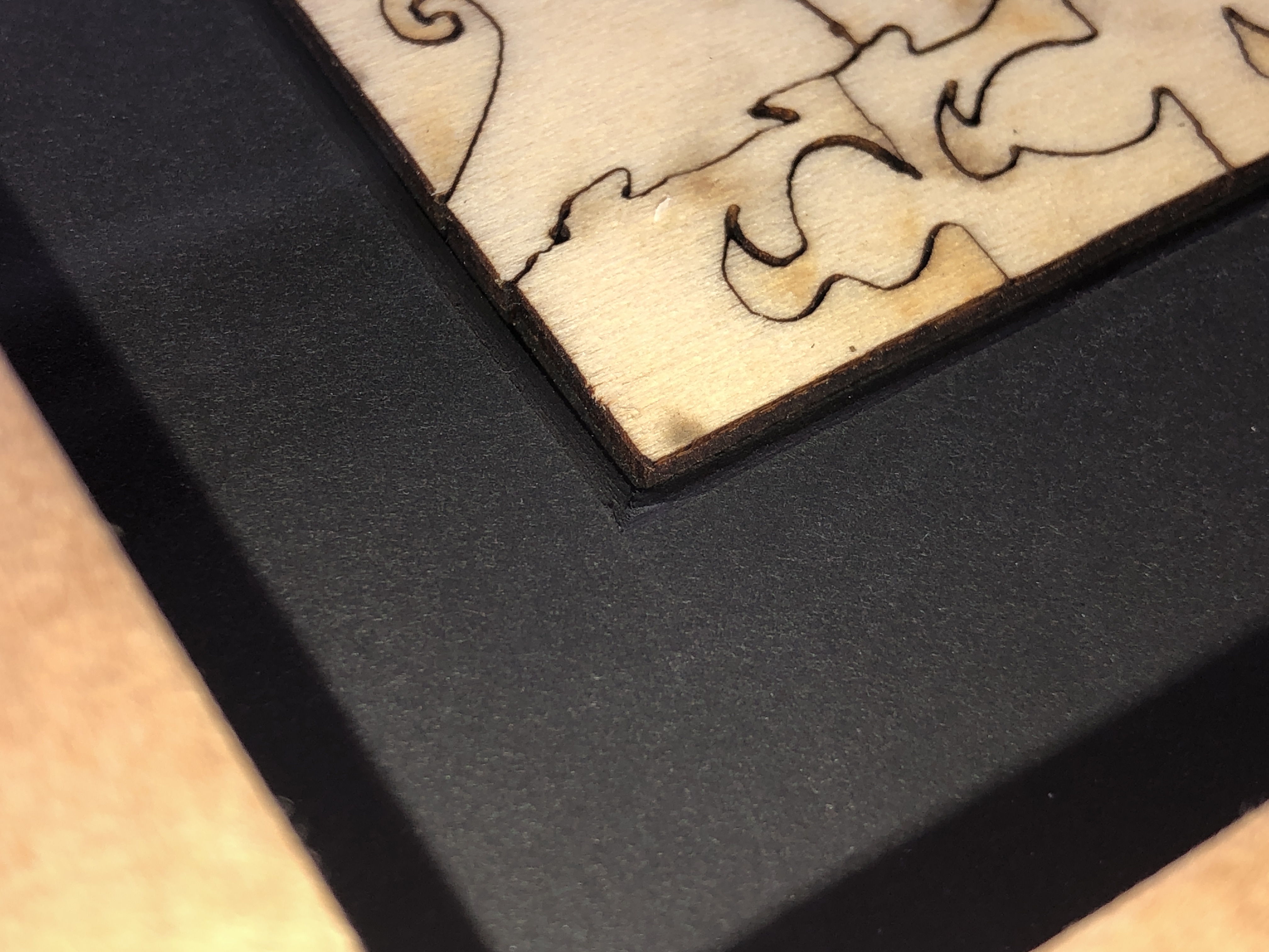
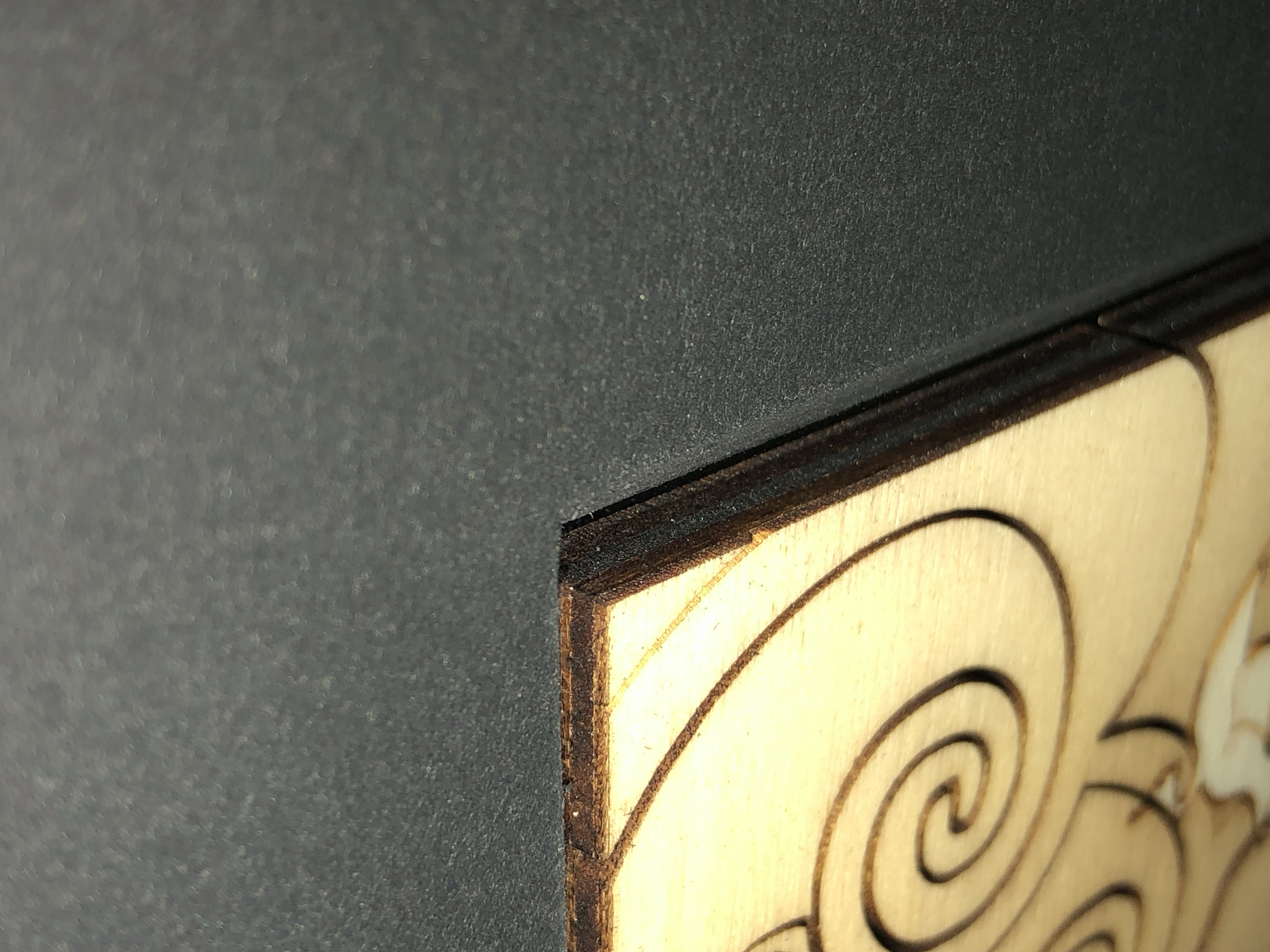
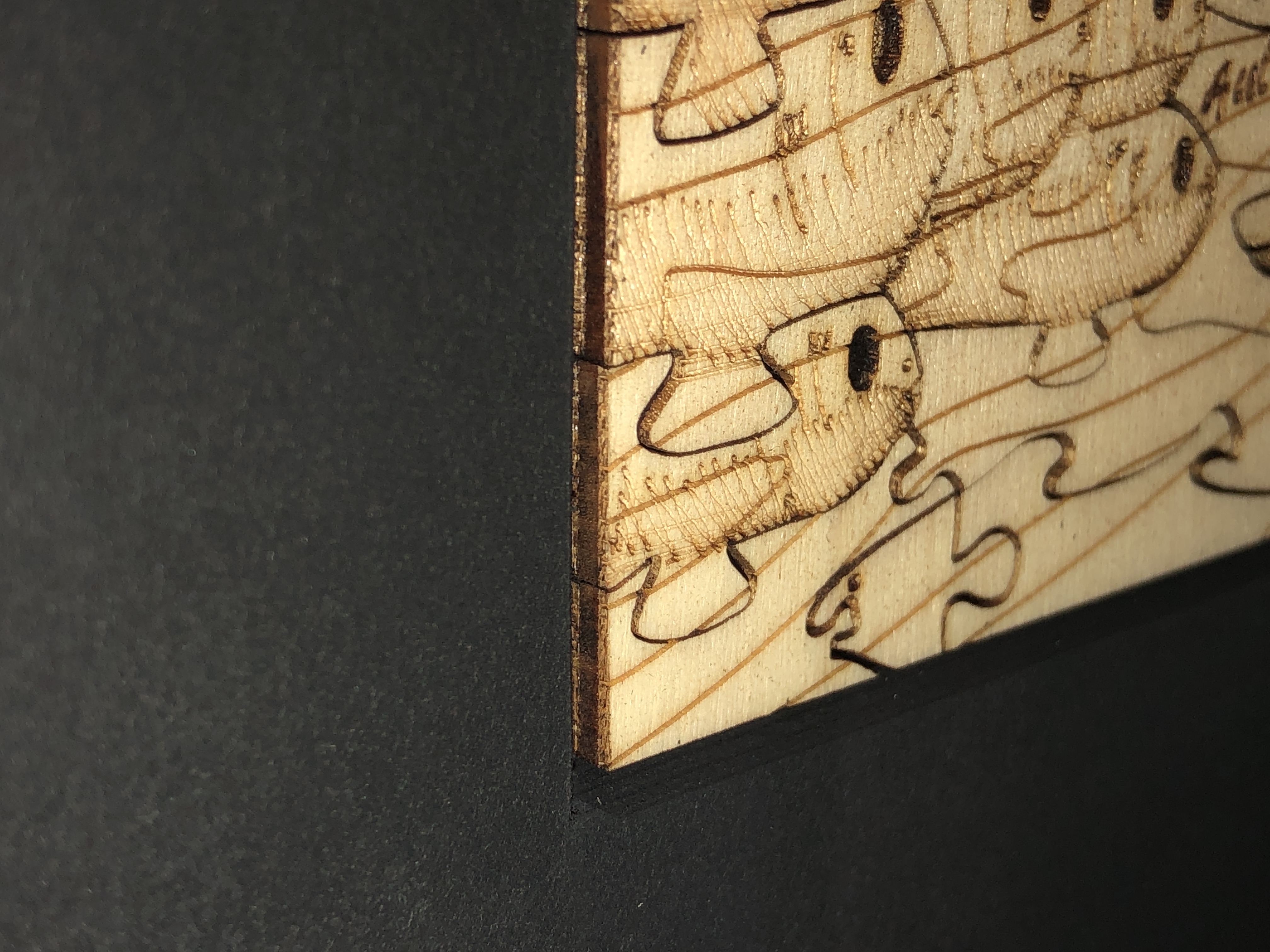
    How to achieve an all-round side view? Well, since we are only dealing with relatively shallow depths (6mm in my case), bevel-cutting both of the 3000 micron (3mm) sink mat mountboards gives us a 45 degree side view from both sides of the 6000 micron thick sink mat. In fact, because the artefact in only in contact with the apex of two back-to-back bevel-cut mountboards, nothing of the artefact is hidden or obscured from view – as may hopefully be seen more clearly in the following close-up diagram :-

    Are here are some example photos showing this side-viewing capability front and back :-

    Should the sink mat layers be glued together – as is common practice? In this instance I think this is not necessary because the three pieces are required to be exactly the same size (are best cut with the same cut stops on the mountboard cutter [or computerised mat cutter]), they simply cannot move at all in the compressed sealed frame package, it’s extra work, and any glue is not without risk – even wheat starch or Methyl cellulose.

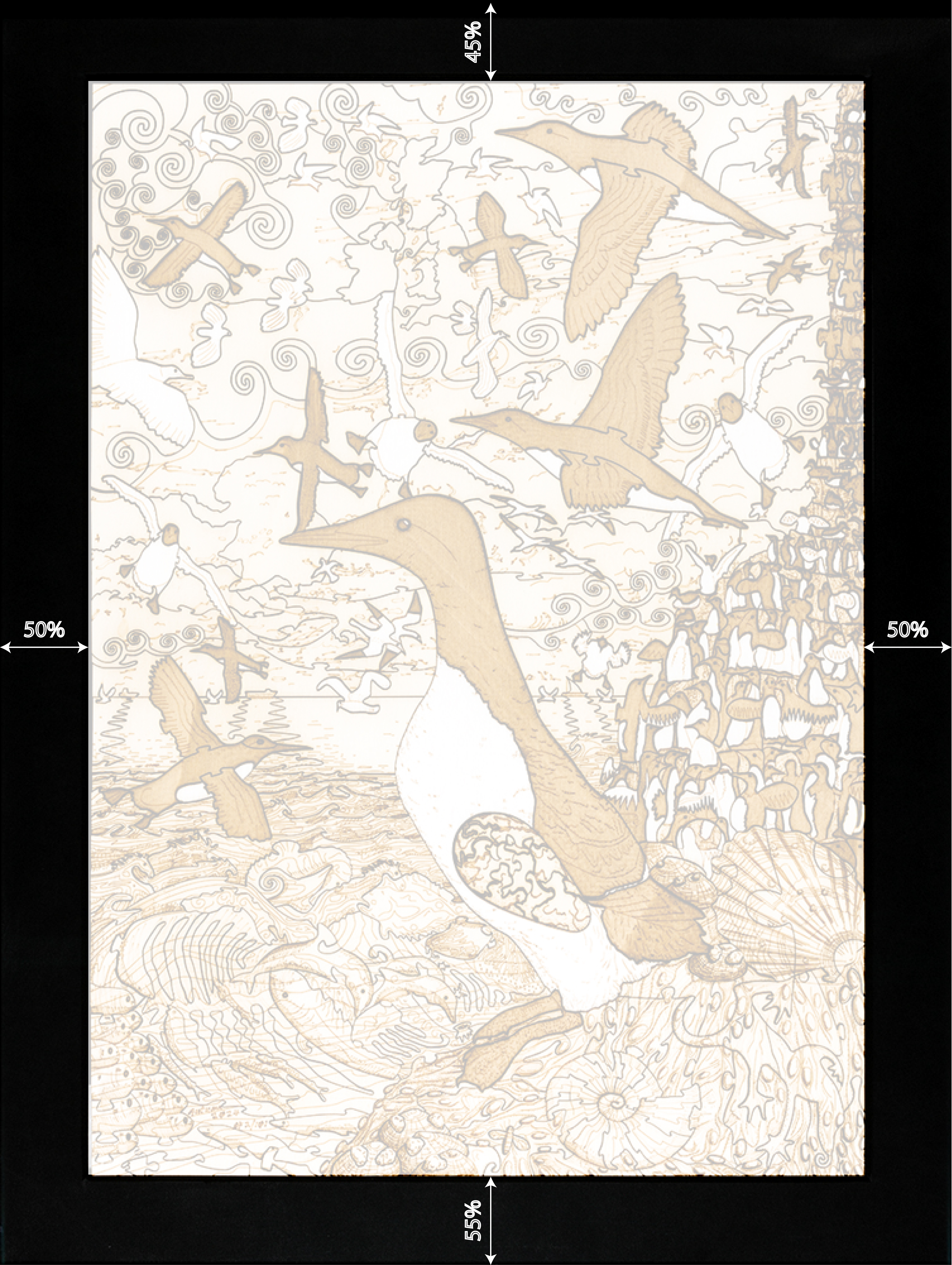
    To allow for natural slight expansion, the size of the sink mat window should obviously be just slightly bigger than the artefact – but not so big as to allow the artefact to slosh around in the frame. I suggest about 2% larger – so about 1mm per 500mm length. And the positioning of the sink mat window relative to the sides, and whether you want symmetry or not – is down to the individual preferences of the framer or client. My preference is sideways symmetry – i.e. equal spacing at the sides – and vertical asymmetry – i.e. the old standard of 45% top and 55% bottom – to allow for natural down-shift of the whole package in the frame (due to margin allowances), and to compensate for visual perceptual effects of the frame being hung at eye-level on a wall (see below).

    Spacing around the sink mat window

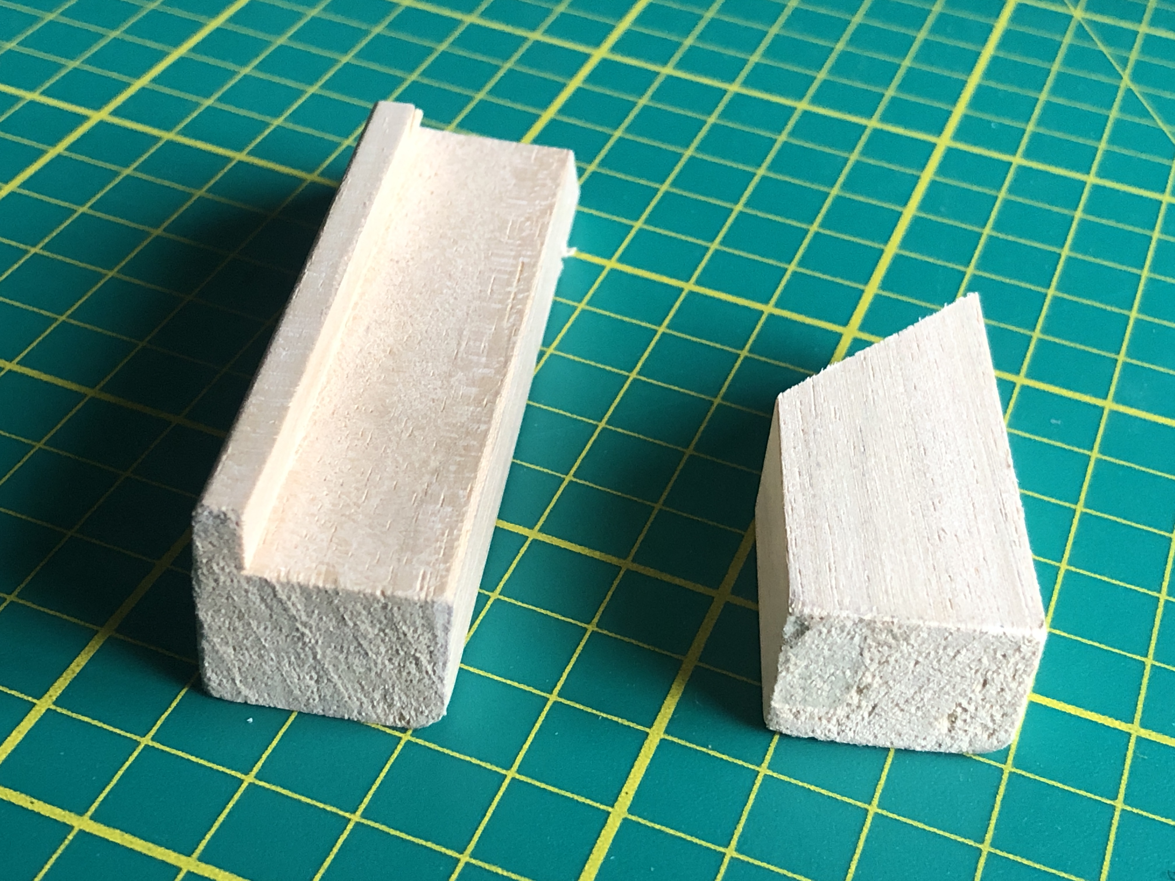
    With this approach a rear frame/slip is required to secure the sealed frame package in the frame – pressed firmly against the front frame moulding rebate – and fixed, as normal, with stiff framer’s points. In my case I used a small plain frame moulding and routed out the rebate – making a plain rectangular profile, because the rebate was getting in the way (see below) :-

    Small wooden moulding used for the rear slip frame – before and after routing off the rebate
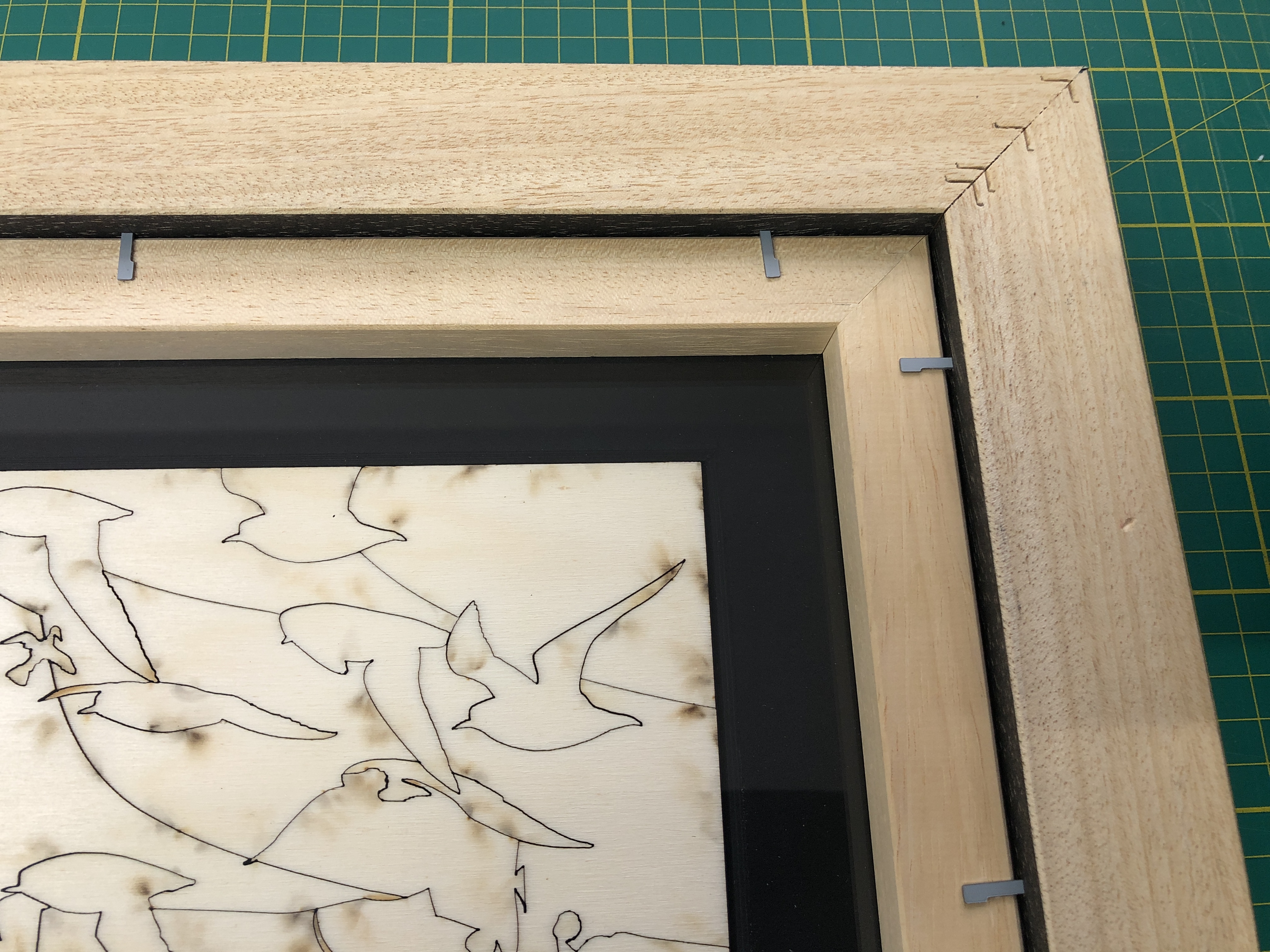
    The rear slip frame held in place with framer’s points

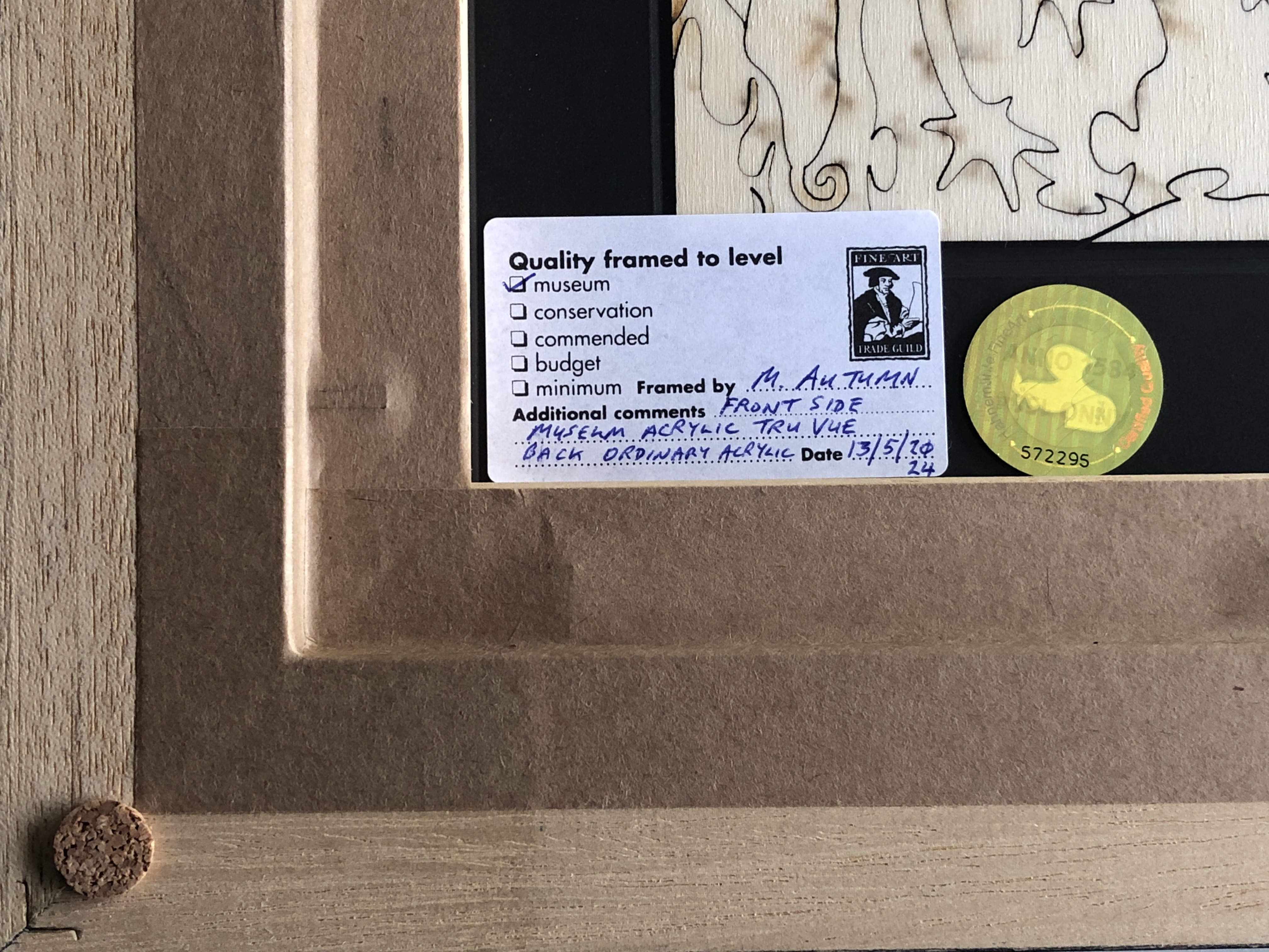
    Both frame mouldings at the back of the frame can be finished off with normal water-gummed paper tape (or some other FATG Level 1 acceptable frame-sealing tape). Here is an example photo detailing this :-

    Detail of corner of the back of the frame with the rear encasing slip covered with frame-sealing tape.

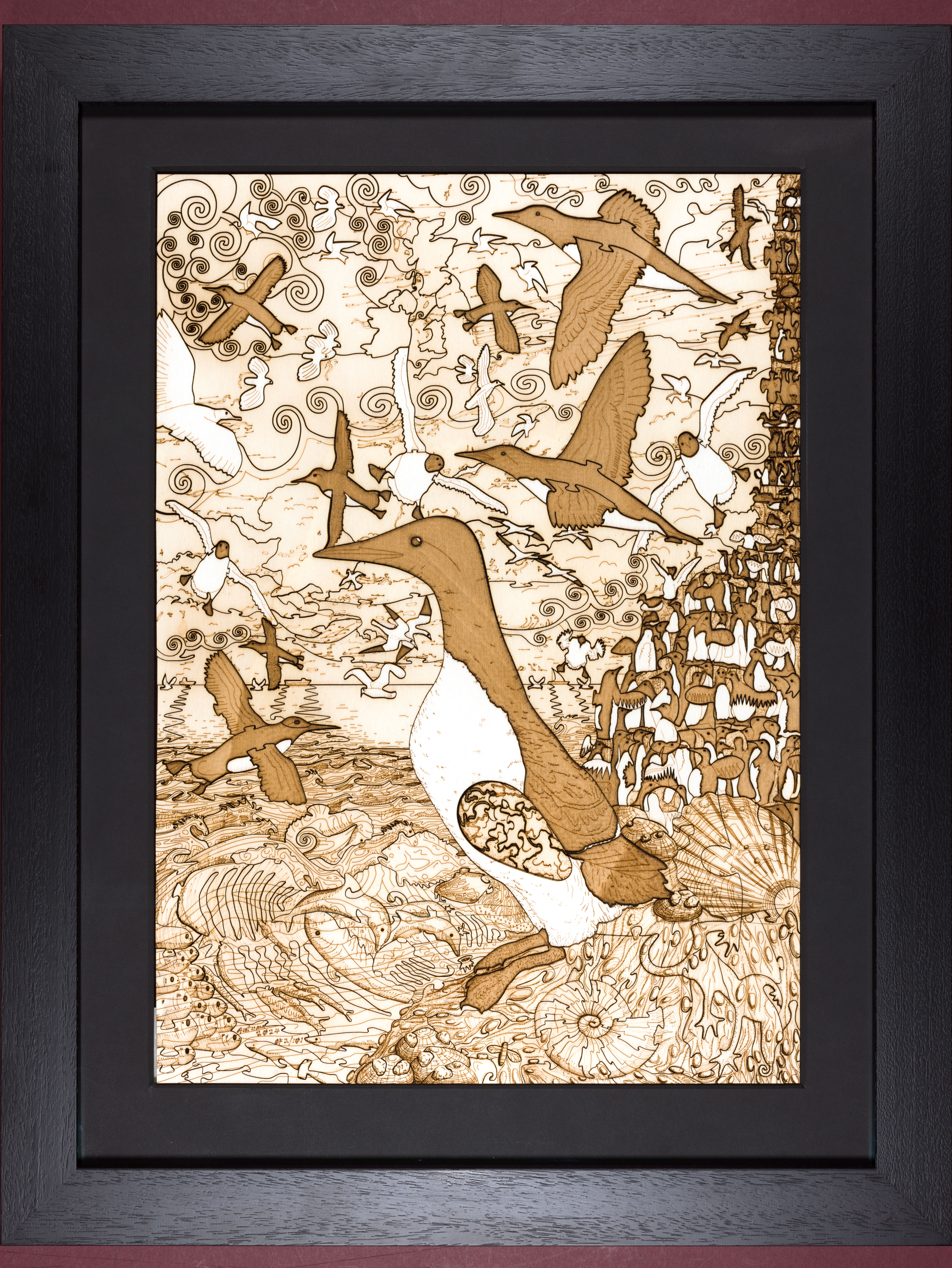
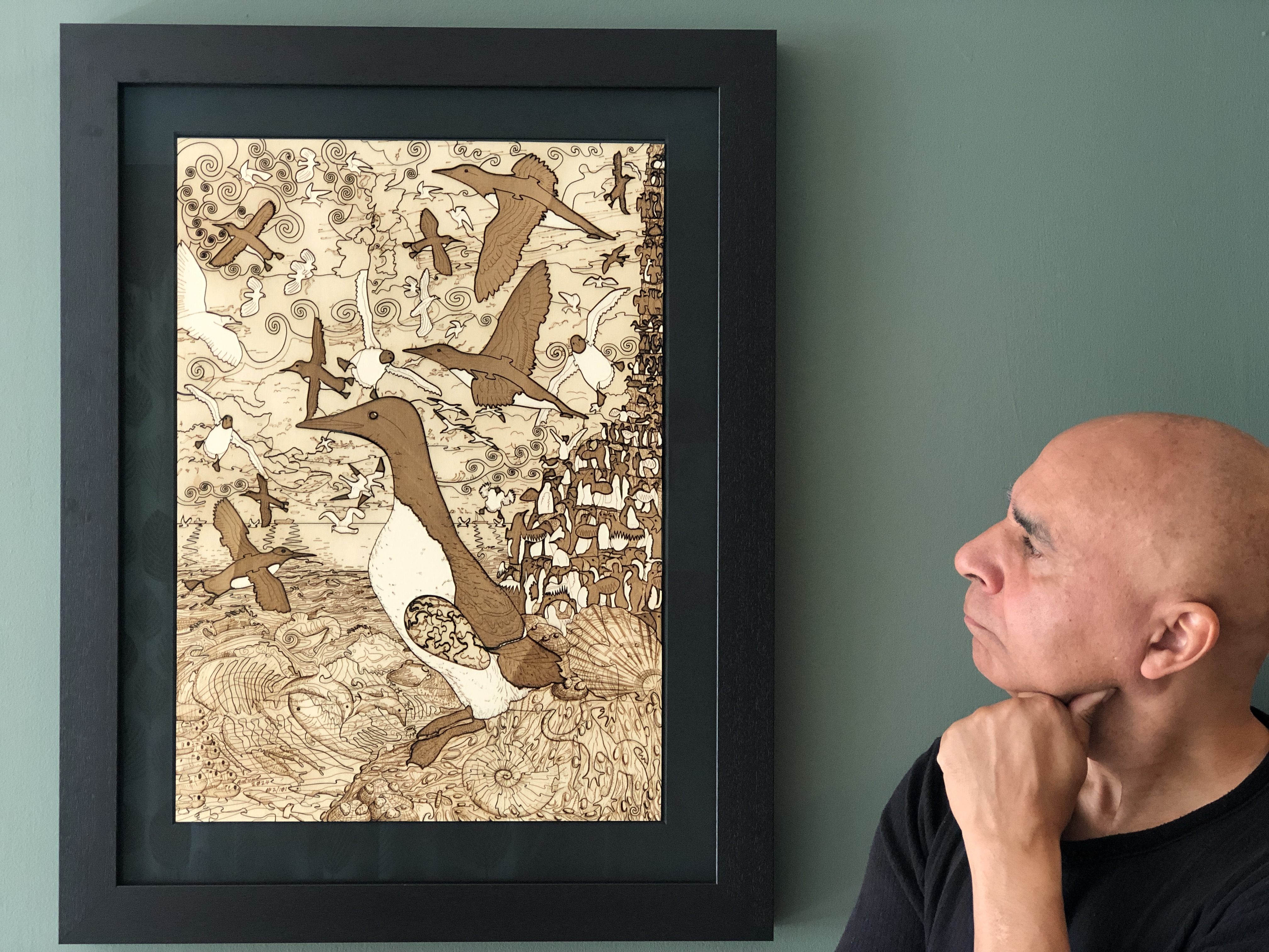
    Here is a complete front view of a frame following this solution (I’m in one of the shots just to give an idea of the size) :-

    Size: 39.0cm (W) x 55.1cm (H), framed 73cm x 57cm

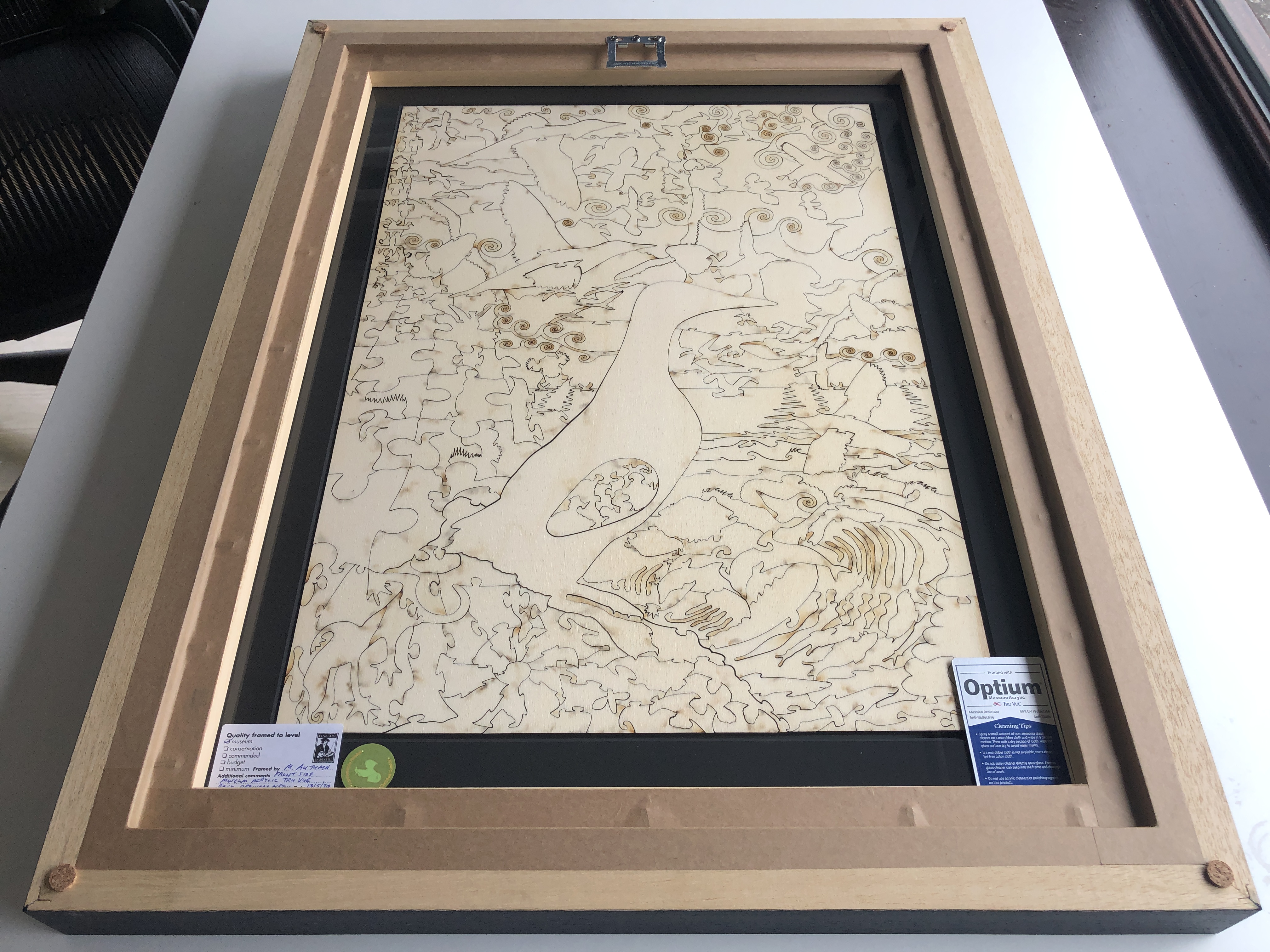
    And here is a rear view :-

    So this concludes the proposed museum (FATG Level 1) frame design for wooden puzzles and other thin, flat, 2.5D artefacts designed and intended to be viewed from both front and back. If the artwork is to be hung on a wall – and not frequently viewed from the back – then ordinary acrylic seems adequate – and will cut down on the not inconsiderable costs of this solution. The only time I feel it would be necessary to use museum acrylic glass on both sides is where the frame is to be displayed in such a way that it can always be seen from both sides – such as in a free-standing display partition, in an interior wall with an opening/hatch, or suspended from a ceiling away from a wall – where viewers can wander all around it.

    Incidentally, notwithstanding the UV protection provided by the museum acrylic glass described above, I additionally varnish my wooden puzzles and engravings (front and back) with the best available UV, non-yellowing, clearest, matt varnish. The point being that, wherever possible, the artefact in the frame should be given as much non-invasive, non-destructive, protection in and of itself – a belt-and-braces approach to conservation. This is similar to using archival UV protective inks in Giclée prints – as well as UV varnishing them – and not relying solely on a museum grade (FATG Level 1) frame to protect them…

    The completed version of the framed artwork mentioned at the beginning

    References

    Kistler, V C (2001). Conservation Framing, Vol 4, 2001. Library of Professional Picture Framing.

    Miller, J (2021). Direct contact overlay mounting. ART + FRAMING TODAY, April-June 2021.

    Kosek, J M (2004). Conservation Mounting for Prints and Drawings. A Manual Based on Current Practice at the British Museum. Archetype Publications in association with the British Museum.

  • Art work: “Depth of Tulip Field”

    Depth Of Tulip Field F Brochure Whole

    (Catalogue #100_5644-5730: 44” x 66” – edition of 100)

    The human eye is an amazing gift, tool, and experience. The power of the brain behind it takes seeing to mesmerizing capabilities. Take focusing for example. My Left Eye 100_0002cThat part of the image in the centre of our field of vision is in sharp focus (excepting for long- and short- sightedness), and the rest of the image gets progressively out of focus – the further away from the centre we go. But we are usually not aware of this. Anything we scan our eyes over becomes instantly sharp. The fact is we are constantly re-focusing as we scan a scene. If we are looking at one part of a scene it is in sharp focus. We may not even be aware that the rest is out of focus, because no sooner have we moved our eyes to something else, then that new part becomes immediately in focus.

    Focus has a few noteworthy properties. The closer we try to focus, the shallower the depth of focus is. If you hold your hand in front of your face and focus on it, even things just in front of it (try placing a finger of your other hand in front of your hand without looking directly at it), and things immediately behind it will be out of focus – i.e. blurred. This is a “shallow” depth of focus – or depth of field as it is more commonly known in photography. The further away the subject is the greater is the focus depth – the region from the nearest to the furthest part in focus. The focus range is invariably perpendicular to our eye view.

    The camera acts like a static eye in that it can capture one static scene and its inherent depth of field. It is unlike the eye in one important respect: we focus on a narrow zone where our two eyes converge, and outside this area – left, right, up or down – but at the same distance from our eyes – things become progressively more out of focus the further away from the centre of our gaze they are. The camera on the other hand focuses on planes. Think of double glazing: the zone between the two pieces of glass is in focus, everything in front and behind are out of focus. As always with focus, there are no sharp boundaries between in and out of focus – just very sharp to progressively less sharp. However, there is a general area where most people would agree is an acceptable level of sharpness – enough to say it’s in focus.

    Depth of field can be controlled by the diameter of the iris or aperture: the smaller the aperture the greater is the depth of field. But the aperture can only affect depth of field to a small degree. What also applies to the camera is the phenomenon that the closer the subject is, the shallower the depth of field. There are special cameras/lenses that offer a tilting mechanism that allow you to literally tilt the plane of focus, but these are only effective with flat surfaces – like a road or a lake. Anything in the foreground sticking up or down – rising above or below the narrow horizontal plane of focus – like my tulips – would appear out of focus.

    Why am I rambling on about depth of field? When you are confronted with a real life scene you can survey it at your leisure, and it is something we all seem to enjoy. We seem to love being able to see a long way, and climbing/driving to the top of a hill or mountain to see a great view is a common goal we nearly all like to do. Taking a static image of such a scene – from our toes to the horizon – is virtually impossible, especially if there is fast movement in the scene as well.

    What has all this got to do with art? If art is about enhancing the viewer’s experience of life, getting the viewer to think about their surroundings, and their perceptions and pre-conceptions of it, then “Depth Of Tulip Field” is very much art.

    I use photography a great deal because I’m so moved by reality, and a lot of what I want to convey about my perceptions, pre-conceptions, and ideas about reality I feel are best expressed by being as realistic as possible. I’m completely in awe of vision – it is the most amazing gift. When I see a beautiful scene I’m frustrated as an artist that I cannot transport you there to see it also. So much art is about non-reality, disfiguring reality, or making attempts at copying reality – with varying degrees of success. But reality cannot be faithfully copied – it has near and far properties, and we can interact with it in almost an infinite number of ways – moving to different parts of it, zooming in to any level of detail. And reality’s main quality is, I feel, the freedom we have to look at it in any way we choose.

    At a scene we can scan and focus on anything we please, and that is the real delight I want to capture. Conventional photography pre-focuses for you on a static focal plane. Depth Of Tulip Field F Bruchure Flying BeeThe photographer has to decide what he/she wants you to focus on – that is what he/she wants to focus on themselves, and they capture that in stone as it were. You are not free to focus on what you want. That is not necessarily a criticism – indeed it may well be the intention. But in this case my intention is that you should be free to look at any part of the picture in great detail – as I had the pleasure of doing.

    The conventional artist – oil painter for example – is severely limited by the materials she uses, and by time. Whilst she doesn’t have the same limitations of depth of field, close up daubs of paint look like daubs of paint. And what would the point of meticulously copy reality anyway in this day and age of photography? The best you’ll ever achieve is a photograph. If Vermeer or Ingres (two of the best detailed artist I know of) were around today, would they reject photography and paint? Depth Of Tulip Field Brochure ButterflyWas it the process of painting they enjoyed or were they trying to capture something they considered beautiful, captivating, worthy of putting on a pedestal…?

    In Depth Of Tulip Field I have gone to enormous lengths to share the freedom of focus I enjoyed on a fateful trip in Norfolk, England. It was early morning, the date was spring 2004, I was driving along and suddenly this amazing field of tulips appeared. The field was huge and the rows ran perpendicular to the road. A striking feature was the bands of brilliant colours. The sun was not out fully (it was burning up the morning mist), and it was at the wrong angle anyway (aesthetically) – so I decided to come back later in the afternoon (the forecast was for sun).

    When I returned I went to the far end of the field with the sun shining at me – I love the sun shinning through plants – it really brings out their colour. I spent quite a while admiring the scene and wondering how best to shoot it – how to do it justice. I had all the main types of cameras, numerous lenses, and other equipment with me – so I had very few technical limitations on what I could do. The field was wonderfully long. I didn’t want to crop it. I didn’t want to focus on one part of it. I wanted it all. Eventually I came up with an idea and proceeded to execute it…

    There are a lot of different types of birds, insects, and other animals in this picture, but that is only to draw your attention to the fact that there were none! This field – due to modern chemically assisted intensive farming methods – was a veritable desert of life! Everything was either dead (killed by “pesticides” – implying they are pests – probably a propaganda ploy by the agrichemical companies) or the wildlife stays away – perhaps because there is no natural food there and/or because it is such an alien landscape to them and they have no natural cover. Depth Of Tulip Field Brochure DeerI did actually see the hare and the deer running through the field – sadly they were fleeing from a near by gun shot blast – I don’t think it was their natural choice to be there. But it gave me an idea…

    Most landscape paintings don’t depict this level of detail, and many animals in the wild are very elusive – indeed a lot of the time their survival depends on them not being seen. So often they are there but you just don’t see them. But for me this is what is fascinating about Nature: it is everywhere. The more you look, the more you see. And the closer you look the more detail you see. You can start with looking at a whole landscape (even my depiction of the tulip field is a small section of the whole), and you can zoom in on a field, then a flower in the field, then an insect on a flower in the field, and see the amazing detail of it. Zooming in still further, you can see the hairs on its body, its compound eye, the structure of its wings. Zooming in on the eye reveals its conical hexagonal lens structure. You can go on to see the structure of the cones, the cells that make it, the internal structure of the cells, the structure of its proteins, the atoms that make up the molecules, the structure of the atom – its subatomic particles. And who knows where this journey ends in ever smaller worlds…?

    I have kept the detail in the picture to what you could see with the naked eye, but I hope I’ve got my point across about the detail in Nature.

    Sometimes we come across a scene so beautiful that we stop what we’re doing. We stop and stare, remain silent, and enter into a trance-like state. It’s fascinating that our mind should respond so strongly to what are after all just images. It is also fascinating that the vast majority of us will respond in a similar way to the same scenes… I, as a contemporary artist, feel just the same (possibly more?) about such scenes – but I want to respond to them in a very personal and unique way, and to sometimes use them as a vehicle to express certain ideas I’m interested in.

    Really this is many photographs (circa 80) combined into one, with a great deal of digital editing – including much freehand work. But it is essentially what I saw. I have spent more time on this “photograph” than I have ever spent on a real painting or drawing. (No, I haven’t attempted to break any world records – some artists will have spent longer on their paintings.) My goal was to try to break the limits of photography, to highlight our wonderful, amazing, delighting, gift of vision; to produce something beautiful – or something I consider beautiful. The result is not perfect, but I’m happy it goes a long way to depicting what I saw and the ideas I wanted to convey. It gives me immense pleasure to be able to share that experience.

    Nature is not always what it seems, and in Nature reproduction is a vital force…

    16/05/2004


    Exhibited at Royal Academy Summer Exhibition 2006

    2006-06-07-Getty-Images-RA-Summer-Exhibition-press-view

    This YouTube video is using a new video-from-photo technique I developed.