David Hockney (1937-2026), may he rest in peace, is one of the very, very, few artists I like and admire. He and I seem to be in the minority – in thinking that the main purpose of art is to be a source of joy. There is so much unjoyful art (putting it as kindly and politely as I possibly can!) these days that it makes me cringe, and makes me weary about calling myself an artist – least I be tarnished with the same brush (if you’ll pardon the pun…) and prejudice…
His artwork was far more substance than BS. So many contemporary “artists” are all BS and no substance – indeed this is what “art college” seems to encourage in recent decades – and this is why art is at its worst point in history – at its nadir. They believe it’s all about the concept/idea/s – it doesn’t matter what it looks like or how well executed it is. We totally disagree. Art that would be displayed in no place other than a modern art gallery/museum – because no sane person would have it in their home – is not art at all – its rubbish, pure and simple. Art – that most people who didn’t know who had created it would think it had been created by an unskilled child – is not art at all – its rubbish, pure and simple. Art that only exists in the minds of a very few very “learned” “art critics” (who make their living by bigging-up crap art – and often inventing “meaning” that was never there) – is not art at all – its rubbish, pure and simple…
David Hockney was a very deep thinker, immensely skilled artist, fabulous colourist, unpretentious, and worked all is life doing what he enjoyed doing – exploring new ways of seeing and bringing joy to people. May he rest in peace, and may history bring forth more like him…
Why don’t I use a commercial professional printing service to produce giclée prints for me – like most people?
Believe me – I wish I could! I searched high and low, but I couldn’t find a printing company that met all my exacting requirements – and I wasn’t prepared to compromise and accept what random permutation of my requirements individual companies happened to offer. My art is too important to me. Most companies were only offering two or three, out of my seven, requirements – which are as follows :-
Using verified archival pigment inks from a highly reputable ink maker (this is currently only EpsonUltraChrome PRO inks as far as I’m concerned)
Using a 12-colour printer. None were offering this! This is because 12-inks is new on the market and most printing companies are using older generations of printer.
Minimum of 60 inches wide. Most only offered 44”. 60”+ is quite niche.
Printing on Hahnemühle Smooth Fine Art 370 canvas. I want the texture of the canvas to be as inconspicuous as possible, and this canvas is the smoothest, most archival, canvas that I know of. It also has the brightest natural white (without using the completely non-archival – and therefore completely unacceptable – optical brightening agents (OBAs)). It also has a matt finish – which looks better from all viewing angles and preserves colours best with random, background lights. Most companies use their own preferred canvas and weren’t prepared to use this!
Mount the canvas on aluminium stretchers. Aluminium stretchers will never twist or warp – unlike with wooden stretchers – something that is especially important with large canvases. No canvas printing companies I researched offered this.
Stretch the canvas leaving a precise specified white margin (aka museum wrap – which I use for limited editions – where I add a title, edition number / edition size, and signing in pencil. No canvas printing companies I researched offered this.
Finish the canvas with a completely invisible, waterproof, archival UV-protective varnish (only one offered this).
Sometimes in life if you want to have a job done well (because you know what well means) then you have to do it yourself…
Why did I want a 60″+ Giclée Printer?
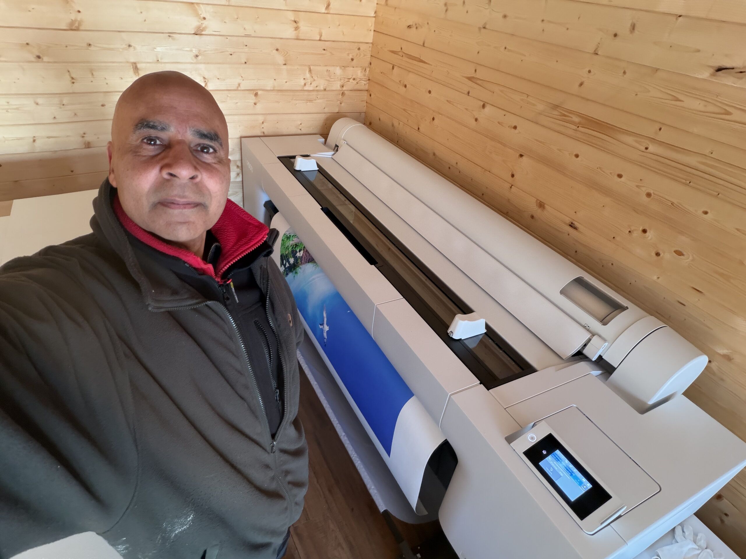
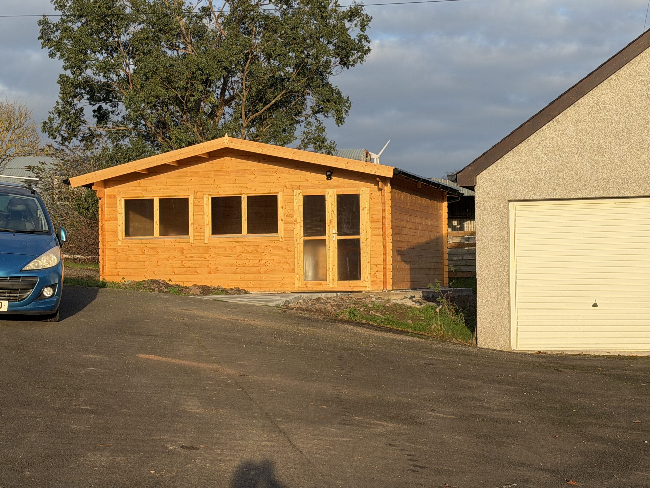
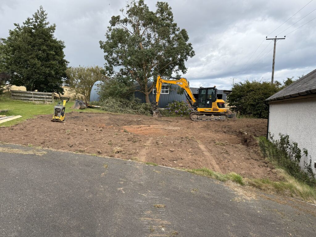
Getting the best 60″+ giclée (pronounced “zhee-clay“) printer (as considered by most in the know) was a big decision for me – not only because of it’s expense (and the twelve 1.6 litre inks for it are half as much again!), but also because it needs quite a lot of working space. That’s the room required to handle, cut, stretch (canvases), mount, and frame the huge prints it produces. I didn’t have anywhere near enough dust-free, clean, space where I live, so before buying the printer I bought space for it – in the form of a new 6m x 6m log cabin (see My new big printer requires a new shed!).
Why did I want such a big printer? I’m an artist, I want to make a big impact. I see big, I think big. I love Nature, and a lot of the time I try to capture or say something about Nature. I don’t like big things being unnecessarily shrunk. Small is easy. Everybody and anybody does small. Point a camera (or more likely a smartphone these days), click, small print. It’s all too quick and too easy, has little or no value, and doesn’t stand out in the crowd. Small doesn’t have a big impact. Large does. Small is not special. Large is much more likely to.
Much, though by no means all, of my art is large and photo-realistic – and is intentionally made to look like photographs (although they are not simply photos – very far from it). In relation to this genre of my art, you could say that I attempt to make “photos” – rather than simply take photos. Unlike photos, I don’t want my art to fade – I want them to last as long as possible – hundreds of years – hence why I got interested in giclée printing and museum framing techniques many years ago.
I’ve been doing this form of art for quite a long time – since the noughties in fact (prior to the that I was doing high-end conventional analogue photography, however, I’ve always conventionally manually drawn and painted as a separate passion). It seemed like a god-given opportunity to me in the beginning of the digital age – and, with my background in computing and photography, I took to it like a duck to water.
Some twenty years ago I bought what was then the best large format 44″ giclée printer. I started producing and framing large scale, highly detailed, and archival artworks (using museum-grade inks, materials and framing techniques) – some of which were accepted by the Royal Academy of Art in London (although I never got around to other galleries or outlets at the time).
My life took an absolutely terrible turn (details of which I needn’t go into) and effectively my creativity was put on hold for about a decade and a half. After fifteen years in the wilderness, I am largely recovered, re-motivated, and re-energised.
Size isn’t everything.
What about quality? What is a giclée printer? A giclée printer is an uncompromisingly high quality, very high resolution, printer that uses archival pigment inks on archival papers and canvases – and produces superb prints that will keep their pristine colours and vibrancy for at least 200 years under normal indoor lighting conditions. First and foremost a giclée printer uses pigment inks. Pigment inks used by giclée printers are among the purest forms of water insoluble colour substances we know of – which we get from rocks (including clays), plants, metals, and some we synthesize – and are the most lightfast colourants generally available. The key word is colourant, because every printing technology tries to change the colour of the surface it is printed on. The crucial question for me – as it should be for all artists and photographers – is how long will the colours remain as vibrant and pure as the day they were originally printed? In addition to the inks used, a key determinant of lightfastness is the material it is printed on – how stable it is over time, and how well does it present (reflect) colours printed (or painted) on it? In this respect cotton – in the form of papers and canvas – is one of the most colour stable and colour faithful print surfaces we know of and use extensively in high end art and printing.
Colour Gamut
Another crucial aspect of giclée printers is called colour gamut. What is the range of colours it can print – and how vibrant are they? Put simply, this is how many colours and tonal ranges a printer can reproduce. In theory only four colours are required to make any reflected colour – Cyan, Magenta, Yellow, and blacK (CMYK). But there is much more to printing than this. Basic CMYK cannot directly produce all the colours we can see, and many colours are achieved quite crudely by the placement of small dots of CMYK colour next to each other – to give the impression of the other colours – like red (from yellow and magenta), blue (from cyan and magenta), and green (from yellow and cyan). However, this effect looks pixelated close-up because you can literally see the patches of dots – so effectively the resolution of basic simple four-colour CMYK printing is low. Also, the vast number of shades of blue and green in nature cannot be reproduced very well with this basic approach.
My printer has twelve colours – the most currently available on any pigment inkjet printer – to give the widest possible range of colours. The set includes dedicated colours for those particularly difficult hues to reproduce by combining other colours – orange, green, and violet. It also has two greys (mid and light), and two blacks – a matte black (for matt surfaces) and a photo black (which reproduces blacks better on a glossy surface) – so it is exceptional at black-and-white prints also.
So, wanting to make as big an art impact as I can, I thought: if I don’t do it now, I probably never will… This new printer is the best of what is available today – and is really only a continuation of where I left off fifteen years ago…
Installation was forced on me!
The steps I went through to get this printer was, firstly, deciding what printer I wanted (back in April 2025), and finding out how much it would cost; secondly, realising I needed to build a log cabin to put it in and researched the options; thirdly, realising I needed a concrete base, researched that, and got one built; fourthly, buying and then building the log cabin, fitting it out, treating the wood inside and out, making a path and building two very large workbenches (I finished in late September 2025); fifthly, revisiting the market to see what the best deal I could get now.
However, in the six months between the first and fifth steps, something very impactful happened: the company who I originally planned to buy the printer from said back in April that the price included delivery, unpacking, removing all the packaging, installation, and training. Great, I thought – that’s a lot of work and worry avoided. However, when I came to ordering it in late September, that delivery deal was no longer available because the third-party company who provided that service decided, for whatever reason, not to do it anymore – and it turned out they were the only company in the country providing that service… So, I was left with the daunting prospect of doing everything myself…!
The printer was hands down the biggest and heaviest thing I have ever had to handle – (and I have handled quite a few large machines in my time – including big CNC machines, a big industrial laser, and other big woodworking machines).
Using my heavy-duty pallet jack, my neighbour and I managed to roll the huge 3.5m x 1.5m x 1m printer box from the driveway (where the tractor forklift took it as close as it could), along my newly built path, into the log cabin (over a carefully designed double ramp I built). We managed to get all the surrounding cardboard and most of the polystyrene off it. There was a daunting number of pieces in bags and boxes of various sizes, and labelled bags of nuts and bolts.
With the main printer chassis propped up on big dense blocks of polystyrene resting on the huge pallet, we set about assembling all the other pieces as much as we could – including the stand (which also had to be assembled). It was by no means straightforward, and some parts were incredibly confusing as to where they were supposed to go – or how they were supposed to be fixed in position. The instructions were far from clear, and the order some things should have been done was utterly confusing at times. Anyway, after about three hours, all that was left to do was to lift the printer on to the wheeled stand. And, because this required at least five people, we stopped working on it that day – and I was left with trying to rope in a couple of other near neighbours to help. I did manage to get their commitment, and we scheduled a day (the following week) where the five of us could do it.
It required four guys to lift/move the printer onto the nearby stand – and two people to guide us on to the stand and pull the big pieces of polystyrene out from underneath it. The whole 6m by 6m log cabin felt full to the brim with all the packaging it came in, and the pallet it was transported on was so heavy that it took four of us to carry it out of the log cabin afterwards!
It was quite a mammoth effort to move and assemble the printer – something that was never even discussed in the sales process – nor even mentioned on the manufacturer’s website…! In hindsight I don’t think this printer should ever be sold without a full installation commitment by an experienced dedicated team. Leaving it to the customer is a huge ask, and, with so much difficult and delicate assembly required by the customer, it begs the question how the manufacturer can offer any warranty – let alone two years…
Then there was the clean-up of all the packaging. It was one hell of a job fitting all the polystyrene in my hatchback – to take it to the recycling centre. And there were huge sheets and boxes of thick cardboard that I just dumped in my large shed for the time being – until I decide what to do with it.
Installing the inks was no simple matter either! The instructions were useless, and I couldn’t find any clearer instructions or videos online. The 1.6 litre flimsy-looking flexible plastic bag ink pouches are extremely expensive – at nearly £500 each – so you really want to put them in properly – and not leak or tear them…!
Ink charging
The printer comes completely empty of ink, and filling the required system components with ink known as ink-charging. What I don’t understand is why doesn’t the printer come with a small sized set of starter inks for this purpose – like every printer has that I have ever bought up until this one…? And why does this ink-charging process take a whopping 45 minutes – and require two- and a-bit maintenance tanks to be filled with “waste” ink?! The printer came with six maintenance tanks – three of which were already in the printer, however, two of these – exactly as explained in the instructions – were completely filled – and needed to be discarded and replaced with new ones – during this initial ink-charging!
I compared the weight of a used, full (and therefore needing to be disposed of), maintenance tank, with a new empty one, and I estimate there was about a half a kilo of weight difference. A kilogram is roughly the weight of one litre of liquid (with a similar density to water), and so this means that, over and above the ink used to fill the many metres of tubing in the printer, the ink charging squirted out a total of well over a litre ( spread over all twelve ink pouches) straight into the waste maintenance tanks! That’s about 10% of the £6,000 worth of ink – straight into the bin – including two maintenance tanks…!
Colour-Proofing
With the printer all set up, the next task was to load it up with some canvas and do some test prints. A crucial step was to calibrate my new proofing computer monitor with the inks and the Hahnemühle canvas in the printer. Having done a lot of colour proofing before, this should have been quick and easy to do. Was it heck! There turned out to be a completely unexpected red herring in the form of Hahnemühle’s Fine Art Smooth Canvas ICC colour profile. This is the ICC colour profile I should be using: it’s made specifically for this canvas and this printer’s inks – and is supplied by Hahnemühle! However, it consistently produced weird small black streaks on the same parts of the print. Over four days I tried absolutely everything I could think of to get rid of these disastrous black streaks – wasting lots of canvas and ink in the process. In the end, by a process of elimination, it turned out to be a weird fault with Hahnemühle’s ICC colour profile -because when I tested the same print with Epson’s Matt Canvas ICC colour profile for this printer, it printed perfectly every time. I’m really annoyed with Hahnemühle about this because it wasted so much of my time, ink and canvas. What kind of testing did they do – if any – because the very first time I tried to use it, I ran into this problem…?!
Final Thoughts
The cost of getting top-quality commercial prints done is very high – often running into hundreds of pounds each – which is okay if you have confirmed sales (or a lot of money). During the creative process there is no guarantee for most artists that any artwork will sell, so the individual cost of experimental or test prints can be quite off-putting, and stifling of creativity.
By owning such a versatile and brilliant printer as this one, I can experiment with different sizes and media – and can simply re-do prints if I’m not happy with them. So, although the up-front cost (and effort!) was enormous, I don’t have to worry much about each print individual I do…
The printer is an extremely versatile and power tool, and by owning it I can explore all its capabilities – creative and technical opportunities that would otherwise be completely unavailable to me.
As an artist, it’s a dream come true to have such a printer – to have such a fabulous creative instrument in my toolbox. And I bought it for that reason alone. However, some companies make good money printing for clients who want the best. This commercial opportunity, coupled with the potential I have for selling my own limited and unlimited edition prints, could mean I will reap financial rewards with it. Indeed, it is far from impossible or improbably that, in time, it will comfortably pay for itself – and more…
Finally, from a providence and buyer’s perspective, it is surely much better for customers to know that I, the artist, printed and handled the artworks – as opposed to a random commercial printer…?
Much, though by no means all, of my art is large and photo-realistic – and is intentionally made to look like photographs (although they are not simple photos – very far from it). In relation to this genre of art, you could say that I attempt to make photos – rather than simply take photos. Unlike photos, I didn’t want my art to fade – I wanted it to last as long as possible – hundreds of years – hence why I got interested in giclée printing and museum framing techniques.
I’ve been doing this form of art for quite a long time – since the noughties in fact (prior to that I was doing high-end conventional analogue photography – and I’ve always drawn and painted as a separate passion). It seemed like a god-given opportunity to me of the then new digital age – and, with my background in computing and photography, I took to it like a duck to water.
Some twenty years ago I bought what was then the best large format 44″ giclée (pronounced “zhee-clay“) printer (a very high quality printer that uses archival pigment inks on archival papers and canvases – and produces superb prints that will keep their pristine colours and vibrancy for at least 200 years under normal indoor lighting conditions). I started producing and framing largescale, highly detailed, and archival artworks (using museum-grade inks, materials and framing techniques) – some of which were accepted by the Royal Academy of Art in London (although I never got around to other galleries or outlets at the time).
My life took an absolutely terrible turn (details of which I needn’t go into) and effectively my creativity was put on hold for about a decade and a half. After fifteen years in the wilderness, I am largely recovered, re-motivated, and re-energised.
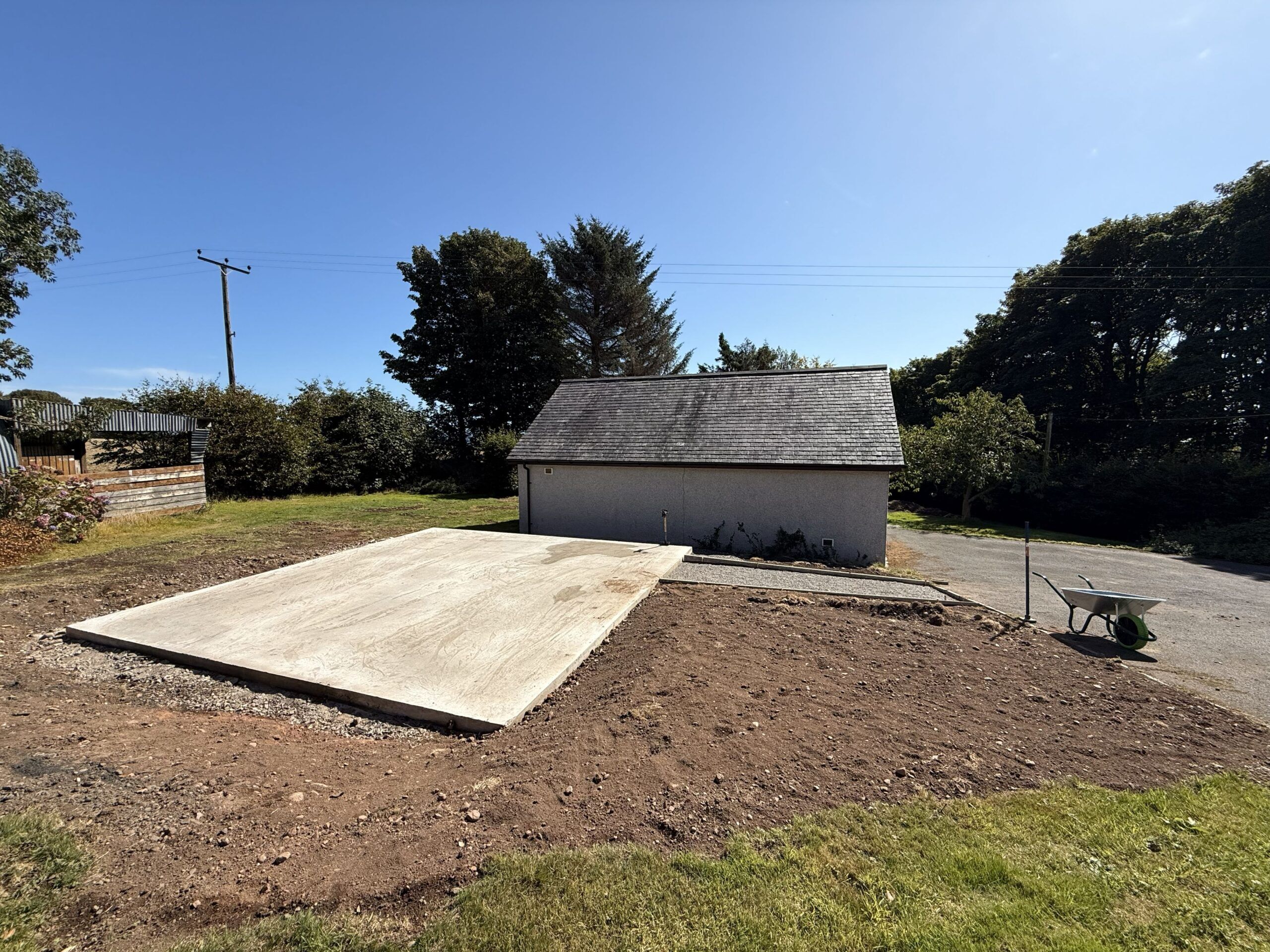
At the beginning of this year (2025) when I decided to get what is widely regarded (by those in the know) as the best large format 64″ giclée printer, the first obstacle to overcome was where on earth was I going to put it?! At 3.5m wide, 1.5m deep, just over 1m high, and weighing about 250kg – there was no room in my house (in any case it would be impossible to get it in the house because no doors are wide enough!). Also there was not enough room in my far-from-small studio/workshop because it was maxed out with tools, lasers, a CNC machine, and workbenches – besides, I wanted somewhere very clean and free of dust for highest quality printing. Building an extension to the house would have been far too expensive (and slow), so I decided to get a log cabin (that wouldn’t require a lengthy and expensive planning application).
Originally I naively hoped to get something like a 12m x 8m building, but after much searching for a good quality log cabin supplier, and the shock of how little square meterage you get for your money(!), I plumped for a 6m x 6m x 2.5m unit – that being the minimum I could usefully use and could just about afford (allowing for the fact I had a very expensive printer to buy – along with the also very expensive inks, archival printing canvas, very large workbenches, etc.). Next, I had to decide where to put it. The patch of land between the studio and the workshop seemed the best option.
The site where the log cabin is going – between studio and workshop, and just off the driveway
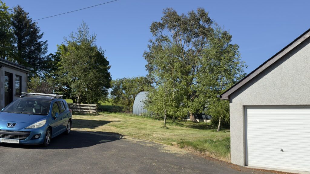
I ran the proposal past the county council planning department – just to make sure it came under “Permitted Development” – which it did – so I didn’t need planning permission. I had to get the base area firstly excavated and then get a concrete base put down (this I couldn’t do myself so I used a contractor).
Contractor levelled and prepared the ground for the log cabin
If I wasn’t watching the concrete base being built, only half of the base would have had a dampproof membrane – until I insisted…!
The completed concrete base (100mm thick on 100mm hardcore) (done by a contractor)
I left the ordering of the log cabin (which comes in kit form) until the base was finished. Then I (re-)looked extensively for the best quality and deal I could find. When I came to a decision it was mid August. I wanted to go with a local supplier but they couldn’t deliver until mid October. The thought of putting up the log cabin in mid autumn – with the high probability of rain, frosts, strong winds – put me off. So I checked the delivery estimate of my second choice. They said three weeks. Decision made.
Undaunted by such challenges, I decided to build the log cabin myself (from a kit) – both to save money, but also to be in total control of the quality of the build and the materials used. From quite a lot of experience, I have little faith in “handymen” – who often cut corners, do things as quickly and as cheaply as possible. I’m quite practical, patient, have some common sense, and can seek advice and/or find out anything I want to know.
I took my time – doing everything as best as I could, and using the best materials and techniques I either knew or researched. The September weather was absolutely gorgeous – sometimes too gorgeous (too hot)! I had a large tarpaulin to cover the timber over night and when it rained (which wasn’t often).
I lost quite a lot of time during the log cabin build because of receiving visitors over the North East Open Studios (NEOS) ten open days in early September (which I committed to back in January). But I like/liked meeting people interested in my art. It’s what art all about…? So whenever visitors turned up, I just downed tools, was probably filthy and stinking of sweat(!) – and gave them as much time as they wanted (which was often quite a lot).
The build was enjoyable for the most part. The instructions weren’t as clear as they could have been, the timber pieces weren’t labelled, and because many were very similar (but subtly different)- and there were unspecified spare pieces – it was very confusing at times. The most difficult part was the path leading from the drive to the log cabin – getting big and heavy concrete paving slabs to slope in two planes from level to the steep slope of the drive. But I got there in the end. It was very satisfying…
Ever since submissions of works for consideration to the annual Summer Exhibition have had to be done solely by photographs of the works – rather than sending in the actual works – I have felt very uncomfortable and uneasy about the selection process.
Firstly, judging an artwork by a relatively small photograph on a small computer screen (of who-knows what quality…?) is a very disingenuous way of seeing art. This disproportionately disadvantages large works compared with smaller ones. Also it disproportionately disadvantages colourful, compared with monochrome, works. And the quality of the photographs may not do the image justice… I imagine some of the widely established best works of art in history would be rejected based on up to three 1920 x 1080 pixel photographs seen on a computer screen…
Secondly, I am especially concerned by the request for certain pieces of information on the application forms – information that should have absolutely no bearing whatsoever on the selection process. Whether this seemingly irrelevant information is used in the selection process or not is simply not know, but the mere fact that it is requested – and with the process not being transparent – leaves this open to question…
Why do you need to know if we have exhibited at the Summer Exhibition before?!
Why do you need to know if we are a Friend of the Royal Academy?!
Why do you need to know the price of the work (you can ask for this if the work is selected)?
The trouble of this covert digital selection process is that we have no way of even knowing if our photos are reviewed at all – or whether they are simply filtered out as rejects based on arbitrary, but irrelevant, information – or due to some other covert agenda… Who knows if preference is given to Friends of the RA…? Who knows if preference is given to people who have (or haven’t) exhibited before…? Who knows if decisions are based on the price of the work, or expected revenue from sales of the work…?
I am not casting aspersions or making accusations about the selection process, I am merely highlighting that it is not transparent at all, it is far from the ideal way to see art, and it is certainly open to abuse. If you persist with this selection process you should make every effort to make it transparent – and not ask for irrelevant information on the application form. Some information is only relevant if the work is selected – not before…
I mourn the days of simple transparency – when work was physically submitted and paraded in front of the selection panel – and it was sometimes filmed for all to see. This assured us that the visual impact of the whole work – with no irrelevant information – was the only selection criterion. In those halcyon days of knowing the selection panel were seeing the works in the flesh – and with no prior knowledge of the artist or the work – only then did we know that this was the most objective and honest way of a panel of RA artists making a collective subjective decision…
I fully understand that during COVID-19 there was no alternative other than to submit photographs of artwork, but now there is absolutely no excuse not to go back to the tried and tested physically present ways – the method the RA used for nearly 250 years prior to COVID. The reduced cost of using photographs and the sending of emails has considerably reduced costs to the RA Summer Exhibition, but it is to the great detriment of the exhibitors…
The Summer Exhibition is a hugely profitable source of revenue for the RA, but it relies entirely on the trust and support of artists. I will not be submitting any more works to future Summer Exhibitions unless we go back to the tried and tested way of doing it, or until the issues of transparency are completely addressed, and I urge other artists to seriously consider their position…
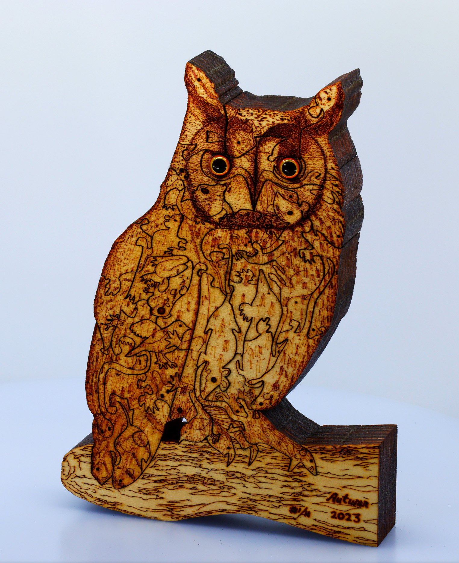
Title: “Long-eared Owl (Art Puzzle) (You Are What You Eat)” – laminated Artist: Michael Autumn Life-sized part-handmade, part laser-cut & engraved, two-sided, laminated plywood art puzzle (Limited Edition of 11)
Long-eared Owl (Art Puzzle) – Laminated: Full image – front
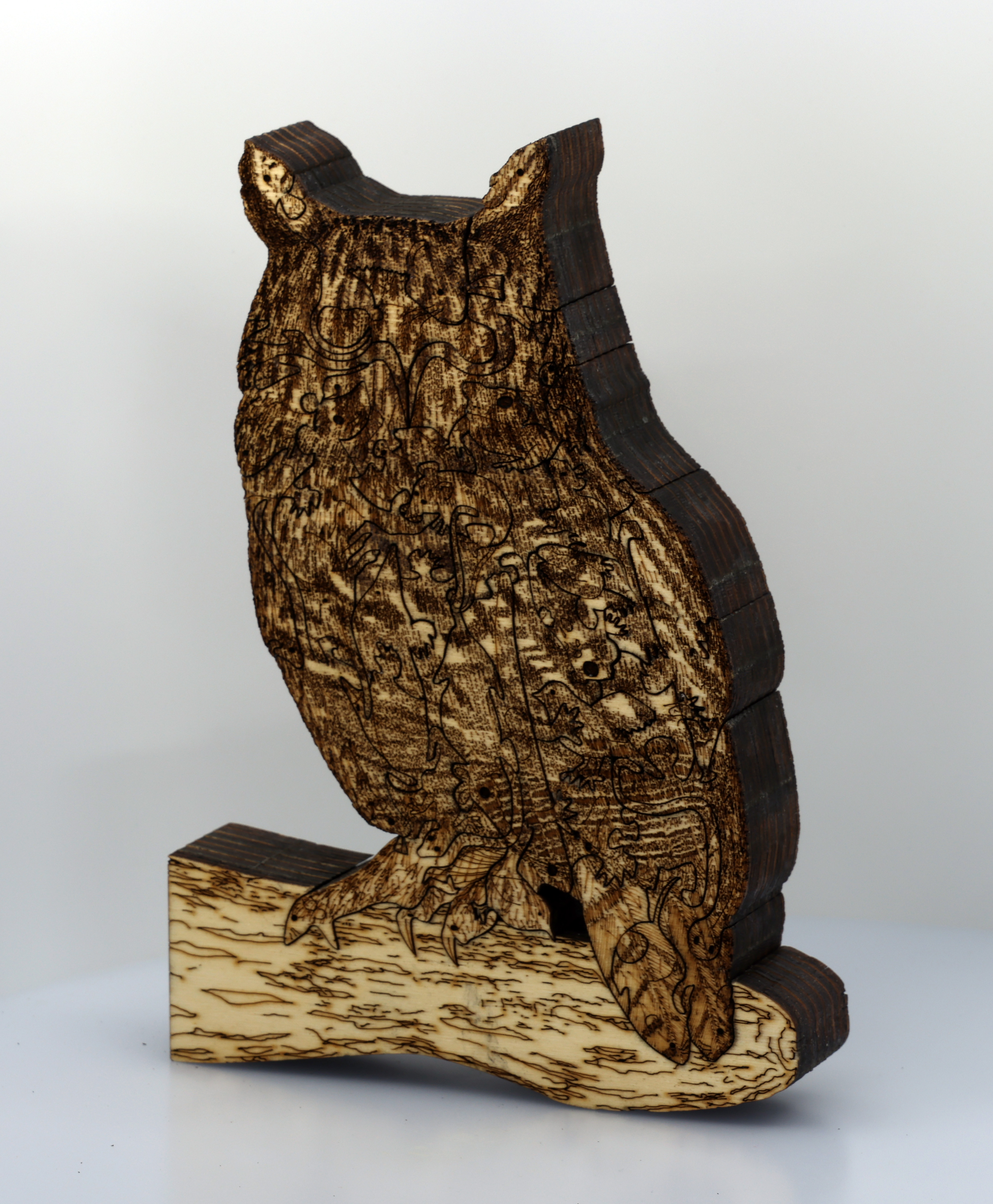
Size: 20cm (W) x 30cm (H) x 4cm (depth) @ 0.65kg weight Medium: 7 laminated layers of 6mm AB/AB Italian Panguaneta Poplar plywood + acrylic eyes. Date: 2023Rear of the laminated version
This is the culmination of three years of trying to find an engineering solution to making the incredibly intricate thick oak art puzzles I used to very laboriously (and painstakingly!) cut by hand using an electronic scroll (fret) saw. I tried waterjet cutting (that blasts away intricate areas and requires continuous cuts – totally wrong!). I bought and tried CNC routing (for about six months) with the smallest router bits available – but the bits that had the required diameter (1/32″) kept breaking and couldn’t reliably cut the depth required. And it require cutting at such small depths at each pass that even if the router bits didn’t keep breaking (and the whole job having to be restarted!) then it would have taken literally weeks to complete a single design!
The problem with conventional laser cutting (which I spent the best part of a year trying – with three different bought lasers) is that the deeper the material is, the more power is required – and therefore the wider the laser beam is. This results in an unacceptably wide kerf – gap between cuts. The kerf (gap) I managed by scroll-sawing – was about 0.7mm – which is the minimum I can accept. A laser that can cut through 42mm of plywood would ordinarily have a kerf of well over 1mm. So that is out of the question.
I pondered this dilemma for months, and tried various ideas – none of which worked. Eventually I can up with the idea of not trying to cut such thick material all at once – but to cut it much more finely in several thin layers – and then bond them together. This has (had) a number of issues and challenges in and of itself, however, I’m extremely please and relieved that I worked out solutions to the problems. And when I first produced the first fully acceptable complete version I was on cloud nine for several days…!
Suffice to say that the part hand-, part laser-, cut laminated version of my Long-eared Owl (Art Puzzle), is far more accurate, better fitting, and more reproducible – without causing RSI/hand arthritis! Having said all that, it takes about the same amount of time in total as hand-cutting(!) – about a week for each edition – because of all the part-laser cutting of multiple layers, doing the rear design – and quite a lot hand-finishing. But at least if is much less of a strain on my hands – and infinitely less daunting…!
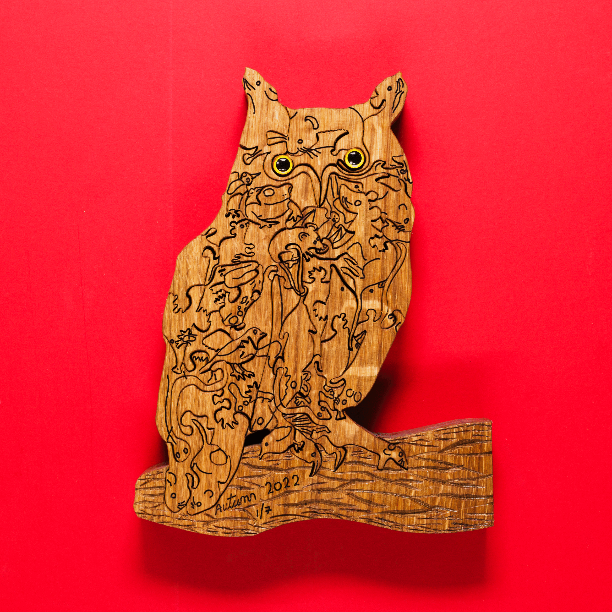
Title: “Long-eared Owl (Art Puzzle) (You Are What You Eat)” Artist: Michael Autumn Life-sized handmade solid oak jigsaw puzzle (Limited Edition of 7)
Long-eared Owl (Art Puzzle): Full image Size: 20cm (W) x 30cm (H) x 4cm (depth) @ 1.5kg weight Medium: Solid European Oak, hand-cut, hand-engraved, hand-carved, art puzzle + acrylic eyes. Date: 2022
Long-eared Owl
The story behind this art piece was to have a free-standing, tactile, life-sized long-eared owl, and to toy with the idea – “You are what you eat“. These birds are ferocious predators (as are all owls) – and will basically eat anything that moves that is smaller than them. They often swallow their prey whole, and regurgitate a large pellet of the undigestible parts – such as bones, teeth, hair, feathers. Indeed, examining their pellets is how ornithologists know so much about what they eat.
I often think about predator-prey relationships – perhaps being a veggie has something to do with this… All animals have to get their energy and material they are made of by consuming specific things – protiens, carbohydrates, and fats. Herbivores obviously get this material directly and indirectly from plants – which is often widely available (they don’t usually eat fats directly, but make them from carbohydrates). However, they usually have to eat a lot of plant material in relation to their size because it is a low concentrated source of food – requiring long, slow, complex digestion. Predators usually don’t eat plants – instead they prefer much more concentrated and complex food in the form of other animals.
I have designed the owl to show that it is literally made of many of the wide variety of creatures that it eats. From the moment of conception – where it starts as a single egg – it literally takes parts of smaller animals – and its amazing body chemistry converts them into material to make (and maintain) it’s growing body – and energy. I used the simple jigsaw-puzzle you-are-what-you-eat metaphor to illustrate this puzzling (pun intended!) transformation of lots of small animals making up an owl.
Owls typically eat 2-4 mice-sized animals per day – so about a thousand a year. Without owls, goodness know how many mice, moles, voles, rats, small birds, newts, etc. there would be…!
(I have to confess this was originally intended to be a tawny owl! I haven’t been lucky enough to actually see a wild long-eared owl, and as I got a long way into designing this piece I felt it would look better with ears – and, of course, a tawny owl doesn’t have visible “ears“… So I thought, okay, I’ll change it to a long-eared owl – they have great “ears” (well they look like ears, but they’re actually not – they’re just tufts of feathers!). The two species are quite similar in many respects – so the change was easy!)
The phrase limited edition in this case is a bit of a misnomer. These are all individually handmade by me from my original design. I really wish there was, but there is no mechanical or chemical process I know of by which these can be reproduced – like screen printing, lithographs, card puzzles (using a die and jigsaw press), etc. (for more details please see the aforementioned post).
Life-sized handmade solid oak art puzzle (Limited Edition of 7)
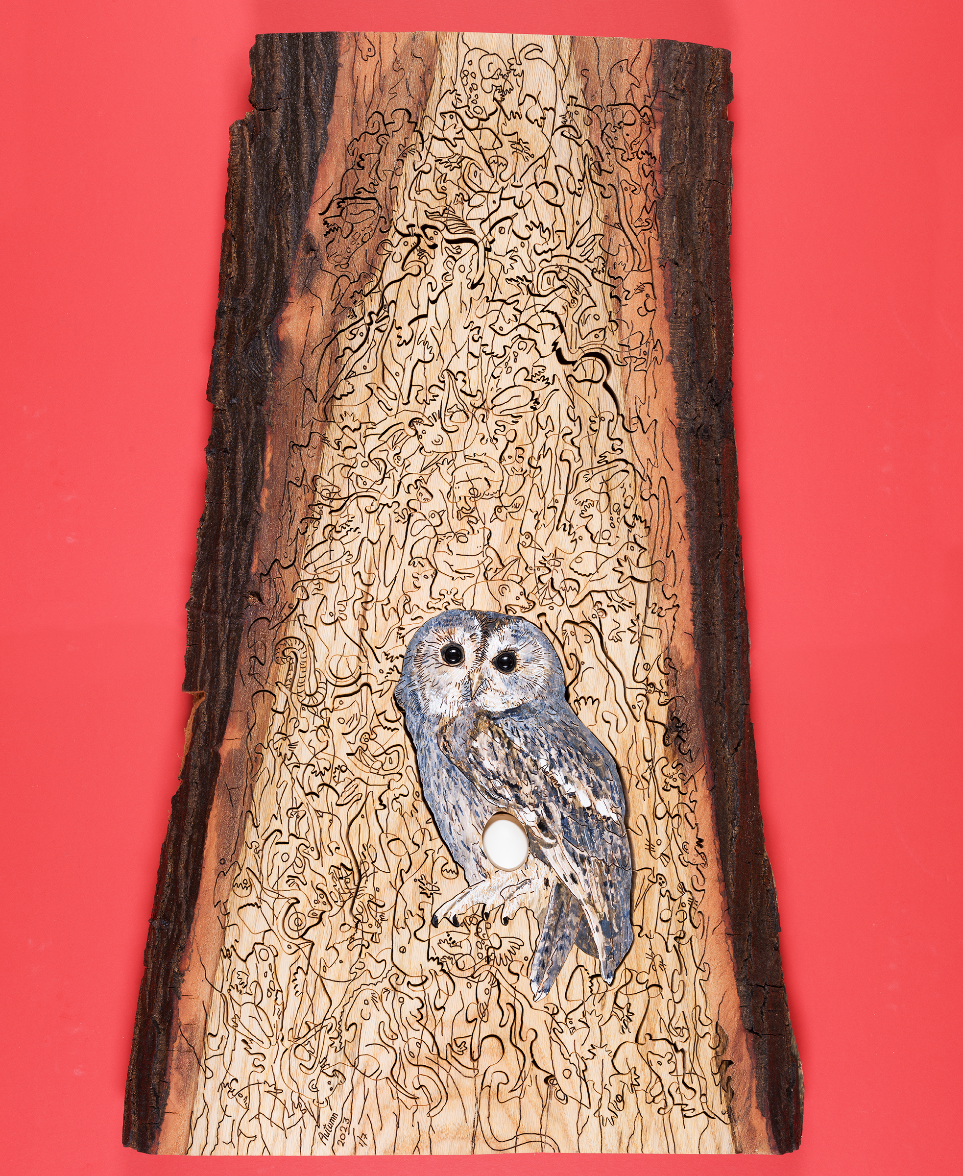
Tawny Owl with Egg (Art Puzzle): Full image Size: 50cm (W) x 82cm (H) x 8cm (depth) @ 20kg weight Medium: A single piece of waney-edged European Oak, hand-cut, hand-engraved, art puzzle with inset full-size replica tawny owl egg and acrylic eyes. Date: 2023
First and foremost I want to mention that the eggs used in my work are not real – for obvious ethical reasons (it is also illegal to take wild birds eggs). They are life-size replicas made of a plaster resin composite and hand-painted – not by me, but by a very reputable leading replica birds eggs maker.
Tawny Owl
Following on from Guillemot with Egg (Jigsaw Puzzle) (see https://michaelautumn.wordpress.com/2020/03/01/guillemot-with-egg-art-puzzle/), I thought I would pay homage to another favourite bird of mine – the Tawny Owl (Strix aluco). These, like all owls, are very mysterious – especially the noctornal ones (which tawnies are) – because they do things the opposite to us: they sleep/rest during the daylight, and come out – and hunt – at night. They are supremely designed and adapted to this lifestyle: they have excellent hearing and eyesight, they fly almost silently, and their hunting strategy is to hunt in the darkness – when other small nocturnal animals think it’s safe to come out…!
Mice, voles, shrews, moles – in fact any small rodent up to the size of a rat – are largely nocternal to avoid daylight predators – like kestrels, buzzards, merlin, sparrowhawks. But while rummaging for food and going about their normal lives – in what they think is the relative safety of darkness – a tawny owl – alerted to their presence by their quiet, but inevitable, sounds – can swoop undetected near to the unwitting little creatures. From close by the tawny can watch their prey’s every move – until they decide to pounce, crush and puncture them with their razor-sharp tallons – and then invariably swallow them whole…
Little birds could be roosting or sleeping in trees or bushes, but if they make any sounds in their sleep – even just quietly snooring or sleep-calling/singing – they are easy game for these owls… Frogs, toads, newts – in fact any small reptile – making any kind of sound at night – are likely to court the deadly attention of a tawny owl. Even fish splashing about at the water’s surface, or in the shallows, are fair game for these owls…
Suffice to say that if it is small and it makes a noise, it is on the menu…! So I thought I would play with this idea and illustrate as many of the small creatures tawny owls eat – as jumbled up jigsaw pieces surrounding the main protagonist. The whole design slightly resembles a huge regurgitated pellet of the tawny owl, and the small prey animals are all jumbled up – like fragments in a pellet.
I like art in the form of a jigsaw puzzle because it is interactive, and by careful design of the shapes and carving on the pieces, I can get the puzzle-solver to look at, and think very carefully about, them – in a way that is simply not possible with non-interactive art. Indeed, someone could look at a piece of art like this and not even notice the small creatures surrounding the main owl – let alone have any understanding why they are there – and why these particular animals. However, trying to solve a puzzle like this is a very different matter – they will definitely think more about what it is they are looking at…!
I have deliberately made the jigsaw puzzle very subtle because Nature is very subtle. These creatures are very difficult to see because of their camouflage and because they mainly come out at night – and it is precisely because they are so difficult to see that the owls rely on the noise they make to home in on them… The puzzle metaphor lets me toy with the idea that these small creatures think they are invisible – or out of harm’s way – but to a tawny owl, in the dead calm of night, their sounds makes them highly visible…
Owls typically eat 2-4 mice-sized animals per day – so about a thousand a year. Without owls, goodness know how many mice, moles, voles, rats, small birds, newts, etc. there would be…! If all the creatures a tawny own ate over the course of its lifetime were put into a 30cm diameter (about the width of this jigsaw puzzle) very tall clear tube – I wonder how high the pile of eaten animals would be…
Close-up of the life-sized tawny owl with replica eggSome of the art puzzle pieces laid out
The phrase limited edition in this case is a bit of a misnomer. These are all individually handmade by me from my original design. I really wish there was, but there is no mechanical or chemical process I know of by which these can be reproduced – like screen printing, lithographs, card puzzles (using a die and jigsaw press), etc. (for more details please see the aforementioned post).
Life-sized handmade solid oak art puzzle (Limited Edition of 7)
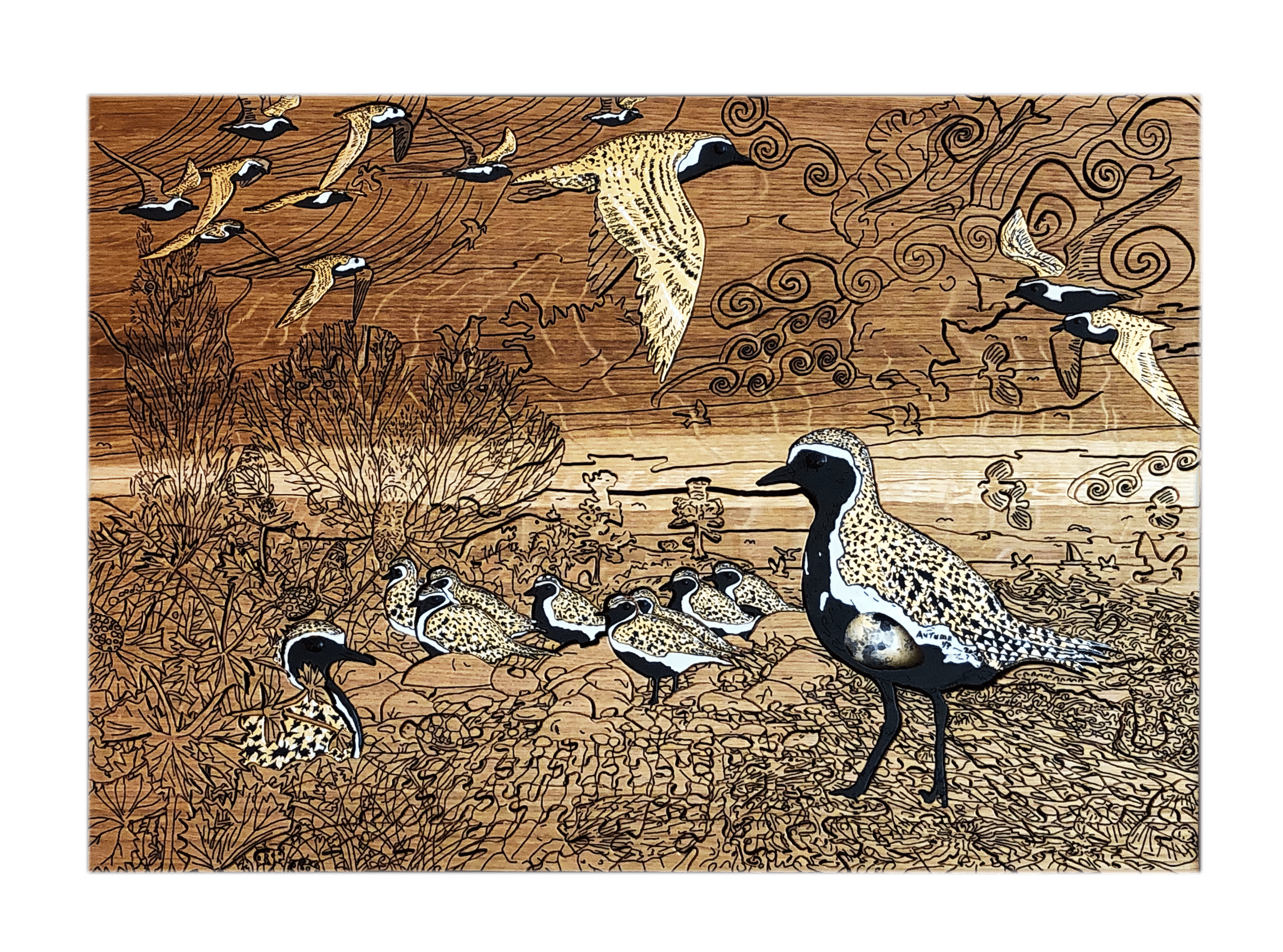
Golden Plover with Egg (Art Puzzle): Full image Size: 59cm (W) x 41.5cm (H) x 4.4cm (depth) @ 9kg weight Medium: Solid European Oak, hand-cut, hand-engraved, jigsaw puzzle with inset full-size replica golden plover egg. Date: 2020Golden Plover in artist’s dining room (click on image to see artists’ home studio, workshop, and gallery).
First and foremost I want to mention that the eggs used in my work are not real – for obvious ethical reasons (it is also illegal to take wild birds eggs). They are life-size replicas made of a plaster resin composite and hand-painted – not by me, but by a very reputable leading replica birds eggs maker.
Golden Plover
Following on from Guillemot with Egg (Jigsaw Puzzle) (see https://michaelautumn.wordpress.com/2020/03/01/guillemot-with-egg-art-puzzle/), I thought I would pay homage to another favourite bird of mine – the Golden Plover (Pluvialis apricaria). In winter plumage these birds are lovely, but unremarkable. However, in summer plumage they are absolutely stunning. The males are slightly more outstanding than the females, however, both are very distinctive and eye-catching. The spring transformation of the Golden Plover from winter to summer plumage is one of the most extreme, and beautiful, I know of. The word “dandy” comes to mind. They become the most striking of all the waders I know of.
Golden Plover in summer plumage
In summer their coal black bellies and faces, fringed with a slim cotton white mantle or fringe, and their “golden” upper parts – are a bold, brilliant sight to behold. But golden they are not! They are “buff”, ochre, or sandy brown – like most wading birds – who feed predominantly on mudflats and shorelines – and thus gain good overhead camouflage – so as not to draw attention to predators such as peregrine falcons, marsh harriers, etc.
To highlight this golden misnomer I thought it would be fun to actually make them golden – 24 carat gold gilt to be precise! Gold is an incredibly beautiful and mysterious metal – mysterious both in terms of its physical properties and appearance, and its hold over us. Gold, with its density of 19.3 (over 19 times that of water), is the absolute nemesis of flight! Gold, with it strikingly bright, mirroring, shimmering sheen – is the nemesis of camouflage!
24 carat gold gilded Golden Plover
I hope the metallic gold of the Golden Plover in the above pictures is clear. Being metallic the light reflects differently according to the angle being viewed and the available light.
Migration
In summer Golden Plover breed in the tundra – countries such as Iceland, Greenland, Scandinavia, and northern Russia – where the days are very long indeed – and over-winter in warmer climes – and where there isn’t perpetual winter darkness – such as here in the UK (some go as far south as northern Africa). The migration to and from Iceland is no mean feat for such a small bird. The main bird in the picture is life-sized: they are approximately 20cm tall, and 28cm long. Many bird migrations follow land masses with hops over the shortest water expanses. For example many of our summer visitors, like the warblers, coocoos, hobbys, etc. come from Africa – where the largest stretch of water they have to fly continuously across is the English Channel – a mere 20-odd miles – less than a hour’s flight (the Straights of Gibraltar – the sea hop from Morocco to southern Spain is less than ten miles).
In contrast, the non-stop shortest bird flight distance from Iceland to the UK is 850 miles. Golden Plover can fly at speeds up to 60 mph, but for long distances they are more likely to cruise at speeds more like 40 mph. So the non-stop flight from Iceland to the UK would take them a minimum of 21 hours. To salute this feat I have added an Icelandic reference in the picture – see if you can find it…
The phrase limited edition in this case is a bit of a misnomer. These are all individually handmade by me from my original design. I really wish there was, but there is no mechanical or chemical process I know of by which these can be reproduced – like screen printing, lithographs, card puzzles (using a die and jigsaw press), etc. (for more details please see the aforementioned post).
I will not be submitting to this year’s RA Summer Exhibition (2008). No time. Focused on earning a living and iz2u development (link). Sometimes there is as much creativity in trying to provide the economic foundations for the freedom to be artistically creative…
After waiting nearly two months I finally got the bad news:
“Dear Michael Autumn
Summer Exhibition 2007
11 June – 19 August
Thank you for entering this year’s Summer Exhibition. With nearly 12,000 entries the competition was extremely strong. On this occasion, I am sorry to inform you that your works were not hung in the exhibition; two of them however were shortlisted, which is a fine achievement.
…
[ collection details]
…
I very much hope that you will submit work in future years.
Yours sincerely
Sir Nicholas Grimshaw CBE
President”
I can consider myself extremely unlucky to have had two of my three works shortlisted, put into one or two gallery rooms to be assessed for hanging with other works in those rooms – and for them both not to be selected! This could have been because there was not enough space or they didn’t make up the hanging aims of the gallery hanger – in terms of symmetry, size, balance, or some other aesthetics.
My work is high risk in terms of the RA Summer Exhibition: it is big – with limited wall space smaller works have a better chance; digital – for a conservative institution this is not universally understood and appreciated; and they look photographic – for a conservative institution this is not universally understood and appreciated.
It is high time the RA elected digital artists and photographers to better represent the diversity of art being produced today. Currently the Academy’s rules are that there must always be at least 14 sculptors, 12 architects, and 8 printmakers; the balance being made up of 46 painters. Things have moved on since 1769…
It is a bit misleading to call it an “open” exhibition when the 80 Royal Academicians making up its membership can each submit up to six works as of right. With room for approximately 1000 works, up to 480 places – nearly half – are clearly not open. Moreover, the Academician’s work can be, and often is, very large, and sometimes huge – like Hockney’s “Bigger Trees Near Water“: it takes up a whole huge wall (about a third of a room allowing for doorways)! Last year, 2006, the Summer Exhibition included two memorial galleries (from a total of thirteen) dedicated to the late Members Sir Eduardo Paolozzi and Patrick Caulfield…
With these “special privileges” I estimate the Royal Academicians take between 30-70% of the available hanging space. I am not criticising the RA as such: it is their club and they can have whatever rules they like. I just question the use of the term “open exhibition” – because clearly is it not entirely that.
I would like there to be a really open annual art exhibition held in London, somewhere prestigious, where the selections were made by a large cross-section of artists (from all fields) – who couldn’t select their own work.
I am not disheartened. I will try again next year because I like the spectacle, and I just accept that there is a large element of luck and a huge element of subjectivity. This is after all representative of art in general…