David Hockney (1937-2026), may he rest in peace, is one of the very, very, few artists I like and admire. He and I seem to be in the minority – in thinking that the main purpose of art is to be a source of joy. There is so much unjoyful art (putting it as kindly and politely as I possibly can!) these days that it makes me cringe, and makes me weary about calling myself an artist – least I be tarnished with the same brush (if you’ll pardon the pun…) and prejudice…
His artwork was far more substance than BS. So many contemporary “artists” are all BS and no substance – indeed this is what “art college” seems to encourage in recent decades – and this is why art is at its worst point in history – at its nadir. They believe it’s all about the concept/idea/s – it doesn’t matter what it looks like or how well executed it is. We totally disagree. Art that would be displayed in no place other than a modern art gallery/museum – because no sane person would have it in their home – is not art at all – its rubbish, pure and simple. Art – that most people who didn’t know who had created it would think it had been created by an unskilled child – is not art at all – its rubbish, pure and simple. Art that only exists in the minds of a very few very “learned” “art critics” (who make their living by bigging-up crap art – and often inventing “meaning” that was never there) – is not art at all – its rubbish, pure and simple…
David Hockney was a very deep thinker, immensely skilled artist, fabulous colourist, unpretentious, and worked all is life doing what he enjoyed doing – exploring new ways of seeing and bringing joy to people. May he rest in peace, and may history bring forth more like him…
Much, though by no means all, of my art is large and photo-realistic – and is intentionally made to look like photographs (although they are not simple photos – very far from it). In relation to this genre of art, you could say that I attempt to make photos – rather than simply take photos. Unlike photos, I didn’t want my art to fade – I wanted it to last as long as possible – hundreds of years – hence why I got interested in giclée printing and museum framing techniques.
I’ve been doing this form of art for quite a long time – since the noughties in fact (prior to that I was doing high-end conventional analogue photography – and I’ve always drawn and painted as a separate passion). It seemed like a god-given opportunity to me of the then new digital age – and, with my background in computing and photography, I took to it like a duck to water.
Some twenty years ago I bought what was then the best large format 44″ giclée (pronounced “zhee-clay“) printer (a very high quality printer that uses archival pigment inks on archival papers and canvases – and produces superb prints that will keep their pristine colours and vibrancy for at least 200 years under normal indoor lighting conditions). I started producing and framing largescale, highly detailed, and archival artworks (using museum-grade inks, materials and framing techniques) – some of which were accepted by the Royal Academy of Art in London (although I never got around to other galleries or outlets at the time).
My life took an absolutely terrible turn (details of which I needn’t go into) and effectively my creativity was put on hold for about a decade and a half. After fifteen years in the wilderness, I am largely recovered, re-motivated, and re-energised.
At the beginning of this year (2025) when I decided to get what is widely regarded (by those in the know) as the best large format 64″ giclée printer, the first obstacle to overcome was where on earth was I going to put it?! At 3.5m wide, 1.5m deep, just over 1m high, and weighing about 250kg – there was no room in my house (in any case it would be impossible to get it in the house because no doors are wide enough!). Also there was not enough room in my far-from-small studio/workshop because it was maxed out with tools, lasers, a CNC machine, and workbenches – besides, I wanted somewhere very clean and free of dust for highest quality printing. Building an extension to the house would have been far too expensive (and slow), so I decided to get a log cabin (that wouldn’t require a lengthy and expensive planning application).
Originally I naively hoped to get something like a 12m x 8m building, but after much searching for a good quality log cabin supplier, and the shock of how little square meterage you get for your money(!), I plumped for a 6m x 6m x 2.5m unit – that being the minimum I could usefully use and could just about afford (allowing for the fact I had a very expensive printer to buy – along with the also very expensive inks, archival printing canvas, very large workbenches, etc.). Next, I had to decide where to put it. The patch of land between the studio and the workshop seemed the best option.
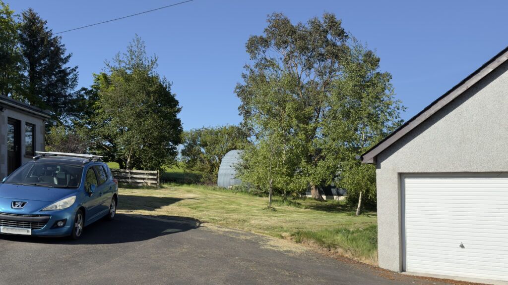
The site where the log cabin is going – between studio and workshop, and just off the driveway
I ran the proposal past the county council planning department – just to make sure it came under “Permitted Development” – which it did – so I didn’t need planning permission. I had to get the base area firstly excavated and then get a concrete base put down (this I couldn’t do myself so I used a contractor).
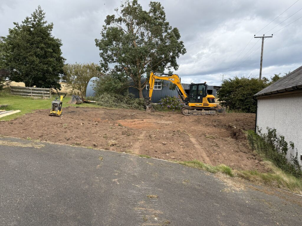
Contractor levelled and prepared the ground for the log cabin
If I wasn’t watching the concrete base being built, only half of the base would have had a dampproof membrane – until I insisted…!
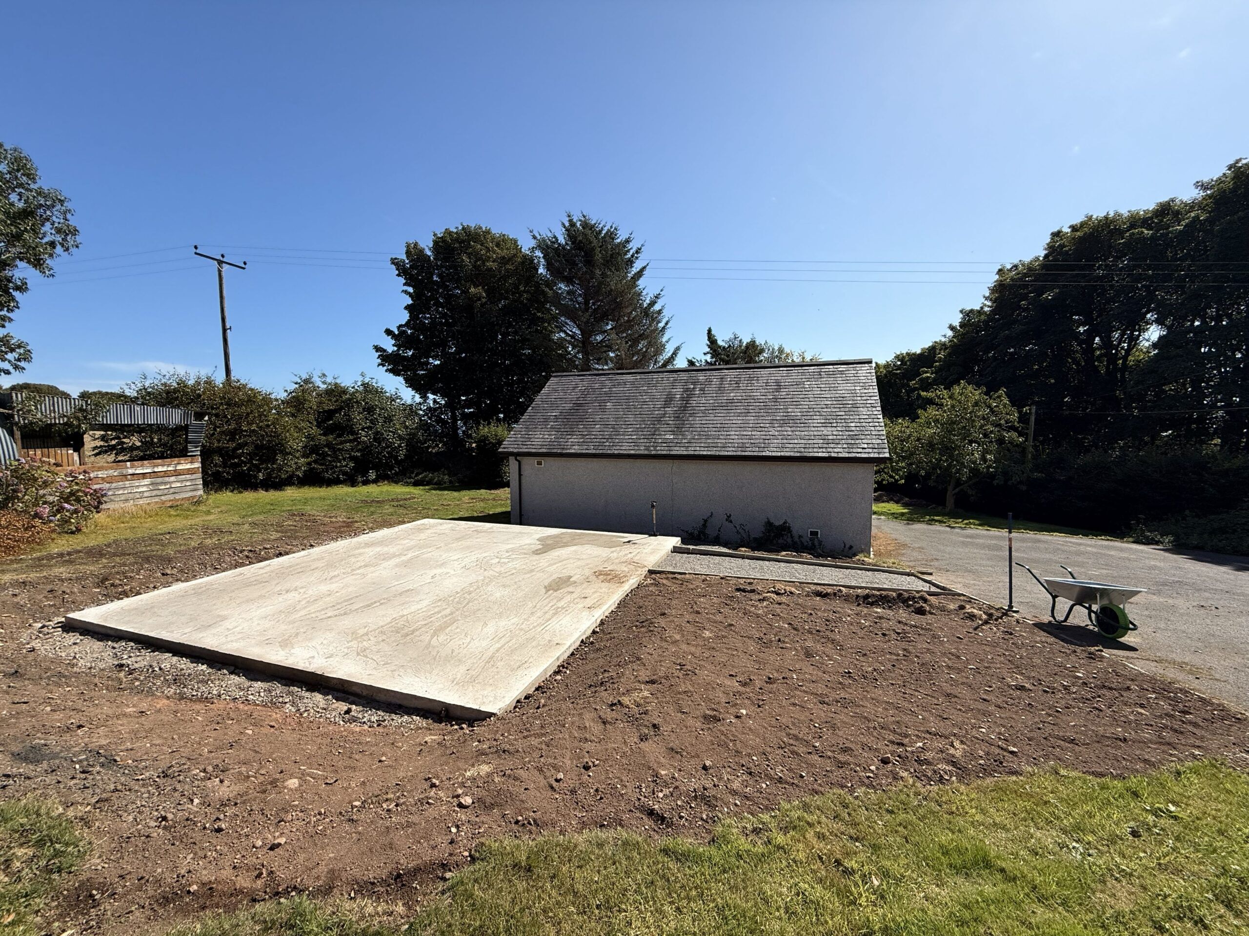
The completed concrete base (100mm thick on 100mm hardcore) (done by a contractor)
I left the ordering of the log cabin (which comes in kit form) until the base was finished. Then I (re-)looked extensively for the best quality and deal I could find. When I came to a decision it was mid August. I wanted to go with a local supplier but they couldn’t deliver until mid October. The thought of putting up the log cabin in mid autumn – with the high probability of rain, frosts, strong winds – put me off. So I checked the delivery estimate of my second choice. They said three weeks. Decision made.
Undaunted by such challenges, I decided to build the log cabin myself (from a kit) – both to save money, but also to be in total control of the quality of the build and the materials used. From quite a lot of experience, I have little faith in “handymen” – who often cut corners, do things as quickly and as cheaply as possible. I’m quite practical, patient, have some common sense, and can seek advice and/or find out anything I want to know.
I took my time – doing everything as best as I could, and using the best materials and techniques I either knew or researched. The September weather was absolutely gorgeous – sometimes too gorgeous (too hot)! I had a large tarpaulin to cover the timber over night and when it rained (which wasn’t often).
I lost quite a lot of time during the log cabin build because of receiving visitors over the North East Open Studios (NEOS) ten open days in early September (which I committed to back in January). But I like/liked meeting people interested in my art. It’s what art all about…? So whenever visitors turned up, I just downed tools, was probably filthy and stinking of sweat(!) – and gave them as much time as they wanted (which was often quite a lot).
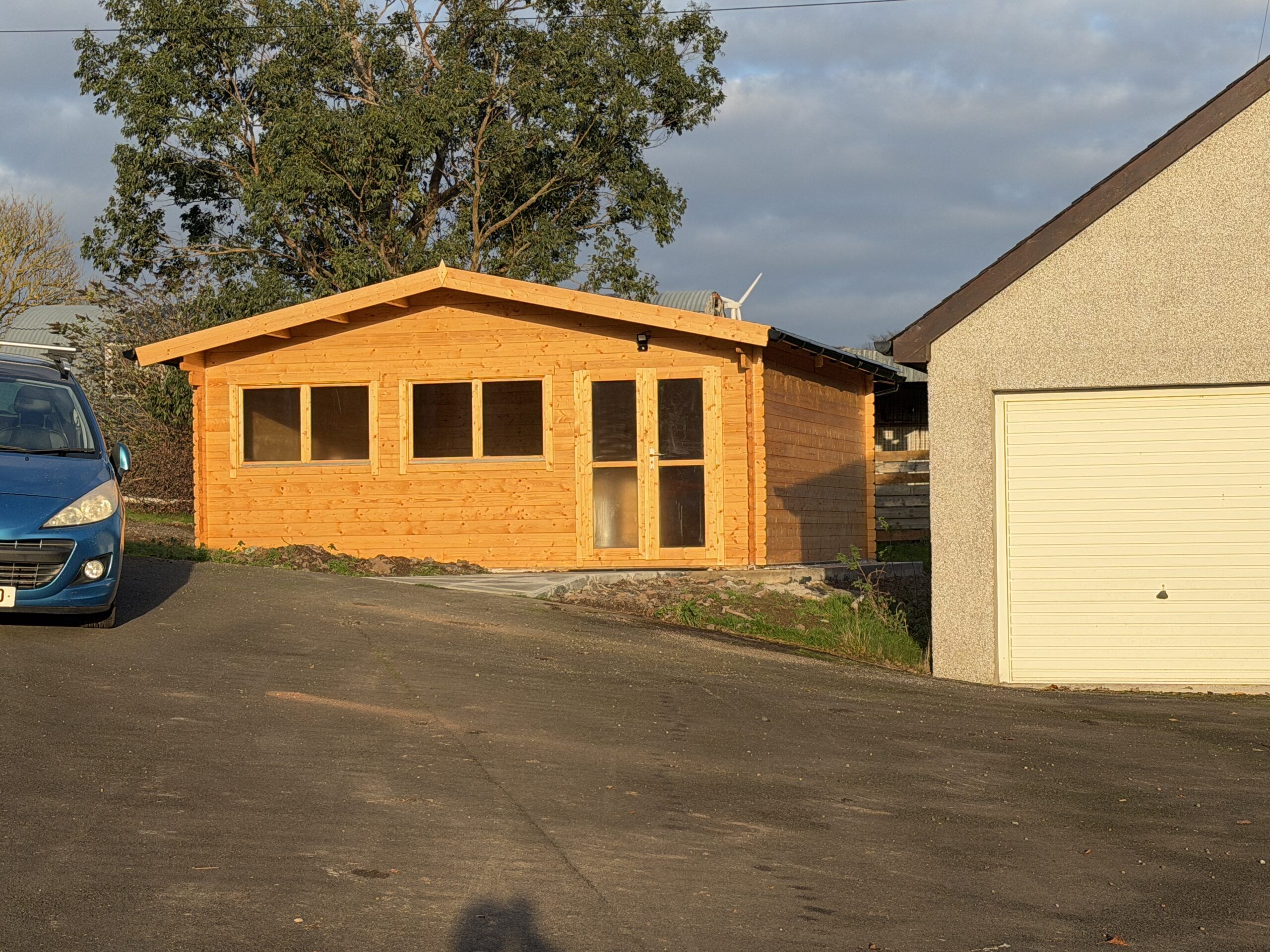
The build was enjoyable for the most part. The instructions weren’t as clear as they could have been, the timber pieces weren’t labelled, and because many were very similar (but subtly different)- and there were unspecified spare pieces – it was very confusing at times. The most difficult part was the path leading from the drive to the log cabin – getting big and heavy concrete paving slabs to slope in two planes from level to the steep slope of the drive. But I got there in the end. It was very satisfying…
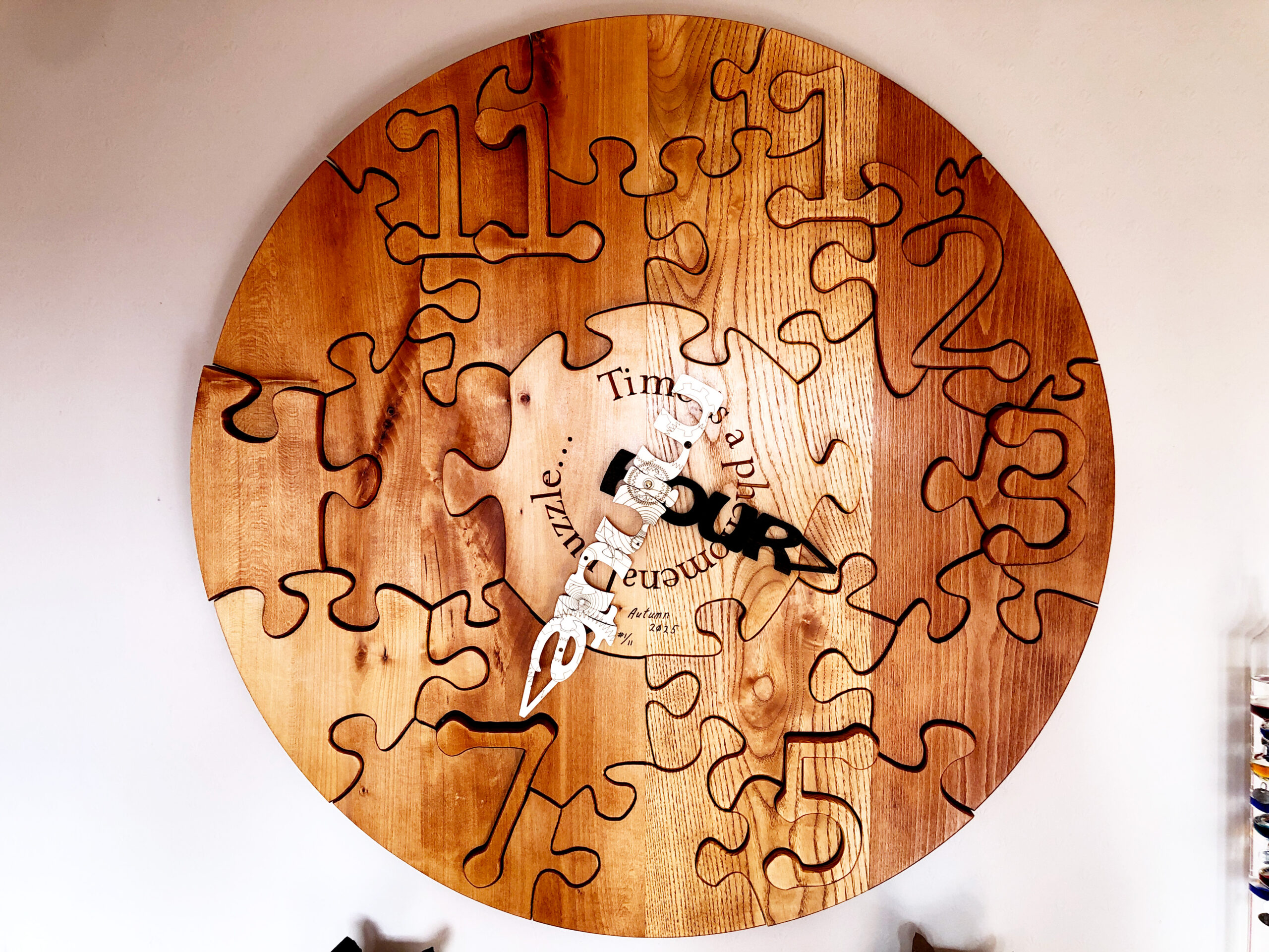
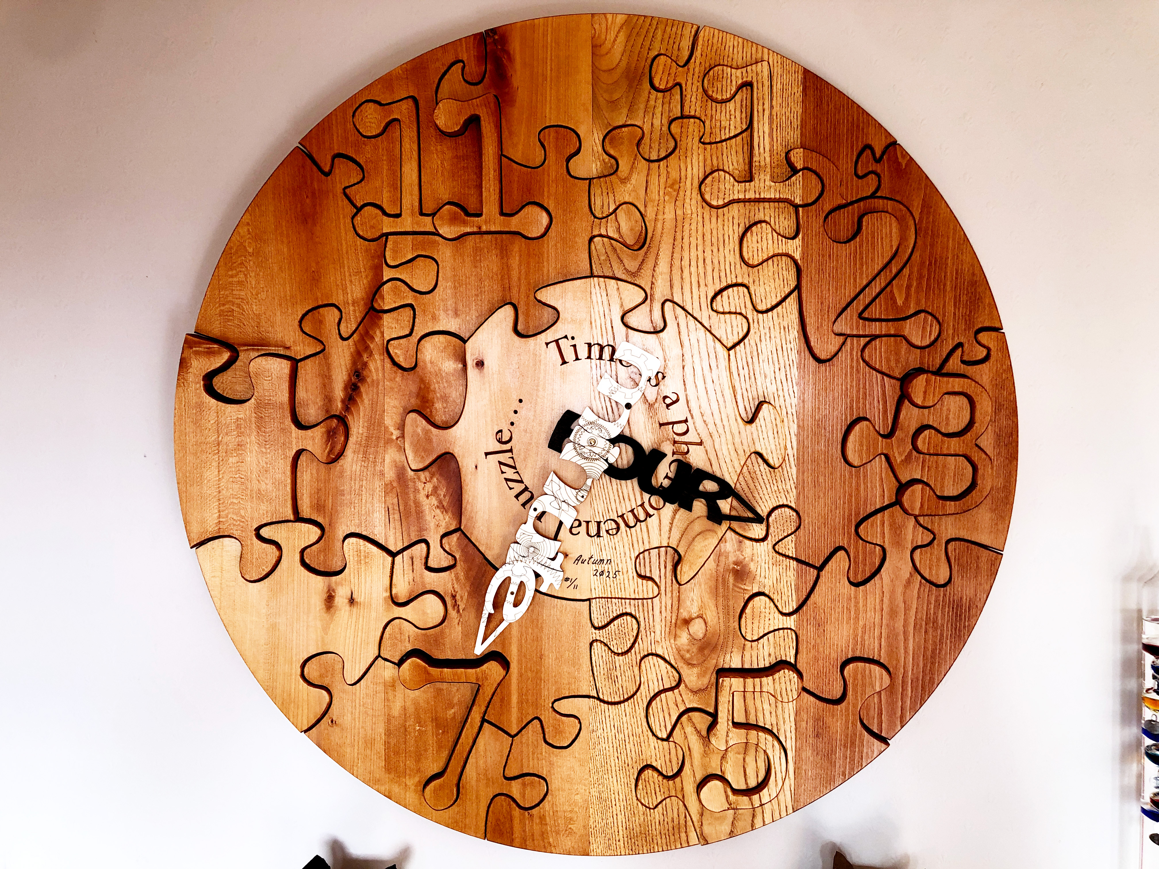
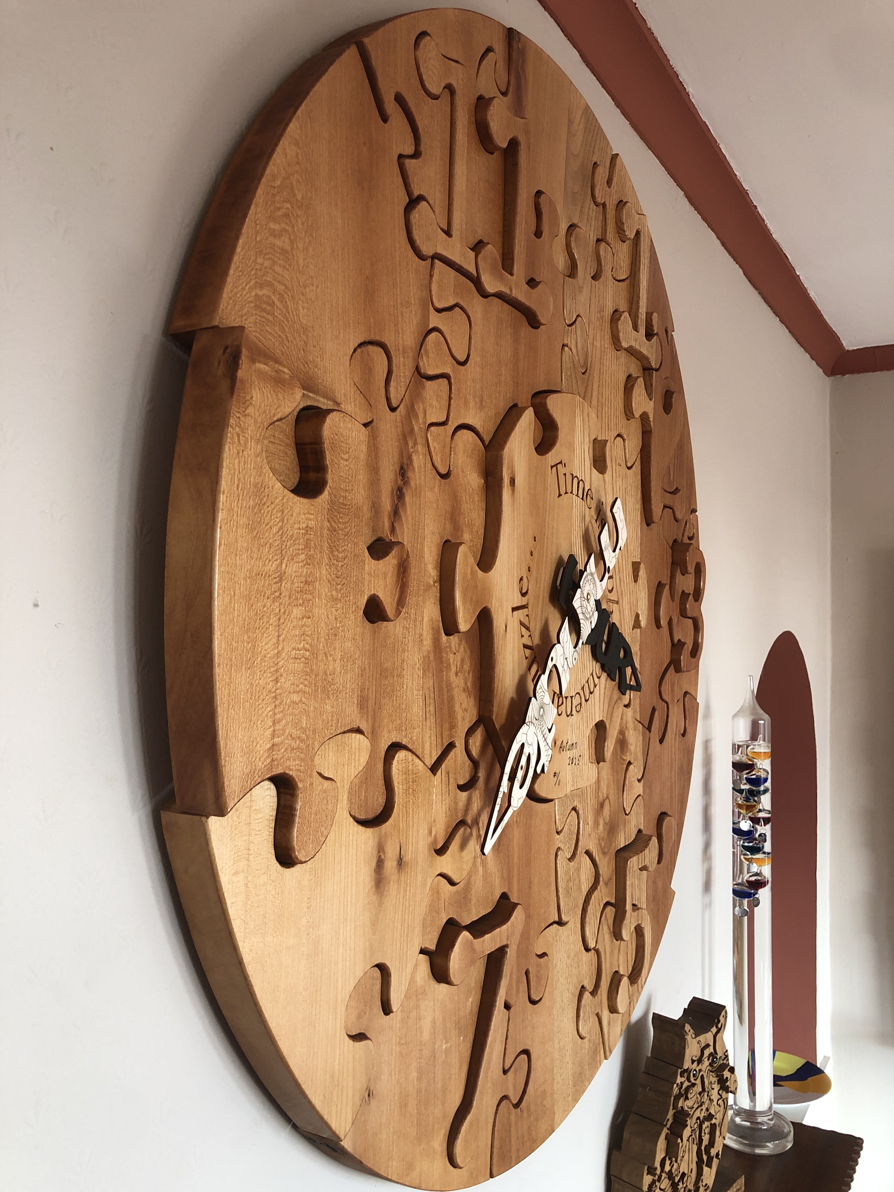
Title: “Time is a phenomenal puzzle…(Clock and Art Puzzle)” Artist: Michael Autumn Medium: Oak wood clock face and plywood hands. Working clock movement. Size: 95cm (W) x 95cm (H) Edition: 11 (only made to order) Authenticity: Hand-engraved (bottom, center of main central piece). Date: 03/2025
This is an artwork primarily about time – that eternal puzzle in human minds – mine included – and what better way to depict time than by a clock…? However, during my journey in creating this piece I realised that it is also about gravity – because without gravity this clock would simply fall apart – because there is nothing else holding it together…! And this ties in nicely with Einstein’s Theory of Relativity – where gravity deflects time (gravitational time dilation) in what is known as “spacetime”…
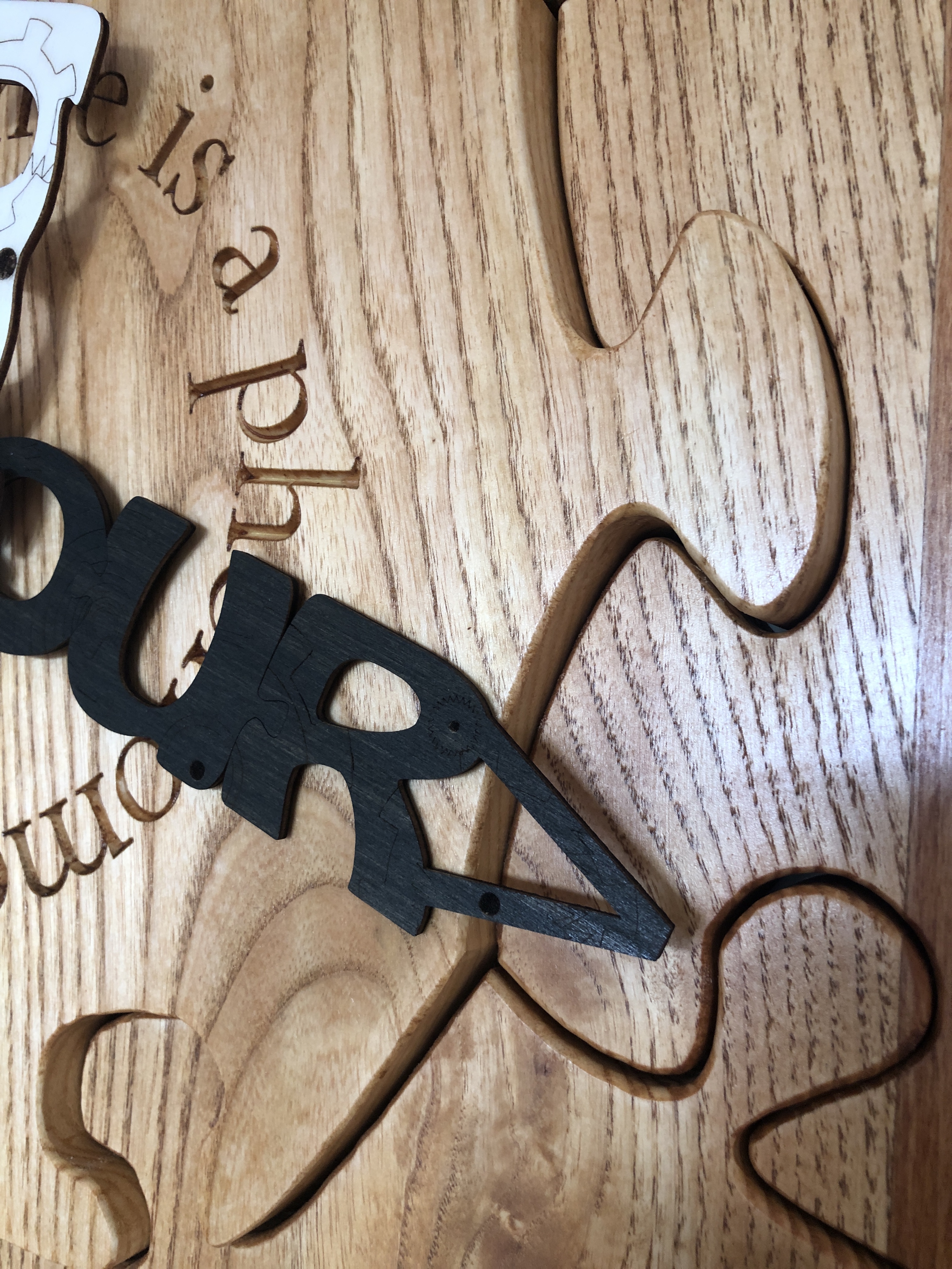
But this is not a normal clock (as you might expect from me!?): it is in fact two puzzles – and it was quite a technical challenge or puzzle to design and make both of them…! There is nothing holding the clock face or clock hands jigsaw pieces together – other than gravity – i.e. their own weight. There is no glue, screws, or nails – all the pieces are gravity-defying wooden joints!
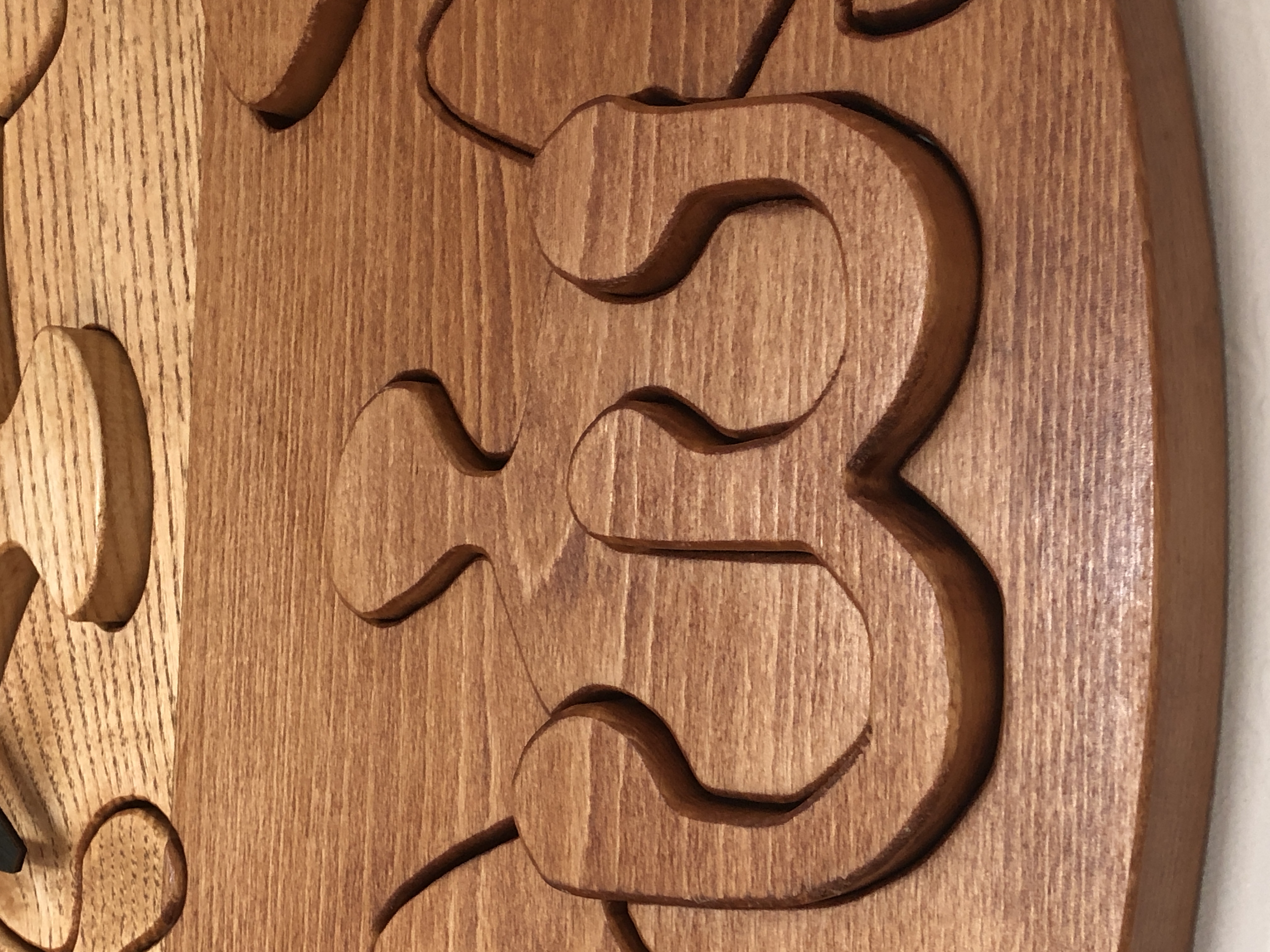
Close-up of some face pieces – they are all loose. I vary the depth of some pieces to make them stand out…
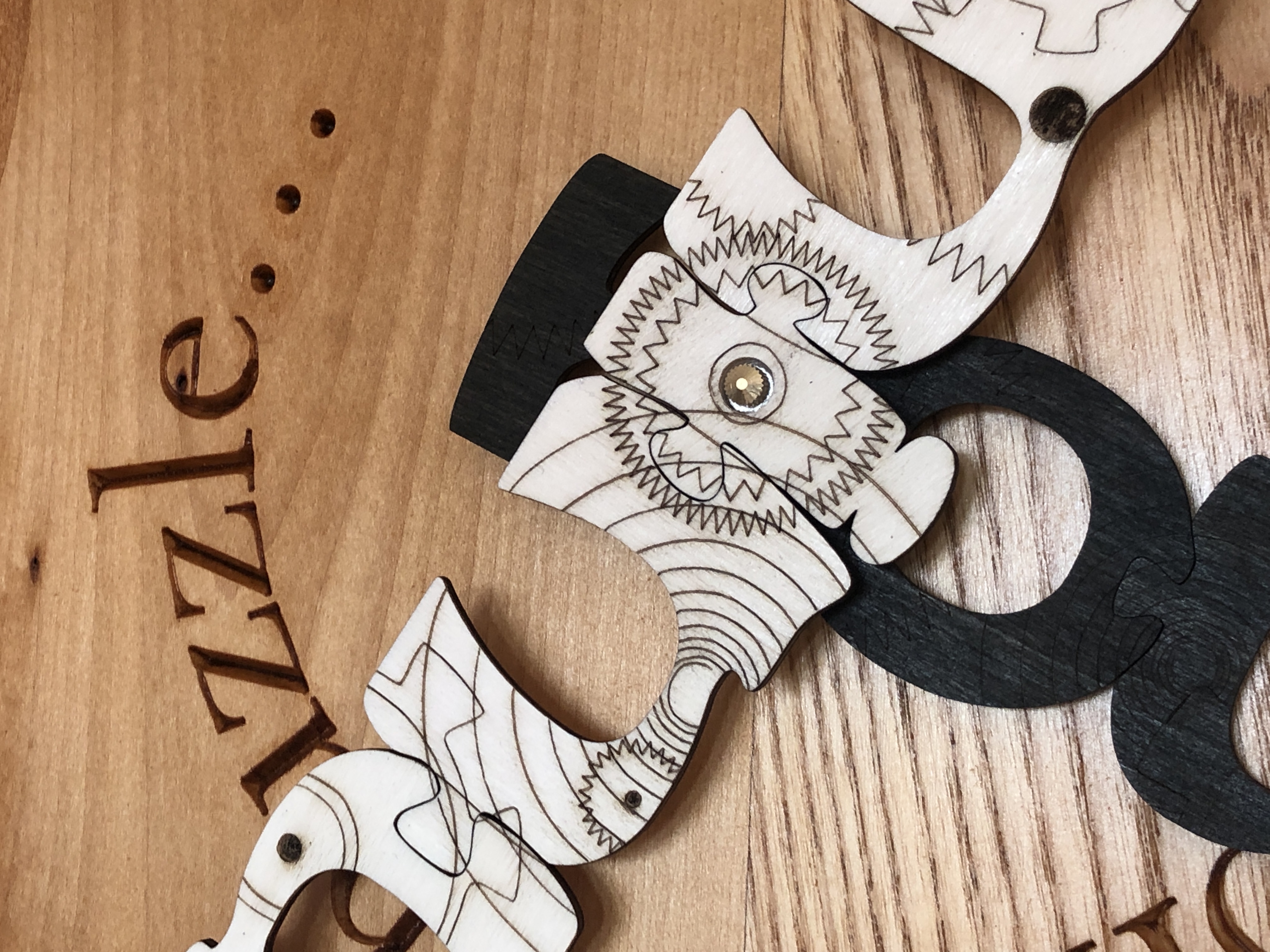
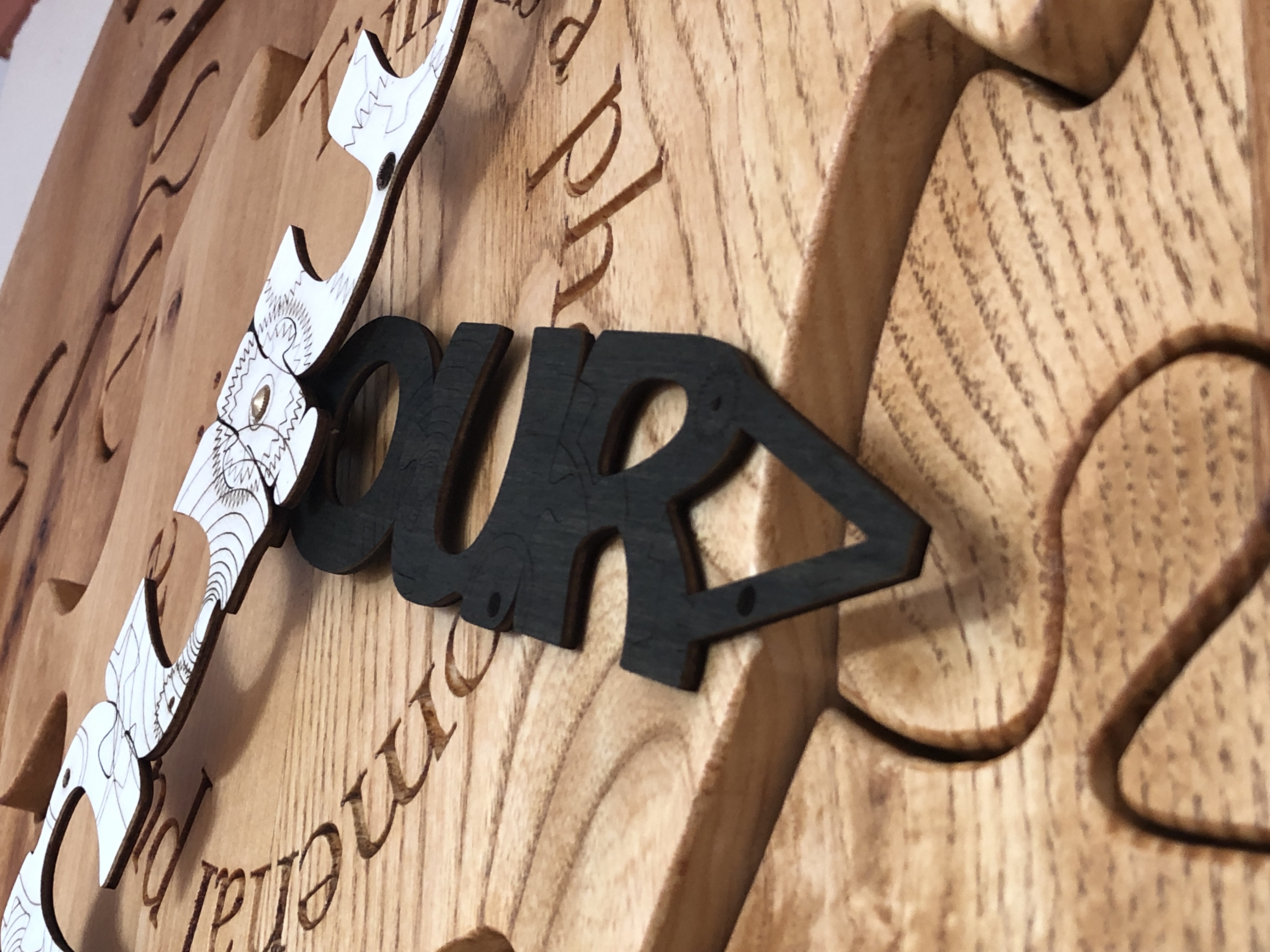
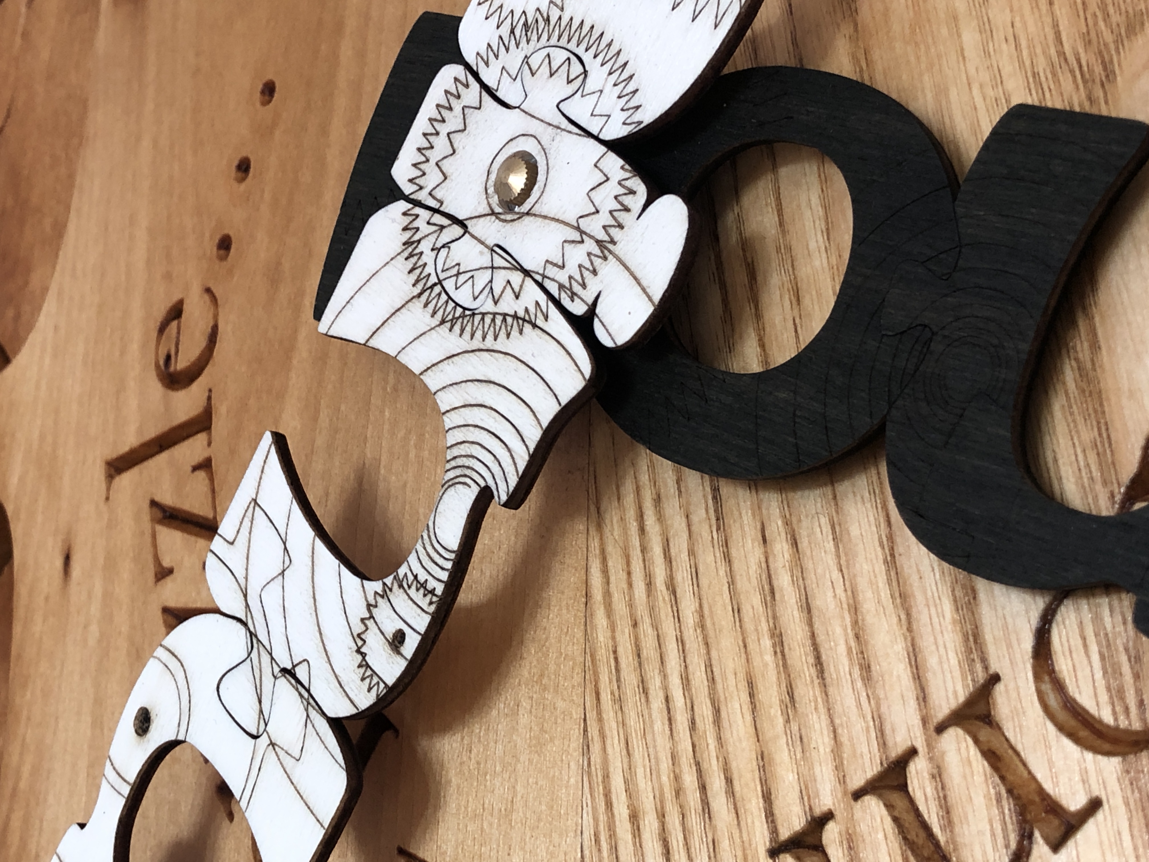
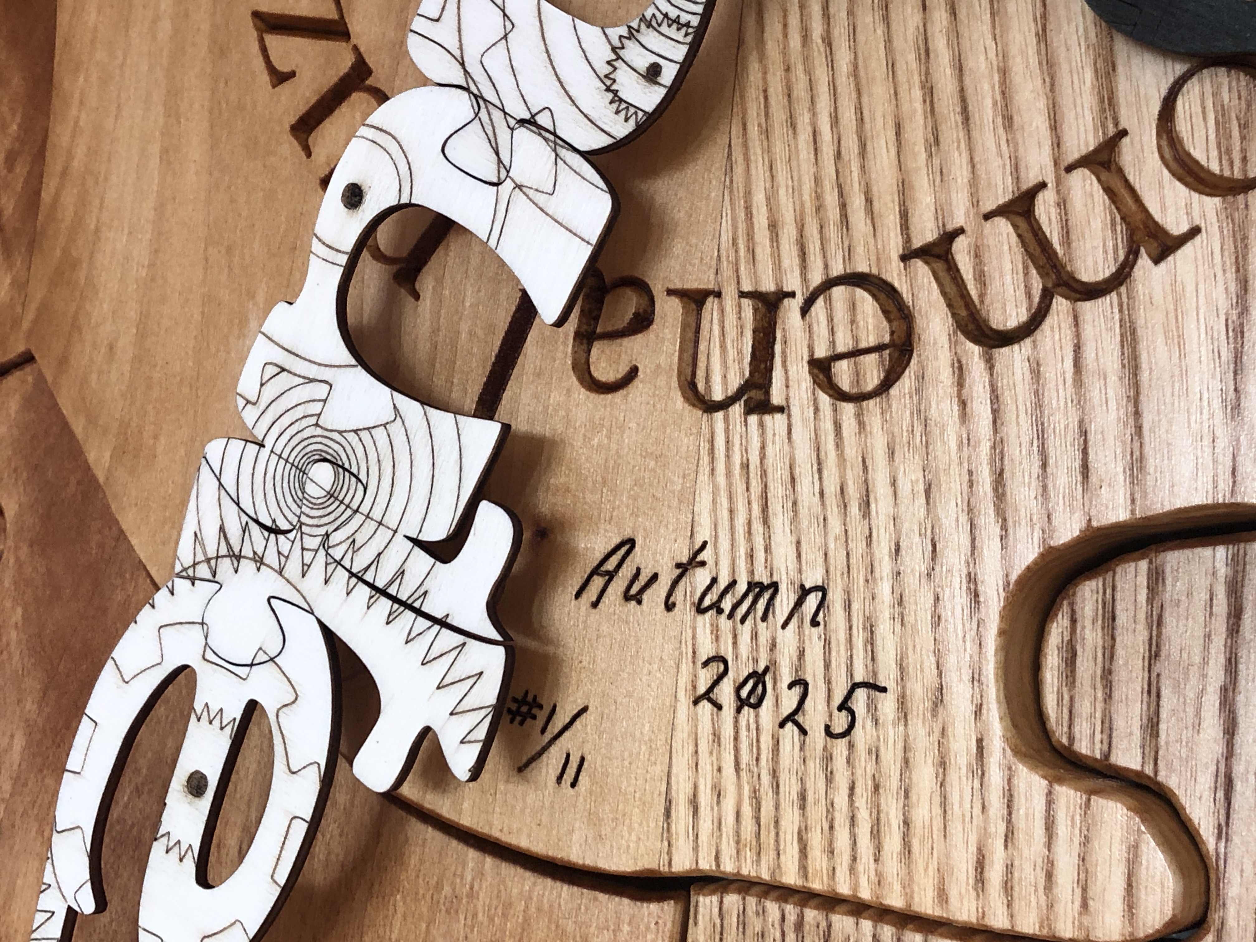
The clock face is a large (950mm or 37 ½ ” diameter) thick circular wooden jigsaw puzzle – where all the pieces are solid oak – about 32mm (1 ¼ ”) thick. The clock hands are very strong but light plywood jigsaw puzzle pieces 3mm (about an ⅛ ”) thick – spelling out the words “hour” and “minute”. They have a steampunk motif engraving of cogs, wheels, springs, shafts, and screws – as if they were word-shaped windows revealing the inner workings of the clock inside.
Close-up of steampunk motif engraving of cogs, wheels, springs, shafts, and screws
I designed and made the puzzle clock face about three years ago (December 2021) (albeit a “small” one – about 500mm – 20” – in diameter), but I couldn’t think of a design I was happy with for the clock hands. This proved really difficult because I wanted the clock hands to be puzzles in themselves – so the pieces had to reliably and tightly fit together – each as a rigid unit, be fully rotatable, and fit securely on a conventional working clock movement. The latter was an interesting technical challenge, but I really struggled with a suitable aesthetic design for them. What would look appropriate or conforming with the theme of a time puzzle? What would look aesthetically pleasing (to me at least!)?
I toyed with several ideas and made prototypes – most of which failed – but recently I came up with the idea of a steampunk motif on the words “hour” and “minute” – and I figured out how to make them into actual jigsaw puzzle pieces. It involved the use of an extremely precise laser (you could be forgiven for thinking all lasers were equally precise, but that would be very wrong…), choosing extremely flat, strong, very light, and knife-edge-holding, material – with very careful preparation and handling. The hands have been dyed – not stained or painted – to give good contrast with each other and the clock face.
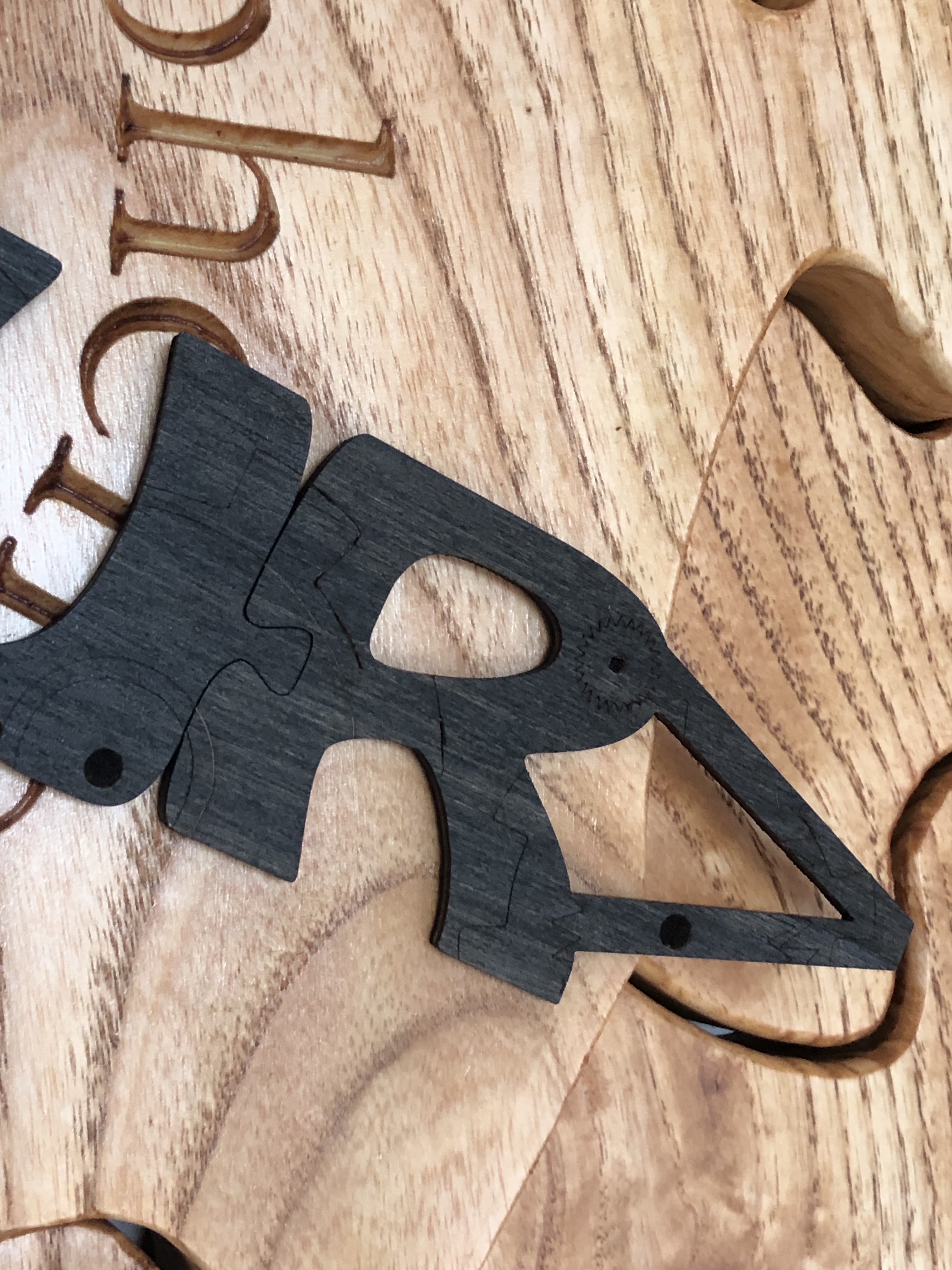
Close-up of the “R” of the HOUR hand. Note the join with the “U”.
The final artwork has been 95% made by hand, my hands, using the best tools at every stage (as the making-video shows). I’m very pleased to reference, and hope to provoke thought into, two fundamental and very puzzling concepts in physics and philosophy – time and gravity…
Why are some of the numbers missing on my clock face?
The keen-eyed amongst you might notice that the only numbers I’ve used are prime numbers. Having a penchant for prime numbers, when designing the clock face, I felt that putting on all the numbers – one to twelve – would make it look too crowded. Also, my goal was to design a clock puzzle – i.e. with interlocking puzzle pieces. Interlocking puzzle pieces are where two or more distinct puzzle pieces structurally hold together – and each piece connects with two or more other distinct puzzle pieces.
It is surely a coincidence that whoever came up with the shape of the Hindu-Arabic numbers we use today, all the single-digit prime numbers have no holes – or negative spaces – in them, whereas the non-prime numbers have holes. This means that the non-prime numbers – 4, 6, 8, and 9 – cannot be single, whole, puzzle pieces. They are two or more pieces – with one or more smaller (hole) pieces fully enclosed. These “hole” pieces – or negative spaces – are attachable to only one other piece – the positive space of the enclosing main digit shape – whereas the prime single digit numbers are all simple single puzzle pieces…
The negative spaces of the even numbers do not meet the criterion of a puzzle piece – each piece connects with two or more other distinct puzzle pieces – and were excluded from the design.
This clockface design is using only prime numbers because it is a proper structural puzzle – all the pieces meet the criteria of proper puzzle pieces – and, most importantly, this appeals to my aesthetic and numerophile senses (in fact I did originally call this artwork “Prime Jigsaw Clock”, but later changed my mind). A clock face is so familiar to modern people that numbers are not strictly necessary – and many clockface designs have no numbers at all. So, to be provided with six very special prime numbers, is six more than strictly necessary – and adds to the mystique of what this clock is all about…
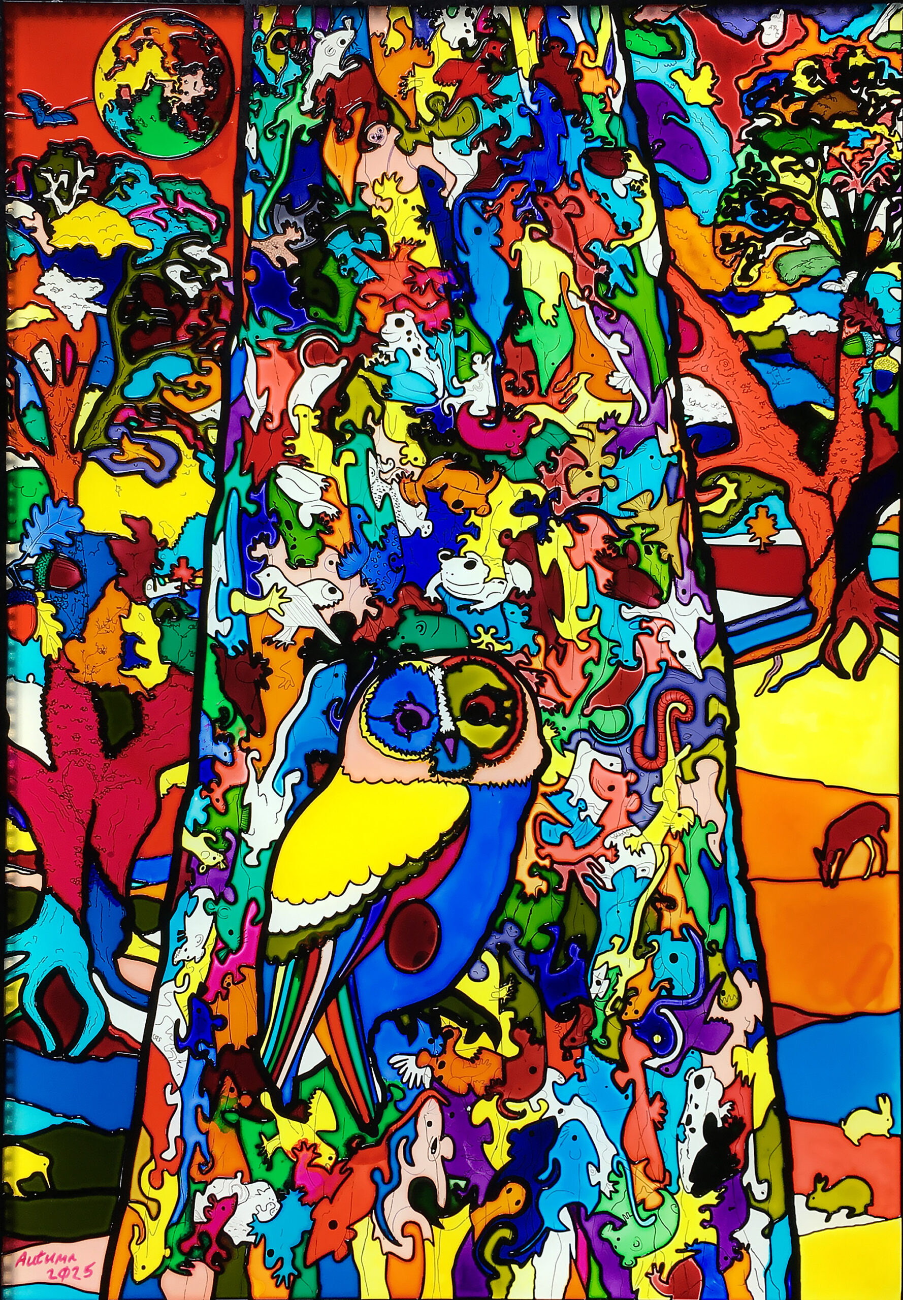
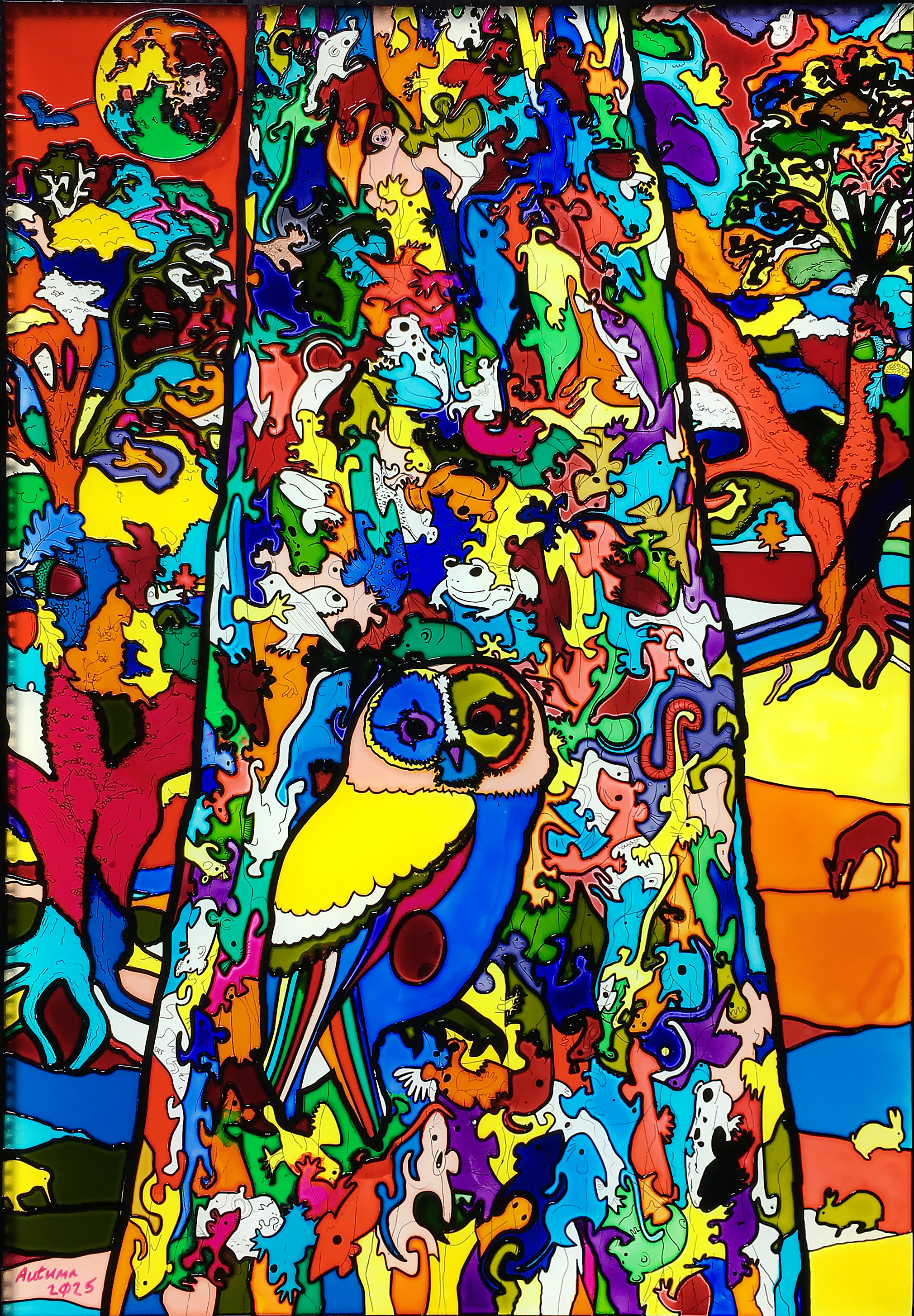
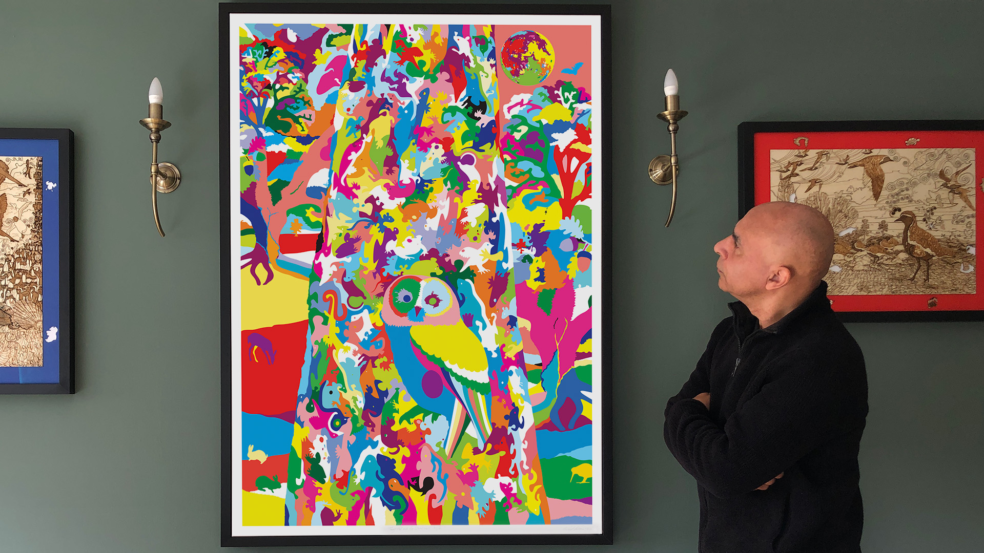
Title: “Tawny Owl in Landscape (Predator and Prey) (floral map)” Artist: Michael Autumn Medium: Resinous glass paints on faux leaded (composite plastic) clear cast acrylic sheet Size: 60cm (W) x 85cm (H) Edition: Original Authenticity: Hand-signed (bottom, far left) with purple glass paint on light pink painted cloisonné cell. Date: 02/2025
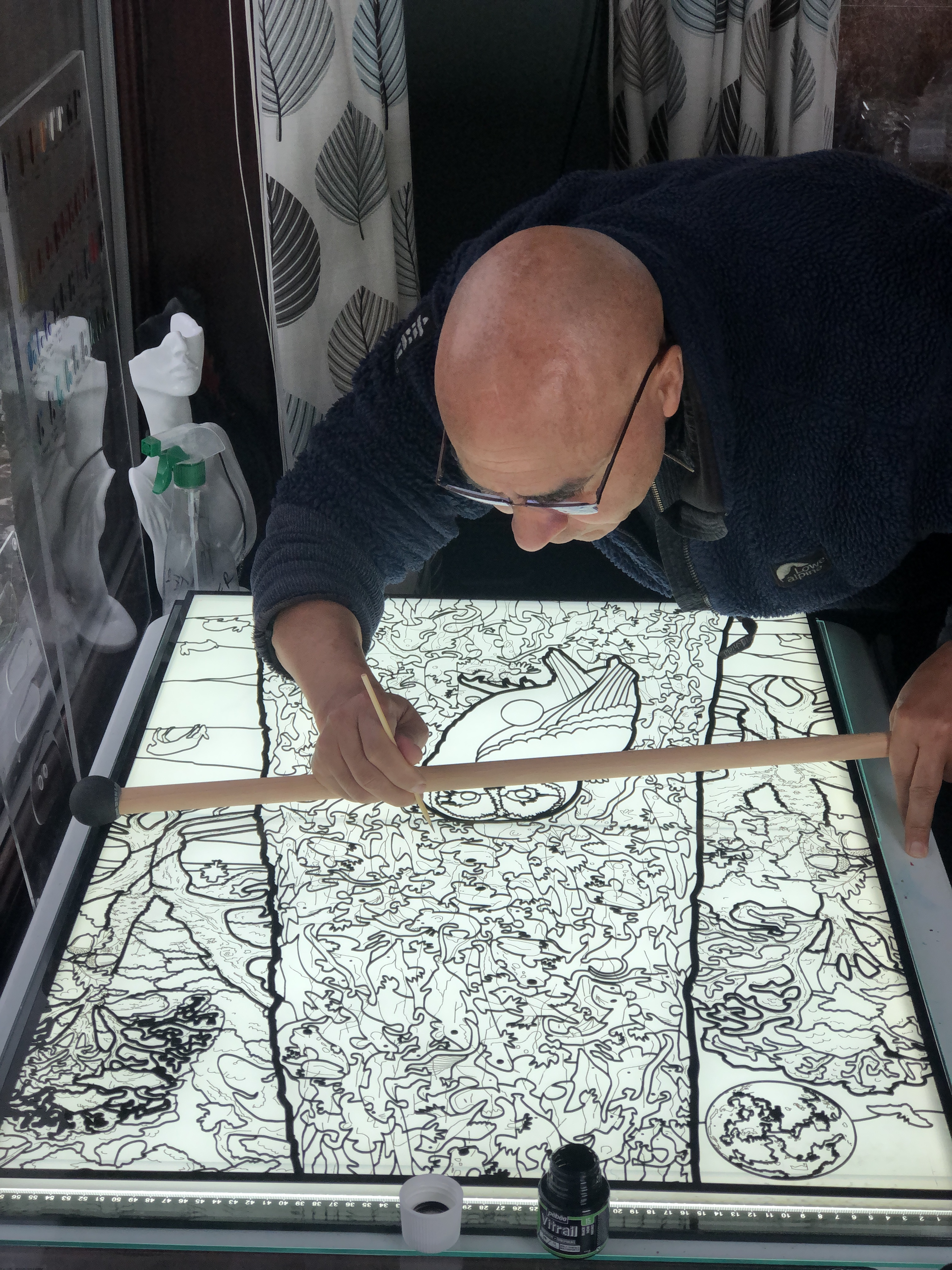
Michael Autumn drawing and painting black detail lines and spots amid the laser cut black composite plastic faux leading.
TL;DR
Not tied to any particular medium or technique, I have tried to devise a way of achieving a stained-glass look with much more detail than is conventionally possible – using a clear acrylic sheet, laser-cut black composite “leading” (aka “cames” – the “H”-shaped strips of lead holding the glass pieces together), and the coloured “glass pieces” are transparent resinous glass paint.
The scene is a tawny owl in a “tree”, in a landscape with animals, trees, bats, and the moon in the background. The main foreground “tree” trunk is actually made up of a variety of the owl’s prey creatures – and asks the question: if these owls eat 2-6 of these animals every day, and they live up to 24 years…?
The centre column (the main tree trunk) of this artwork comes directly from my original thick oak wooden art puzzle (see https://michaelautumn.wordpress.com/2023/05/03/tawny-owl-with-egg-art-puzzle/). That work is naturally quite dark and monochromatic because it is a nocturnal scene, and most of the prey animals (depicted in the main tree trunk) are also nocturnal, and therefore dark and dull coloured. So I thought it would be interesting to turn the idea upside-down and make it into a vibrant kaleidoscopic “stained-glass” landscape scene.
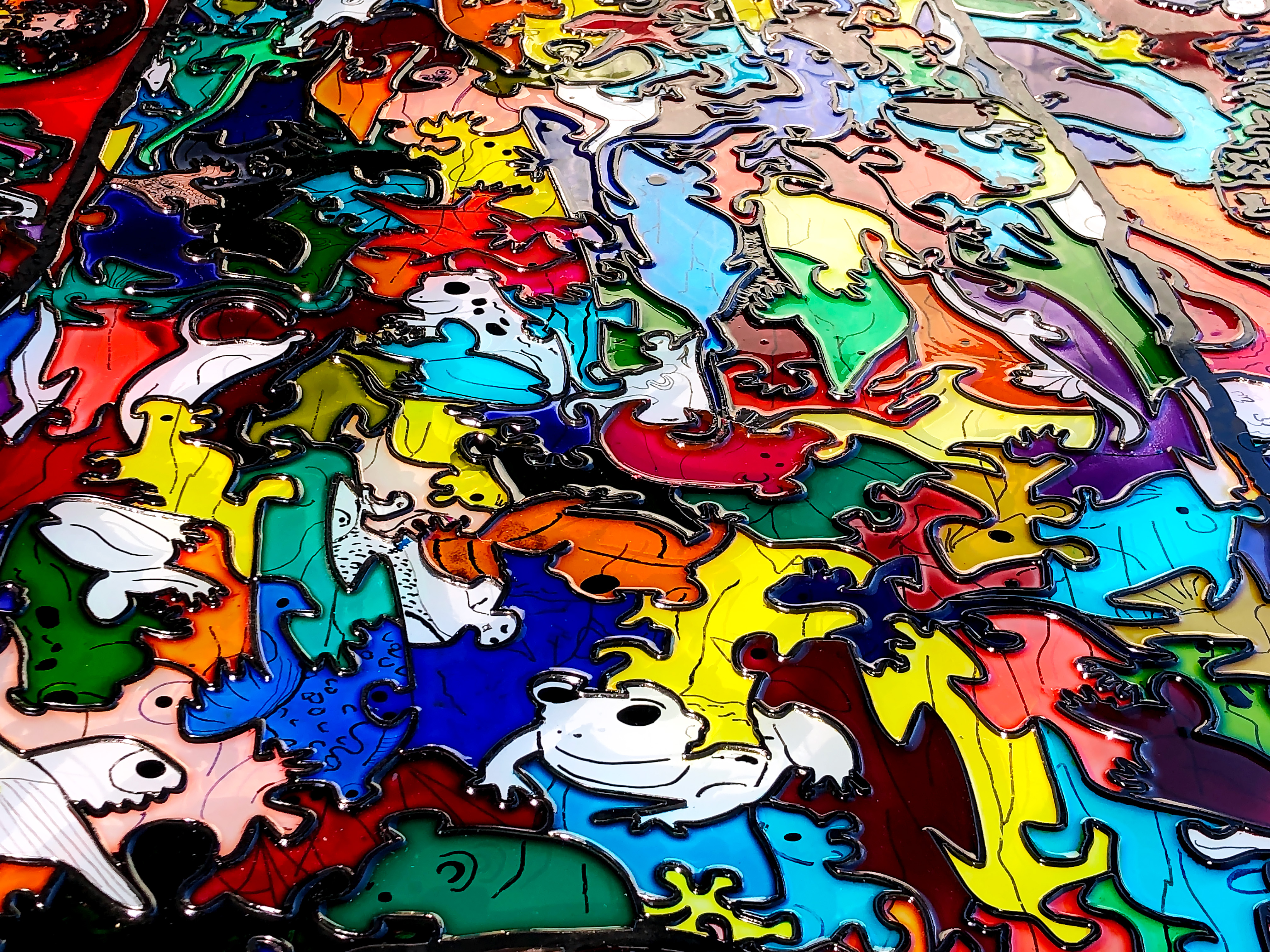
This imaginary landscape faux stained-glass artwork is my attempt to overcome some of the limitations of conventional stained-glass techniques. It’s hand drawn and hand painted (using transparent resinous glass paints) on a 10mm thick clear 850mm x 600mm acrylic base. The faux leading (aka “cames” – the “H”-shaped strips of lead holding the glass pieces together) (of different widths) is my devising: its hand-drawn, laser cut, black composite – glued to the acrylic base. The coloured glass effect is achieved with transparent resinous glass paint lasgely poured into each cell – an effect very much like cloisonné stained-glass.
I’m lucky to be a completely free artist – unaffiliated to any art movement, genre, or medium; and not tied to any particular materials, methods or techniques. My main interest is expressing my creativity and achieving my designs to the best of my ability – using any material/s or techniques I can think of to help me achieve my goals. I like exploring new materials, tools, and technologies: you might call me a tech geek. I’m very interested in pushing art forward – as opposed to continuing centuries-old traditions and techniques. In every historical medium I can think of, past masters in those mediums cannot be matched – let alone surpassed – and I think it’s pointless to try. All artists can do what they like, but I am keen on creating new things. I’m very interested in trying new materials and tools that give new and/or greater creative possibilities. While I like the look of stained-glass, I find that the centuries-old tradition of cutting glass and fusing pieces side-by-side with lead – is too restrictive, time-consuming, and cumbersome. Through my own research and tests I realised it’s possible to create the same look, but more easily and in much greater detail.
In this artwork I have simulated the opaque dark lead cames look of stained-glass using laser cut black plastic composite. I developed this idea through research and testing, and my design fully exploits the much greater detail possible. My most intricate laser can cut thin material and can readily cut 1mm latticework. The thinnest commercially available lead cames I can find are between 3.5mm and 5mm… The majority of the faux cames in this artword are 1mm, the widest is 8mm. This means not only that far greater detail in the design are achievable, but also more light can come through the window…
Lead cames have the function of binding pieces of transparent glass side by side. But I am using coloured transparent resinous glass paint – so I don’t need to bind pieces of glass together. Cames also have an aesthetic that I like that highlights shapes and colours. I use different widths giving me greater artistic freedom than with conventional cames.
Finally, the whole piece is covered in a thin layer of clear resin to seal everything and provide extra protection. So the actual stained-glass piece is a thin layer sandwiched between a sheet of clear cast acrylic and a clear resin topcoat. The base, or rear, acrylic sheet also acts as natural UV protection – filtering out up to 99% UV radiation. And, since this is the side facing the sun/daylight, means it is in the best position to protect the sandwiched coloured layer…
This is just the beginning of me trying this new technique…
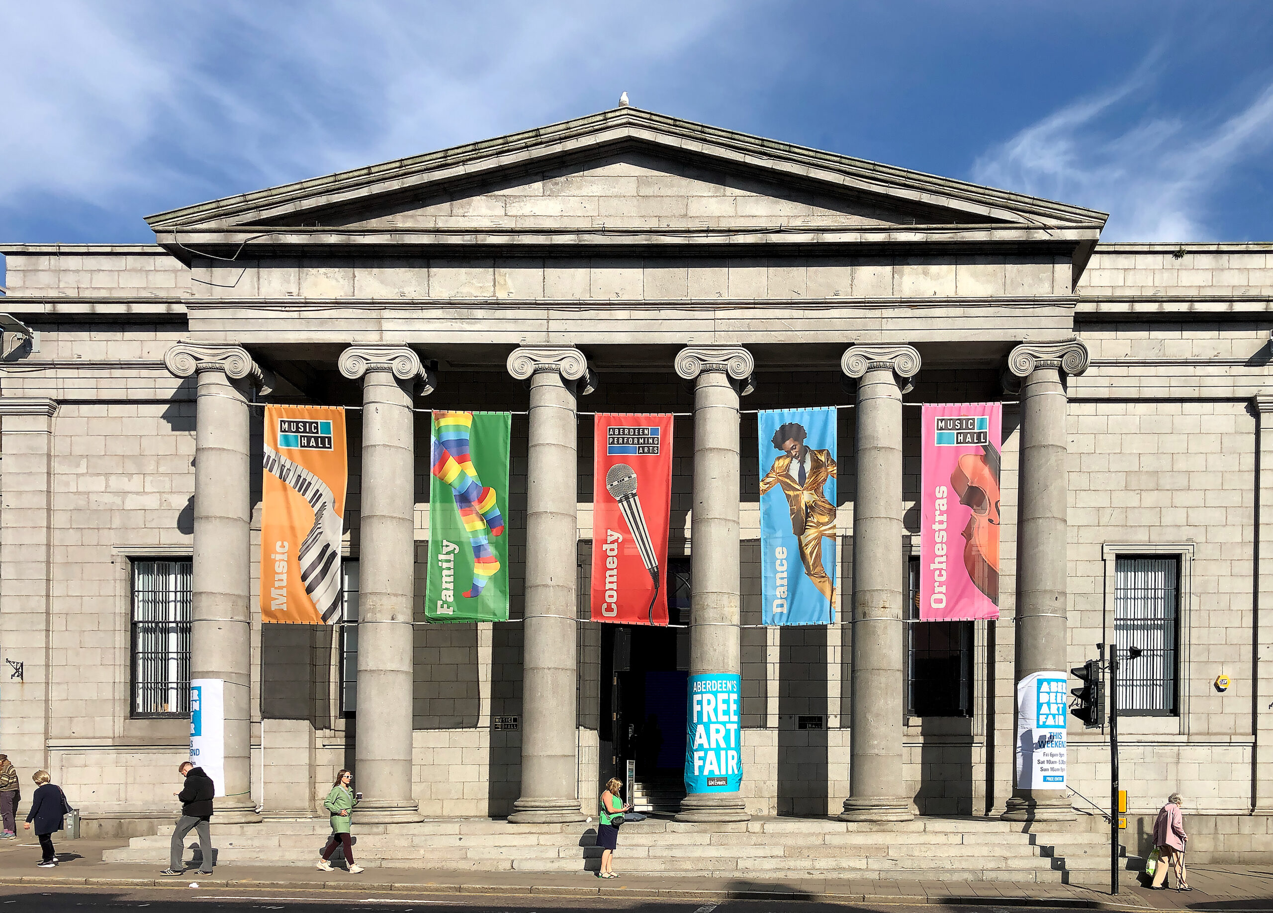
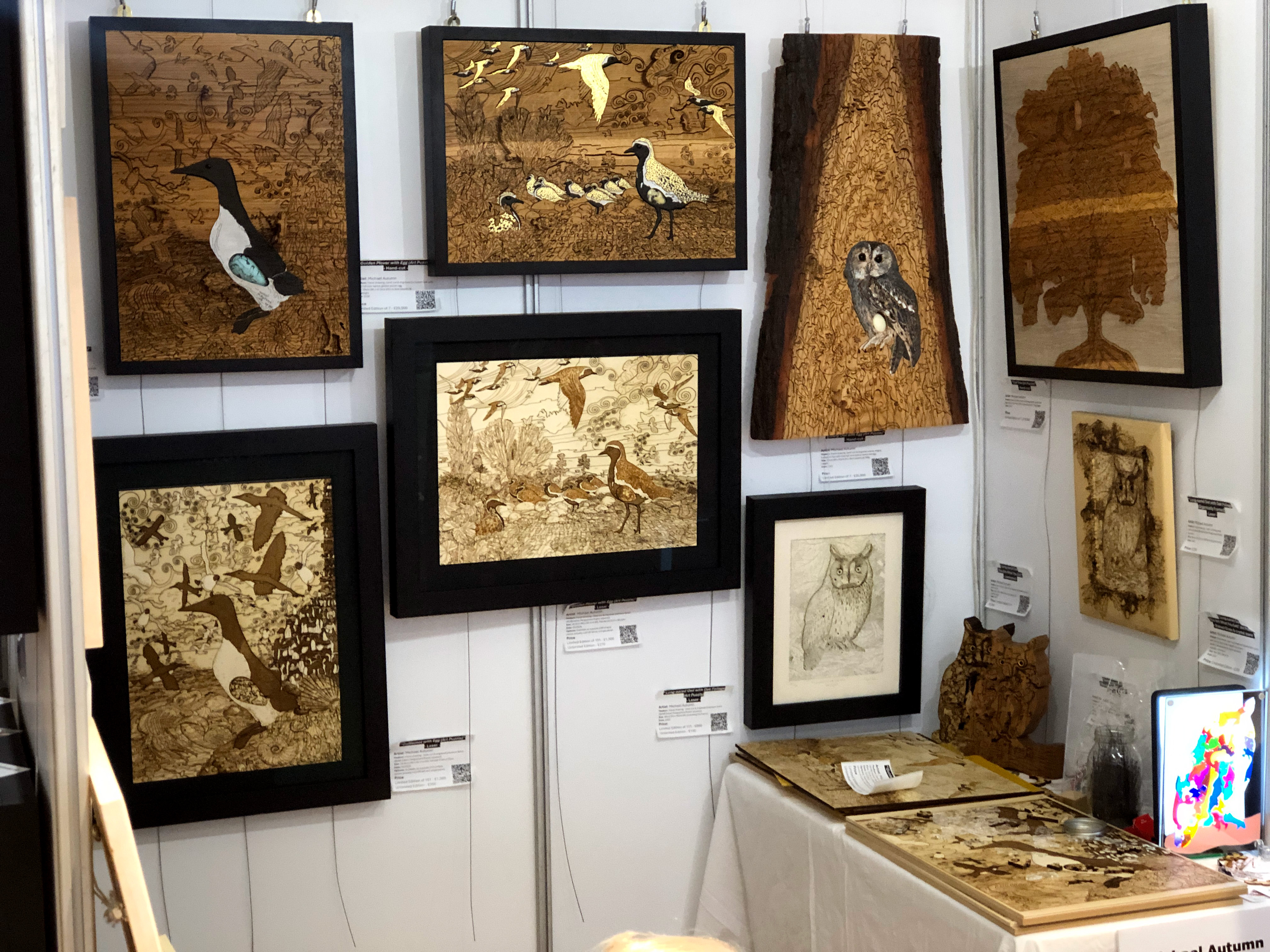
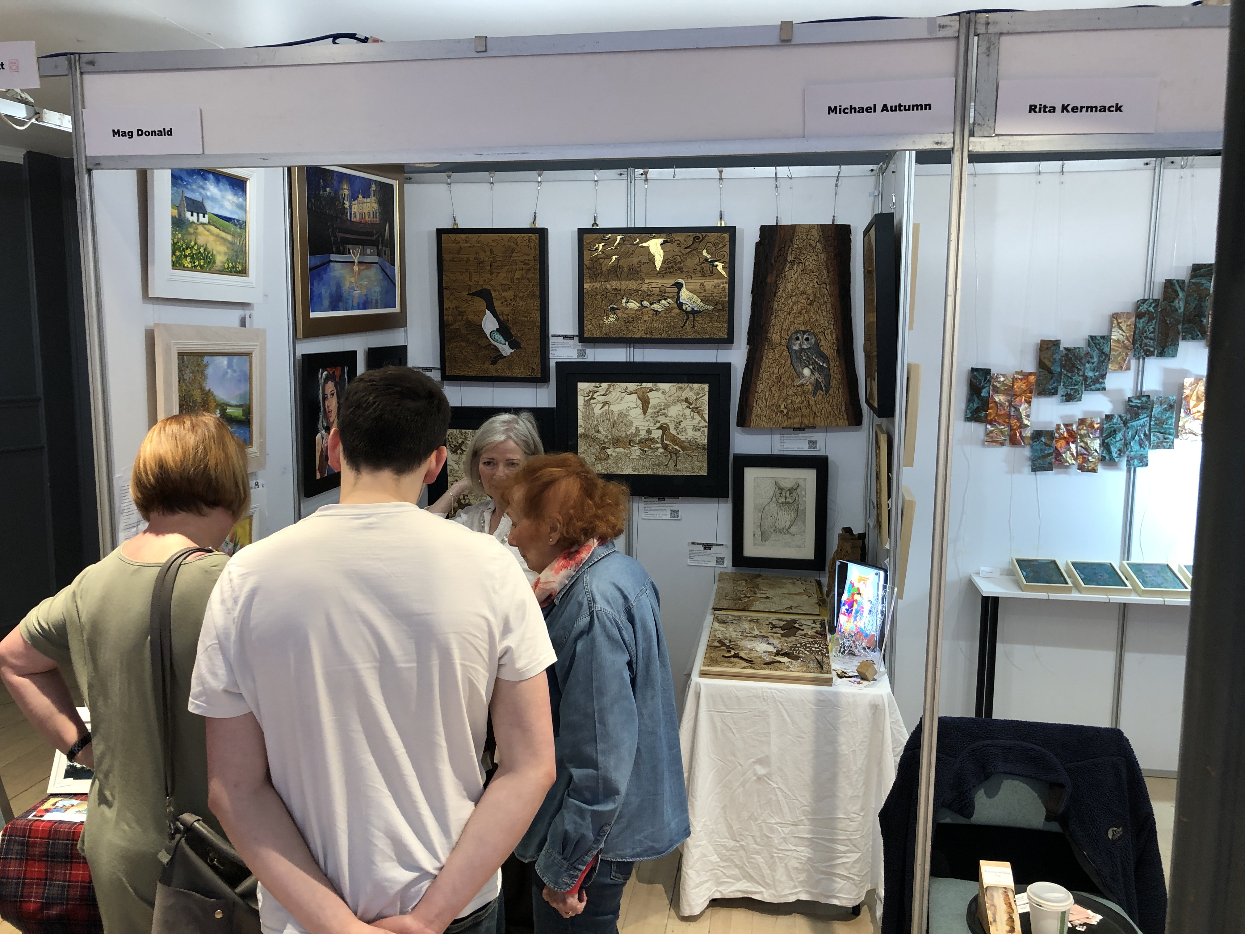
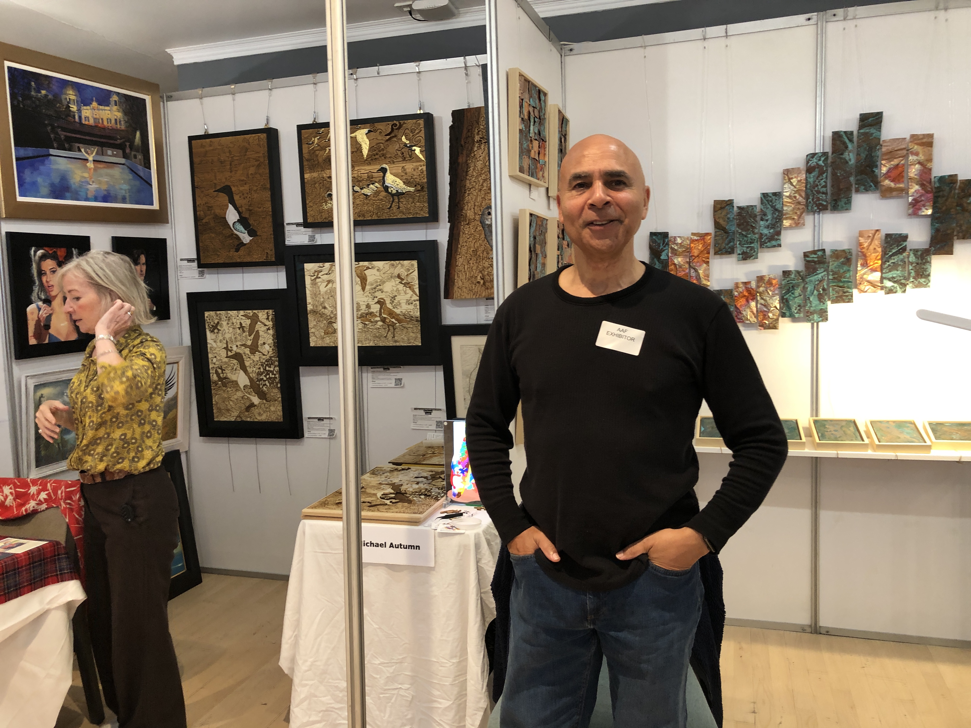
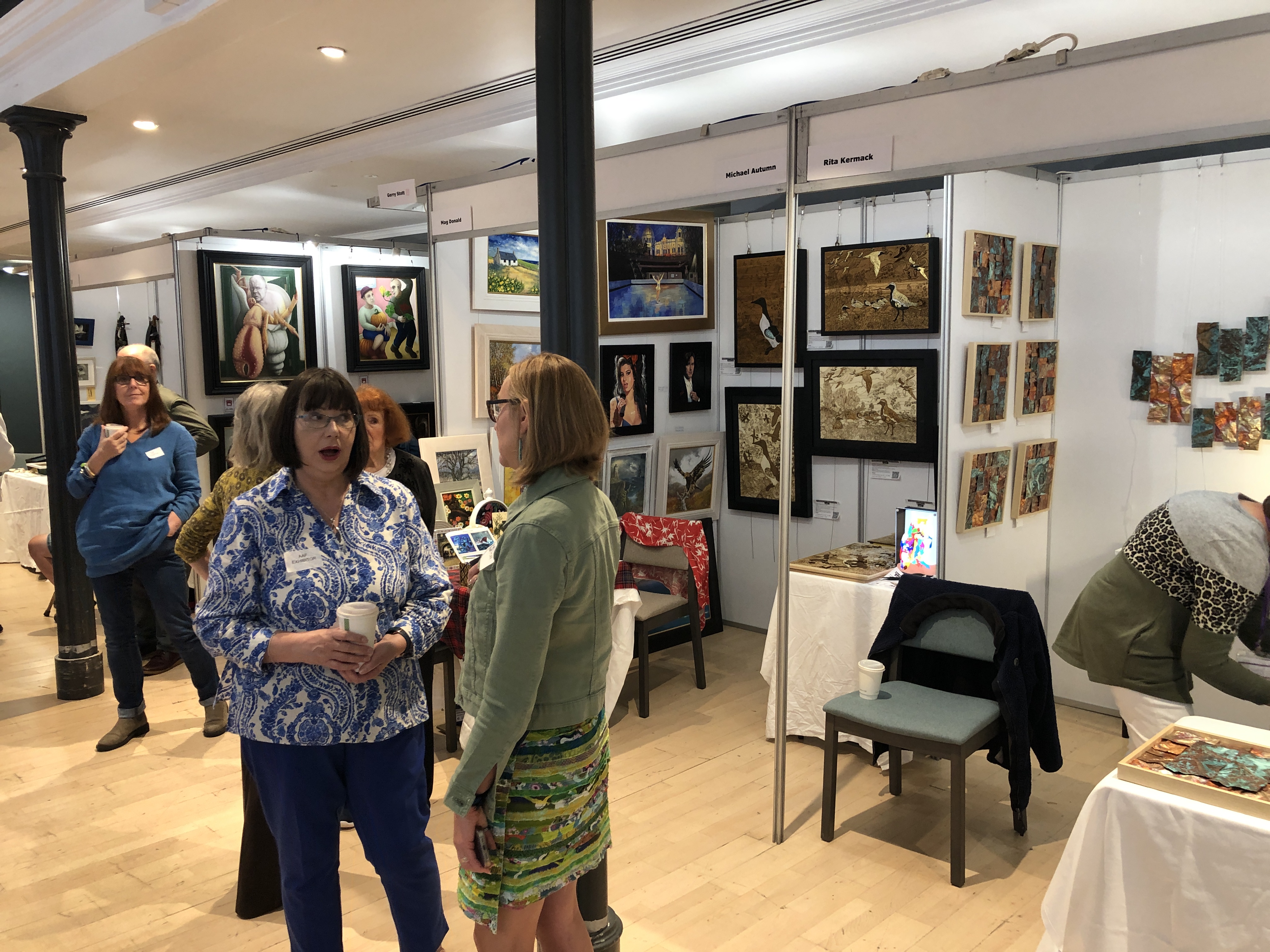
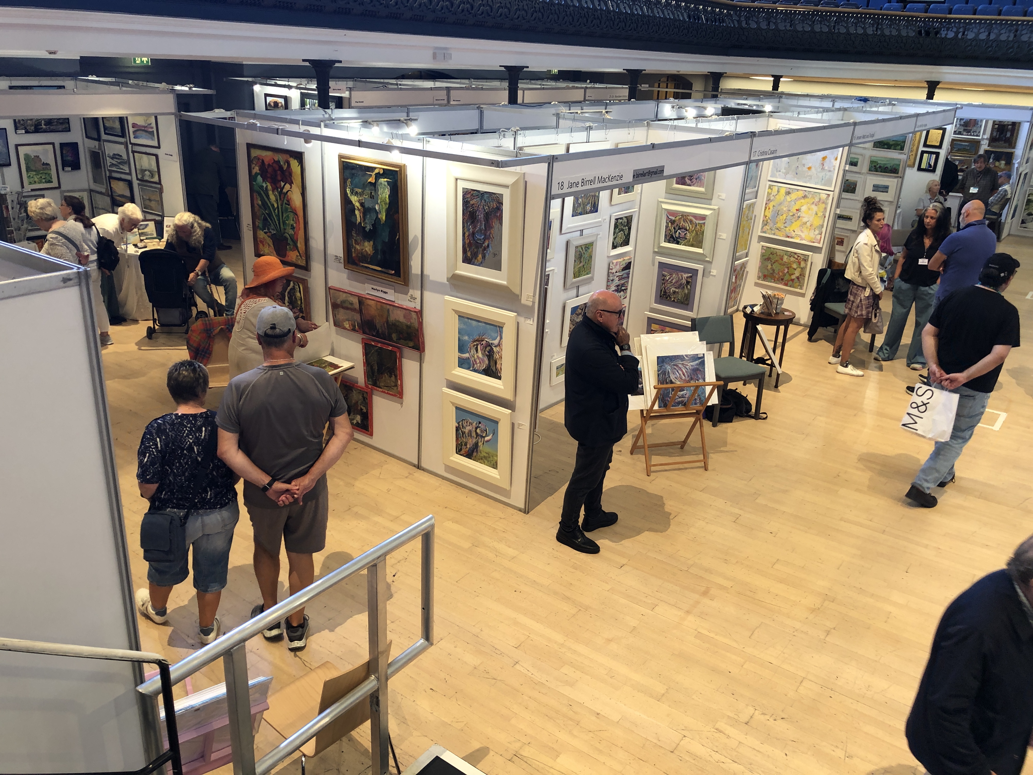
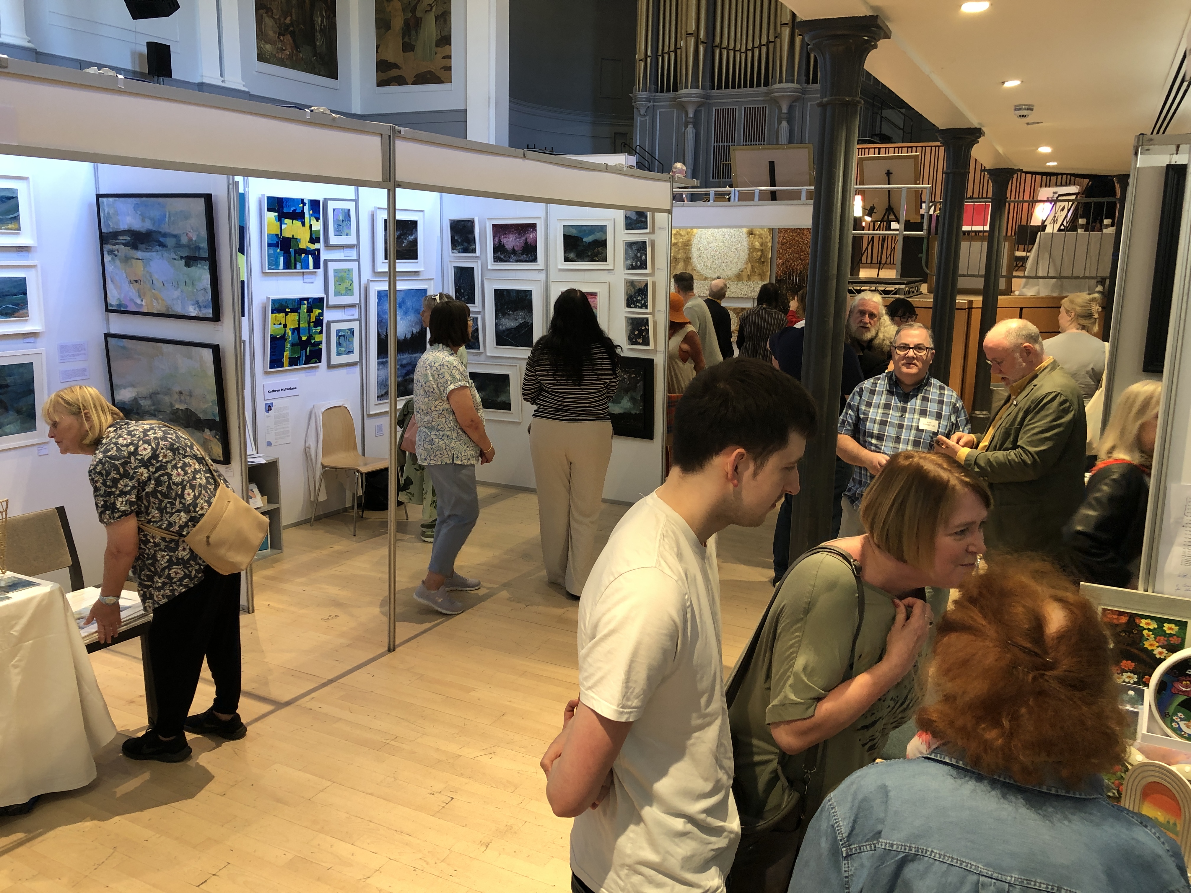
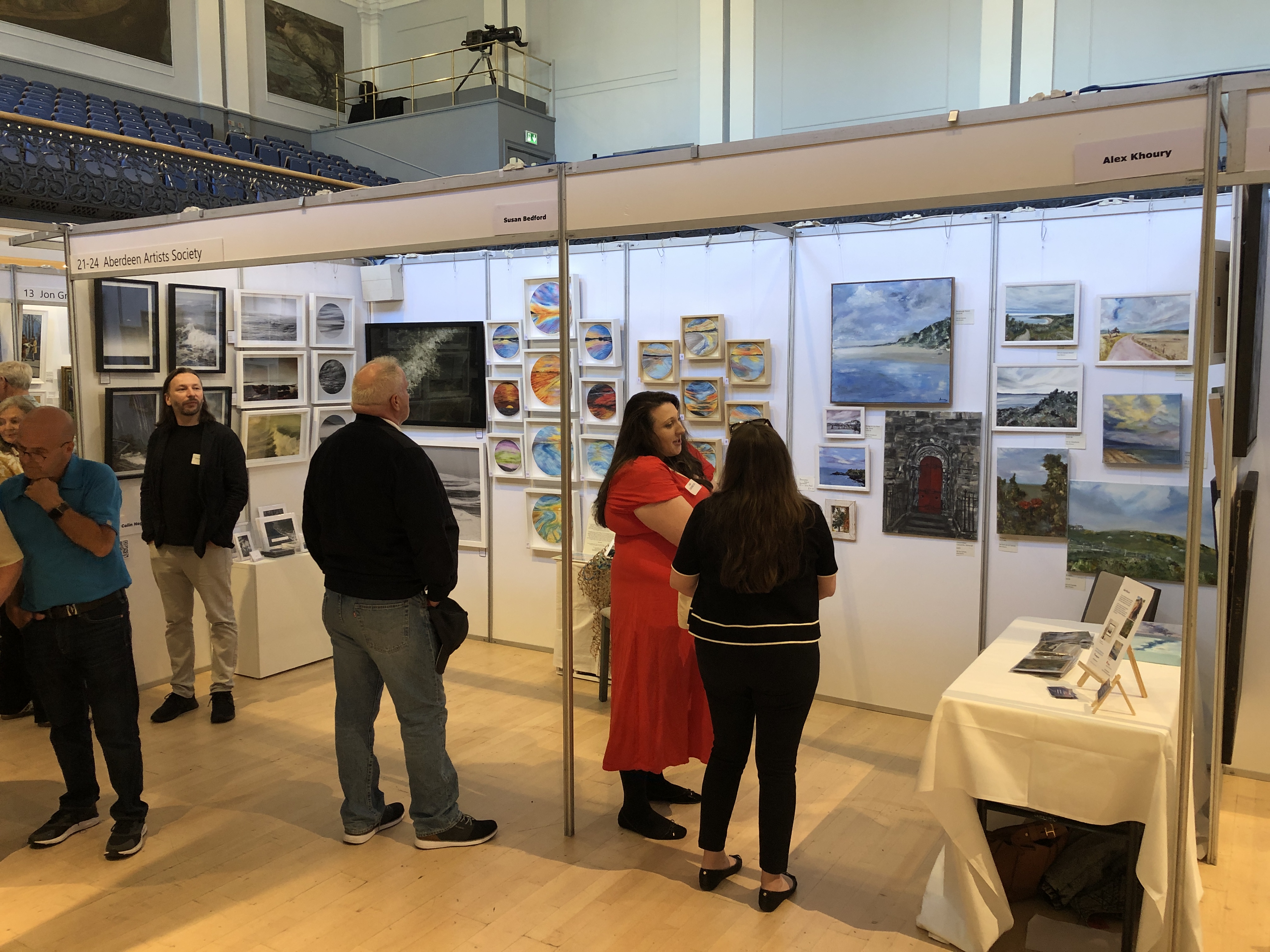
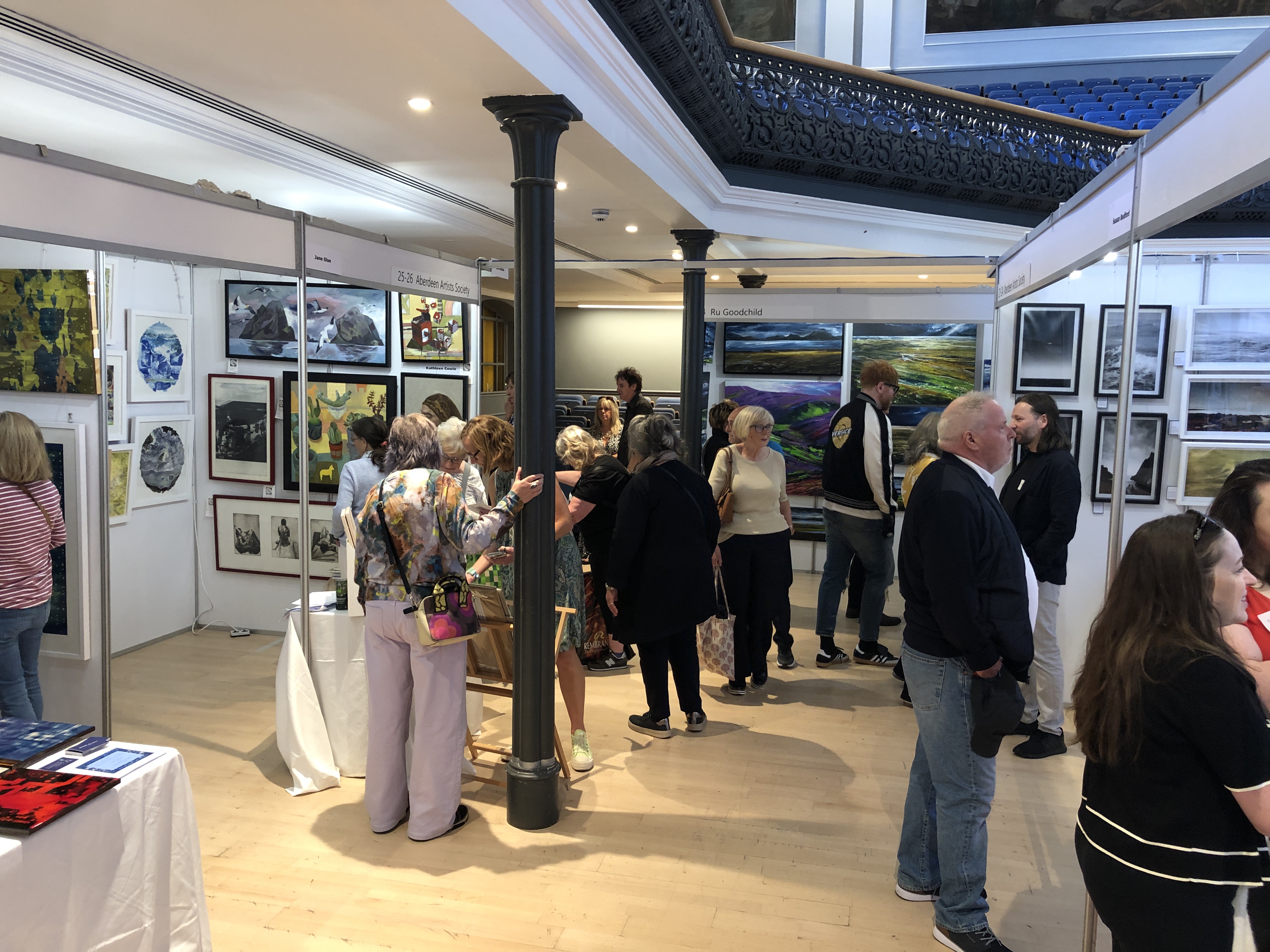
Being new to the area, on 11th August I joined the Aberdeen Artists Society (AAS). Several days later while looking for art fairs in Scotland to try to exhibit at, I discovered that there was an annual art fair in Aberdeen between 30th August and 1st September. However, the deadline for applications was in March(!), and all places were obviously taken. I was naturally disappointed that I was so late to the scene.
Since there was a block-booking by AAS for a number of the available stands at the fair, I thought I would just message them in the very remote chance that there was a cancellation. The following week, Sunday, I woke up to discover an email back from AAS admin that there had been a cancellation – and anyone interested in taking it should reply. I couldn’t believe my luck and responded immediately – and asked for further details. At this point in time, I didn’t know I would get it – but was excited to be at least in with a chance… Later in the day I learned I could have it – a 3-metre stand (@2.4m high) and snapped it up. I had less than two weeks to prepare what I was going take. I have some number-ones of limited-edition artworks – which I like to keep for myself – and so I set about making additional copies of them (with frames). And I researched and bought a portable LED light panel to illuminate my “Long-eared Owl (Art Puzzle) – (You Are What You Eat) – Stained Glass”. This worked really well at the exhibition – and help draw people to my stand (when it wasn’t completely blocked).
It was a very busy couple of weeks preparing for the exhibition, but I naturally wanted to make the most of this opportunity. I especially thought I should take all my hand-cut original thick solid oak art puzzles – that have never been seen in public before. These are large and heavy – too heavy for the provided hanging system – so I had to quickly source suitable ones of my own.
Friday afternoon of the 30th was the setting up time – with a private viewing scheduled between 6-9pm. I was a bit late in starting but managed to complete my stand just after 6pm – when the guests (and friends of exhibitors) starting to arrive…
My L-shaped 3m space (2m + 1m) was adjacent to a 2m stand jutting out at a right angle – which made the space ridiculously tight – effectively walled on three sides. It made putting up and taking down the artworks difficult because we were in each other’s way. This, coupled with my neighbour having a table at the mouth of our pitches – and who seemed to know everyone – and they all stopped for a nice long chat – meant that my pod was practically completely blocked a lot of the time…
I sold some pieces – including one to a former art curator (who said quietly to me “…this is the best work here…”) – so that was very nice.
The genuine deep fascination of some people, very close inspection (by those who could get through!), and the very kind words – like “…these are absolutely incredible…”, “…it’s really made my day to come out and see your work…”, “…this is the best stand…”, “…this is my favourite stand…” – was incredibly, and indelibly, nice to hear – and extremely encouraging. I felt my artwork brought a little joy and thought-provocation to some of the people…
It was also really nice to share the experience with my fellow exhibiting artists, and to share stories of our journeys, trials, and tribulations. For so long I have worked in complete isolation of other artists – and so it was especially good to get feedback from my peers…
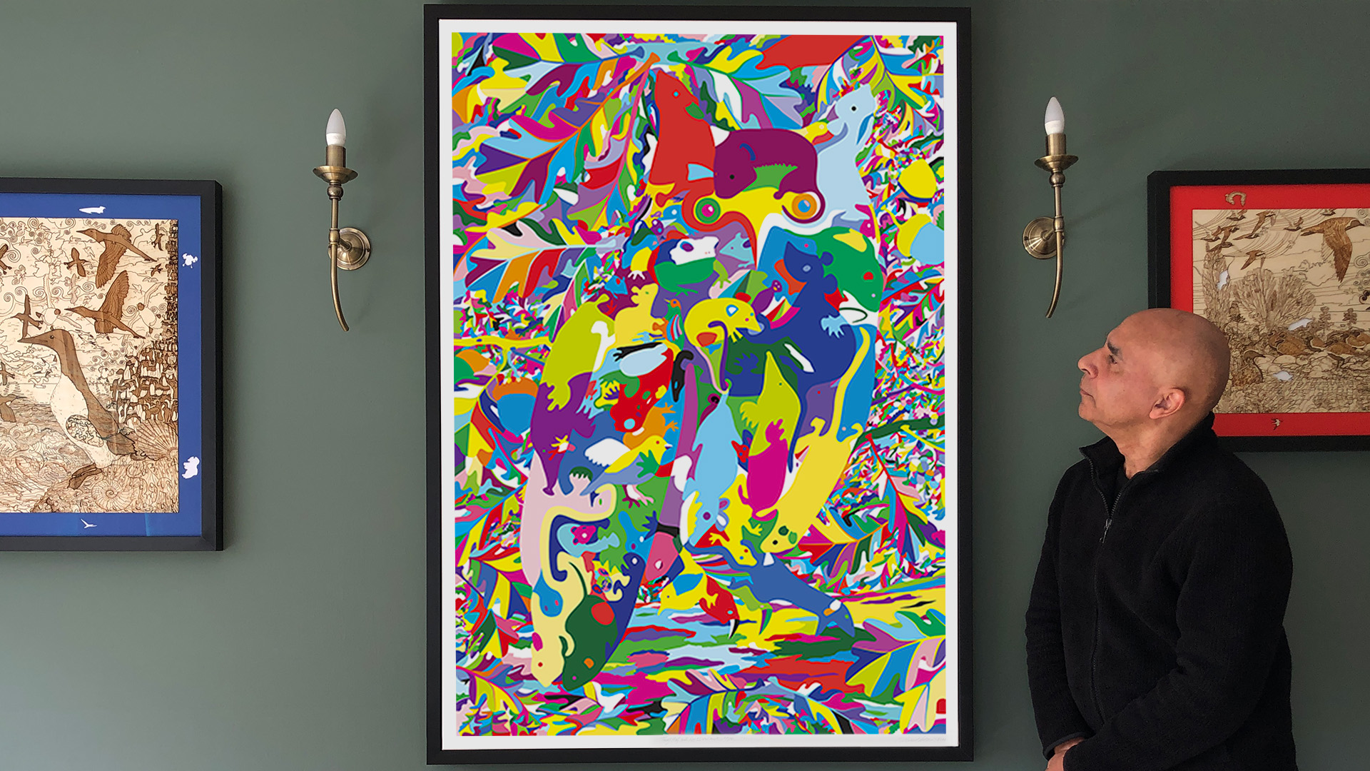
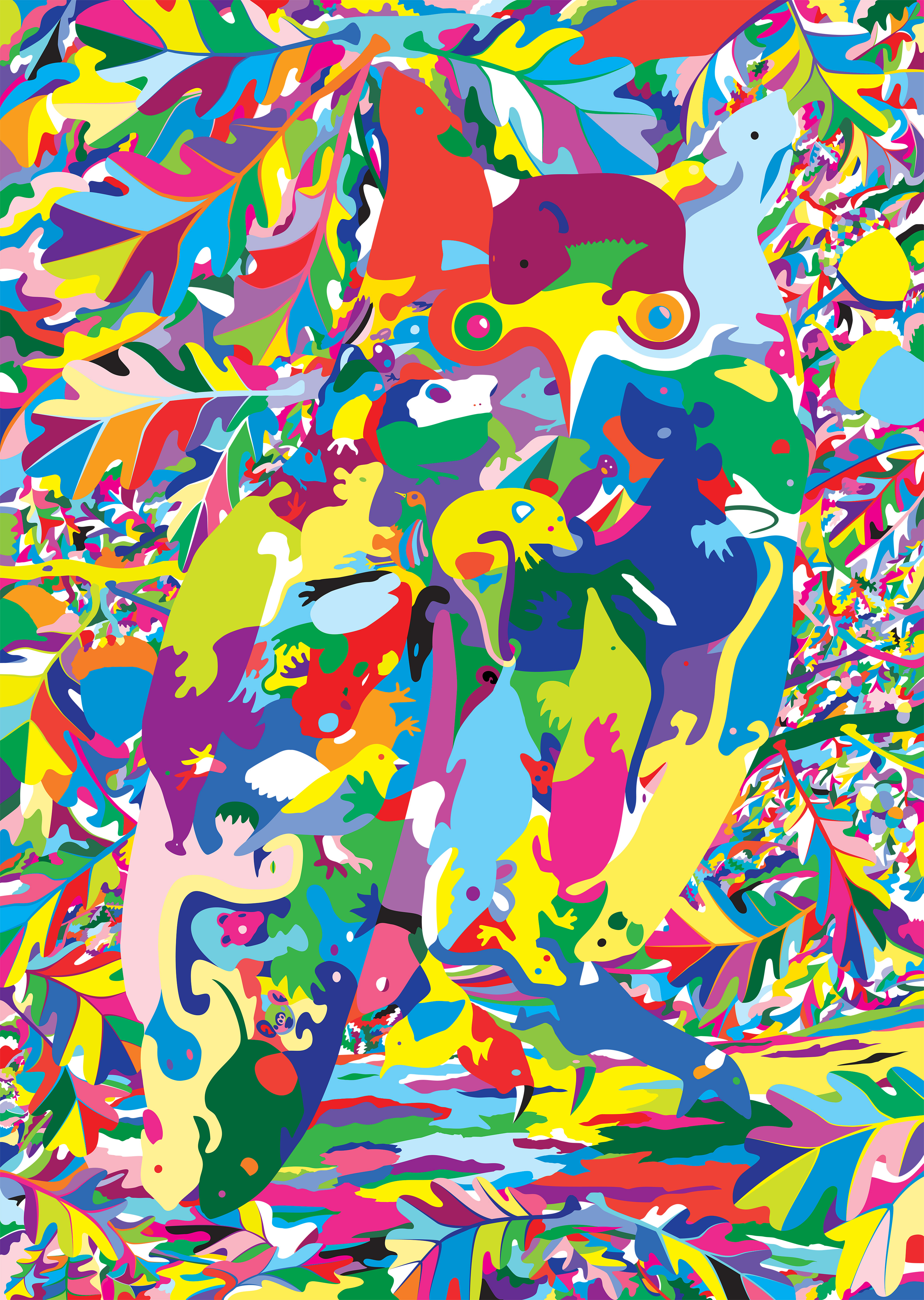
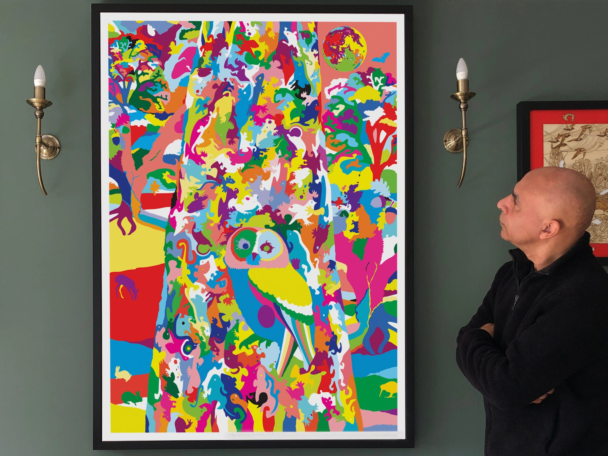
Title: “Long-eared Owl with Oak Foliage (floral map)” Artist: Michael Autumn Medium: Hand-drawing with digital gouache Giclée archival print on fine 100% cotton canvas (matt) Hahnemühle Art Canvas Smooth 370gsm + Hahnemühle UV protection matt varnish Size: 36″ (W) x 50.9″ (H), canvas stretcher 38″ (W) x 53″ (H) Edition: Limited Edition of 101 Authenticity: Hand-signed (front, bottom, far right on white canvas border) with graphite pencil (varnished over with same UV-protective matt varnish as whole) and titled (front, bottom, centre on white canvas border) Date: 04/2024
Just to give an idea of the size the artwork…
TL;DR
This artwork is an homage to visual perception – it’s about how we detect meaning from the millions of individually coloured photons entering our eyes – and how I, as an artist, can trick you into seeing what I want you to see.
Owls, like this one, are incredibly well camouflaged – not so much by their colouring, but by their habit of staying completely still, most often in a tree, during their time of rest and sleep (often during the day). So much so, that you could literally walk within feet of them and you probably wouldn’t even realise they are there. Likewise, in this artwork, you have to really look to see the owl…
And there is a reference to the idiom – “you are what you eat“…
Long-eared Owl with Oak Foliage (floral map) is the simple colouring-in (albeit very carefully selected and juxtaposed colours) of a flat line drawing I did previously of this art puzzle design (see the photo of that artwork below and this post: Long-eared Owl with Oak Foliage (Art Puzzle)).
Long-eared Owl with Oak Foliage (Art Puzzle)
I used this technique to regularly check for line breaks (where there shouldn’t be any), and to get a better view of the shapes of the individual pieces I was designing – amid a sprawling mesh of simple black thin lines on a white background. This got me to thinking about the difference between the dumb mechanical process of colouring a shape (of a flood fill) and true animal (human) understanding…
It may be quite common for artists to write about how they feel about their work, but I’ve personally never come across it. This is probably just my lack of reading (I’m not a big reader, I usually only read to learn something specific – which is quite often).
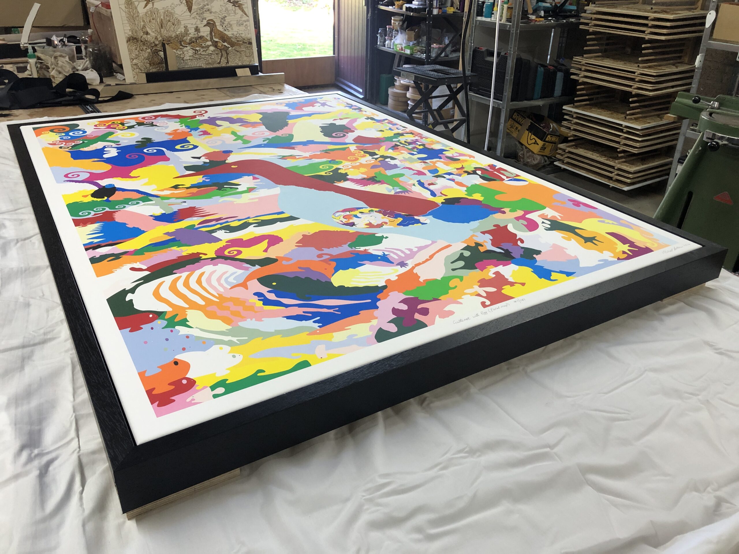
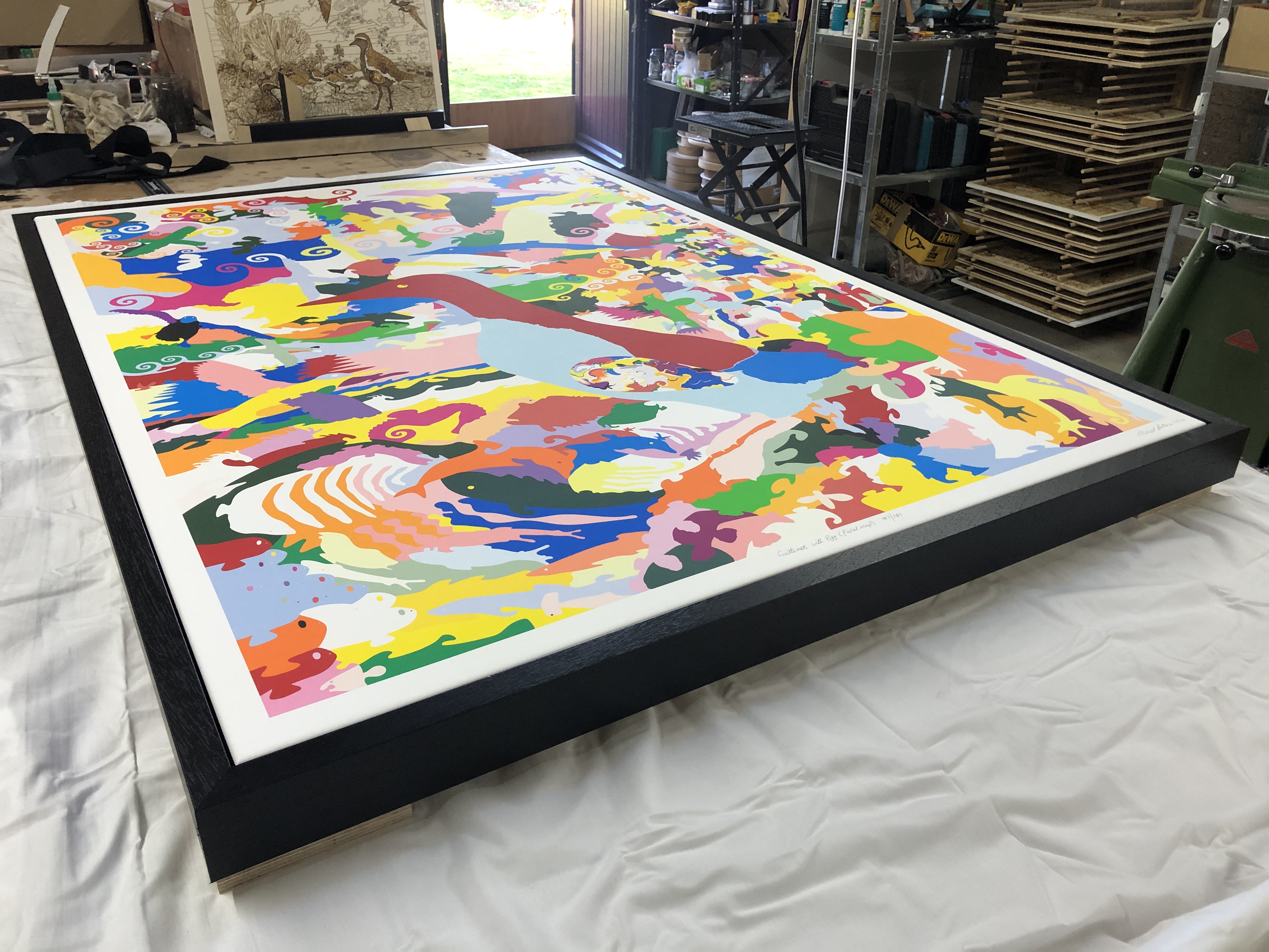
Yesterday I framed this large canvas :-
Guillemot with Egg (floral map)
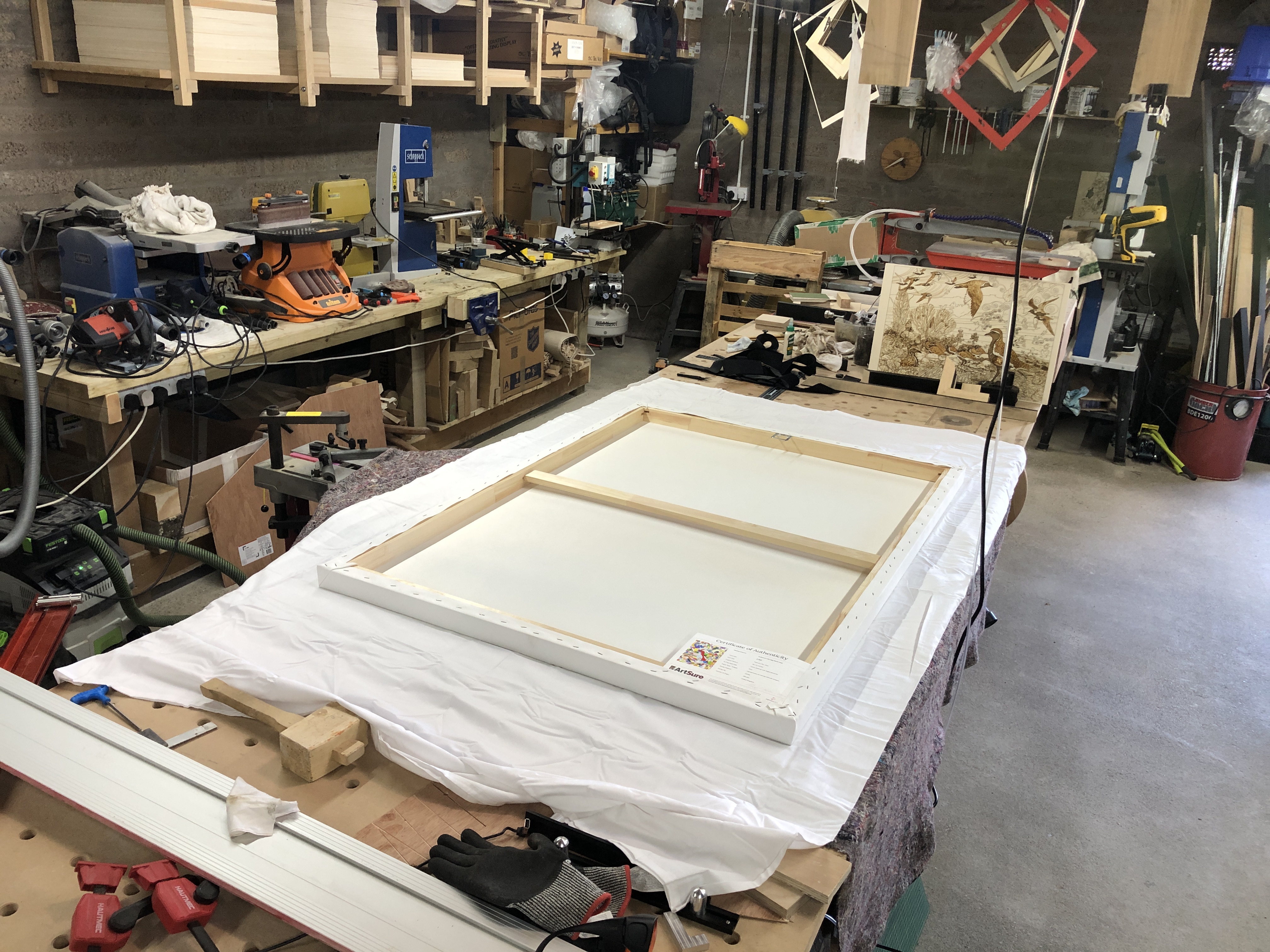
After working on the back fixings, I turned it over to see the finished work. In all candour, I thought it looked really fabulous. The heavy black tray (float) frame made the colours pop even more, and the whites to appear whiter. I was really moved and felt a great sense of achievement.
When I think back over the months I have spent on it, the weeks designing it, all the hundreds of hours drawing innumerable curves – that I have meticulously weaved and tweaked; all the colour choices and juxtapositioning… It feels it was definitely worth all the effort – and not inconsiderable cost. It was a truly joyous, uplifting, moment, and I felt very blessed and proud…
This just reinforces why I cannot part with original artwork – and so steer clear from doing non-reproducible art. Most of my artwork I do primarily for myself: mainly to show and express my gratitude and wonder of Nature. Yes, I love to share my feelings of what moves me – often to tears – which is why I have invested so much time and resources into reproducibility (editions as opposed to original art). It is a real privilege that I can produce copies of my artwork, like this one, to a standard that I am very happy with – and can share with many others (some of whom are fortunate enough to have the resources to own copies)… This is immensely satisfying.
If this work can give a fraction of the joy it gives me, to other people, then I am truly grateful and blessed…
Title: “Tawny Owl with Egg (floral map)” Artist: Michael Autumn Medium: Hand-drawing with digital gouache Giclée archival print on fine 100% cotton canvas (matt) Hahnemühle Art Canvas Smooth 370gsm + Hahnemühle UV protection matt varnish Size: 36″ (W) x 50.9″ (H), canvas stretcher 38″ (W) x 53″ (H) Edition: Limited Edition of 101 Authenticity: Hand-signed (front, bottom, far right on white canvas border) with graphite pencil (varnished over with same UV-protective matt varnish as whole) and titled (front, bottom, centre on white canvas border) Date: 03/2024
Just to give an idea of the size the artwork…
TL;DR
This artwork is an homage to visual perception – it’s about how we detect meaning from the millions of individually coloured photons entering our eyes – and how I, as an artist, can trick you into seeing what I want you to see.
Tawny Owl with Egg (floral map) is the simple colouring-in (albeit very carefully selected and juxtaposed colours) of a flat line drawing I did previously of this art puzzle design (see the photo of that artwork below and this post: Tawny Owl with Egg (Art Puzzle)).
Tawny Owl with Egg (Art Puzzle)
I used this technique to regularly check for line breaks (where there shouldn’t be any), and to get a better view of the shapes of the individual pieces I was designing – amid a sprawling mesh of simple black thin lines on a white background. This got me to thinking about the difference between the dumb mechanical process of colouring a shape (of a flood fill) and true animal (human) understanding…
It’s difficult sometimes to know what to include in an artist’s diary. I keep my diary to the absolute minimum – not only because I simply don’t have the time to jot down everything, but I have a high level of self-censorship. Some things are trivial, however, who knows what legacy I may leave (if any), and what are significant landmarks in an artists’ life that may be of historical and/or biographical interest…?
This is not a posting about any specific piece of work, I just want to put an entry in the diary of recent achievements that will probably be the beginnings of a fruitful seam of creativity for me – after having recently solved a series of technical challenges (wearing my IT (computer programming) hat) that literally enable some creative ideas that would otherwise not be realisable…
I’ve long been interested in depicting puzzling, ambiguous, dimorphous ideas in art – and have had many, and a growing number of, ideas mulling around in my head for several years – but with no satisfactory or acceptable way of representing them. So they have been on the backburner – waiting for solutions…
In parallel to this, for the last few years I’ve been exploring puzzles as a means artistic expression, and this has resulted in me spending hundreds of hours doing vector-based freehand drawings (using a graphics tablet). I have recently been doing some intricate image manipulations and transformations manually (with the creative software I use), and this gave me the idea of using these techniques for the aforementioned other art ideas. However, the problem is (was) that these techniques, if applied to the other ideas, would take prohibitively long. With my IT hat on, I wondered if there might be a way to program some, or all, of these laborious tasks…?
The great thing about computer programming is that once you solve a problem, it’s a trivial matter to scale it up. For example, if you get a computer program to draw a grid of rectangles – let’s say 5 by 7 – then it’s a trivial matter to get it to do any number of rectangles – e.g. 500 x 700, 5,000,000 x 7,000,000 – or any number you choose. Also, the repeatability of any solved task opens up enormous opportunities – including testing, simulations, daisy-chaining tasks, etc…
I’ve never mixed proper art with computer programming before. I have designed and developed an art program for others to create digital art, but I’ve never used computer programming to create, or help create, art. However, a few weeks ago I thought it could be a very worthwhile investment of my time to see if I could automate some tasks which would otherwise be too laborious to be conscionable…
So I looked at the following :-
Generate a vector puzzle of any size (these are freely available online)
Break a bitmap image into any vector puzzle
Make jigsaw puzzle tiles of any colour – particularly random colours from a given palette
Break a given percentage of a bitmap image into puzzle pieces. Set these pieces to a given colour or a random selection of colours from a given palette
Interleave the puzzle pieces of two (or more) images
Allow the masking (in or out) of any of the above
Allow the manual manipulation of any of the above – i.e. everything should be manually changeable
The handful of solutions (the above tasks are very different – and each require a different solution) I have recently come up with collectively give me what I would describe as a new visual grammar with which to express – or depict – a number of visual ideas – including all the ones I have been struggling with prior to this point… Watch this space…
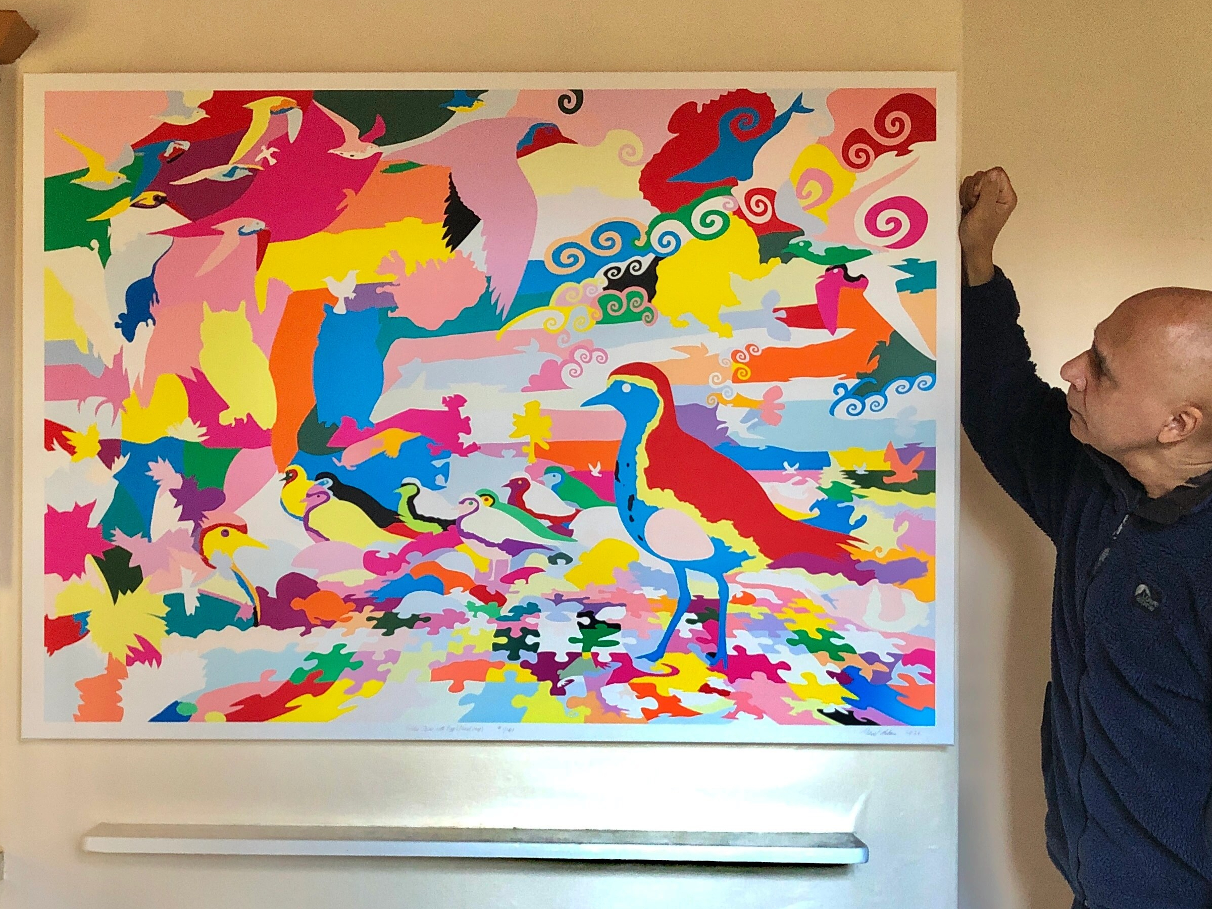
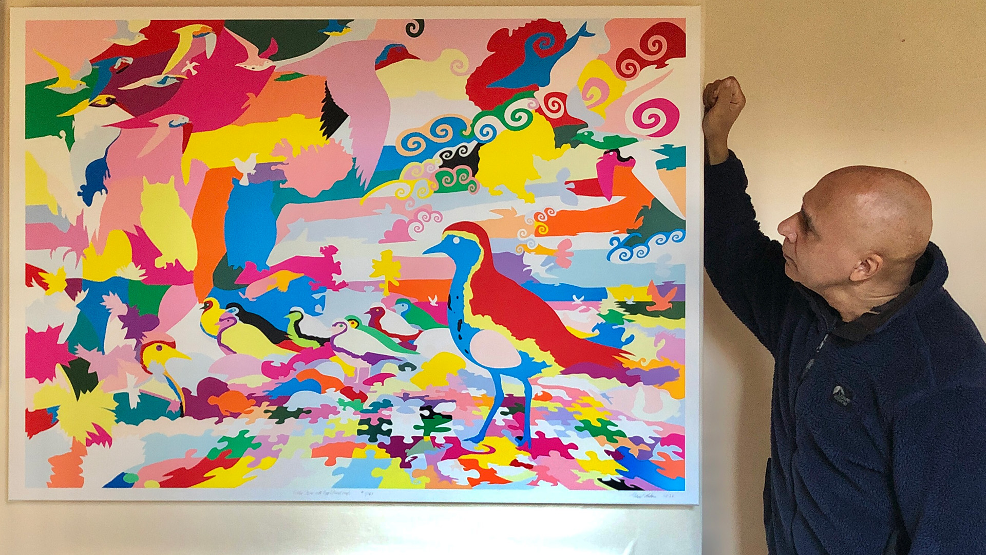
Title: “Golden Plover with Egg (floral map)” Artist: Michael Autumn Medium: Hand-drawing with digital gouache Giclée archival print on fine 100% cotton canvas (matt) Hahnemühle Art Canvas Smooth 370gsm + Hahnemühle UV protection matt varnish Size: 51″ (W) x 36″ (H), stretched canvas 38″ (W) x 53″ (H) Edition: Limited Edition of 101 Authenticity: Hand-signed (front, bottom, far right on white canvas border) with graphite pencil (varnished over with same UV-protective matt varnish as whole) and titled (front, bottom, centre on white canvas border) Date: 02/2024
Just to give an idea of the size the artwork…
TL:DR
This artwork is an homage to visual perception – it’s about how we detect meaning from the millions of individually coloured photons entering our eyes – and how I, as an artist, can trick you into seeing what I want you to see.
Golden Plover with Egg (floral map) is the simple colouring-in (albeit very carefully selected and juxtaposed colours) of a flat line drawing I did previously of this art puzzle design (see photo below and this post: Golden Plover with Egg (Art Puzzle)).
Golden Plover with Egg (Art Puzzle)
I used this technique to regularly check for line breaks (where there shouldn’t be any), and to get a better view of the shapes of the individual pieces I was designing – amid a sprawling mesh of simple black thin lines on a white background. This got me to thinking about the difference between the dumb mechanical process of colouring a shape (of a flood fill) and true animal (human) understanding…