Category: Creativity

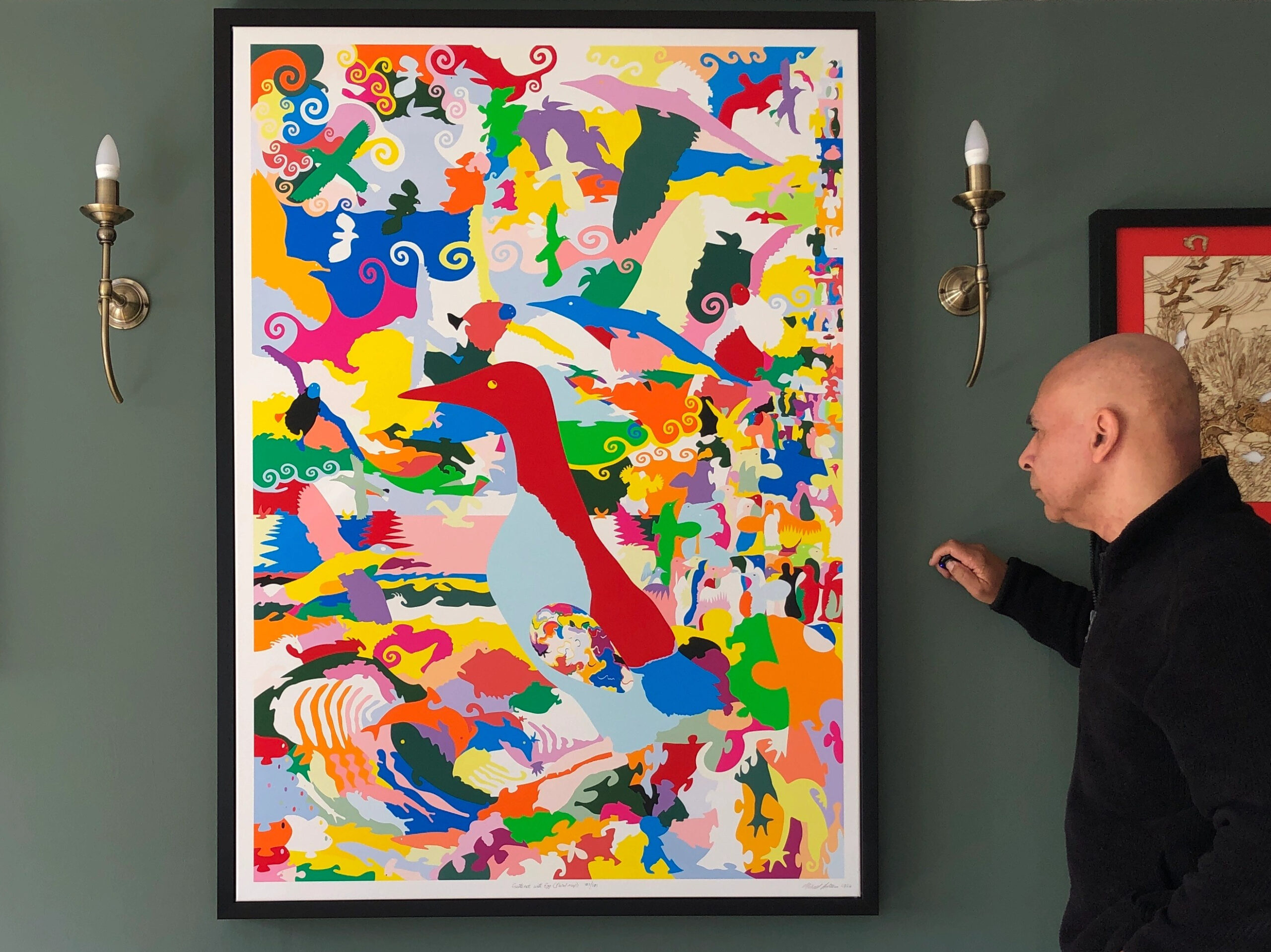
  • Guillemot with Egg (floral map)

    Guillemot with Egg (floral map)

    (Very low resolution for copyright reasons)

    Title: โ€œGuillemot with Egg (floral map)โ€
    Artist: Michael Autumn
    Medium: Hand-drawing with digital gouache
    Giclรฉe archival print on fine 100% cotton canvas (matt)
    Hahnemรผhle Art Canvas Smooth 370gsm + Hahnemรผhle UV protection matt varnish
    Size: 36″ (W) x 50.9″ (H), canvas stretcher 38″ (W) x 53″ (H)
    Edition: Limited Edition of 101
    Authenticity: Hand-signed (front, bottom, far right on white canvas border) with graphite pencil (varnished over with same UV-protective matt varnish as whole) and titled (front, bottom, centre on white canvas border)
    Date: 02/2024
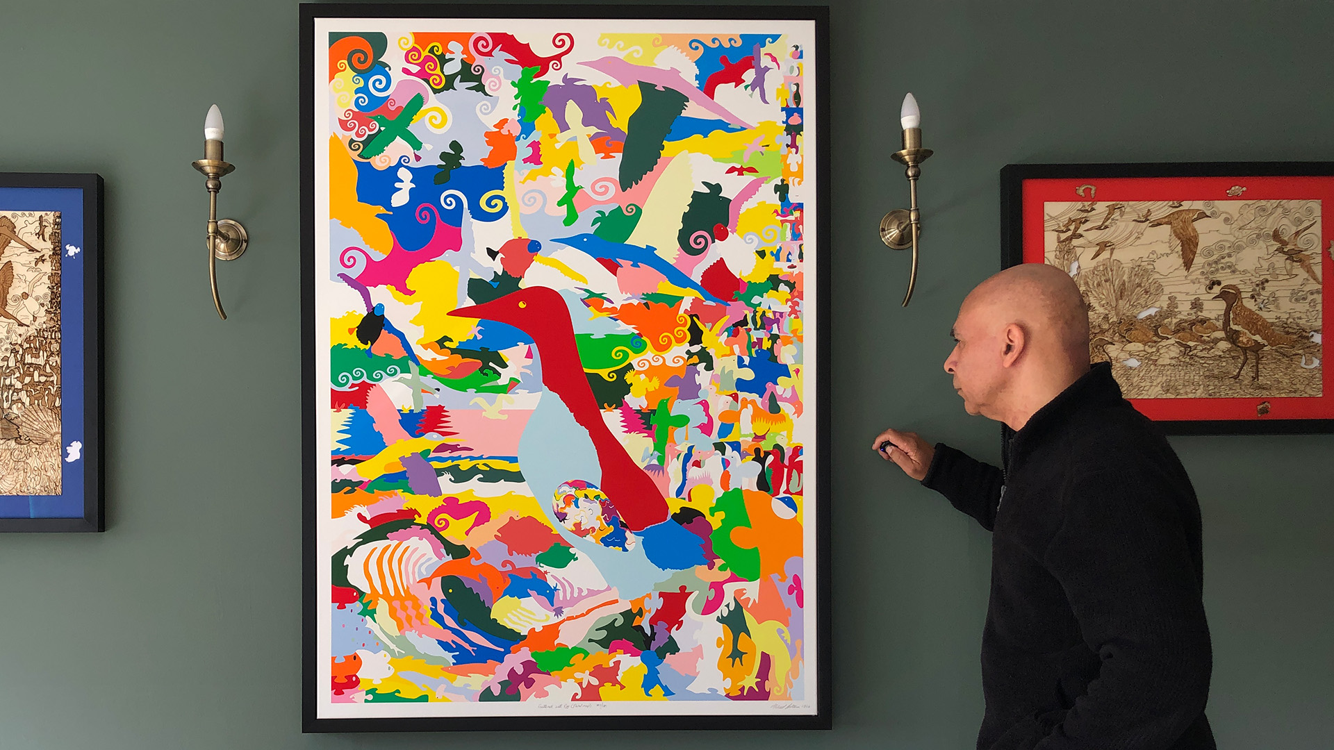
    Just to give an idea of the size the artwork…

    TL;DR

    This artwork is an homage to visual perception โ€“ itโ€™s about how we detect meaning from the millions of individually coloured photons entering our eyes โ€“ and how I, as an artist, can trick you into seeing what I want you to see.

    Guillemot with Egg (floral map) is the simple colouring-in (albeit very carefully selected and juxtaposed colours) of a flat line drawing I did previously of this art puzzle design (see photo of that artwork below and this post: Guillemot with Egg (Art Puzzle)).

    Guillemot with Egg (Art Puzzle)

    I used this technique to regularly check for line breaks (where there shouldnโ€™t be any), and to get a better view of the shapes of the individual pieces I was designing โ€“ amid a sprawling mesh of simple black thin lines on a white background. This got me to thinking about the difference between the dumb mechanical process of colouring a shape (of a flood fill) and true animal (human) understandingโ€ฆ


    The story behind this artwork is part intentional, part serendipity, and partly the indirect fruits of some non-trivial computer programming I did many, many, moons ago…

    I am immensely impressed, and deeply bewildered, by our ability to visually perceive our environment. As you might know, typical adult human beings have about six million cones in our eyes to effectively detect pixels of coloured light (photons) in daylight (rods are used in low-light/dark conditions). Each detected pixel of light is to all intents and purposes completely independent of each other โ€“ and the eyeโ€™s cones are simple colour detectors of light coming into the eye โ€“ not in themselves capable of making any sense of the totality of what the all the other cones are measuring โ€“ they simply pass what they individually detect to the brain (via the optic nerve). It takes one of the most impressive and complex machines in the universe โ€“ a brain โ€“ to interpret these patchworks of colour.

    The brain compares all the pixels together, detects edge boundaries, and uses its vast database of previously classified images (and parts thereof) to try to understand the current image. And by understanding the image I mean recognising the individual objects within it. Without the aid of a vast memory and very sophisticated pattern-recognition, reinforcement, and continuous learning โ€“ making sense of what we see would be impossible โ€“ and we simply wouldnโ€™t survive. Why? Because we wouldnโ€™t be able to find food and water, avoid danger, and move about pursuing our instinctive goals – build and maintain a shelter, avoid various dangers, find a mate, reproduce, etc… That’s not to say that the brain never gets things wrong. In fact, our brainโ€™s insatiable appetite to pattern-match and classify what it โ€œseesโ€ is so strong that it is sometimes fooled into โ€œseeingโ€ things which arenโ€™t thereโ€ฆ Anyone ever seen elephant-shaped clouds…?

    Since about 2021, I have been exploring the physical and metaphorical world of puzzles โ€“ particularly those in Nature: things that are camouflaged, paradoxical, ambiguous, double-entendre, things that are not what they seem. I have been expressing this through the medium of actual visual puzzles โ€“ jigsaw puzzles with a twist, and a completely different purpose โ€“ the purpose of expressing ideas rather than a challenging pastime. I call them art puzzles.

    I start by hand-drawing a full size completely imaginary, but plausible, nature design of a main bird in an appropriate landscape (which takes me a long time – by far the bulk of the total), and then I physically cut out the puzzle (usually in wood). While designing the artwork for these intricate puzzles โ€“ with an eye for structurally interlocking pieces (which are often heavily disguised) โ€“ I periodically check that the cut lines all work โ€“ i.e. that there are no gaps where there shouldnโ€™t be any, and all the pieces cut out cleanly (i.e. not stuck together anywhere).

    This checking is important because, while I cut the pieces by hand for the first three years (and could compensate for any imperfections in the drawings), I have an eye on getting them cut by a computer-controlled machine โ€“ waterjet, laser, or some other technology โ€“ so I have to make the drawings โ€œperfectโ€. As many of you will know, if you provide instructions to humans, you can get away with some imperfections and inaccuracies because an intelligent human being is likely to still achieve the correct result โ€“ compensating for your mistakes and imperfect measurements/instructions โ€“ because they can guess at your intentions. But most of you will also know that you canโ€™t get away with anything when a computerised mechanical machine does the work: it will do exactly what it is told โ€“ no more, no less โ€“ because it has no notion of what it is supposed to do.

    Zooming in on a complex detailed drawing and looking for gaps of where lines donโ€™t join where they should – is a very tedious, long-winded, task โ€“ and itโ€™s difficult to be certain youโ€™ve properly checked everywhere. So a while back I got the idea of flood-filling the areas to see if there are any leaks. For those of you not familiar with the term, flood-filling is an automated way of filling an area of colour – of any complexity – with a new colour. It is not filling the whole image with colour โ€“ that isnโ€™t much use. It fills/puts the new colour everywhere that is the same colour as the original point (pixel) colour โ€“ and here is the subtle bit โ€“ the colour has to be connected to the original point. To illustrate this, here is a sequence of pictures showing a small detail of my gap-finding process :-

    Detail of the drawing with no gaps

    Detail of the drawing with a small gap – can you see it…?

    Detail of the drawing with red arrow showing a small gap

    Detail of the drawing with flood fill going through the gap

    Detail of the drawing with flood fill confirming gap fixed

    Detail of the drawing with various flood fills showing good gap integrity


    So where does the computer programming part come in – that I mentioned in the introduction? Well, many, many, moons ago – when personal computers were just emerging, I started a career which involved creatively using IT to help people with special needs โ€“ recreation, communication, education, etc… One of the most rewarding projects I took on was to design an art program that would enable people who could reliably press one, two, or three buttons with any part of their body – to draw and paint on the computer – and print out their colourful creations. (I was an artist long before I got involved in computing, and so this was particularly interesting to me.) My main customer and inspiration for the program at the time was a very talented mouth-artist, called Mary, whom I was very ambitious for. I wanted to provide for every feature she asked for – in addition to those I thought should be there. One day while doing quite a complex design with the program, Mary asked if it was possible to change the colour of part of her picture. It wasnโ€™t at the time, but I set about designing the feature. To my knowledge it hadnโ€™t been done before, and it turned out to be quite challenging (it took me about a month to crack it). These days it’s common in art programs, and is something most people take for granted. But solving the problem from scratch was very satisfying and gave me insights to its many possibilities (including solving any 2D line-drawn maze of any complexity)โ€ฆ

    The serendipitous aspect of this artwork lies in when I realised that the various flood fill tests I was doing during the course of designing the original art puzzle – were actually quite appealing in their own right. While I was only using a few simple random colours for my tests, I thought that with a harmoniously selected floral colour pallet and careful colour juxtapositions, I could make a really attractive design… I parked the idea at the time because I was engrossed with my original intention, but I did come back to it this year. It took quite a long time to arrive at the final design, and printing the colours correctly (i.e. as I envisioned and designed them on my computer) was really tricky (as usual!). Printed on the best available printer with the most archival inks. Best UV protection matt varnish.

    I really like it, and itโ€™s like nothing Iโ€™ve seen beforeโ€ฆ

  • Oak Tree (Art Puzzle)

    Oak Tree (Art Puzzle)

    Title: โ€œOak Tree (Art Puzzle)โ€
    Medium: Hand-drawn, hand-cut and engraved solid European Oak art puzzle (Limited Edition of 7).
    Size: 60cm (H) x 61cm (W) x 4.4cm (depth) @ 11.8kg weight
    Date: 2022

    It started out as a clock!

    I canโ€™t remember why, but this started out as a design for a clock! But after a short while I decided I should make a clock jigsaw puzzle and an oak tree jigsaw puzzle โ€“ as completely separate works.

    My Favourite Tree

    The oak (English Oak – Quercus robur) – is probably my favourite English tree, and Iโ€™ve wanted for many years to pay homage to them. Iโ€™ve travelled quite a bit over the UK, and often it has been to get somewhere lovely by sunrise โ€“ or close to it โ€“ and often Iโ€™ve driven home at sundown โ€“ because I donโ€™t particularly like driving in the dark (for the simple reason I canโ€™t see anything). So I have seen a lot of sun rises and sunsets (sometimes both in the same day) โ€“ and the visions that stand out most in my memory are oak trees with the sun rising or setting behind them. Many an oak I have seen with blood red skies, blazing yellow and orange skies, gloomy slate skies, fresh cold blue skies, stiflingly hot blue skies.

    A great irony of the massive plunder we have done of the natural oak forests in the UK is that the very few trees that remain really stand out alone in the landscape. Often you will see a solitary great oak forming part of a hedge, or standing proud in the middle of a field. And so we can probably see and appreciate them much better now than if we were to go back a thousand years or more โ€“ when the country was blanketed in them โ€“ and you literally couldnโ€™t see the tree for the forests.

    I particularly like to see oak trees in winter โ€“ when you can see their gnarly cauliflower-shaped fractal trunks, branches, and twigs โ€“ and the great silhouettes formed by the trees and the ubiquitous chocking parasitic ivy.

    How to capture the essence of an Oak Tree?

    A 2D photograph doesnโ€™t do an oak tree justice because there is so much to them. But as a starting point, what better way to depict an oak tree than by carving an oak tree from a big chunk oakโ€ฆ?

    How to capture an oak tree in all of its many different guises? Among other things, I wanted to try to depict their status as a keystone species. So many species of mammals (like squirrels, mice, bats), insects (like moths, butterflies (and their caterpillars), and flies), most woodland birds (like owls, tree creepers, nuthatches, tits, finches, warblers, pigeons, doves) – depend on the oak as a place to live. Birds and bats live, rest, and/or nest in the branches, holes bored into the wood, or simply cracks in the bark. Insects shelter on, and in, the bark and leaves (often highly camouflaged). Many parasitic plants like ivy and mosses live on it, as do many species of lichens and fungi.

    Many species depend on oak trees directly or indirectly for food: fungi have a symbiotic relationship with them, bees and wasps pollenate its flowers in spring, insects eat its leaves, bark, and wood. Moths prey on its flies, bats prey on its moths.

    Birds eat the oak treeโ€™s caterpillars (of the butterflies and moths) โ€“ indeed many, like tits, specifically time their breeding to coincide with the huge glut of the caterpillars in spring โ€“ and most warblers in the UK travel all the way from Africa in early spring specifically to do this. Jays, squirrels, and some wasps and bees feed on the acorns, but it is the Jays and squirrels that actually hugely benefit the oak tree by spreading its acorns (seeds) far from where they fall. Without these, the oak tree would depend on the very poor and unreliable mechanical dispersal of acorns rolling downhill or being washed by rain water away from its canopy – in order to spread far and away, and stand a good chance of survival (often there are no plants on the ground under an oak treeโ€™s canopy because of its very dense leaf cover and the competition for nutrients โ€“ so this is a very hostile place for the oak treeโ€™s own seedlings to grow).

    The oak tree is a keystone species even when it is dead (or killed). Fungi, lichen, mosses, and insects will eat and/or digest them, many insects will lay their eggs in them (which in turn will eat the dead wood), and homo sapiens have built navies, buildings, used them as firewood and in the smelting of metal ores and in metals for thousands of years.

    So in a very small way I have tried to capture some of this ecological complexity…

    Fractals

    I also wanted to capture something about the oak treeโ€™s fractal appearance. Small branches resemble a whole tree, and so do large branches. If they are pollarded, what look like whole trees grow out of their stump.

    Seasonality

    I also wanted to capture something about the oakโ€™s seasonal differences โ€“ specifically that they have two distinct personalities: one with leaves and one without leaves. Most of the leaf clumps (summer) in the work can be removed โ€“ leaving exposed branches (winter).

    Oakโ€™s Fruit

    I wanted to capture something about the fruit of the tree โ€“ the humble acorn โ€“ and how that tiny thing can grow into a monster of a plant โ€“ with the chance of living five hundred years or more โ€“ and itโ€™s dead body โ€“ timber โ€“ in the right conditions capable of surviving a thousand years or more.

    Why a Jigsaw Puzzle?

    A jigsaw puzzle seemed a very apt way to represent or capture some the complexity and interconnectedness of the oak tree – which is very interesting because this is proving to be a very fruitful visual communication medium phase I am going through at the moment (I have worked in many art mediums)…

    A jigsaw puzzle is, among other things, a metaphor for my appreication of the wonder of Nature and its mysteries. It is my (very feeble) 2D representation of the 4D (3D + time = 4D) complexties and variaties of some of the huge number of spieces’ interconnectedness – where jigsaw pieces and carved lines are symbolic of some of Nature’s species, camouflage, and its mixed uses.

    Naturally, with this jigsaw puzzle being made of quite chunky oak, the hard, heavy, wood directly communicates oakness to the viewer. So in some unique, and perhaps mysterious, way, the material and the original whole subject – the oak tree – express each other…

    Texture

    Finally I wanted to capture the texture of the tree โ€“ particularly its very rough bark. Iโ€™ve tried to do this by the tactile nature of the puzzle pieces and the engraving on the work.

    “Limited Edition” of 7

    The phrase limited edition in this case is a bit of a misnomer. These are all individually handmade by me from my original design. I really wish there was, but there is no mechanical or chemical process I know of by which these can be reproduced – like screen printing, lithographs, card puzzles (using a die and jigsaw press), etc.

  • Artist Anxiety

    Artist Anxiety

    There are many different types of artist and many types of journeys in creating a work of art. Much art in the last century is what I call utter rubbish – slipshod, slapdash – made within minutes to a few hours or a day or two. And it shows. For example Pollockโ€™s drip โ€œpaintingsโ€, or Hirstโ€™s โ€œspinโ€ โ€œpaintingsโ€. Most of it is utter contemptible rubbish in my humble opinion. Even many of the Impressionistโ€™s work was done in a day – often outside with a portable easel and done in a single sitting (however, purely aesthetically, I do like a lot of work from that period from that art movement).

    Iโ€™m certainly not saying that the more time and effort spent on an art work the better it will be – and vice se versa. I’m saying that the more effort an artist puts into their work the more I will respect it and the more I will try to understand and appreciate it – and the better quality it is likely to be. This seems obvious to me…?

    Consider a book of a handful of words compared to one of 100,000 words… The latter usually is expressing much more than the former. But a 100,000-word book is not necessarily saying more that a 10,000-word book. The former could be very waffly and poorly structured. Whatever one is trying to express there is usually some minimum or ideal way of expressing it (for the target audience)… My general point is that something expressed very briefly or quickly is usually not expressing very much – compared to something where a lot more time and effort has gone into it…

    Iโ€™ve been working on a piece called โ€œGolden Plover with Eggโ€ (Jigsaw puzzle) for over ten weeks now, and Iโ€™m coming to the final stages – where things are finally starting to take shape – and, at last, Iโ€™m beginning to feel good about it. Often through the long arduous hours – many of which have been physically very demanding – Iโ€™ve been deeply anxious. Why am I doing this? Why is it taking so long? Am I wasting my time? Will anyone appreciate it?

    Not that I am doing it for money (more on this later), but will the work be worth anything? Will it have a value that is reflective of the effort I have put into it ? Iโ€™ve worked in I.T. for many years where I was paid quite a high hourly rate. What I would earn in three months (because I have about another two weeks work to go on my current piece) was a not inconsiderable sum. What might my hourly rate be for this piece…? (Not that I will sell it, but I will hopefully sell other editions of it…)

    The peculiar thing about art is that some art created in a slapdash fashion sells for thousands, if not tens – or even hundreds – of thousands, of pounds (ยฃ) – making the hourly rate absolutely ridiculous. Picasso made about 46,000 works of art in his lifetime – many of which were created well within a day. So his hourly rate was in excess of ยฃ100,000!

    Some art takes hundreds of hours – and sells for a pittance – making the paid hourly rate utterly pitiful – and puts a contemptible value on the artistโ€™s time/life. Clearly there is no relationship between an art workโ€™s value and the amount of time and effort that went into making it. Yet, for most other goods in society, the more time taken to make them the more expensive they are. Itโ€™s a very strange world we live in…?

    Why do I do art – I keep asking myself?! I donโ€™t have to. Unlike some artists, there are plenty of other things I could do – and have done – for a living. The simple answer is: I donโ€™t really know! I just know that I like making things and commenting on things that interest me.

    Yesterday, while working on โ€œGolden Plover with Eggโ€, I was thinking why I do art – and this piece in particular? Itโ€™s so much work, effort, and cost (the raw materials and special tools are expensive)?! Mahlerโ€™s beautiful Symphony No. 4 was playing in the background, and I thought of the effort he must have put into composing that sublime masterpiece – the trials and revisions that it must have gone through. I wonder what emotions and motivation drove him to do it, the frustrations he experienced, the ups and downs he went through, the anxiety he felt of what others might think of it…? He was a fellow artist, so I thought I must share some of his emotions and anxieties…?

    Malher didnโ€™t have to compose that symphony. No one asked him to do it (as far as I know). Possibly something inspired him, but, like many great works or inventions, inspiration is one thing, implementing it is quite another… Something in his deep psyche drove him to do it. No one told him how long it must take. He just set about doing it, and didnโ€™t stop until he was satisfied with it. And all through the journey he will have applied his skills as a musician, and his heart and sense of aesthetics to evaluate and refine it. He would have been striving for a level of quality acceptable to him – and only him.

    There are no rights and wrongs with art – so there are no objective ways to judge it, or to know if the objective has been achieved. Well thatโ€™s not strictly true. In each form of art there are usually a few ground rules. Like music for Mahler, I guess he ruled out discordances, wanted to use (or felt he should use) certain instruments, and he possibly wanted four movements – because that was the standard Western classic symphonic tradition he was raised in?

    He had to figure out how to make the sounds he wanted – or at least make sure it was practically possible – i.e. playable and audible. So finding a practical solution to each and every note, phrase, passage – were upmost in his mind. He possibly followed other music rules that we donโ€™t know about (because he didnโ€™t write them down), and those Iโ€™m not competent to know or understand.

    However, the vast majority of the huge number of decisions that go into the artistic creative process are entirely subjective. Do I like everything? Do all the pieces โ€œgoโ€ together? Do they โ€œgelโ€ together and create some form of harmony? If not, what can I change so that they do? Is it good enough? How can I improve it? What am I trying to say or communicate with this? Is what I want to communicate interesting and/or important? Have I achieved my goal/s? Is it finished? (I certainly donโ€™t believe all, or even most, artists think like this – but the best ones do…)

    I think Edisonโ€™s phrase: โ€œGenius is 1% inspiration and 99% perspirationโ€ is a gross understatement. I think itโ€™s much more like 0.0001% inspiration – or even less – and the rest perspiration!

    Back to my thoughts yesterday and Mahlerโ€™s Symphony No 4. While listening to all four movements, I thought how each was utterly sublime, perfect, and complete on their own – yet Mahler created a unified whole with them all. A staggering and wonderful achievement that enhances and enriches anyone who listens to it. It occurred to me that possibly only artists fully appreciate other artists – because they will have some insight into, or empathy for, the effort and emotion that has gone into the creative process…

    I donโ€™t know what drives artists to create unnecessary, uncalled for, unusable, works of art, but listening to Mahlerโ€™s Symphony No 4 I thought: โ€œthank god they doโ€…

    I think back to my last piece – โ€œGuillemot with Eggโ€ (http://michaelautumn.wordpress.com/2020/03/01/guillemot-with-egg-jigsaw-puzzle/) – which took a similar amount of time and effort as my current piece – and I forget all the effort, trials and tribulations that went into designing and making it. It may seem strange, but I love to look it, and Iโ€™m just so glad I did it! Itโ€™s such a huge sense of achievement – of fulfilling something that was such a tall order. If it was easy many people would do it – and it wouldn’t be such a sense of achievement…?

    Itโ€™s very nice that other people seem to like it, but thatโ€™s not why I did it. And they will have no idea of the amount of work, sacrifice, and emotion that went into it. But hopefully it communicates something to them – about the ideas I was trying to express – that no other form of expression could achieve…

    But why, oh why…? And does anybody apart from me really care…?

  • Isle of Lewis Wall Chessboard

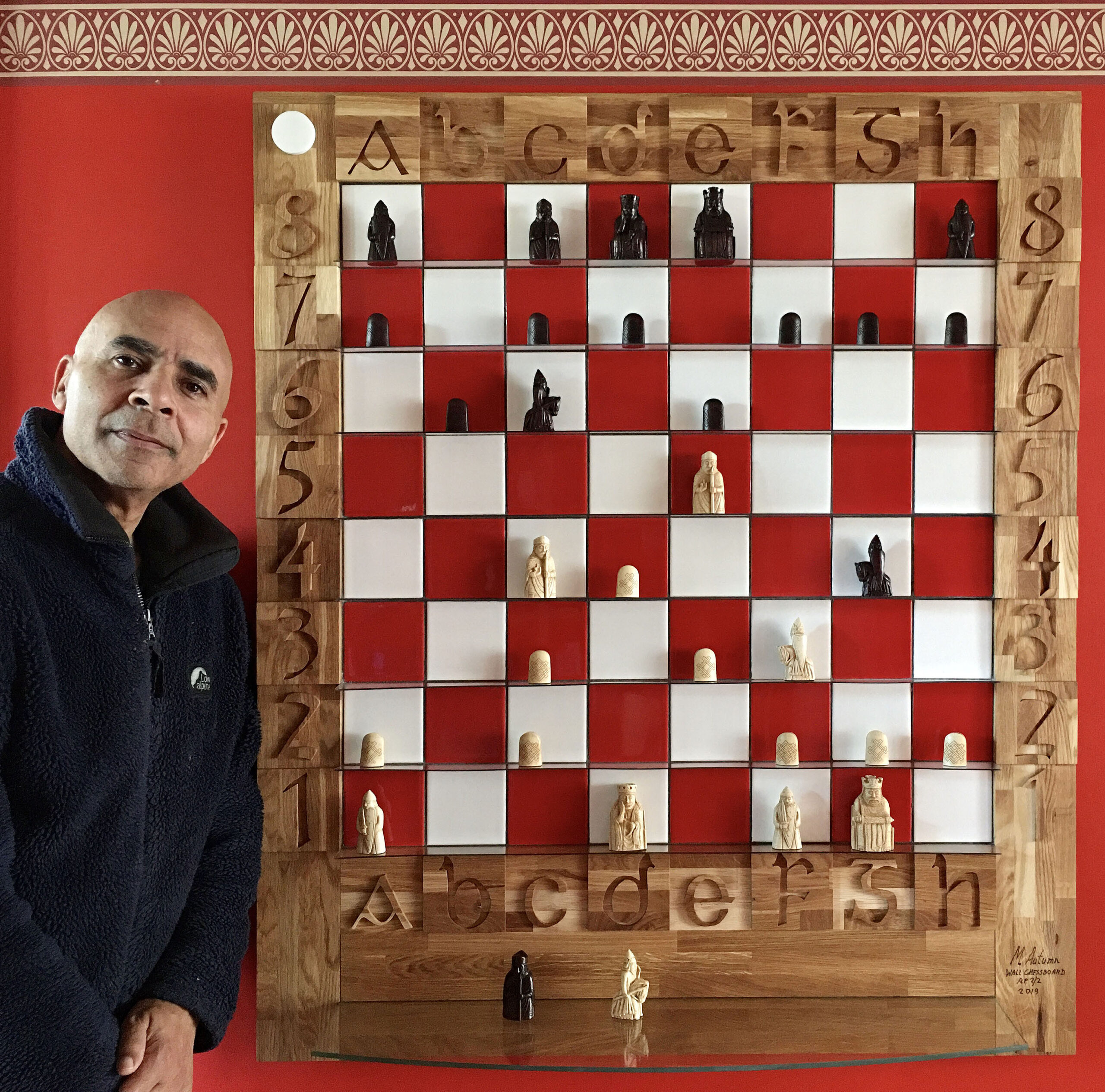
    Isle of Lewis Wall Chessboard

    Wonderful Isle of Lewis Chessmen

    I’m quite keen on chess, but I’m no expert by any means. Quite randomly I was looking into the history of chess (I often look up stuff just out of curiosity) and stumbled on the beautiful Isle of Lewis Chessmen.

    Isle of Lewis Chessmen
    Attribution: National Museums Scotland

    I was intrigued by the pieces and thought they looked wonderful, intriguing, and tactile. They conjure up a real mediaeval battle – quite unlike any other chess set I’ve seen, and the detail on them is very impressive – especially considering they’re 12th century – 800 years old – and carved out of walrus ivory! (Ethically I’m not impressed with the material but I am impressed with the craftsmanship.)

    File:Lewis Chessman, British Museum.jpg

    I love to have beautiful things in my house, and if they’re functional that’s even better – so I set about seeing how expensive a set would be. I was pleasantly surprised to discover that a full-sized resin set costs under ยฃ100 (2018 price). There were more expensive sets but they were out of my budget at the time (and didn’t look much better). The set came with a rather disappointing, unbefitting, cardboard chessboard, but I thought I could get (or make) a better one later…

    As chess pieces go they were quite big – about 3ยฝ” (9cm) high – and reassuringly heavy (the heaviest piece, the king, was 98g – a little less than the official replica copies from the original National Museum of Scotland’s set @ 126g). The pieces were very nice but there was a plasticky look and feel to them. Nevertheless, I liked them and played a few games on the board that they came with.

    Why choose a wall-mounted chess board?

    The board that came with my chess set was quite big (about 19″ (47cm) – with the squares about 2″).ย Devoting a table to a chess match for several days is a bit of a problem in most households, and obviously there is a risk of pieces being accidentally knocked over – with the serious additional problem of not knowing where the pieces were before. An intense chess battle of several days could be obliterated by someone simply bumping into the table – and so I started to think of alternative ideas…

    I considered a wall-mounted chessboard – because this would be out of the way, would take up no floor or table space, and in theory would be far less prone to accidents. How often do people bump into wall-mounted pictures…?

    I’d never seen a real wall-mounted chessboard before – only pictures – and started looking online to see what was available. Obviously it would have to be quite big because each square would have to be big enough for the tallest of the Isle of Lewis Chessmen pieces – the King (at nearly 3 ยฝ”) – so about 4″ (10cm) squares are required…

    I looked high and low but couldn’t fine a nice large enough wall-mounted chessboard. The main thing I disliked about most of the chessboards I found was that the squares weren’t square – they were rectangularย – taller than they were wide! I thought this was very strange indeed and really didn’t like the look of them – they grated with my sense of aesthetics! So I parked the idea and thought of making my own some day…

    Thoughts about making my own wall chessboard

    I wanted to buy a nice wall-mounted chessboard but couldn’t find one I liked. I have to really like something for it to get room in my house…! I didn’t want to design and make my own – that would take a lot of time and money! (I make lots of things and I know that the first time you make anything it takes a lot more time and effort than expected because you usually have to buy and/or make tools and templates to help you make the thing with – as well as research and purchase all the materials – and possibly learn new techniques.)

    Months passed. I had some ideas about buying pre-cut square pieces of two different types of wood (in contrasting light and dark shades) – but this didn’t particularly inspire me. Also I didn’t think the chess pieces would stand out very clearly because their colour is quite woody… And I couldn’t think how I could do the shelves – I just felt that they should be transparent/clear…

    I decide to try to make a beautiful wall-mounted chessboard

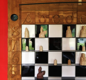
    I thought over a period of several weeks about the squares – I felt these were crux of the problem – and the cornerstone of the design. Out of thin air it came to me: ceramic tiles! Black and white square ceramic tiles! It was so obvious! They are naturally square and their colour and texture wonderfully contrasts with the chess pieces. Naturally I had technical challenges: what to mount the tiles on, how to make shelves (or compartments), letters and numbers around the edge, etc. Nevertheless, I felt the urge and inspiration to make a beautiful wall-mounted chessboard – and I had a very inspiring starting point…

    I saw symmetry, maths, patterns in the chessboard, and I wanted to incorporate twelfth/thirteenth-century ideas into it – as if the board was designed when the Lewis Chessmen were made…

    This is my first attempt :-

    First attempt
    First attempt at ceramic tile wall-mounted chessboard

    So far so good. It’s nice, functional, but it’s just a chessboard… While there is nothing more that can be done to the squares themselves, somehow it needs to be made special/beautiful…

    I feel it should have letters and numbers around the border (A-H & 1-8) – and here I can try to add some nice design… I thought about typefaces, materials, and size/scale around the edge of the board – but also about the structural strength of it – because the board is already quite heavy (about 30kg) – being tiled on some very heavy deep plywood (so it won’t warp) – and the border will be the only practical way of lifting it…

    So, while there was a serious practical/structural challenge, thinking about the aesthetics preoccupied me for a long time. I plumped for a solid oak boarder – exactly the width of a chess square – for it’s strength and beauty – with raised letters and numbers made of the same material. The oak I chose is from sustainable sources (as is the deep plywood base) and has (for me at least) a lovely block grain structure that adds a wide variety of tones, and contrasts beautifully with the typeface.ย 

    Here is the finished first design :-

    Solid oak font border - detail
    Solid oak carved numbers & letters 12th/13th century font border

    Also I had the idea of adding a large-ish toughened glass shelf for putting taken pieces on.

    3rd Draft
    3rd Draft with shelf for putting taken pieces on.

    It’s not perfect but I’m very happy with this design. It’s total weight is about 50kg and so it needed a very strong bracket to mount it on the wall!

    Typeface Tribute

    I chose a font which I believe may have been in use in 12th – 13th century Scotland – when my imaginary chessboard was designed.

    IMG_8036_Font_ab_1

    IMG_8037_font_34

    It’s not until you cut, carve, and smooth every curve of all the letters and numbers – and orientate, glue, and oil all the facing sides – that you appreciate all the work and aesthetics that goes into designing a typeface. And to think they had this skill and artistry all those years ago beggars belief…

    We will probably never know who designed this typeface, but whomsoever it was, they have my deepest respect and thanks. This typeface is at the core of my chessboard design. I’ve added a tiny personal touch by literally adding a dimension – to give it depth (and existence…). This accentuates the typeface’s delightful sensual shapes and curves – and changes with light arriving from different directions. In some very real sense the board – with the typeface being at it’s core – takes on many different forms depending on the light…

    It’s curious to think that my implementation of the typeface doesn’t really exist! It exists only in the shadows from directional light – and is helped by the subtle contrast between the oak grain pattern of the letter and number cut-outs – and the background timber. My alphanumerics primarily owe their visibility to the shadows they cast…

    Whose turn is it?!

    With a wall-mounted chessboard games can readily take as long as is required because there is no pressure on space. With this in mind I started to think how best to show who’s turn it is? Surprisingly this took a couple of months to solve (off and on – not solidly!) – during which I thought of many different ideas: pointers, sliders, etc. But I wanted something simple, beautiful, “mathematical”, and easy to make – and something perhaps befitting of the 12/13th century. In the end I came up with the simple idea of a black and white disc (with black on one side and white on the other) – and a tight-cut hole to display and hold it – tight enough for it to stay in by itself – and can be easily taken out and turned around to indicate whose turn it is (see below).

    So here is the final signed Artist Proof (1 of 2) black and white version :-

    AP-1of2-4th-draft-avec-moi-IMG_7822.JPG

    Might others like to have one of these Chessboards?

    It was never my intention to make a chessboard – let alone for other people. But why not, I thought…? Many people who have seen it have said how much they like it. I make art for other people. Is my chessboard art…? Does art have to be completely non-functional…? I thought of putting the whole set in clear resin – so that the pieces couldn’t be moved – and call it: “This is not a Chess set” (or chessboard?). Perversely that probably would be acceptable as art – but is a functional chessboard art…?

    Duchamp said if an artist calls something art then it is art – hence his urinal – called “Fountain” (1917) – a completely un-made-by-an-artist artefact. Whether you agree with him or not is an entirely different matter…! I think of myself as an artist so I can call my chessboard “art”… I suppose that if an artist designs and hand-makes something – as opposed to a factory or sweatshop making it – then that qualifies as art…? But that is not to say that everything an artist makes is art…

    This chessboard for me is an object of beauty and I have put as much thought, time, and effort into designing and making this as I have put into most of my other (unequivocal) art works. But it doesn’t really matter to me if they are considered art or not, I have decided to share them… At the very least it is a chessboard designed and made by an artist…

    And I will submit it to next years’ Royal Academy Summer Exhibition to see what my peers think of it…

    Upgrade of the Chess set + change the board colours

    I thought: if I’m going to sell my chessboards then I really should sell them with chess sets befitting of them. And the best – in my humble opinion – are the sets from the Scottish National Museums. So I bought a set.

    The “white” pieces are ivory/cream coloured – and show up very well against the while or black tiles. However, it struck me immediately that the dark/black pieces of this new set were really dark – much darker than the cheaper set I originally bought (see photo below) – and they don’t show up very well at all against the jet-black squares of my chessboard! This got me thinking about having a different colour for the “black” squares – because I can’t change the colour of the pieces…

    Testing tile colours
    Testing tile colours

    Choosing a colour is a very difficult challenge – especially of tiles! Feeling red would be the best substitute for black squares, I searched for what must have been weeks, and had various sample tiles sent to me – because the web and a computer screen is not the ideal way to see colours accurately. Eventually I found a red I liked and that worked well with the rest of the colours. (Getting the tiles in quantity was a whole different challenge…!)

    Black pieces against red and white ceramic tiles
    Black pieces against red and white ceramic tiles

    White pieces against red and white ceramic tiles

    White pieces against red and white ceramic tiles

    Another minor change was to have the glass shelve at the bottom (the original shelf was put at the top more of as afterthought because I had space there). This is the 2nd and final signed artist proof (with the Scottish National Museums‘ Isle of Lewis Chess pieces) :-

    Isle of Lewis Chessboard
    Finished article: Isle of Lewis Chessboard (Isle of Lewis Chessmen inspired)
    Signed & dated detail
    Signed & dated detail
  • Art work: “Depth of Tulip Field”

    Depth Of Tulip Field F Brochure Whole

    (Catalogue #100_5644-5730: 44โ€ x 66โ€ – edition of 100)

    The human eye is an amazing gift, tool, and experience. The power of the brain behind it takes seeing to mesmerizing capabilities. Take focusing for example. My Left Eye 100_0002cThat part of the image in the centre of our field of vision is in sharp focus (excepting for long- and short- sightedness), and the rest of the image gets progressively out of focus – the further away from the centre we go. But we are usually not aware of this. Anything we scan our eyes over becomes instantly sharp. The fact is we are constantly re-focusing as we scan a scene. If we are looking at one part of a scene it is in sharp focus. We may not even be aware that the rest is out of focus, because no sooner have we moved our eyes to something else, then that new part becomes immediately in focus.

    Focus has a few noteworthy properties. The closer we try to focus, the shallower the depth of focus is. If you hold your hand in front of your face and focus on it, even things just in front of it (try placing a finger of your other hand in front of your hand without looking directly at it), and things immediately behind it will be out of focus โ€“ i.e. blurred. This is a โ€œshallowโ€ depth of focus – or depth of field as it is more commonly known in photography. The further away the subject is the greater is the focus depth โ€“ the region from the nearest to the furthest part in focus. The focus range is invariably perpendicular to our eye view.

    The camera acts like a static eye in that it can capture one static scene and its inherent depth of field. It is unlike the eye in one important respect: we focus on a narrow zone where our two eyes converge, and outside this area โ€“ left, right, up or down โ€“ but at the same distance from our eyes โ€“ things become progressively more out of focus the further away from the centre of our gaze they are. The camera on the other hand focuses on planes. Think of double glazing: the zone between the two pieces of glass is in focus, everything in front and behind are out of focus. As always with focus, there are no sharp boundaries between in and out of focus โ€“ just very sharp to progressively less sharp. However, there is a general area where most people would agree is an acceptable level of sharpness โ€“ enough to say itโ€™s in focus.

    Depth of field can be controlled by the diameter of the iris or aperture: the smaller the aperture the greater is the depth of field. But the aperture can only affect depth of field to a small degree. What also applies to the camera is the phenomenon that the closer the subject is, the shallower the depth of field. There are special cameras/lenses that offer a tilting mechanism that allow you to literally tilt the plane of focus, but these are only effective with flat surfaces โ€“ like a road or a lake. Anything in the foreground sticking up or down โ€“ rising above or below the narrow horizontal plane of focus โ€“ like my tulips – would appear out of focus.

    Why am I rambling on about depth of field? When you are confronted with a real life scene you can survey it at your leisure, and it is something we all seem to enjoy. We seem to love being able to see a long way, and climbing/driving to the top of a hill or mountain to see a great view is a common goal we nearly all like to do. Taking a static image of such a scene โ€“ from our toes to the horizon – is virtually impossible, especially if there is fast movement in the scene as well.

    What has all this got to do with art? If art is about enhancing the viewerโ€™s experience of life, getting the viewer to think about their surroundings, and their perceptions and pre-conceptions of it, then โ€œDepth Of Tulip Fieldโ€ is very much art.

    I use photography a great deal because Iโ€™m so moved by reality, and a lot of what I want to convey about my perceptions, pre-conceptions, and ideas about reality I feel are best expressed by being as realistic as possible. Iโ€™m completely in awe of vision โ€“ it is the most amazing gift. When I see a beautiful scene Iโ€™m frustrated as an artist that I cannot transport you there to see it also. So much art is about non-reality, disfiguring reality, or making attempts at copying reality โ€“ with varying degrees of success. But reality cannot be faithfully copied โ€“ it has near and far properties, and we can interact with it in almost an infinite number of ways โ€“ moving to different parts of it, zooming in to any level of detail. And realityโ€™s main quality is, I feel, the freedom we have to look at it in any way we choose.

    At a scene we can scan and focus on anything we please, and that is the real delight I want to capture. Conventional photography pre-focuses for you on a static focal plane. Depth Of Tulip Field F Bruchure Flying BeeThe photographer has to decide what he/she wants you to focus on โ€“ that is what he/she wants to focus on themselves, and they capture that in stone as it were. You are not free to focus on what you want. That is not necessarily a criticism โ€“ indeed it may well be the intention. But in this case my intention is that you should be free to look at any part of the picture in great detail โ€“ as I had the pleasure of doing.

    The conventional artist โ€“ oil painter for example – is severely limited by the materials she uses, and by time. Whilst she doesnโ€™t have the same limitations of depth of field, close up daubs of paint look like daubs of paint. And what would the point of meticulously copy reality anyway in this day and age of photography? The best youโ€™ll ever achieve is a photograph. If Vermeer or Ingres (two of the best detailed artist I know of) were around today, would they reject photography and paint? Depth Of Tulip Field Brochure ButterflyWas it the process of painting they enjoyed or were they trying to capture something they considered beautiful, captivating, worthy of putting on a pedestalโ€ฆ?

    In Depth Of Tulip Field I have gone to enormous lengths to share the freedom of focus I enjoyed on a fateful trip in Norfolk, England. It was early morning, the date was spring 2004, I was driving along and suddenly this amazing field of tulips appeared. The field was huge and the rows ran perpendicular to the road. A striking feature was the bands of brilliant colours. The sun was not out fully (it was burning up the morning mist), and it was at the wrong angle anyway (aesthetically) – so I decided to come back later in the afternoon (the forecast was for sun).

    When I returned I went to the far end of the field with the sun shining at me โ€“ I love the sun shinning through plants โ€“ it really brings out their colour. I spent quite a while admiring the scene and wondering how best to shoot it โ€“ how to do it justice. I had all the main types of cameras, numerous lenses, and other equipment with me – so I had very few technical limitations on what I could do. The field was wonderfully long. I didnโ€™t want to crop it. I didnโ€™t want to focus on one part of it. I wanted it all. Eventually I came up with an idea and proceeded to execute itโ€ฆ

    There are a lot of different types of birds, insects, and other animals in this picture, but that is only to draw your attention to the fact that there were none! This field โ€“ due to modern chemically assisted intensive farming methods โ€“ was a veritable desert of life! Everything was either dead (killed by โ€œpesticidesโ€ โ€“ implying they are pests – probably a propaganda ploy by the agrichemical companies) or the wildlife stays away โ€“ perhaps because there is no natural food there and/or because it is such an alien landscape to them and they have no natural cover. Depth Of Tulip Field Brochure DeerI did actually see the hare and the deer running through the field โ€“ sadly they were fleeing from a near by gun shot blast โ€“ I donโ€™t think it was their natural choice to be there. But it gave me an ideaโ€ฆ

    Most landscape paintings donโ€™t depict this level of detail, and many animals in the wild are very elusive โ€“ indeed a lot of the time their survival depends on them not being seen. So often they are there but you just donโ€™t see them. But for me this is what is fascinating about Nature: it is everywhere. The more you look, the more you see. And the closer you look the more detail you see. You can start with looking at a whole landscape (even my depiction of the tulip field is a small section of the whole), and you can zoom in on a field, then a flower in the field, then an insect on a flower in the field, and see the amazing detail of it. Zooming in still further, you can see the hairs on its body, its compound eye, the structure of its wings. Zooming in on the eye reveals its conical hexagonal lens structure. You can go on to see the structure of the cones, the cells that make it, the internal structure of the cells, the structure of its proteins, the atoms that make up the molecules, the structure of the atom โ€“ its subatomic particles. And who knows where this journey ends in ever smaller worldsโ€ฆ?

    I have kept the detail in the picture to what you could see with the naked eye, but I hope Iโ€™ve got my point across about the detail in Nature.

    Sometimes we come across a scene so beautiful that we stop what weโ€™re doing. We stop and stare, remain silent, and enter into a trance-like state. Itโ€™s fascinating that our mind should respond so strongly to what are after all just images. It is also fascinating that the vast majority of us will respond in a similar way to the same scenesโ€ฆ I, as a contemporary artist, feel just the same (possibly more?) about such scenes – but I want to respond to them in a very personal and unique way, and to sometimes use them as a vehicle to express certain ideas Iโ€™m interested in.

    Really this is many photographs (circa 80) combined into one, with a great deal of digital editing โ€“ including much freehand work. But it is essentially what I saw. I have spent more time on this โ€œphotographโ€ than I have ever spent on a real painting or drawing. (No, I havenโ€™t attempted to break any world records โ€“ some artists will have spent longer on their paintings.) My goal was to try to break the limits of photography, to highlight our wonderful, amazing, delighting, gift of vision; to produce something beautiful โ€“ or something I consider beautiful. The result is not perfect, but Iโ€™m happy it goes a long way to depicting what I saw and the ideas I wanted to convey. It gives me immense pleasure to be able to share that experience.

    Nature is not always what it seems, and in Nature reproduction is a vital forceโ€ฆ

    16/05/2004


    Exhibited at Royal Academy Summer Exhibition 2006

    2006-06-07-Getty-Images-RA-Summer-Exhibition-press-view

    This YouTube video is using a new video-from-photo technique I developed.