
Category: Following One’s Passion

  • Art work: “Identity”

    Art work: “Identity”

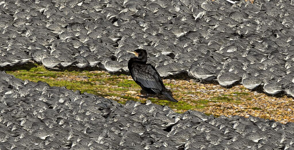
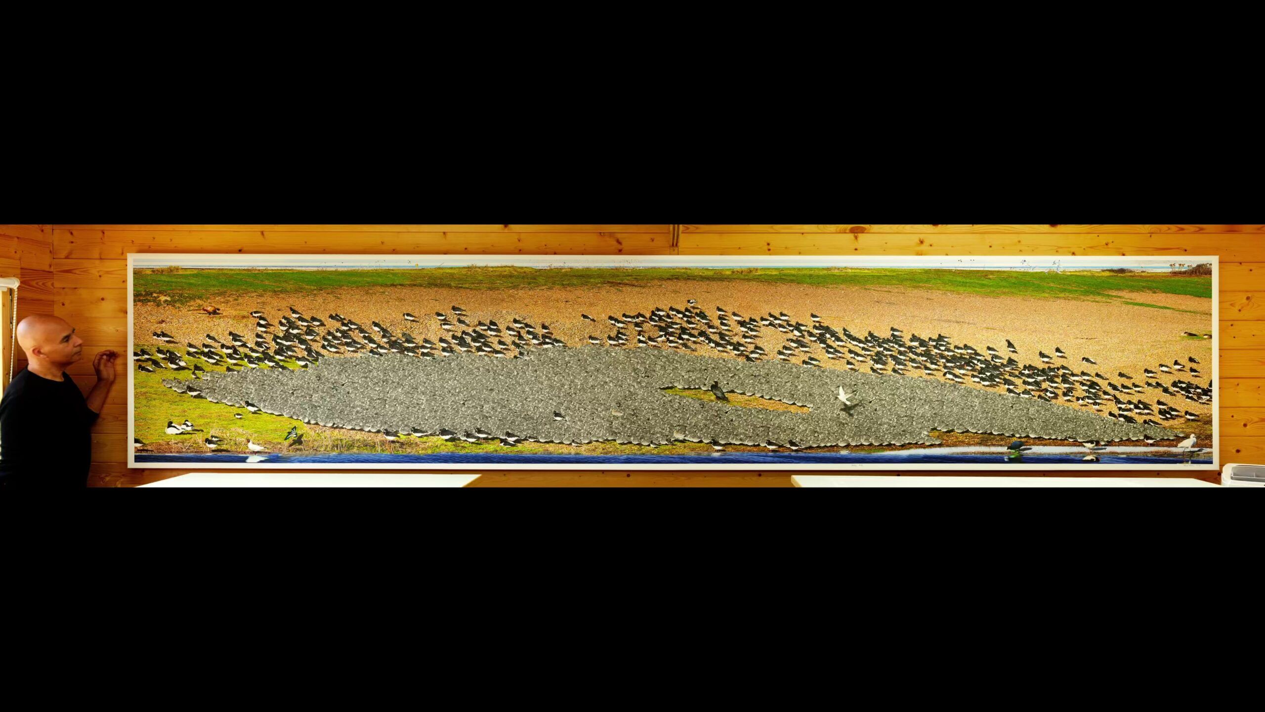
    "Identity" by Michael Autumn (2026) - full image
    “Identity” by Michael Autumn (2026) – full image

    (Catalogue #100_1970-1982: 194โ€ x 36.7โ€ (5m x 1.1m), limited edition of 11)

    TL;DR

    This is a painstakingly reproduced scene (with some artistic licence) of a natural phenomena at Snettisham (U.K.) (the south-eastern part of The Wash – between Norfolk and Lincolnshire) of hundreds of various species of birds roosting on a cold winter’s day – waiting for the tide to go out to resume feeding. The birds are predominantly waders – mudflat/shoreline-foraging, and migratory. What strikes me most about this mass gathering is the different behaviour of the various species – in particular how close they get to their own species and to other species… Each species must have some notion of each of the other species – and form notions about them – such as are they a threat…? One thing for sure is that they all have a concept of others and their own identity… The lone cormorant in the middle of the main flock is a predator (mainly of fish), and wouldn’t normally prey on any of these birds. However, predators usually have similar aggressive, threatening, features – forward-looking eyes, big, sharp, beaks, and are relatively large. The empty space around the cormorant – which would be more or less circular in shape from above – belies what the surrounding birds (knot) think about it…


    Iโ€™m deeply intrigued, and spellbound, by Nature, and spend a lot of time watching, being mesmerised, and photographing/filming it. Every once in a while I come across something even more amazing than normal…

    This scene is as authentic as I saw it, but I have had to overcome the limitations of photography. I have gone to great lengths to faithfully reproduce what I saw in all its detail. It was a very sharp, cold, blustery, early spring morning. The tide was high and these birds were roosting – unable to feed on the mudflats. They were waiting for the tide to go out.
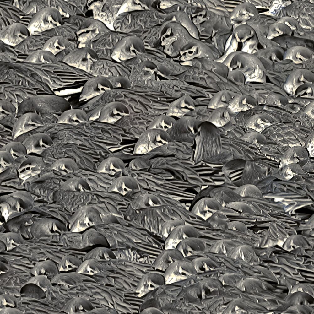
    Identity - Knot huddling together detail
    Identity – Knot huddling together detail

    Some species like the knot (the predominant grey birds in the 8-10,000 strong central flock) huddle together to keep warm, whereas others donโ€™t. Huddling together to keep warm is perfectly understandable, so why donโ€™t the other species in the scene do it…? Generally in the animal kingdom, the smaller something is, the harder it is for it to keep warm – because its surface area – where warmth escapes – in proportion to size (e.g. height) increases the smaller the animal is (this is simple maths). So in theory this should lead to smaller animals huddling together…? But it’s not as simple as this because there are smaller sized species than the knot that donโ€™t huddle – for example the turnstone (the smallest in the scene). Also, the only slightly larger black and white birds – the oystercatchers – don’t huddle together…

    The few individuals of different species engulfed in the sea of knot โ€“ the few lone oystercatchers (big black and white birds with bright red beaks) and the bar-tailed godwits (the long-legged buff-coloured birds with long straight beaks) โ€“ almost certainly didnโ€™t land in the middle of all the knot. Instead, they were probably slowly engulfed by them as the numbers of knot coming off the mudflats to roost gradually swelled.
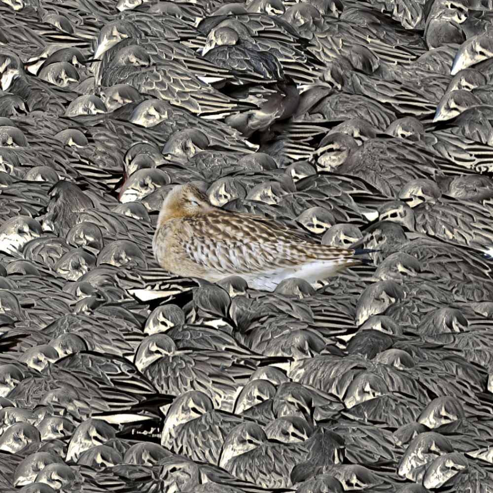
    Identity - Bar-Tailed Godwit engulfed by hundreds of Knot detail
    Bar-Tailed Godwit engulfed by hundreds of Knot detail

    The knot donโ€™t usually go around in one huge flock like this, rather they normally gather in flocks – of anywhere between a handful to a few hundred. While the tide was out and they were feeding, they would have been in these smaller groups. In the last hour or so as the sea slowly rose and covered their feeding grounds, the scattered flocks would have gradually given up the feeding frenzy and come in to roost. Flying over the shingle bank and into this sheltered hollow on the edge of the gravel pit lagoon, they would have seen some of their own already there and joined them โ€“ huddling together. The lone birds of other species would have been on their own initially, but as the mass of knot numbers swelled the โ€œlonersโ€ would have been slowly engulfed.

    A lone cormorant (predator) isolated in the middle of a huge flock of mainly knot - that want to keep their distance...
    A lone cormorant (predator) isolated in the middle of a huge flock of mainly knot – that want to keep their distance…

    For me this image raises lots of questions. Why did the knot feel comfortable getting that close โ€“ literally touching โ€“ some of those other species โ€“ even some that are significantly bigger than them โ€“ and not the cormorant (the big black bird in the middle of the big flock)? Does the cormorant look dangerous to them? Did the cormorant try to attack them? I doubt that very much โ€“ since they are fish eaters and are not known to be aggressive to other birds. Is it just the look of the cormorant that makes them feel uneasy…? Predators have a knack of looking aggressive. So do the knot – and other species for that matter โ€“ have an instinct for what-looks-nasty-probably-is-nasty…?

    And what does nasty look like? Two piercing, forward-looking, eyes; a certain stare-you-down-Iโ€™d-like-to-eat-you attitude; a big mouth with a sharp beak or teeth…? It is utterly amazing to me how such instincts can be carried in DNAโ€ฆ

    What did the cormorant feel โ€“ being completely surrounded by a sea of small grey birds that wouldn’t get close to it…? What did the surrounding knot feel โ€“ especially those on the inner edge closest to the cormorant…? How did they decide what a safe distance from the cormorant would be? From the side-on view of this conglomeration of birds, the shape of the space around the main predator cormorant looks cigar-like, but from about it would look circular – with the cormorant very much in the centre. The radius of the circle – the distance from the cormorant to the nearest knot (plural) – reflects the average distance the knot are conformable being to the big black predator – the distance they think they could fly off before it could strike at them…
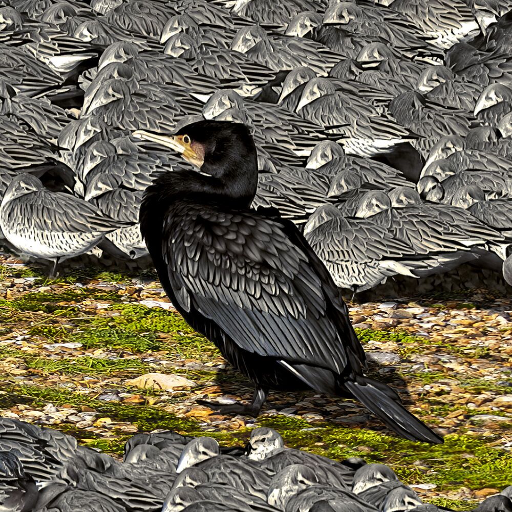
    Cormorant close-up
    Cormorant close-up

    Does the black-headed gull flying over the huge flock think โ€œbloody hell โ€“ thatโ€™s a lot of birds!โ€…? Does it even realise that they are birds at all – and not something like stones that it could land on…? How did the โ€œlonersโ€ feel as they were being slowly surrounded by the knot – as their numbers swelled…? How do animals identify themselves…? Why are some โ€œoutsidersโ€ allowed to get close and not othersโ€ฆ?

    Going back to the smaller flocks on the mudflats: if there were 8-10,000 individuals in the main roost, and the average size of smaller flocks was 200, then out on the mudflats there must have been somewhere in the region of 40-50 separate flocks of knot. I am interested to know what defines these flocks; how does an individual know it is part of a flock? Is there a leader of each flock? Imagine 200 individual birds foraging in the sand and mud for food: they canโ€™t all spontaneously decide to fly off in the same direction to a roost like the one in the picture โ€“ surely one takes the lead? Is it that any one of them can take the lead and all the rest follow…? Or is there a flock leader…?
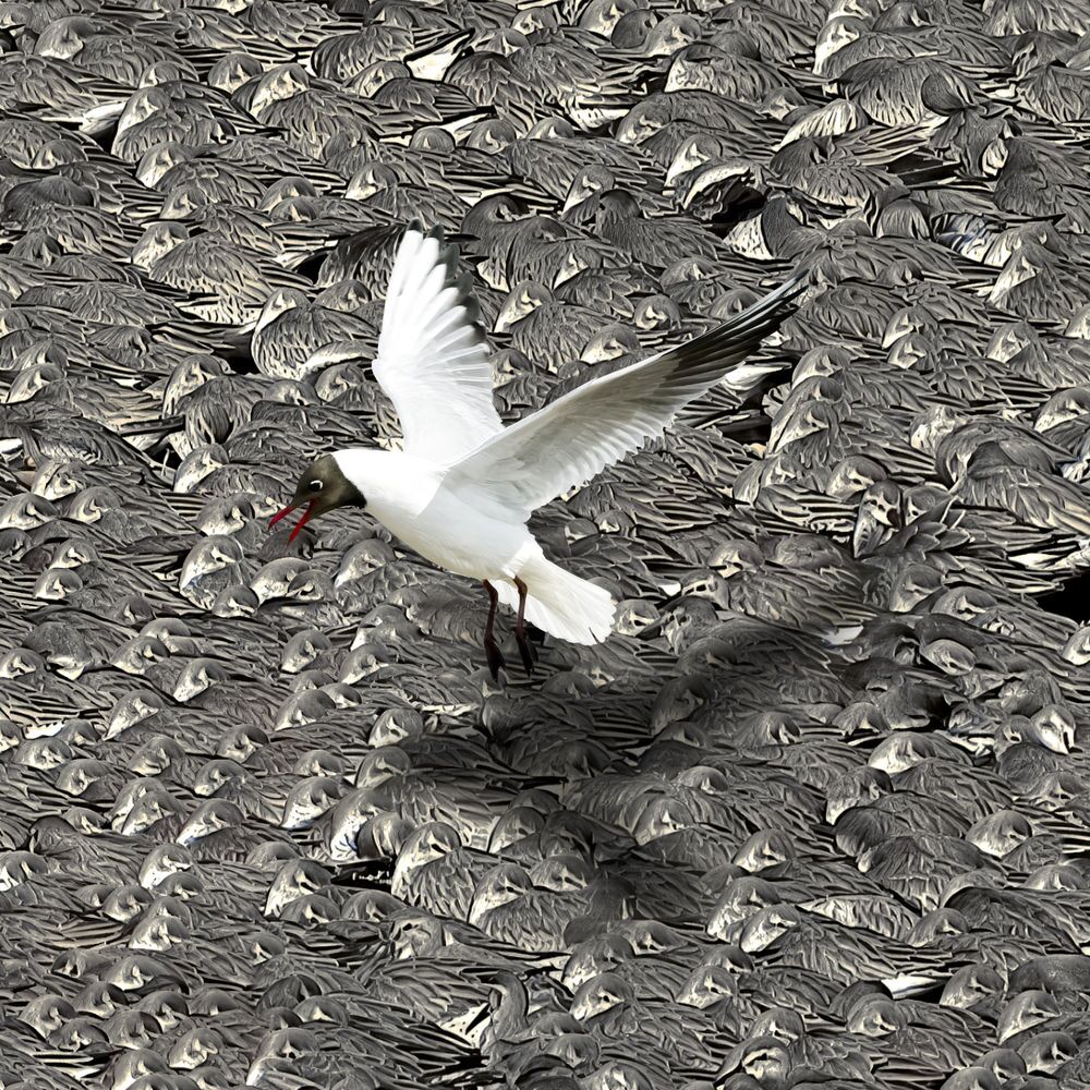
    Black-hooded Gull looking for somewhere to land
    Black-hooded Gull looking for somewhere to land

    Do the members of the flock recognise each other as individuals – or is there just some general sense of belonging and not wanting to be left on their own? Iโ€™m not sure it can be the latter because when the main roost broke up, it broke up gradually. A succession of small flocks flew off โ€“ back to the mud-flats. There wasnโ€™t one almighty exodus. This implies that while other birds were flying off, something kept the others where they were. Was it that no member of their group had taken flight, or did they have a leader who hadnโ€™t taken flight? This behaviour suggests a high level of small flock individuality. If there was a perceived threat like a fox or human getting too close, then Iโ€™m sure the whole roost โ€“ all 8-10,000 of them – would have taken flight; but in the normal calm of the roost each small flock seemed to act autonomously โ€“ just temporarily taking advantage of the warmth afforded by bigger numbers. Iโ€™m not sure we can ever know what is going on in the mind of one of these little birds, but that would be incredibly fascinating to discoverโ€ฆ

    The parallels between birds and us humans are quite striking. We have our little groups โ€“ friends, family, work colleagues, team members, etc. Sometimes we come together in huge crowds โ€“ such as sports events, coronations, concerts, evacuations, etc. And when we are in these huge gatherings we are acutely aware of our group and make special effort to keep in contact and move around together โ€“ to arrive and depart together. Something may trigger us all to move off together โ€“ like the end of an event, or a fire, but we still keep to our personal group wherever possible. There is usually a leaderโ€ฆ

    I am also interested in how comfortable we are for different people to get close to us. Speaking for myself, generally I am happy for strangers to get within a couple of feet from me (unless they look nasty or threatening); I generally donโ€™t like men to touch me at all, but for male friends itโ€™s okay; Iโ€™m happy for women and children to get very close and even touch me; and it is very special and highly desirable for a woman Iโ€™m attracted to to get close and touch me…! Indeed, such a woman could trigger an adrenalin rush โ€“ where my whole mind and body would become fixated, excited, and physiologically chargedโ€ฆ

    As for the closeness we will allow other species to get to us, this very much depends on our familiarity with the species, knowledge of their likely behaviour, and our knowledge of specific individuals and their moods. Generally we are comfortable with cats and dogs (the species depends on the cultural norm – so it might be different species in different cultures), but some people are allergic to them, or allergic to specific ones; some people have had bad experiences with them and wonโ€™t go near them. Suffice it is to say, familiarity and affection draw us together; unfamiliarity and fear push us apart. It is interesting to note that the young of most species are very cute โ€“ giving us the innate feeling of warmth and affection towards them, and wanting to touch them and give them everything they needโ€ฆ It is interesting that many species are programmed to respond in similar ways to cuteness and nastinessโ€ฆ

    Cambridge, England 28/10/2004


    Update June 2026

    I honestly thought this artwork was finished, and so after getting my new very large giclรฉe printer (late in 2025), I was ready to print it this year (April 2026). While preparing to print it, I felt I could make some significant improvements. Mainly I didn’t like the shingle and vegetation – basically all the land – which occupies about 40% of the entire surface area – which is a lot of square feet! I didn’t like it because it lacked colour – I think it had had a coating of dust over the winter months – and/or it hadn’t rained for a long time.

    I have hundreds of nature photos, and I looked at some I had taken several years after the original ones for this picture – and the shingle pebbles were really vibrant and multi-coloured – and the vegetation had much nicer, vibrant, greens (probably because they were taken later in the year – like spring). So I set about the mammoth task of masking out all the old shingle and vegetation, and, using nuanced techniques, I “repainted” all the areas I didn’t like with bits of shingle and vegetation I liked from other photos. When I finished this arduous task I then realised I was also unhappy with all the shadows over the old shingle and vegetation I replaced – so I then set about the equally arduous task of replacing all the shadows…!

    I also improved the detail on most of the birds – particularly the black and white oystercatchers (and I replaced all their beaks to make them more detailed and to stand out more realistically) – so each bird was meticulously improved. I also added a few more birds (from other photos I have taken since the originals) that appeared (or would usually) over the hours I was there. This involved adding shadows and reflections where appropriate.

    If you bear in mind that I try to make everything look as realistic and photographic as possible, you might not be surprised to know that the improvements I mentioned took over 300 hours – about six weeks (which is about as much as the original artwork took)…

    Aberdeenshire, Scotland 6/6/2026
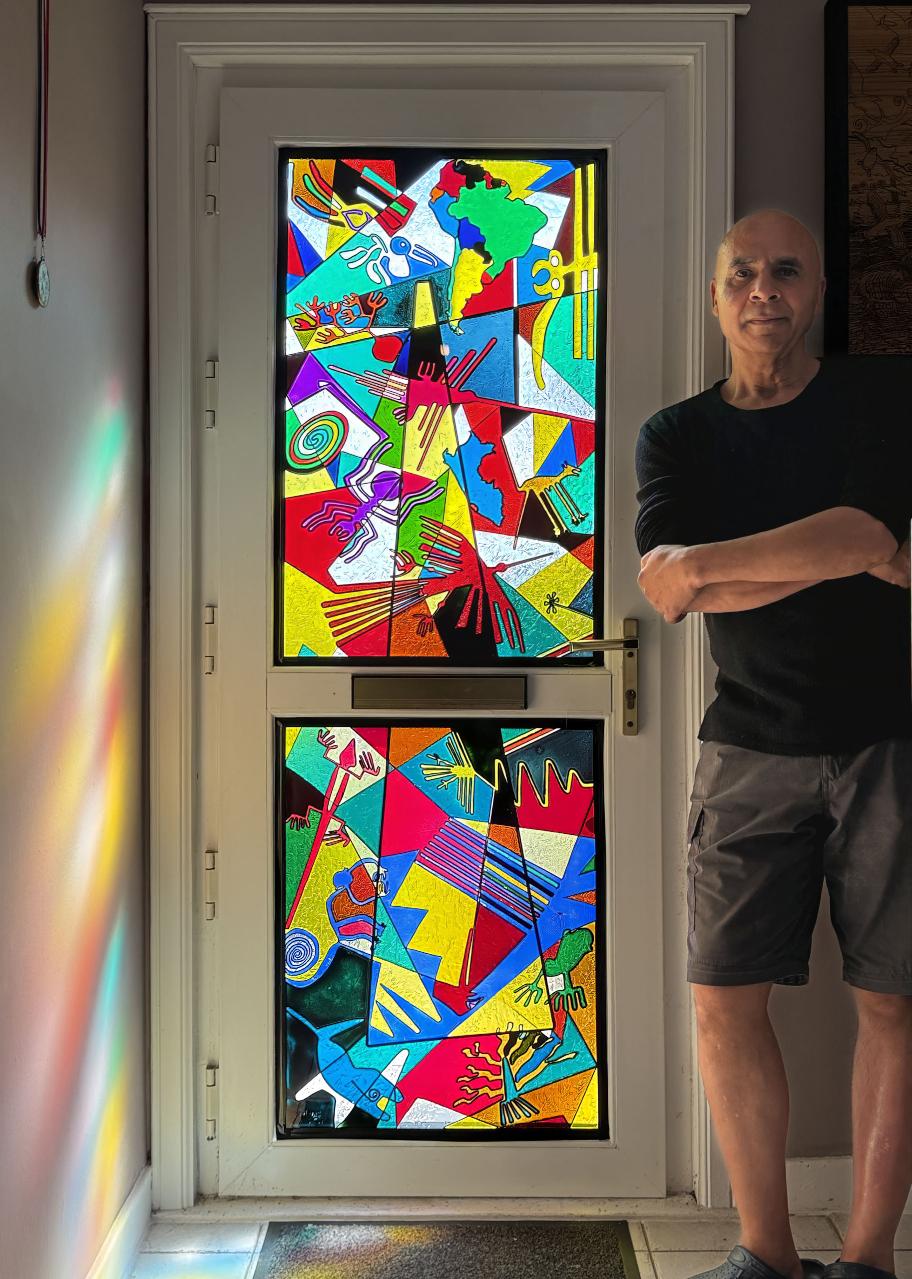
  • Nasza Lines “Stained Glass”

    Nasza Lines “Stained Glass”

    TL;DR

    This artwork is my homage to the lines, trapeziums, and animistic geoglyphs of the Nazca desert in Peru – using liquid “stained glass” paints on my pre-cut fretwork design – fixed to a thick sheet of cast clear acrylic – and covered with a glass-smooth layer of non-yellowing clear resin.


    Some years back I was lucky enough to tour a lot of Peru and take a plane ride over some of the Nazca lines and geoglyphs. I found them incredibly beautiful, intriguing, mysterious, simple, yet complex. They’re spread over quite a large area (approximately 190 to 385 square miles) of the Nazca desert, and they’ve left a lasting impression on me. For a long time I was quite sceptical about them – thinking they may be fake tourist-bait – apparently only discovered when airplanes started flying over the area… However, I have since learnt a lot more about them – and more have since been discovered and been discovered about them – and I’m now convinced about their age and authenticity.

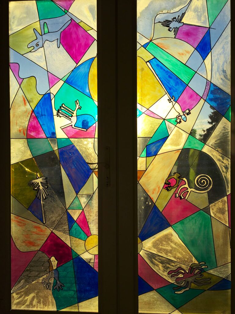
    This is in fact my second stained glass artwork about the Nazca lines and geoglyphs. I did my first around about 2001 – for my then new house that I was improving. The house was quite dark so I replaced all the doors and windows with larger double-glazed units. I decided on double front doors to make it easy to get large things in and out (I always have an eye on transporting large artworks). But the double front doors presented a privacy problem because my house faced onto a busy road and there were clear views into the centre of my house! I wanted to have something to let in the light – and thought about mirrored film. I tried some, but it was far too dark. So that gave me the idea of designing a stained glass window…

    It was my first attempt at “stained glass”, and I come up with the idea of basing it on the Nazca lines and geoglyphs because I had recently travelled to Peru and made a special excursion to see them. For this artwork I tried to pay homage and condense their essence and aesthetics, and I wanted to express the relationship between the lines, trapeziums, and animistic geoglyphs. Sometimes if you stand too closely to something you can’t see it for what it is – and it helps if someone condenses it and shows you… I used glass paint (I can’t remember the brand) – and adhesive lead-effect strips. I designed it using line (vector) drawing software, printed it out, and used that at my template under the glass. The glass was precisely sized to fit in the frame recess of the double patio doors – so the design had to be split in half vertically (but I took no notice of this in my design).

    Original stained glass design for my Cambridge house double front door.
    Original stained glass design for my Cambridge house double front door.

    Some twenty-five years later I revisited “stained glass” making – largely because I saw the huge potential for it with my recent interest in lasers. I got into lasers because I saw lots of creative possibilities using them – for example I could draw things – including very intricate things – and cut them out in various materials extremely precisely – and at any scale. My (new) idea for stained glass was to cut out the black “lead” lines of a stained glass design from a thin sheet of opaque plastic, stick that to a thick sheet of clear acrylic, simply pour coloured glass paint into the what-are-now-recessed shapes, and then cover the whole design with a protective layer of clear resin. Much easier than cutting glass and leading it…? My new design took into account the incredible detail and finesse I could achieve – compared to having to used fixed-width “leading”.


    However, the sticking of a laser-cut fretwork design on to a sheet of acrylic proved to be more difficult than expected because, firstly, it’s very tricky to glue such a large, fine and delicate lattice evenly all over (many parts were a millimetre wide and very fragile), and, secondly, it’s difficult to get even pressure on it while the glue dries because the surface of the plastic proved to be not completely flat. The latter I only realised afterwards, was because the cuts in the plastic are not completely flat – the reason being the laser cuts by melting it, and that melting – from a close-up side-on view of the cut – is not completely even (top and bottom) – especially at corners – when the laser slows down approaching them, and speeds-up again moving away.

    In practice, this imperfect join of the fretwork to the acrylic sheet meant that liquid glass paint poured into individual cells of the design could leak into adjacent cells – which are usually meant to be a different colour. To fix these mistakes required me waiting for the paint in those cells to dry, clean out all the unintended leakages in adjoining cells, before being able to pour paint in them. Naturally the painting process took much longer than anticipated. Big lesson learnt…!

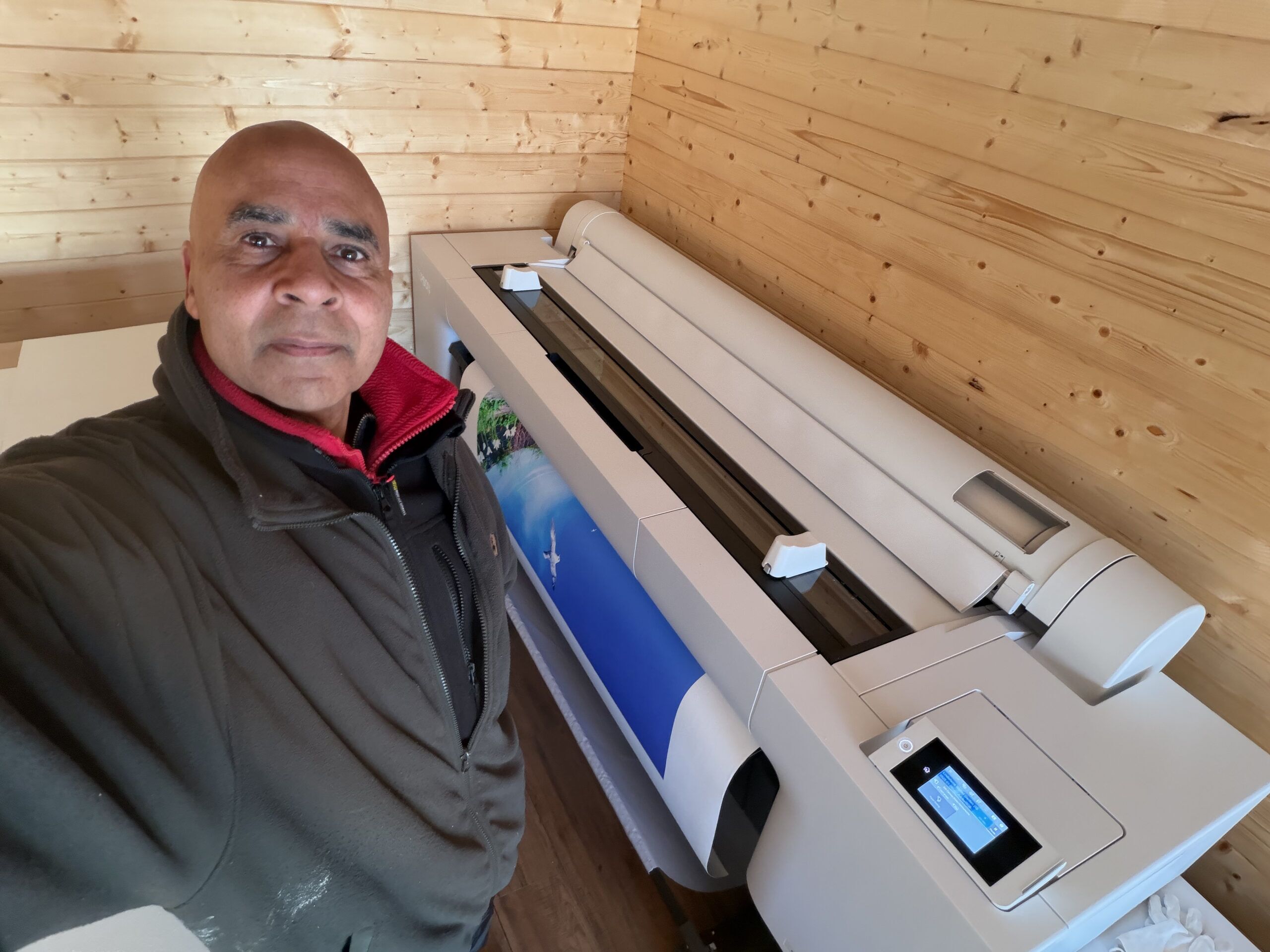
  • My new 64″ giclรฉe printer delivered and installed

    My new 64″ giclรฉe printer delivered and installed

    Why donโ€™t I use a commercial professional printing service to produce giclรฉe prints for me โ€“ like most people?

    Believe me โ€“ I wish I could! I searched high and low, but I couldnโ€™t find a printing company that met all my exacting requirements โ€“ and I wasnโ€™t prepared to compromise and accept what random permutation of my requirements individual companies happened to offer. My art is too important to me. Most companies were only offering two or three, out of my seven, requirements โ€“ which are as follows :-

    1. Using verified archival pigment inks from a highly reputable ink maker (this is currently only Epson UltraChrome PRO inks as far as Iโ€™m concerned)
    2. Using a 12-colour printer. None were offering this! This is because 12-inks is new on the market and most printing companies are using older generations of printer.
    3. Minimum of 60 inches wide. Most only offered 44โ€. 60โ€+ is quite niche.
    4. Printing on Hahnemรผhle Smooth Fine Art 370 canvas. I want the texture of the canvas to be as inconspicuous as possible, and this canvas is the smoothest, most archival, canvas that I know of. It also has the brightest natural white (without using the completely non-archival – and therefore completely unacceptable – optical brightening agents (OBAs)). It also has a matt finish – which looks better from all viewing angles and preserves colours best with random, background lights. Most companies use their own preferred canvas and werenโ€™t prepared to use this!
    5. Mount the canvas on aluminium stretchers. Aluminium stretchers will never twist or warp โ€“ unlike with wooden stretchers – something that is especially important with large canvases. No canvas printing companies I researched offered this.
    6. Stretch the canvas leaving a precise specified white margin (aka museum wrap โ€“ which I use for limited editions – where I add a title, edition number / edition size, and signing in pencil. No canvas printing companies I researched offered this.
    7. Finish the canvas with a completely invisible, waterproof, archival UV-protective varnish (only one offered this).

    Sometimes in life if you want to have a job done well (because you know what well means) then you have to do it yourselfโ€ฆ

    Why did I want a 60″+ Giclรฉe Printer?

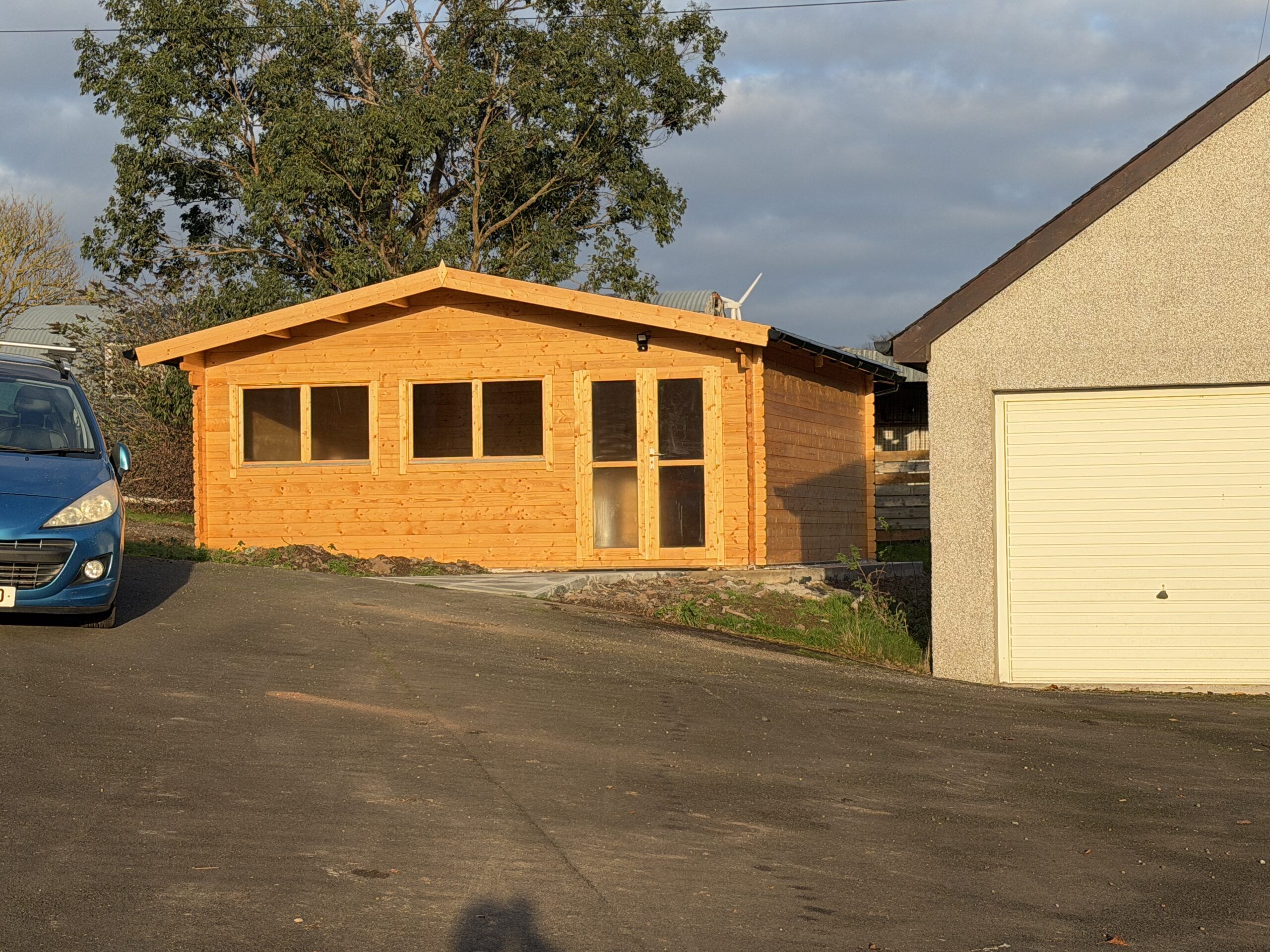
    Getting the best 60″+ giclรฉe (pronounced “zhee-clay“) printer (as considered by most in the know) was a big decision for me – not only because of it’s expense (and the twelve 1.6 litre inks for it are half as much again!), but also because it needs quite a lot of working space. That’s the room required to handle, cut, stretch (canvases), mount, and frame the huge prints it produces. I didn’t have anywhere near enough dust-free, clean, space where I live, so before buying the printer I bought space for it – in the form of a new 6m x 6m log cabin (see My new big printer requires a new shed!).

    Why did I want such a big printer? I’m an artist, I want to make a big impact. I see big, I think big. I love Nature, and a lot of the time I try to capture or say something about Nature. I don’t like big things being unnecessarily shrunk. Small is easy. Everybody and anybody does small. Point a camera (or more likely a smartphone these days), click, small print. It’s all too quick and too easy, has little or no value, and doesn’t stand out in  the crowd. Small doesn’t have a big impact. Large does. Small is not special. Large is much more likely to.

    Much, though by no means all, of my art is large and photo-realistic – and is intentionally made to look like photographs (although they are not simply photos – very far from it). In relation to this genre of my art, you could say that I attempt to make โ€œphotosโ€ – rather than simply take photos. Unlike photos, I don’t want my art to fade – I want them to last as long as possible – hundreds of years – hence why I got interested in giclรฉe printing and museum framing techniques many years ago.

    I’ve been doing this form of art for quite a long time – since the noughties in fact (prior to the that I was doing high-end conventional analogue photography, however, I’ve always conventionally manually drawn and painted as a separate passion). It seemed like a god-given opportunity to me in the beginning of the digital age – and, with my background in computing and photography, I took to it like a duck to water.

    Some twenty years ago I bought what was then the best large format 44″ giclรฉe printer. I started producing and framing large scale, highly detailed, and archival artworks (using museum-grade inks, materials and framing techniques) – some of which were accepted by the Royal Academy of Art in London (although I never got around to other galleries or outlets at the time).

    My life took an absolutely terrible turn (details of which I needn’t go into) and effectively my creativity was put on hold for about a decade and a half. After fifteen years in the wilderness, I am largely recovered, re-motivated, and re-energised.

    Size isn’t everything.

    What about quality? What is a giclรฉe printer? A giclรฉe printer is an uncompromisingly high quality, very high resolution, printer that uses archival pigment inks on archival papers and canvases – and produces superb prints that will keep their pristine colours and vibrancy for at least 200 years under normal indoor lighting conditions. First and foremost a giclรฉe printer uses pigment inks. Pigment inks used by giclรฉe printers are among the purest forms of water insoluble colour substances we know of – which we get from rocks (including clays), plants, metals, and some we synthesize – and are the most lightfast colourants generally available. The key word is colourant, because every printing technology tries to change the colour of the surface it is printed on. The crucial question for me – as it should be for all artists and photographers – is how long will the colours remain as vibrant and pure as the day they were originally printed? In addition to the inks used, a key determinant of lightfastness is the material it is printed on โ€“ how stable it is over time, and how well does it present (reflect) colours printed (or painted) on it? In this respect cotton โ€“ in the form of papers and canvas – is one of the most colour stable and colour faithful print surfaces we know of and use extensively in high end art and printing.

    Colour Gamut

    Another crucial aspect of giclรฉe printers is called colour gamut. What is the range of colours it can print โ€“ and how vibrant are they? Put simply, this is how many colours and tonal ranges a printer can reproduce. In theory only four colours are required to make any reflected colour – Cyan, Magenta, Yellow, and blacK (CMYK). But there is much more to printing than this. Basic CMYK cannot directly produce all the colours we can see, and many colours are achieved quite crudely by the placement of small dots of CMYK colour next to each other – to give the impression of the other colours – like red (from yellow and magenta), blue (from cyan and magenta), and green (from yellow and cyan). However, this effect looks pixelated close-up because you can literally see the patches of dots – so effectively the resolution of basic simple four-colour CMYK printing is low. Also, the vast number of shades of blue and green in nature cannot be reproduced very well with this basic approach.

    My printer has twelve colours – the most currently available on any pigment inkjet printer – to give the widest possible range of colours. The set includes dedicated colours for those particularly difficult hues to reproduce by combining other colours – orange, green, and violet. It also has two greys (mid and light), and two blacks – a matte black (for matt surfaces) and a photo black (which reproduces blacks better on a glossy surface) – so it is exceptional at black-and-white prints also.

    So, wanting to make as big an art impact as I can, I thought: if I don’t do it now, I probably never will… This new printer is the best of what is available today – and is really only a continuation of where I left off fifteen years agoโ€ฆ

    Installation was forced on me!

    The steps I went through to get this printer was, firstly, deciding what printer I wanted (back in April 2025), and finding out how much it would cost; secondly, realising I needed to build a log cabin to put it in and researched the options; thirdly, realising I needed a concrete base, researched that, and got one built; fourthly, buying and then building the log cabin, fitting it out, treating the wood inside and out, making a path and building two very large workbenches (I finished in late September 2025); fifthly, revisiting the market to see what the best deal I could get now.

    However, in the six months between the first and fifth steps, something very impactful happened: the company who I originally planned to buy the printer from said back in April that the price included delivery, unpacking, removing all the packaging, installation, and training. Great, I thought โ€“ thatโ€™s a lot of work and worry avoided. However, when I came to ordering it in late September, that delivery deal was no longer available because the third-party company who provided that service decided, for whatever reason, not to do it anymore โ€“ and it turned out they were the only company in the country providing that serviceโ€ฆ So, I was left with the daunting prospect of doing everything myselfโ€ฆ!

    The printer was hands down the biggest and heaviest thing I have ever had to handle โ€“ (and I have handled quite a few large machines in my time โ€“ including big CNC machines, a big industrial laser, and other big woodworking machines).

    Using my heavy-duty pallet jack, my neighbour and I managed to roll the huge 3.5m x 1.5m x 1m printer box from the driveway (where the tractor forklift took it as close as it could), along my newly built path, into the log cabin (over a carefully designed double ramp I built). We managed to get all the surrounding cardboard and most of the polystyrene off it. There was a daunting number of pieces in bags and boxes of various sizes, and labelled bags of nuts and bolts.

    With the main printer chassis propped up on big dense blocks of polystyrene resting on the huge pallet, we set about assembling all the other pieces as much as we could โ€“ including the stand (which also had to be assembled). It was by no means straightforward, and some parts were incredibly confusing as to where they were supposed to go โ€“ or how they were supposed to be fixed in position. The instructions were far from clear, and the order some things should have been done was utterly confusing at times. Anyway, after about three hours, all that was left to do was to lift the printer on to the wheeled stand. And, because this required at least five people, we stopped working on it that day โ€“ and I was left with trying to rope in a couple of other near neighbours to help. I did manage to get their commitment, and we scheduled a day (the following week) where the five of us could do it.

    It required four guys to lift/move the printer onto the nearby stand โ€“ and two people to guide us on to the stand and pull the big pieces of polystyrene out from underneath it. The whole 6m by 6m log cabin felt full to the brim with all the packaging it came in, and the pallet it was transported on was so heavy that it took four of us to carry it out of the log cabin afterwards!

    It was quite a mammoth effort to move and assemble the printer โ€“ something that was never even discussed in the sales process – nor even mentioned on the manufacturerโ€™s websiteโ€ฆ! In hindsight I donโ€™t think this printer should ever be sold without a full installation commitment by an experienced dedicated team. Leaving it to the customer is a huge ask, and, with so much difficult and delicate assembly required by the customer, it begs the question how the manufacturer can offer any warranty โ€“ let alone two yearsโ€ฆ

    Then there was the clean-up of all the packaging. It was one hell of a job fitting all the polystyrene in my hatchback โ€“ to take it to the recycling centre. And there were huge sheets and boxes of thick cardboard that I just dumped in my large shed for the time being โ€“ until I decide what to do with it.

    Installing the inks was no simple matter either! The instructions were useless, and I couldnโ€™t find any clearer instructions or videos online. The 1.6 litre flimsy-looking flexible plastic bag ink pouches are extremely expensive – at nearly ยฃ500 each โ€“ so you really want to put them in properly – and not leak or tear themโ€ฆ!
    Ink charging

    The printer comes completely empty of ink, and filling the required system components with ink known as ink-charging. What I donโ€™t understand is why doesnโ€™t the printer come with a small sized set of starter inks for this purpose โ€“ like every printer has that I have ever bought up until this oneโ€ฆ? And why does this ink-charging process take a whopping 45 minutes โ€“ and require two- and a-bit maintenance tanks to be filled with โ€œwasteโ€ ink?! The printer came with six maintenance tanks โ€“ three of which were already in the printer, however, two of these โ€“ exactly as explained in the instructions โ€“ were completely filled – and needed to be discarded and replaced with new ones – during this initial ink-charging!

    I compared the weight of a used, full (and therefore needing to be disposed of), maintenance tank, with a new empty one, and I estimate there was about a half a kilo of weight difference. A kilogram is roughly the weight of one litre of liquid (with a similar density to water), and so this means that, over and above the ink used to fill the many metres of tubing in the printer, the ink charging squirted out a total of well over a litre ( spread over all twelve ink pouches) straight into the waste maintenance tanks! Thatโ€™s about 10% of the ยฃ6,000 worth of ink โ€“ straight into the bin โ€“ including two maintenance tanksโ€ฆ!

    Colour-Proofing

    With the printer all set up, the next task was to load it up with some canvas and do some test prints. A crucial step was to calibrate my new proofing computer monitor with the inks and the Hahnemรผhle canvas in the printer. Having done a lot of colour proofing before, this should have been quick and easy to do. Was it heck! There turned out to be a completely unexpected red herring in the form of Hahnemรผhleโ€™s Fine Art Smooth Canvas ICC colour profile. This is the ICC colour profile I should be using: itโ€™s made specifically for this canvas and this printerโ€™s inks – and is supplied by Hahnemรผhle! However, it consistently produced weird small black streaks on the same parts of the print. Over four days I tried absolutely everything I could think of to get rid of these disastrous black streaks โ€“ wasting lots of canvas and ink in the process. In the end, by a process of elimination, it turned out to be a weird fault with Hahnemรผhleโ€™s ICC colour profile -because when I tested the same print with Epsonโ€™s Matt Canvas ICC colour profile for this printer, it printed perfectly every time. Iโ€™m really annoyed with Hahnemรผhle about this because it wasted so much of my time, ink and canvas. What kind of testing did they do โ€“ if any โ€“ because the very first time I tried to use it, I ran into this problemโ€ฆ?!

    Final Thoughts

    The cost of getting top-quality commercial prints done is very high โ€“ often running into hundreds of pounds each โ€“ which is okay if you have confirmed sales (or a lot of money). During the creative process there is no guarantee for most artists that any artwork will sell, so the individual cost of experimental or test prints can be quite off-putting, and stifling of creativity.

    By owning such a versatile and brilliant printer as this one, I can experiment with different sizes and media – and can simply re-do prints if Iโ€™m not happy with them. So, although the up-front cost (and effort!) was enormous, I donโ€™t have to worry much about each print individual I doโ€ฆ

    The printer is an extremely versatile and power tool, and by owning it I can explore all its capabilities โ€“ creative and technical opportunities that would otherwise be completely unavailable to me.

    As an artist, itโ€™s a dream come true to have such a printer โ€“ to have such a fabulous creative instrument in my toolbox. And I bought it for that reason alone. However, some companies make good money printing for clients who want the best. This commercial opportunity, coupled with the potential I have for selling my own limited and unlimited edition prints, could mean I will reap financial rewards with it. Indeed, it is far from impossible or improbably that, in time, it will comfortably pay for itself โ€“ and moreโ€ฆ

    Finally, from a providence and buyerโ€™s perspective, it is surely much better for customers to know that I, the artist, printed and handled the artworks โ€“ as opposed to a random commercial printerโ€ฆ?

  • My new big printer requires a new shed!

    My new big printer requires a new shed!

    Much, though by no means all, of my art is large and photo-realistic – and is intentionally made to look like photographs (although they are not simple photos – very far from it). In relation to this genre of art, you could say that I attempt to make photos – rather than simply take photos. Unlike photos, I didn’t want my art to fade – I wanted it to last as long as possible – hundreds of years – hence why I got interested in giclรฉe printing and museum framing techniques.

    I’ve been doing this form of art for quite a long time – since the noughties in fact (prior to that I was doing high-end conventional analogue photography – and I’ve always drawn and painted as a separate passion). It seemed like a god-given opportunity to me of the then new digital age – and, with my background in computing and photography, I took to it like a duck to water.

    Some twenty years ago I bought what was then the best large format 44″ giclรฉe (pronounced “zhee-clay“) printer (a very high quality printer that uses archival pigment inks on archival papers and canvases – and produces superb prints that will keep their pristine colours and vibrancy for at least 200 years under normal indoor lighting conditions). I started producing and framing largescale, highly detailed, and archival artworks (using museum-grade inks, materials and framing techniques) – some of which were accepted by the Royal Academy of Art in London (although I never got around to other galleries or outlets at the time).

    My life took an absolutely terrible turn (details of which I needn’t go into) and effectively my creativity was put on hold for about a decade and a half. After fifteen years in the wilderness, I am largely recovered, re-motivated, and re-energised.

    At the beginning of this year (2025) when I decided to get what is widely regarded (by those in the know) as the best large format 64″ giclรฉe printer, the first obstacle to overcome was where on earth was I going to put it?! At 3.5m wide, 1.5m deep, just over 1m high, and weighing about 250kg – there was no room in my house (in any case it would be impossible to get it in the house because no doors are wide enough!). Also there was not enough room in my far-from-small studio/workshop because it was maxed out with tools, lasers, a CNC machine, and workbenches – besides, I wanted somewhere very clean and free of dust for highest quality printing. Building an extension to the house would have been far too expensive (and slow), so I decided to get a log cabin (that wouldn’t require a lengthy and expensive planning application).

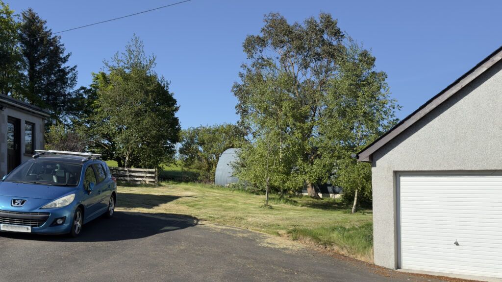
    Originally I naively hoped to get something like a 12m x 8m building, but after much searching for a good quality log cabin supplier, and the shock of how little square meterage you get for your money(!), I plumped for a 6m x 6m x 2.5m unit – that being the minimum I could usefully use and could just about afford (allowing for the fact I had a very expensive printer to buy – along with the also very expensive inks, archival printing canvas, very large workbenches, etc.). Next, I had to decide where to put it. The patch of land between the studio and the workshop seemed the best option.

    The ground where the log cabin is going โ€“ between studio and workshop, and just off the driveway
    The site where the log cabin is going – between studio and workshop, and just off the driveway

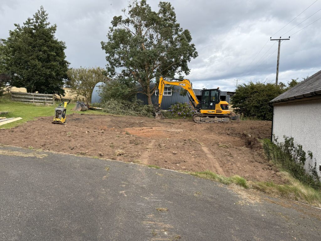
    I ran the proposal past the county council planning department – just to make sure it came under โ€œPermitted Developmentโ€ – which it did – so I didn’t need planning permission. I had to get the base area firstly excavated and then get a concrete base put down (this I couldn’t do myself so I used a contractor).

    Construction site with machinery and trees.
    Contractor levelled and prepared the ground for the log cabin

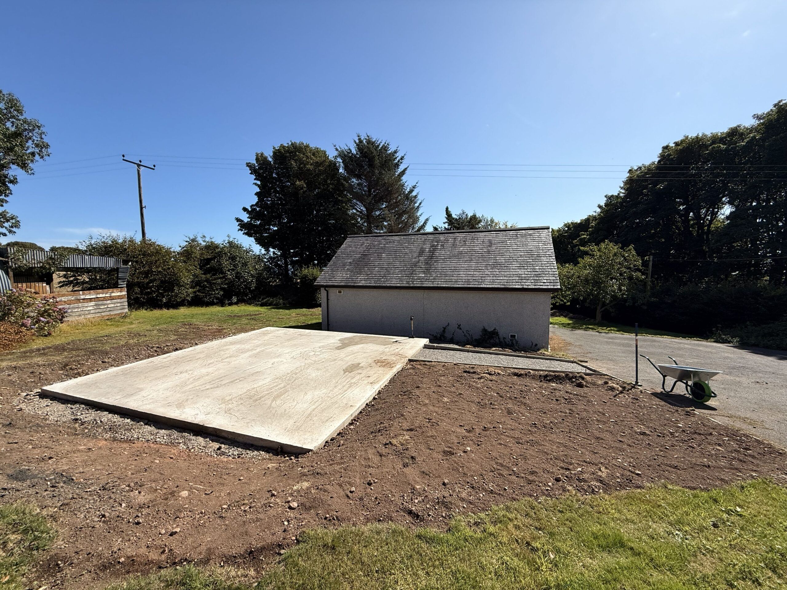
    If I wasn’t watching the concrete base being built, only half of the base would have had a dampproof membrane – until I insisted…!

    Cleared land with concrete base and shed
    The completed concrete base (100mm thick on 100mm hardcore) (done by a contractor)

    I left the ordering of the log cabin (which comes in kit form) until the base was finished. Then I (re-)looked extensively for the best quality and deal I could find. When I came to a decision it was mid August. I wanted to go with a local supplier but they couldn’t deliver until mid October. The thought of putting up the log cabin in mid autumn – with the high probability of rain, frosts, strong winds – put me off. So I checked the delivery estimate of my second choice. They said three weeks. Decision made.

    Undaunted by such challenges, I decided to build the log cabin myself (from a kit) – both to save money, but also to be in total control of the quality of the build and the materials used. From quite a lot of experience, I have little faith in “handymen” – who often cut corners, do things as quickly and as cheaply as possible. I’m quite practical, patient, have some common sense, and can seek advice and/or find out anything I want to know.

    I took my time – doing everything as best as I could, and using the best materials and techniques I either knew or researched. The September weather was absolutely gorgeous – sometimes too gorgeous (too hot)! I had a large tarpaulin to cover the timber over night and when it rained (which wasn’t often).

    I lost quite a lot of time during the log cabin build because of receiving visitors over the North East Open Studios (NEOS) ten open days in early September (which I committed to back in January). But I like/liked meeting people interested in my art. It’s what art all about…? So whenever visitors turned up, I just downed tools, was probably filthy and stinking of sweat(!) – and gave them as much time as they wanted (which was often quite a lot).

    The build was enjoyable for the most part. The instructions weren’t as clear as they could have been, the timber pieces weren’t labelled, and because many were very similar (but subtly different)- and there were unspecified spare pieces – it was very confusing at times. The most difficult part was the path leading from the drive to the log cabin – getting big and heavy concrete paving slabs to slope in two planes from level to the steep slope of the drive. But I got there in the end. It was very satisfying…

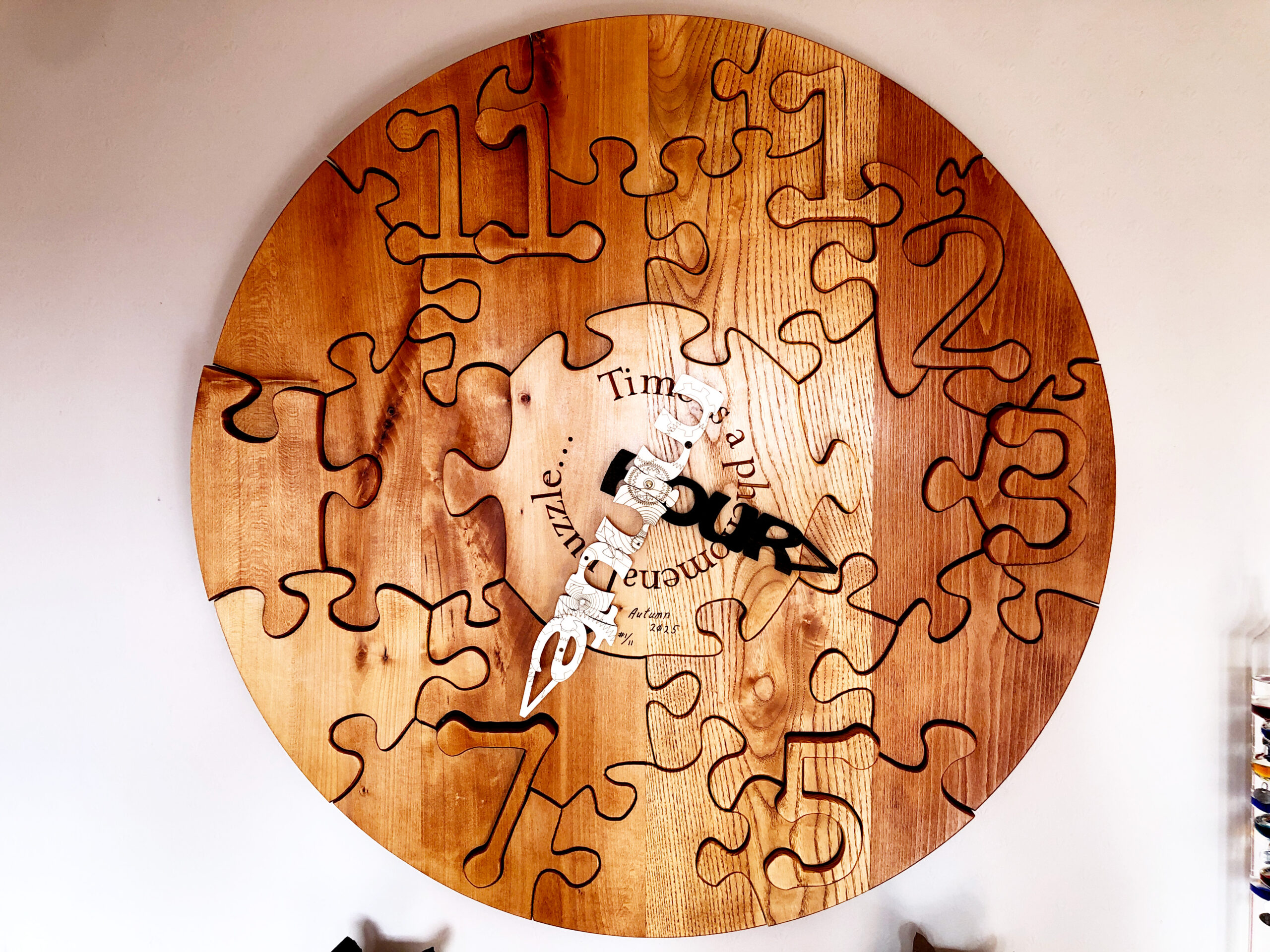
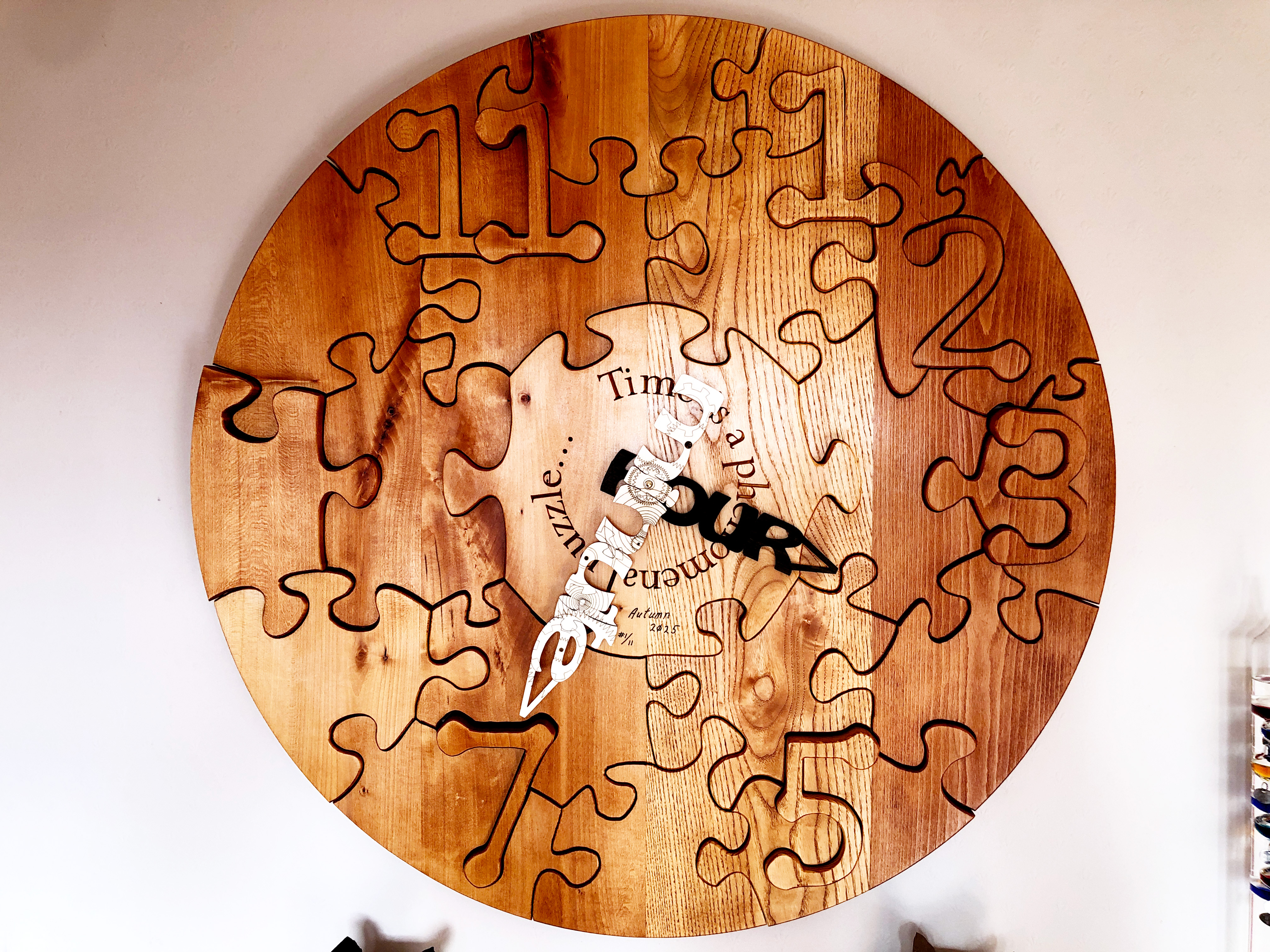
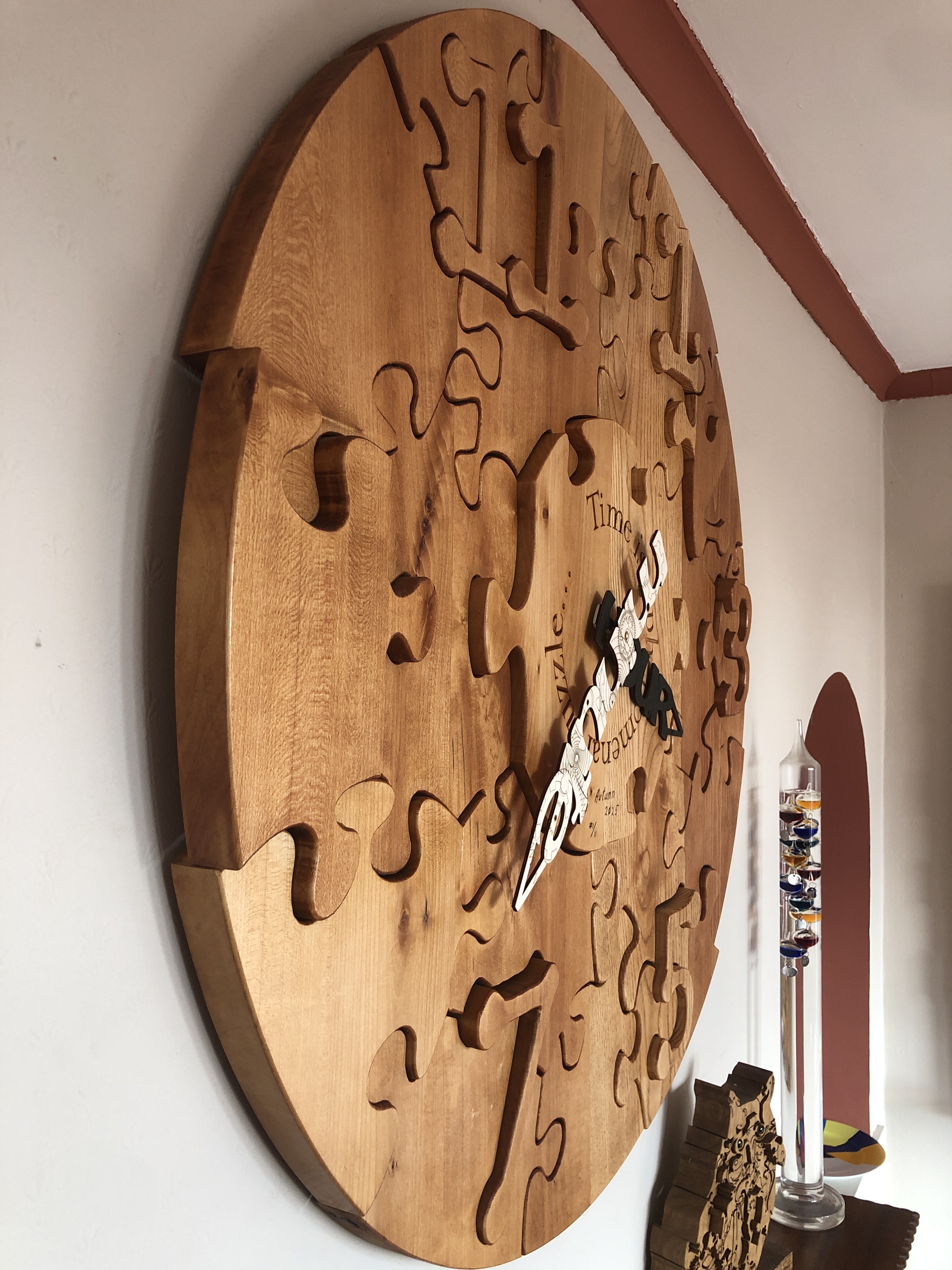
  • Time is a phenomenal puzzle…(Clock and Art Puzzle)

    Time is a phenomenal puzzle…(Clock and Art Puzzle)

    Title: โ€œTime is a phenomenal puzzle…(Clock and Art Puzzle)โ€
    Artist: Michael Autumn
    Medium: Oak wood clock face and plywood hands. Working clock movement.
    Size: 95cm (W) x 95cm (H)
    Edition: 11 (only made to order)
    Authenticity: Hand-engraved (bottom, center of main central piece).
    Date: 03/2025


    This is an artwork primarily about time โ€“ that eternal puzzle in human minds – mine included – and what better way to depict time than by a clockโ€ฆ? However, during my journey in creating this piece I realised that it is also about gravity โ€“ because without gravity this clock would simply fall apart โ€“ because there is nothing else holding it togetherโ€ฆ! And this ties in nicely with Einsteinโ€™s Theory of Relativity โ€“ where gravity deflects time (gravitational time dilation) in what is known as โ€œspacetimeโ€โ€ฆ

    But this is not a normal clock (as you might expect from me!?): it is in fact two puzzles โ€“ and it was quite a technical challenge or puzzle to design and make both of themโ€ฆ! There is nothing holding the clock face or clock hands jigsaw pieces together – other than gravity โ€“ i.e. their own weight. There is no glue, screws, or nails โ€“ all the pieces are gravity-defying wooden joints!

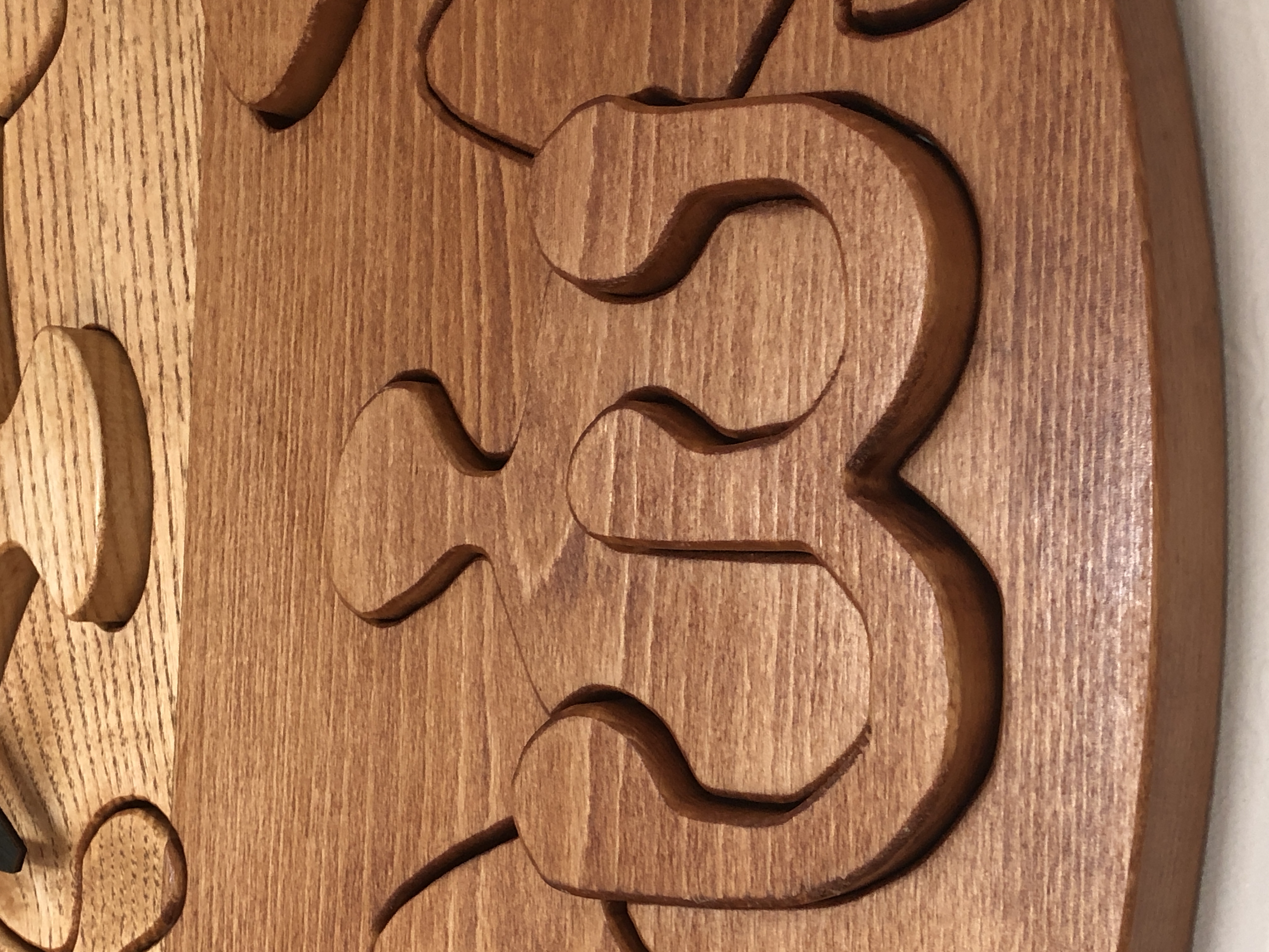
    Close-up of some face pieces – they are all loose.
    I vary the depth of some pieces to make them stand out…

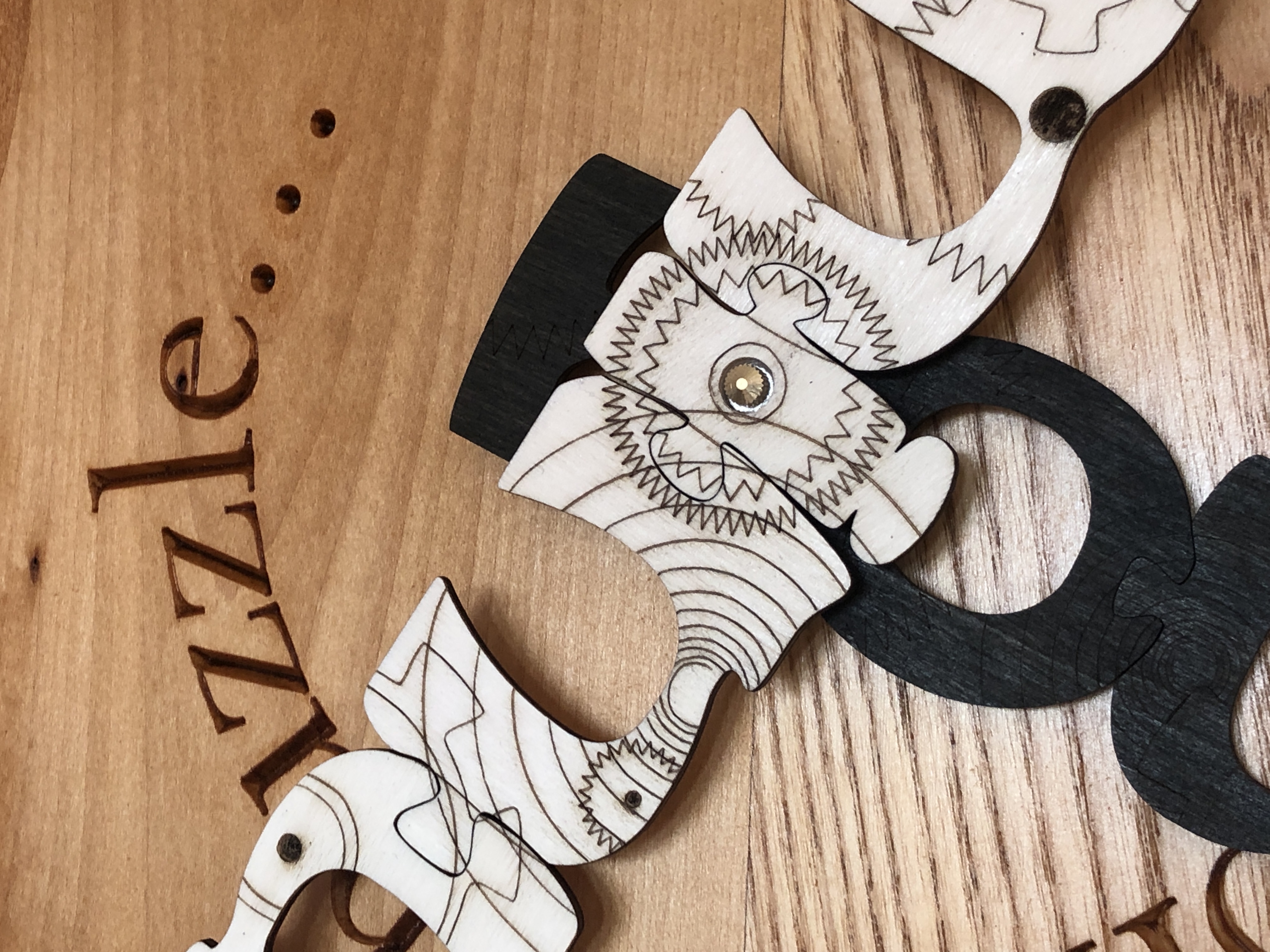
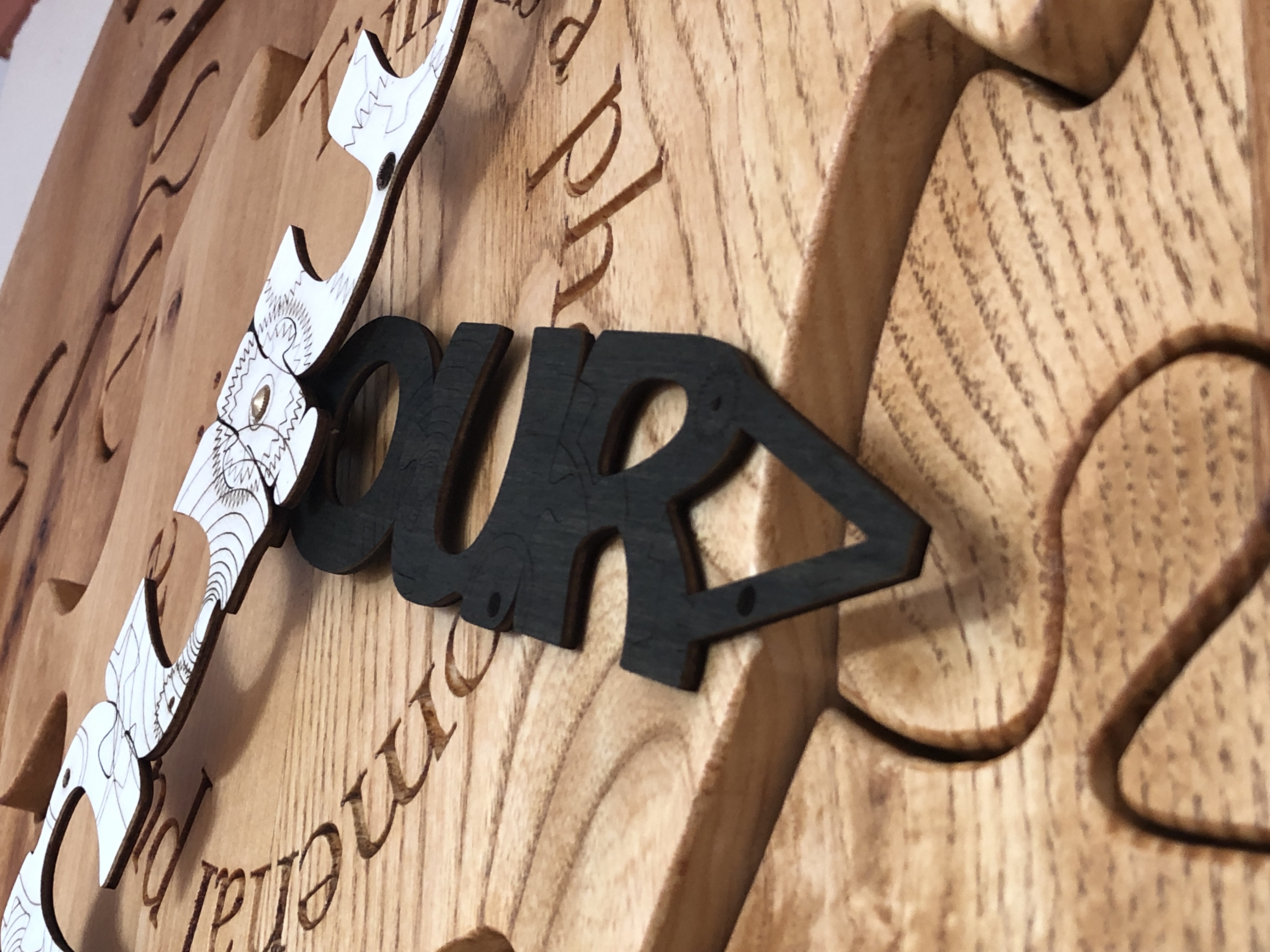
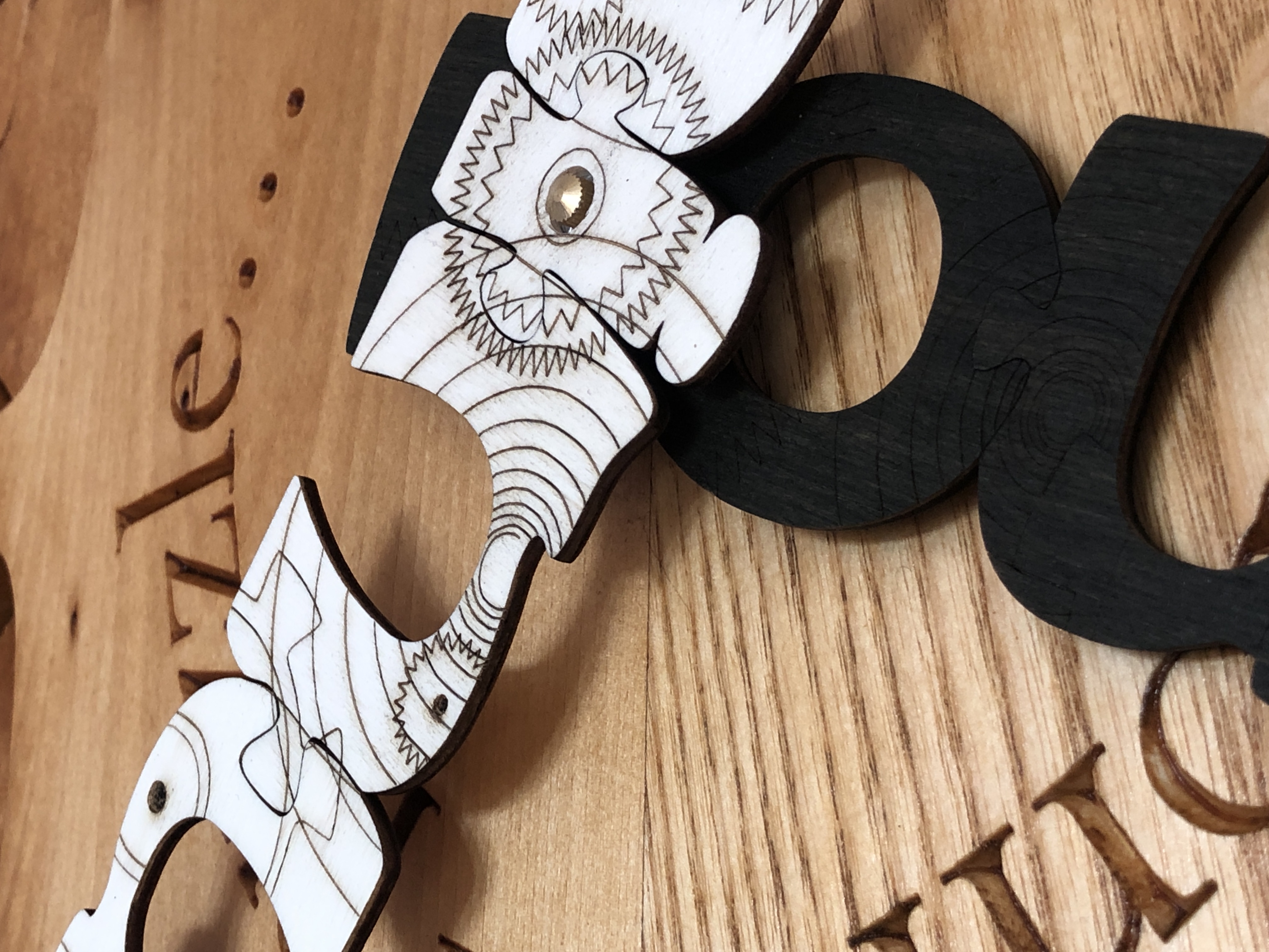
    The clock face is a large (950mm or 37 ยฝ โ€ diameter) thick circular wooden jigsaw puzzle โ€“ where all the pieces are solid oak โ€“ about 32mm (1 ยผ โ€) thick. The clock hands are very strong but light plywood jigsaw puzzle pieces 3mm (about an โ…› โ€) thick โ€“ spelling out the words โ€œhourโ€ and โ€œminuteโ€. They have a steampunk motif engraving of cogs, wheels, springs, shafts, and screws โ€“ as if they were word-shaped windows revealing the inner workings of the clock inside.

    Close-up of steampunk motif engraving of cogs, wheels, springs, shafts, and screws

    I designed and made the puzzle clock face about three years ago (December 2021) (albeit a โ€œsmallโ€ one โ€“ about 500mm โ€“ 20โ€ โ€“ in diameter), but I couldnโ€™t think of a design I was happy with for the clock hands. This proved really difficult because I wanted the clock hands to be puzzles in themselves โ€“ so the pieces had to reliably and tightly fit together โ€“ each as a rigid unit, be fully rotatable, and fit securely on a conventional working clock movement. The latter was an interesting technical challenge, but I really struggled with a suitable aesthetic design for them. What would look appropriate or conforming with the theme of a time puzzle? What would look aesthetically pleasing (to me at least!)?

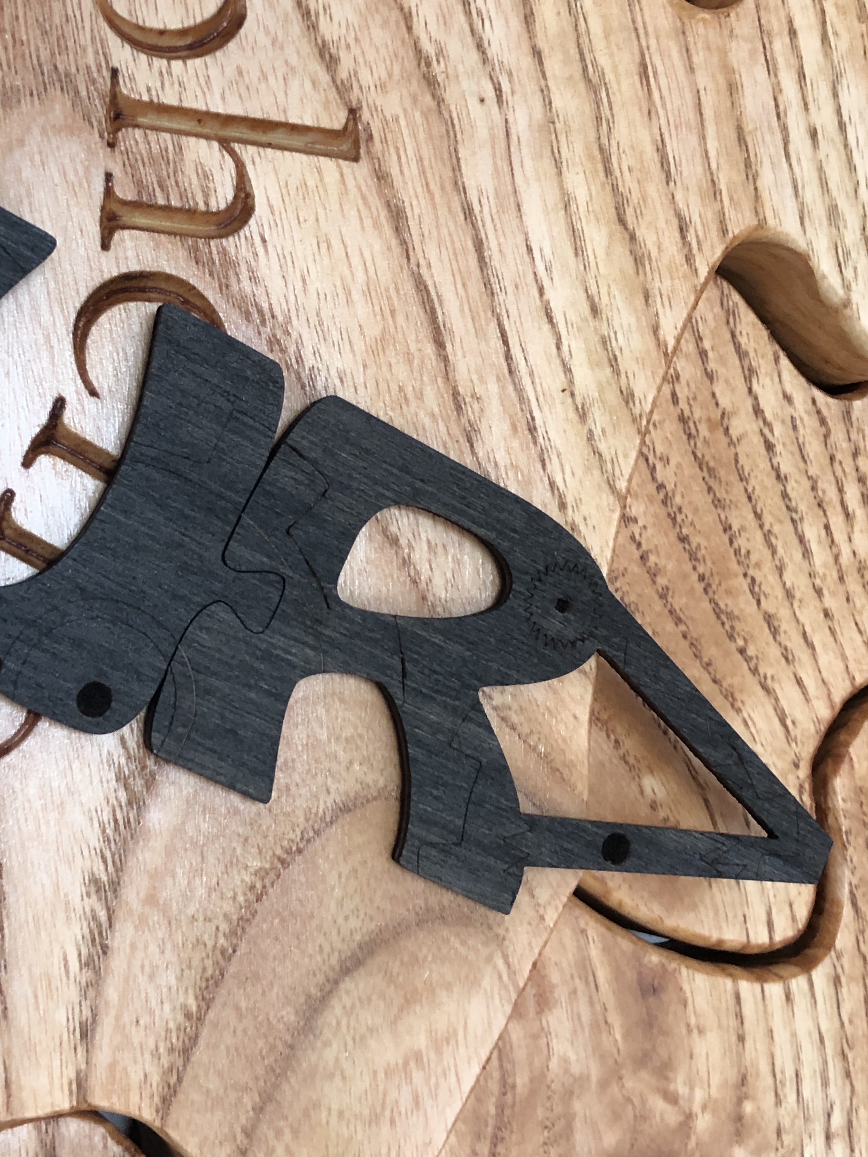
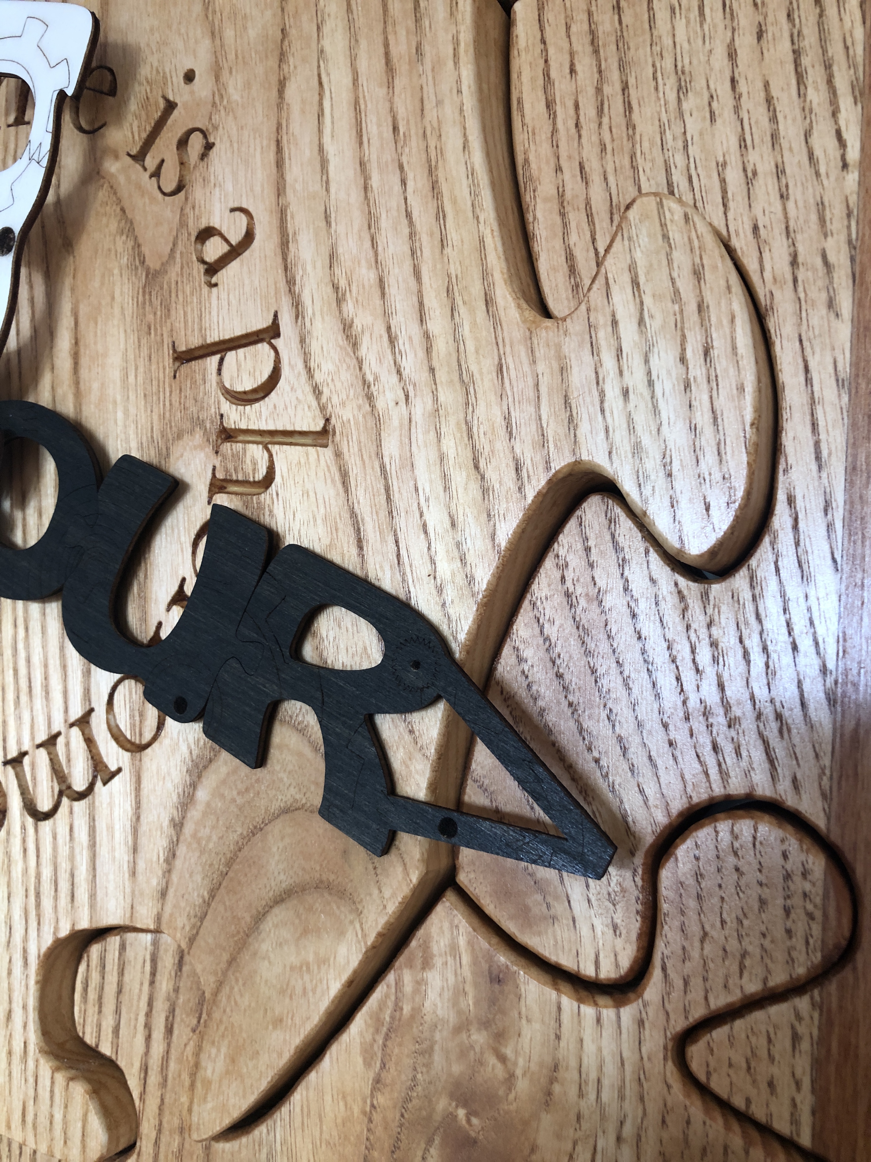
    I toyed with several ideas and made prototypes โ€“ most of which failed โ€“ but recently I came up with the idea of a steampunk motif on the words โ€œhourโ€ and โ€œminuteโ€ โ€“ and I figured out how to make them into actual jigsaw puzzle pieces. It involved the use of an extremely precise laser (you could be forgiven for thinking all lasers were equally precise, but that would be very wrongโ€ฆ), choosing extremely flat, strong, very light, and knife-edge-holding, material – with very careful preparation and handling. The hands have been dyed โ€“ not stained or painted โ€“ to give good contrast with each other and the clock face.

    Close-up of the “R” of the HOUR hand. Note the join with the “U”.

    The final artwork has been 95% made by hand, my hands, using the best tools at every stage (as the making-video shows). Iโ€™m very pleased to reference, and hope to provoke thought into, two fundamental and very puzzling concepts in physics and philosophy โ€“ time and gravityโ€ฆ

    Why are some of the numbers missing on my clock face?

    The keen-eyed amongst you might notice that the only numbers Iโ€™ve used are prime numbers. Having a penchant for prime numbers, when designing the clock face, I felt that putting on all the numbers – one to twelve – would make it look too crowded. Also, my goal was to design a clock puzzle โ€“ i.e. with interlocking puzzle pieces. Interlocking puzzle pieces are where two or more distinct puzzle pieces structurally hold together โ€“ and each piece connects with two or more other distinct puzzle pieces.

    It is surely a coincidence that whoever came up with the shape of the Hindu-Arabic numbers we use today, all the single-digit prime numbers have no holes โ€“ or negative spaces – in them, whereas the non-prime numbers have holes. This means that the non-prime numbers โ€“ 4, 6, 8, and 9 โ€“ cannot be single, whole, puzzle pieces. They are two or more pieces โ€“ with one or more smaller (hole) pieces fully enclosed. These โ€œholeโ€ pieces โ€“ or negative spaces – are attachable to only one other piece โ€“ the positive space of the enclosing main digit shape – whereas the prime single digit numbers are all simple single puzzle piecesโ€ฆ

    The negative spaces of the even numbers do not meet the criterion of a puzzle piece – each piece connects with two or more other distinct puzzle pieces – and were excluded from the design.

    This clockface design is using only prime numbers because it is a proper structural puzzle โ€“ all the pieces meet the criteria of proper puzzle pieces โ€“ and, most importantly, this appeals to my aesthetic and numerophile senses (in fact I did originally call this artwork โ€œPrime Jigsaw Clockโ€, but later changed my mind). A clock face is so familiar to modern people that numbers are not strictly necessary โ€“ and many clockface designs have no numbers at all. So, to be provided with six very special prime numbers, is six more than strictly necessary โ€“ and adds to the mystique of what this clock is all aboutโ€ฆ


  • Tawny Owl in Landscape (Predator and Prey) โ€œStained Glassโ€

    Tawny Owl in Landscape (Predator and Prey) โ€œStained Glassโ€

    Title: โ€œTawny Owl in Landscape (Predator and Prey) (floral map)โ€
    Artist: Michael Autumn
    Medium: Resinous glass paints on faux leaded (composite plastic) clear cast acrylic sheet
    Size: 60cm (W) x 85cm (H)
    Edition: Original
    Authenticity: Hand-signed (bottom, far left) with purple glass paint on light pink painted cloisonnรฉ cell.
    Date: 02/2025


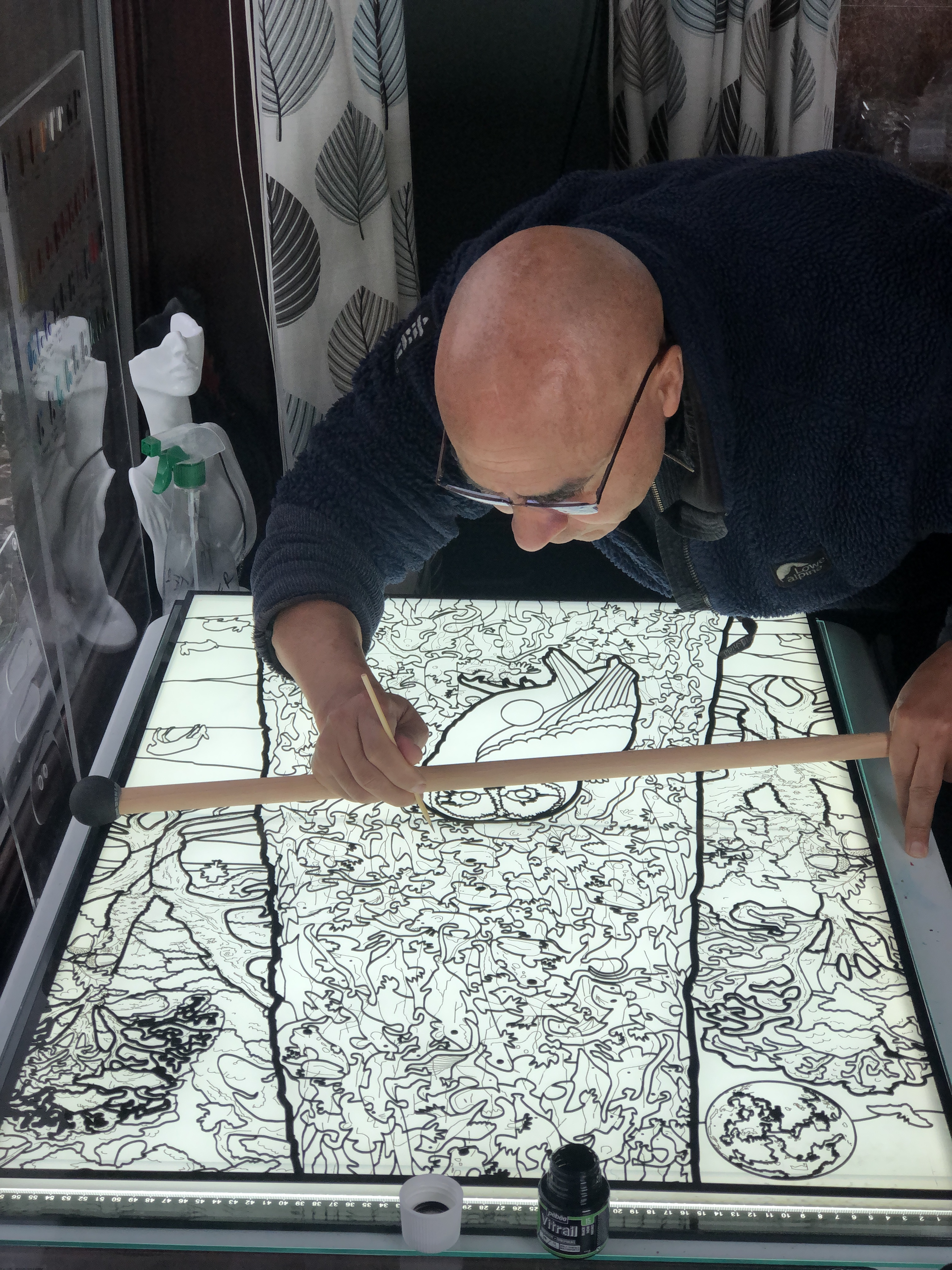
    Michael Autumn drawing and painting black detail lines and spots amid the laser cut black composite plastic faux leading.

    TL;DR

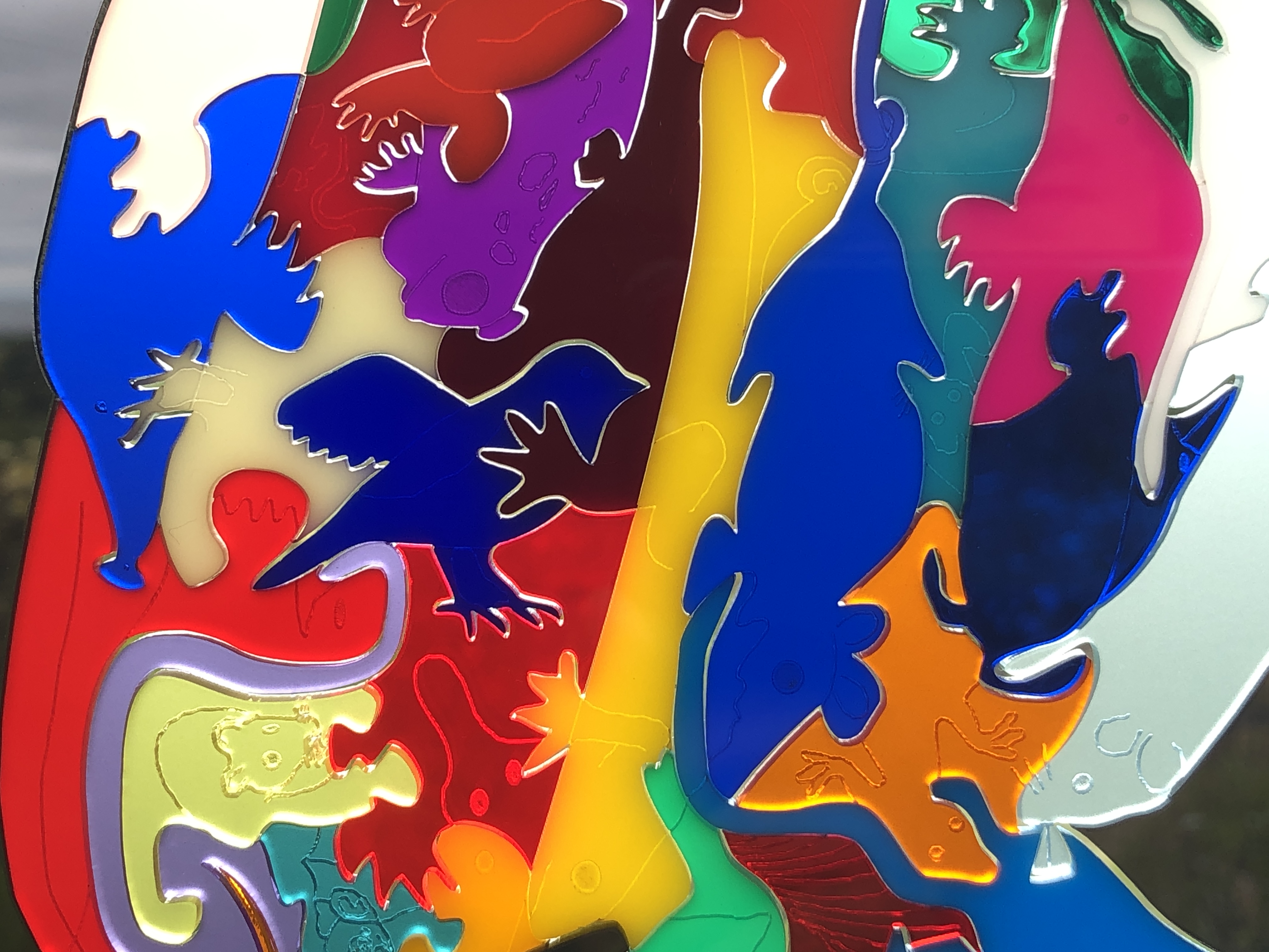
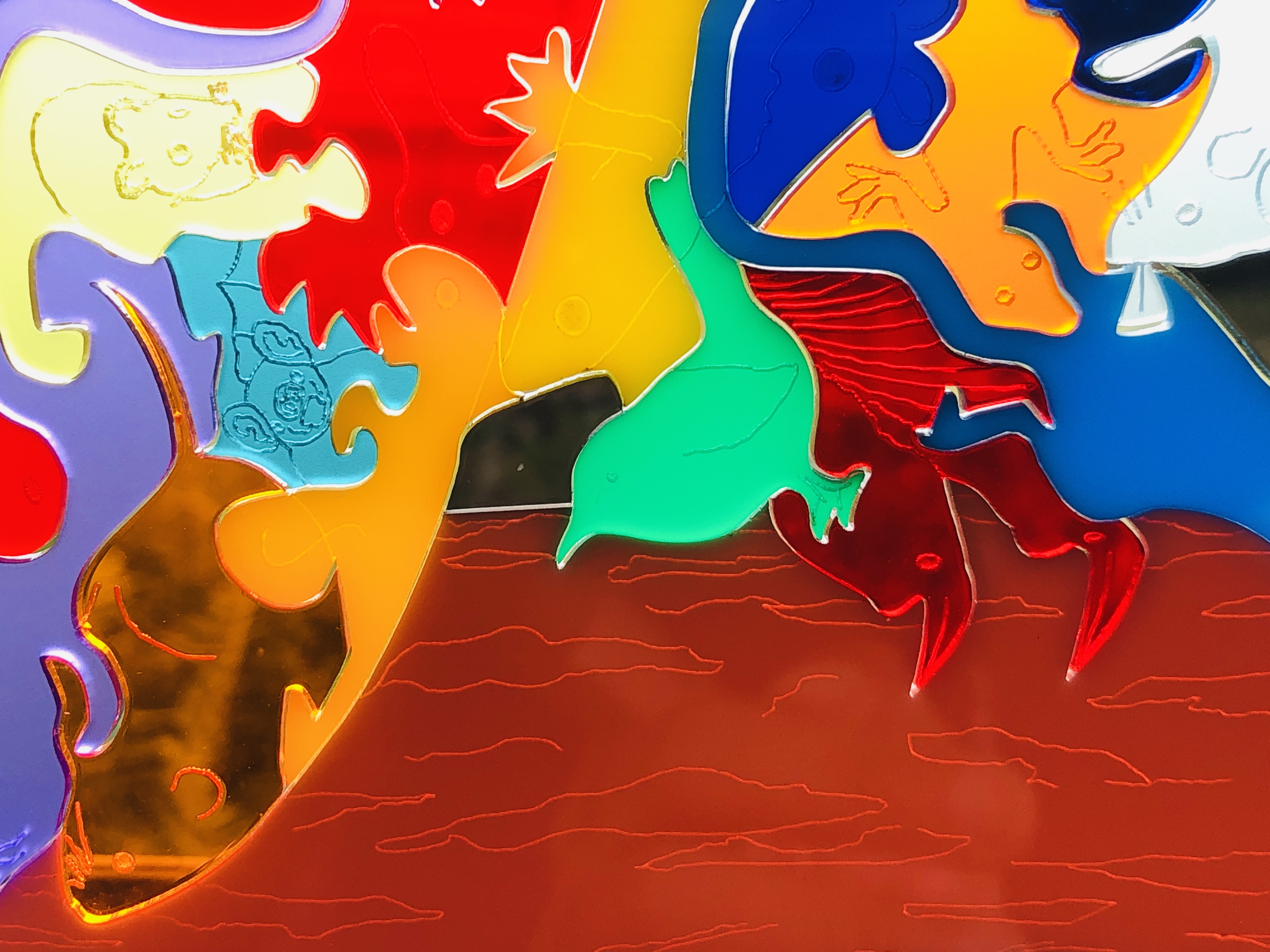
    Not tied to any particular medium or technique, I have tried to devise a way of achieving a stained-glass look with much more detail than is conventionally possible โ€“ using a clear acrylic sheet, laser-cut black composite โ€œleadingโ€ (aka โ€œcamesโ€ โ€“ the โ€œHโ€-shaped strips of lead holding the glass pieces together), and the coloured “glass pieces” are transparent resinous glass paint.

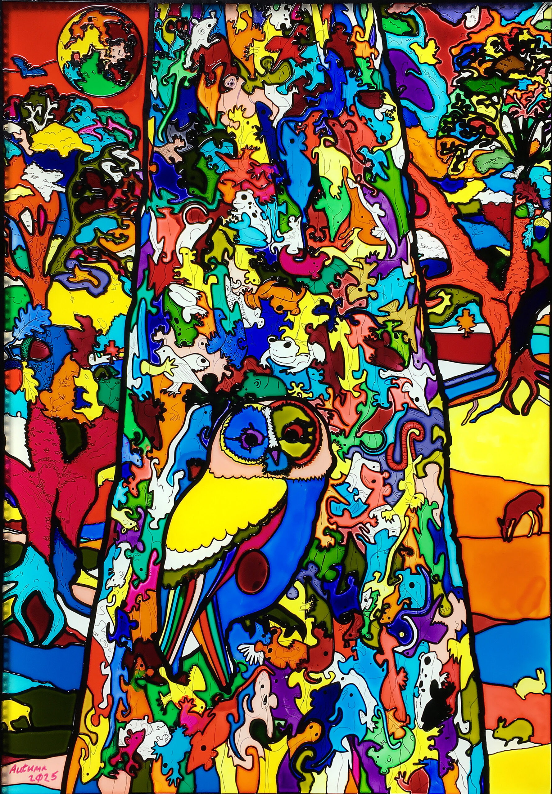
    The scene is a tawny owl in a โ€œtreeโ€, in a landscape with animals, trees, bats, and the moon in the background. The main foreground โ€œtreeโ€ trunk is actually made up of a variety of the owlโ€™s prey creatures โ€“ and asks the question: if these owls eat 2-6 of these animals every day, and they live up to 24 yearsโ€ฆ?


    The centre column (the main tree trunk) of this artwork comes directly from my original thick oak wooden art puzzle (see https://michaelautumn.wordpress.com/2023/05/03/tawny-owl-with-egg-art-puzzle/). That work is naturally quite dark and monochromatic because it is a nocturnal scene, and most of the prey animals (depicted in the main tree trunk) are also nocturnal, and therefore dark and dull coloured. So I thought it would be interesting to turn the idea upside-down and make it into a vibrant kaleidoscopic “stained-glass” landscape scene.

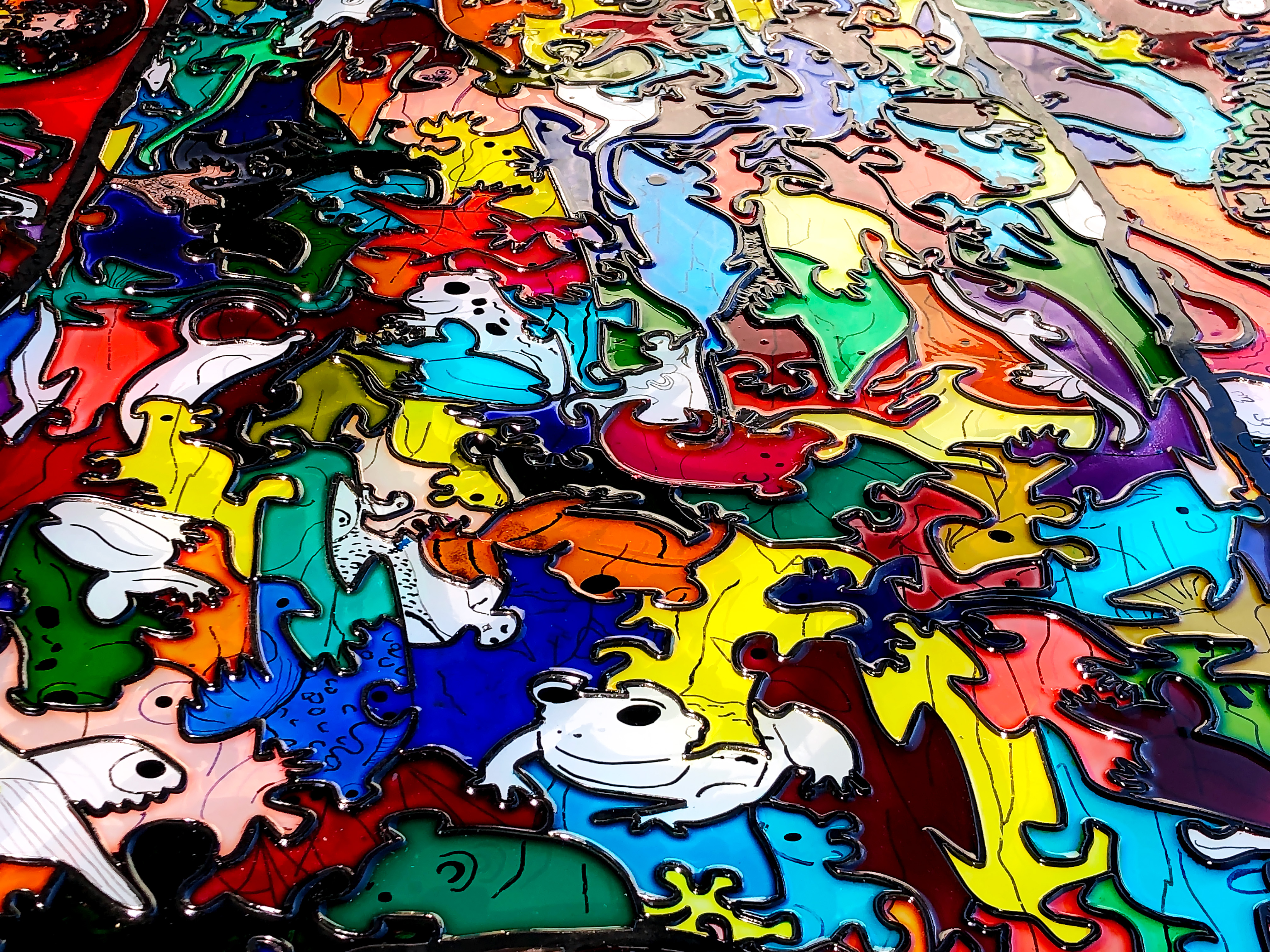
    This imaginary landscape faux stained-glass artwork is my attempt to overcome some of the limitations of conventional stained-glass techniques. Itโ€™s hand drawn and hand painted (using transparent resinous glass paints) on a 10mm thick clear 850mm x 600mm acrylic base. The faux leading (aka โ€œcamesโ€ โ€“ the โ€œHโ€-shaped strips of lead holding the glass pieces together) (of different widths) is my devising: its hand-drawn, laser cut, black composite โ€“ glued to the acrylic base. The coloured glass effect is achieved with transparent resinous glass paint lasgely poured into each cell โ€“ an effect very much like cloisonnรฉ stained-glass.

    Iโ€™m lucky to be a completely free artist – unaffiliated to any art movement, genre, or medium; and not tied to any particular materials, methods or techniques. My main interest is expressing my creativity and achieving my designs to the best of my ability โ€“ using any material/s or techniques I can think of to help me achieve my goals. I like exploring new materials, tools, and technologies: you might call me a tech geek. Iโ€™m very interested in pushing art forward โ€“ as opposed to continuing centuries-old traditions and techniques. In every historical medium I can think of, past masters in those mediums cannot be matched โ€“ let alone surpassed โ€“ and I think itโ€™s pointless to try. All artists can do what they like, but I am keen on creating new things. Iโ€™m very interested in trying new materials and tools that give new and/or greater creative possibilities. While I like the look of stained-glass, I find that the centuries-old tradition of cutting glass and fusing pieces side-by-side with lead โ€“ is too restrictive, time-consuming, and cumbersome. Through my own research and tests I realised itโ€™s possible to create the same look, but more easily and in much greater detail.

    In this artwork I have simulated the opaque dark lead cames look of stained-glass using laser cut black plastic composite. I developed this idea through research and testing, and my design fully exploits the much greater detail possible. My most intricate laser can cut thin material and can readily cut 1mm latticework. The thinnest commercially available lead cames I can find are between 3.5mm and  5mm… The majority of the faux cames in this artword are 1mm, the widest is 8mm. This means not only that far greater detail in the design are achievable, but also more light can come through the windowโ€ฆ

    Lead cames have the function of binding pieces of transparent glass side by side. But I am using coloured transparent resinous glass paint โ€“ so I donโ€™t need to bind pieces of glass together. Cames also have an aesthetic that I like that highlights shapes and colours. I use different widths giving me greater artistic freedom than with conventional cames.

    Finally, the whole piece is covered in a thin layer of clear resin to seal everything and provide extra protection. So the actual stained-glass piece is a thin layer sandwiched between a sheet of clear cast acrylic and a clear resin topcoat. The base, or rear, acrylic sheet also acts as natural UV protection โ€“ filtering out up to 99% UV radiation. And, since this is the side facing the sun/daylight, means it is in the best position to protect the sandwiched coloured layerโ€ฆ

    This is just the beginning of me trying this new techniqueโ€ฆ


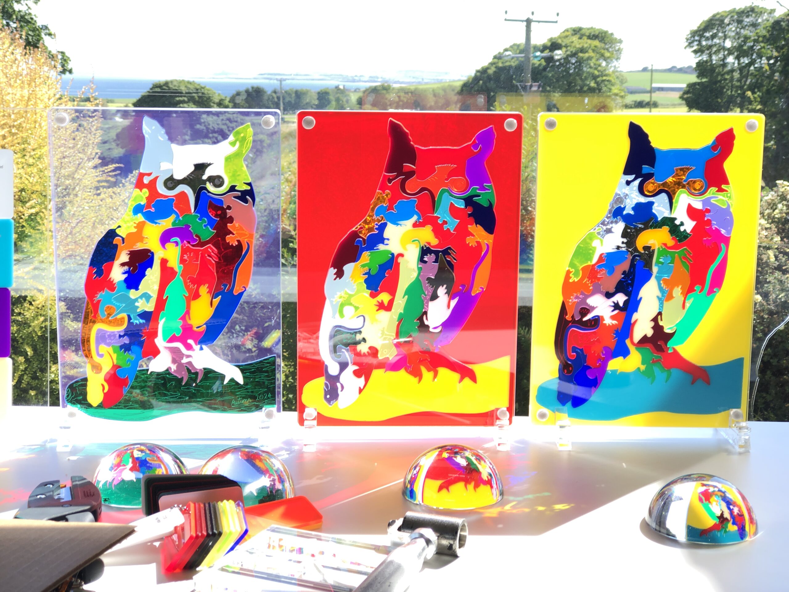
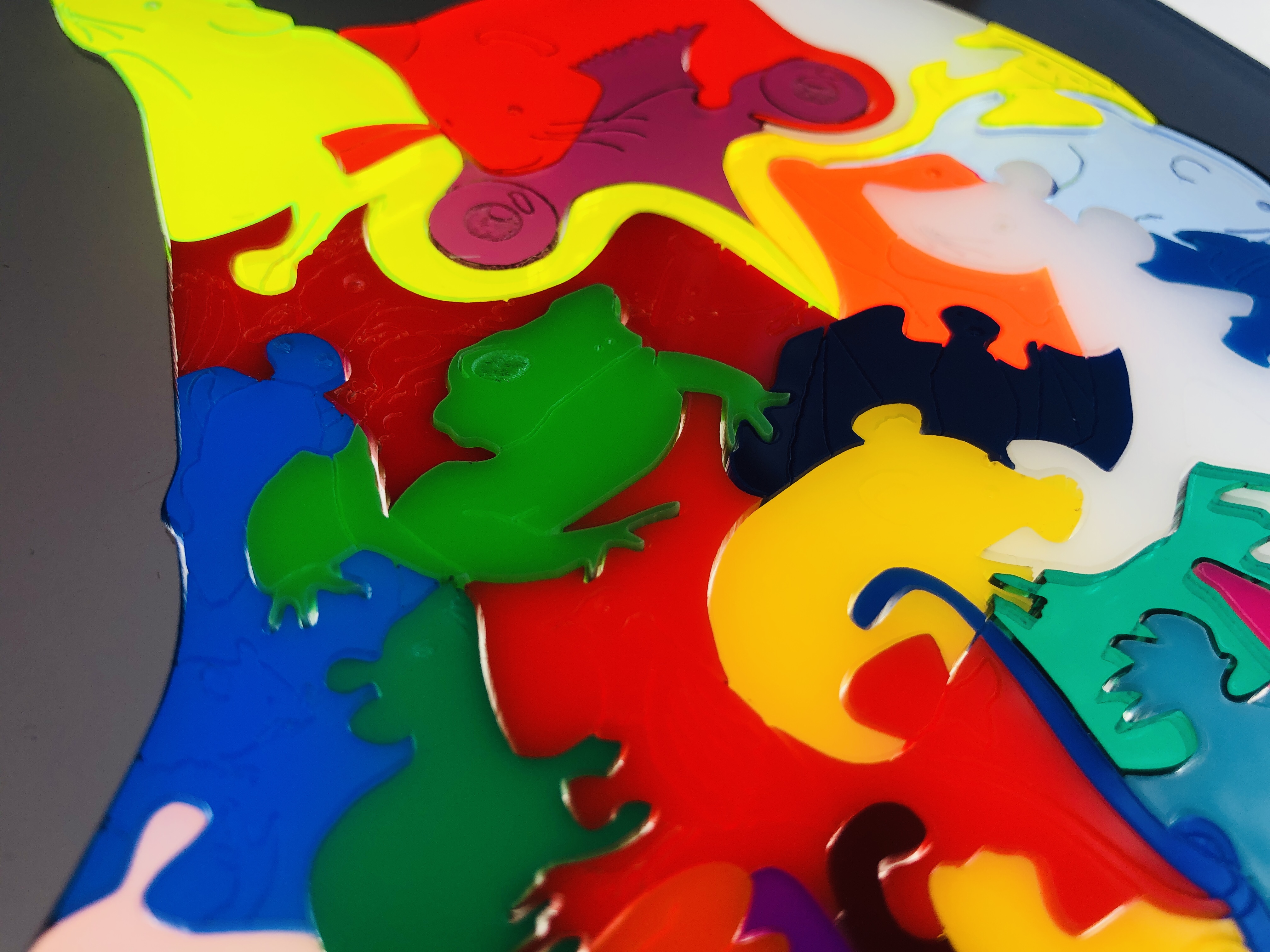
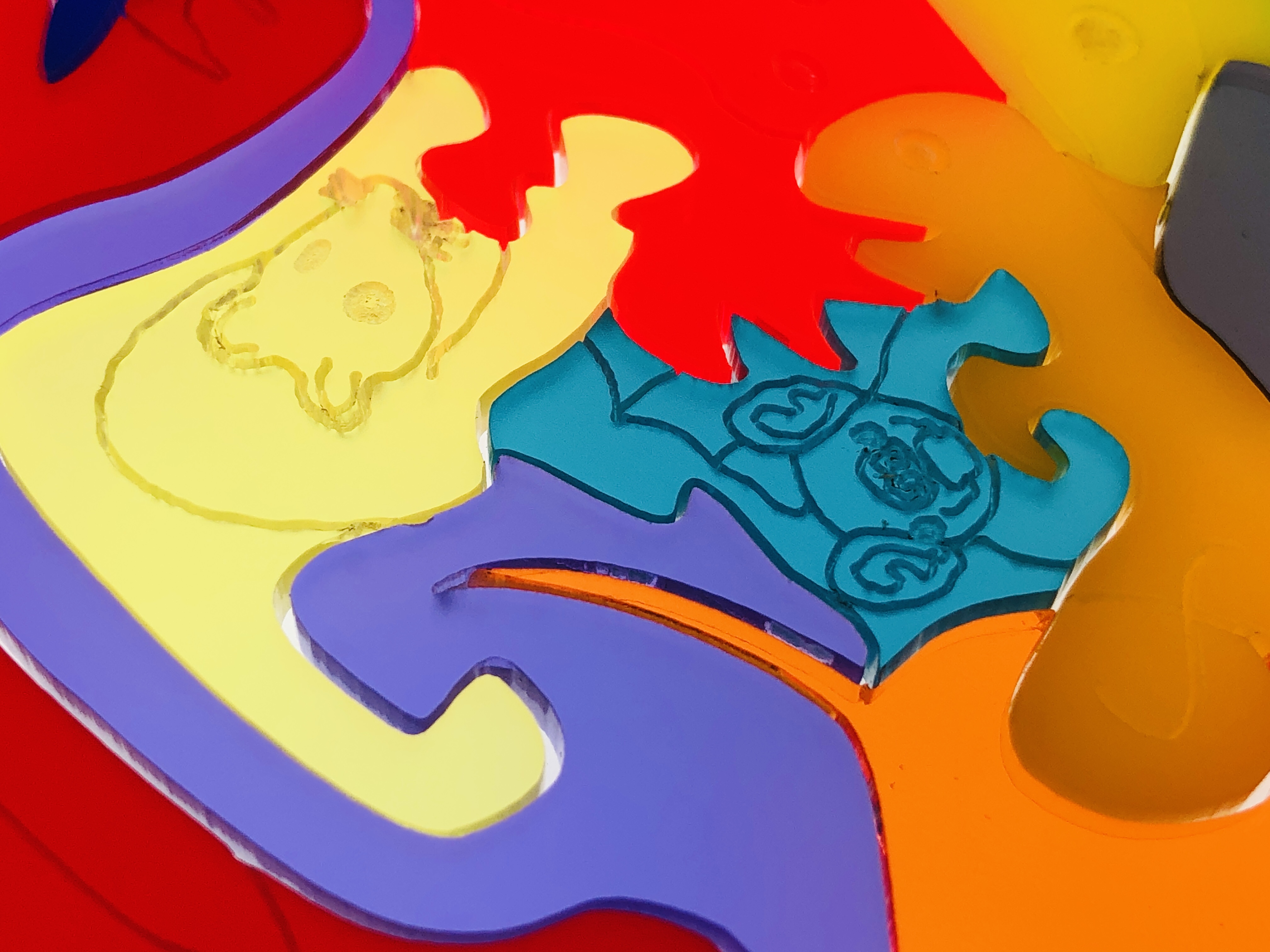
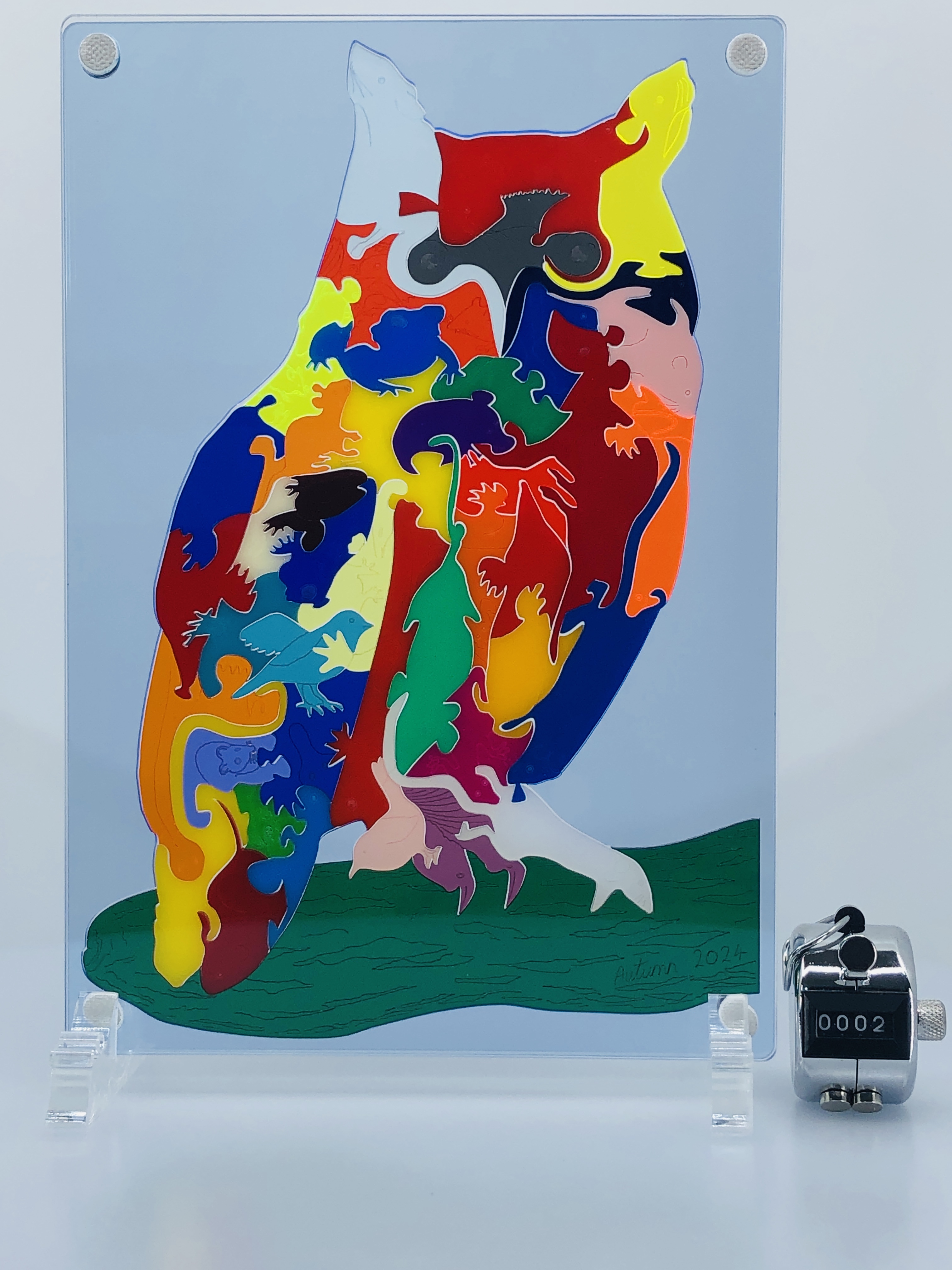
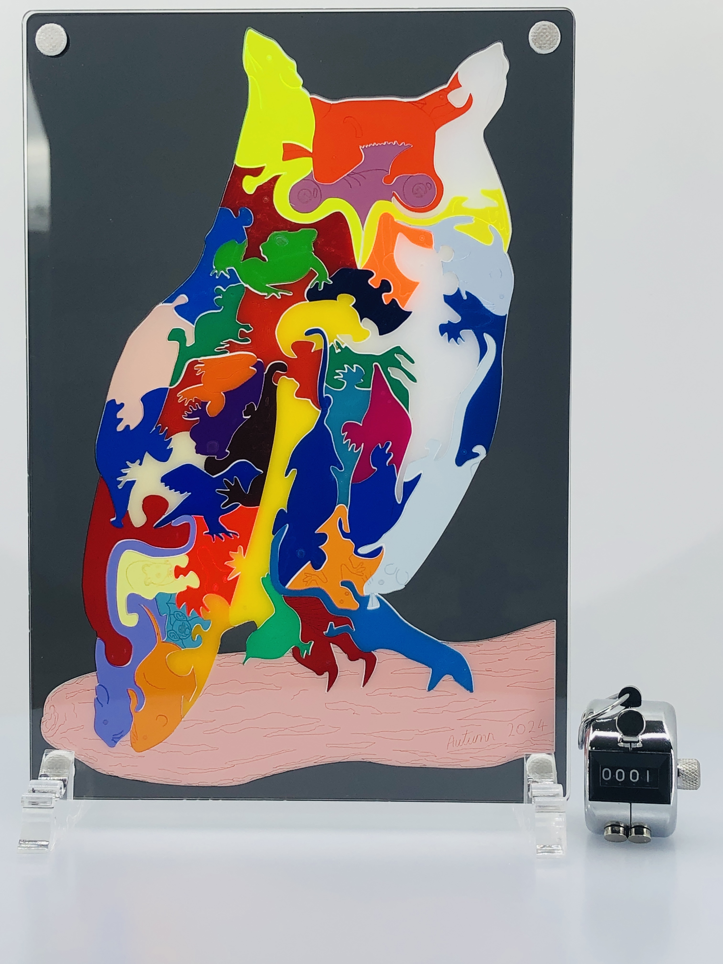
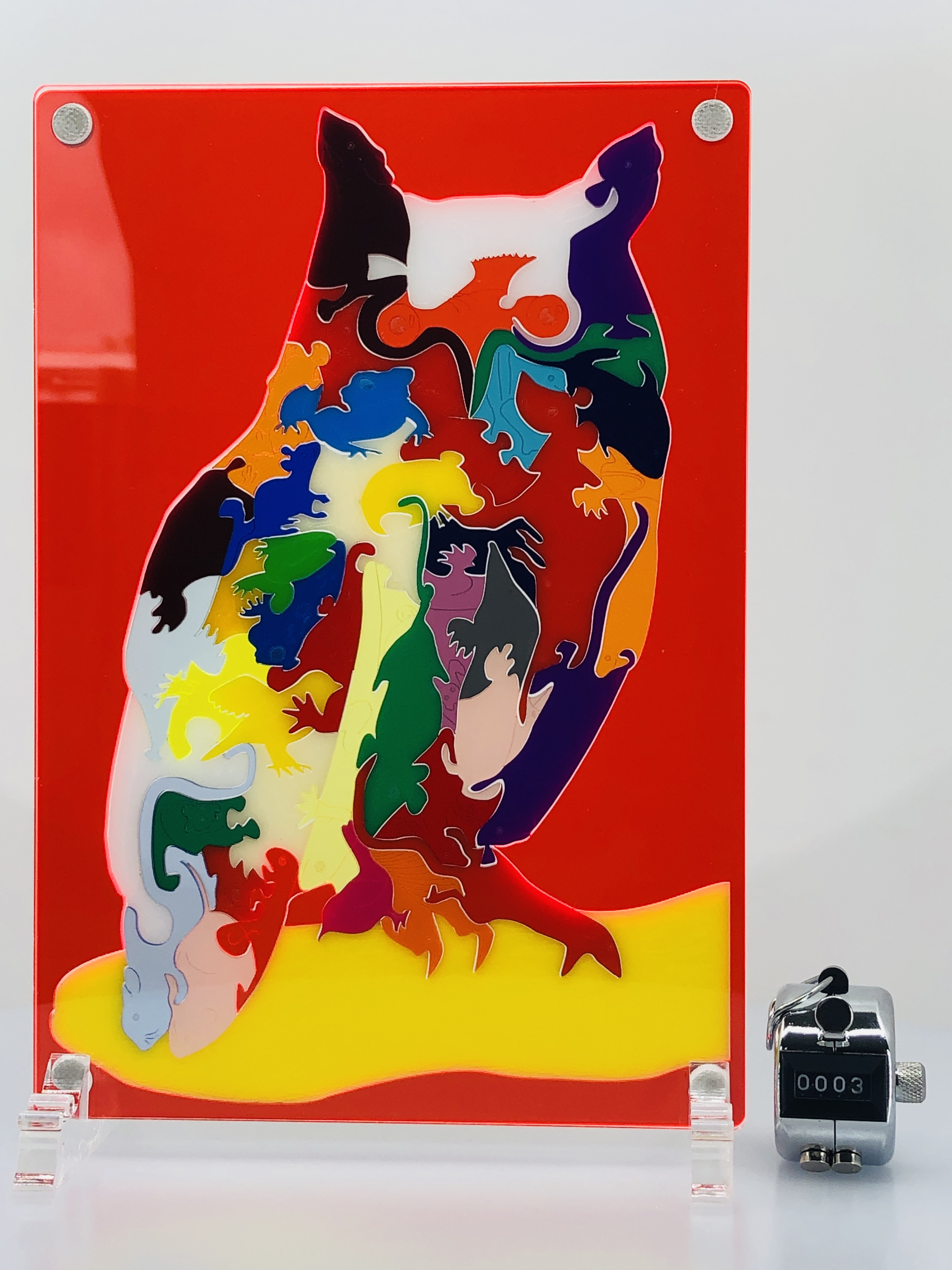
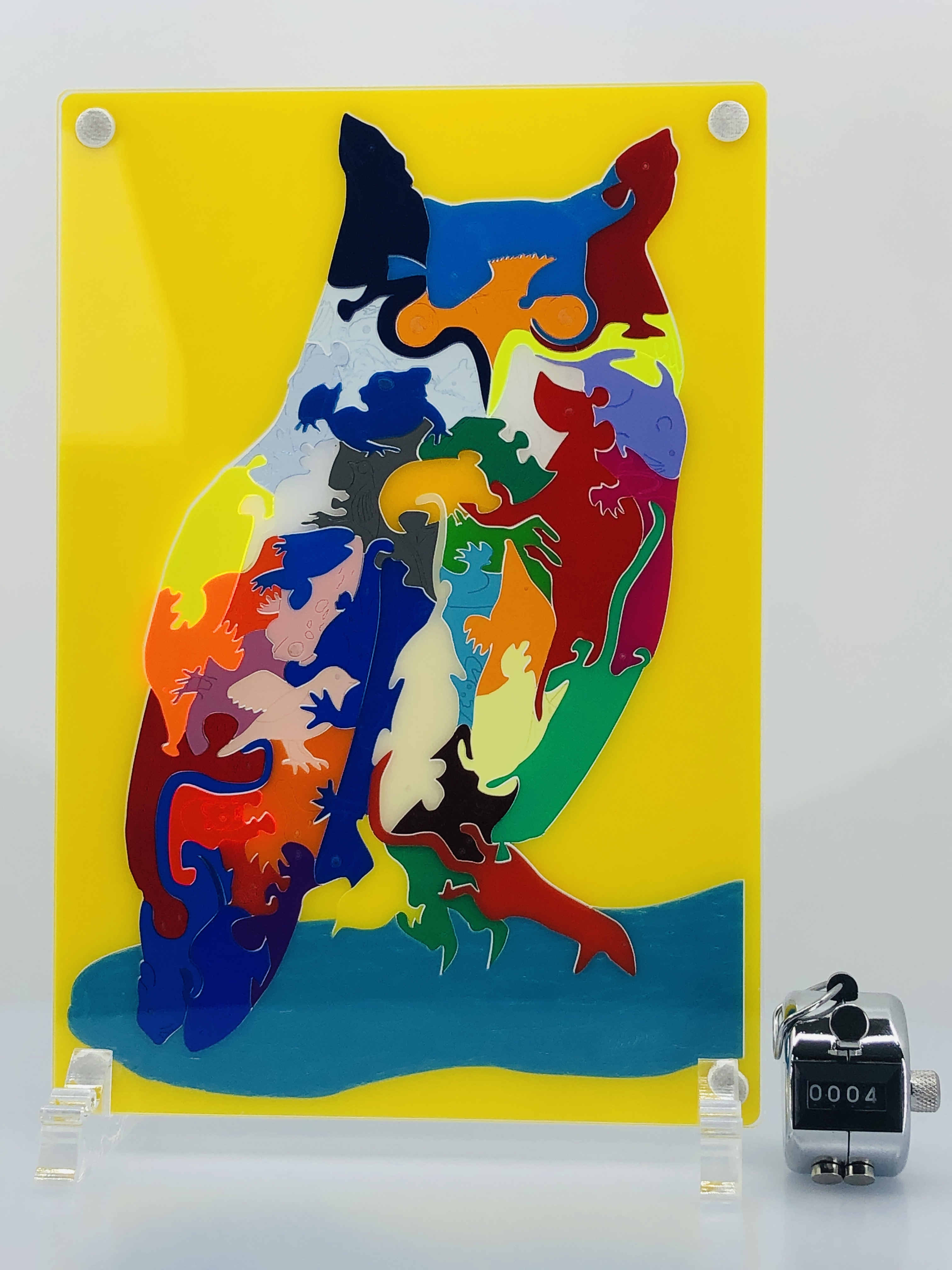
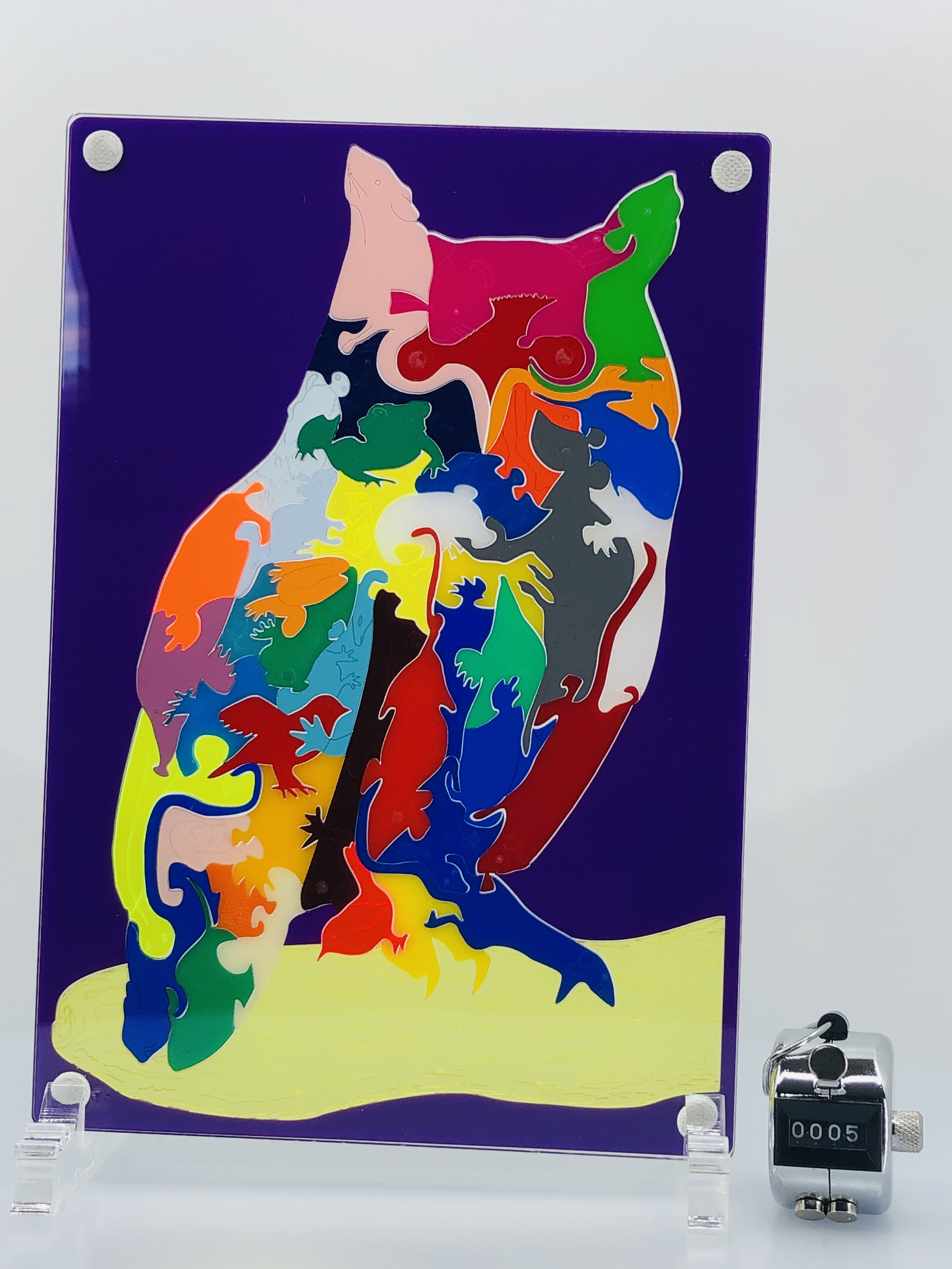
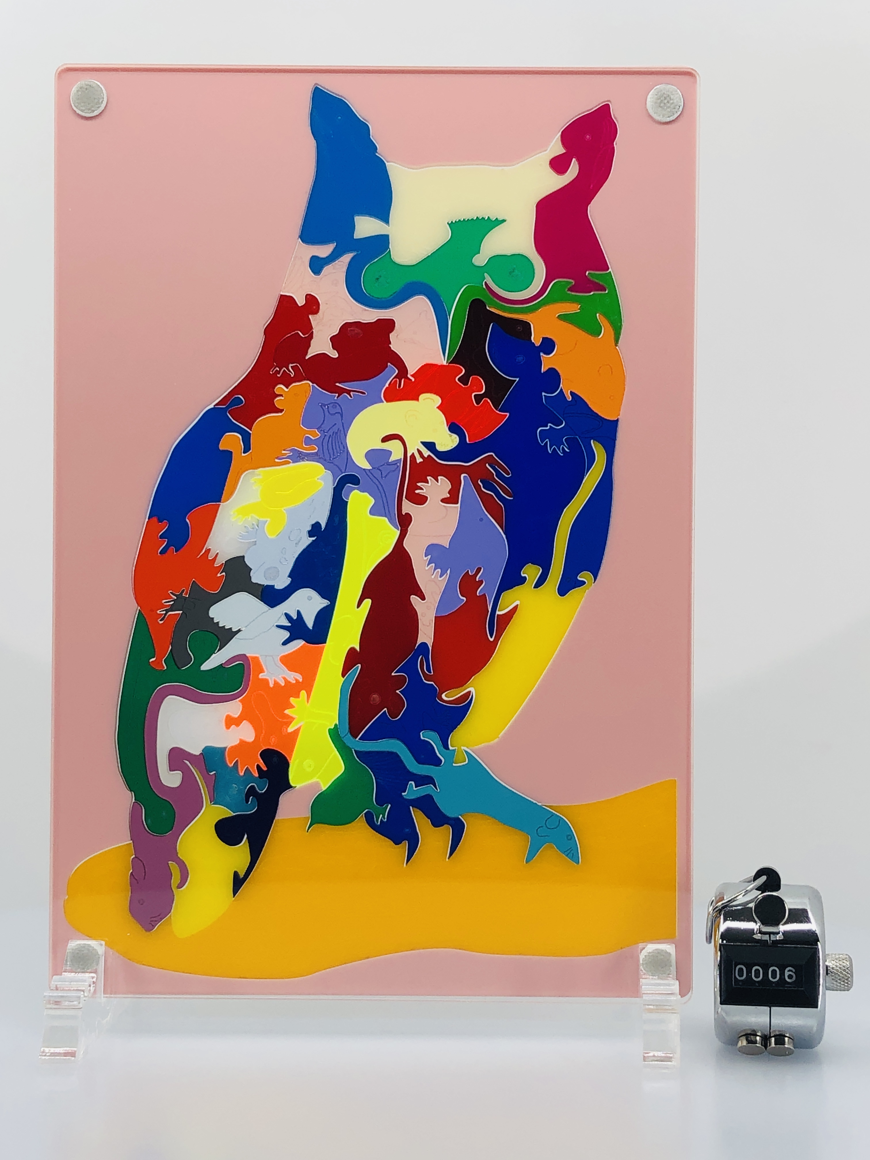
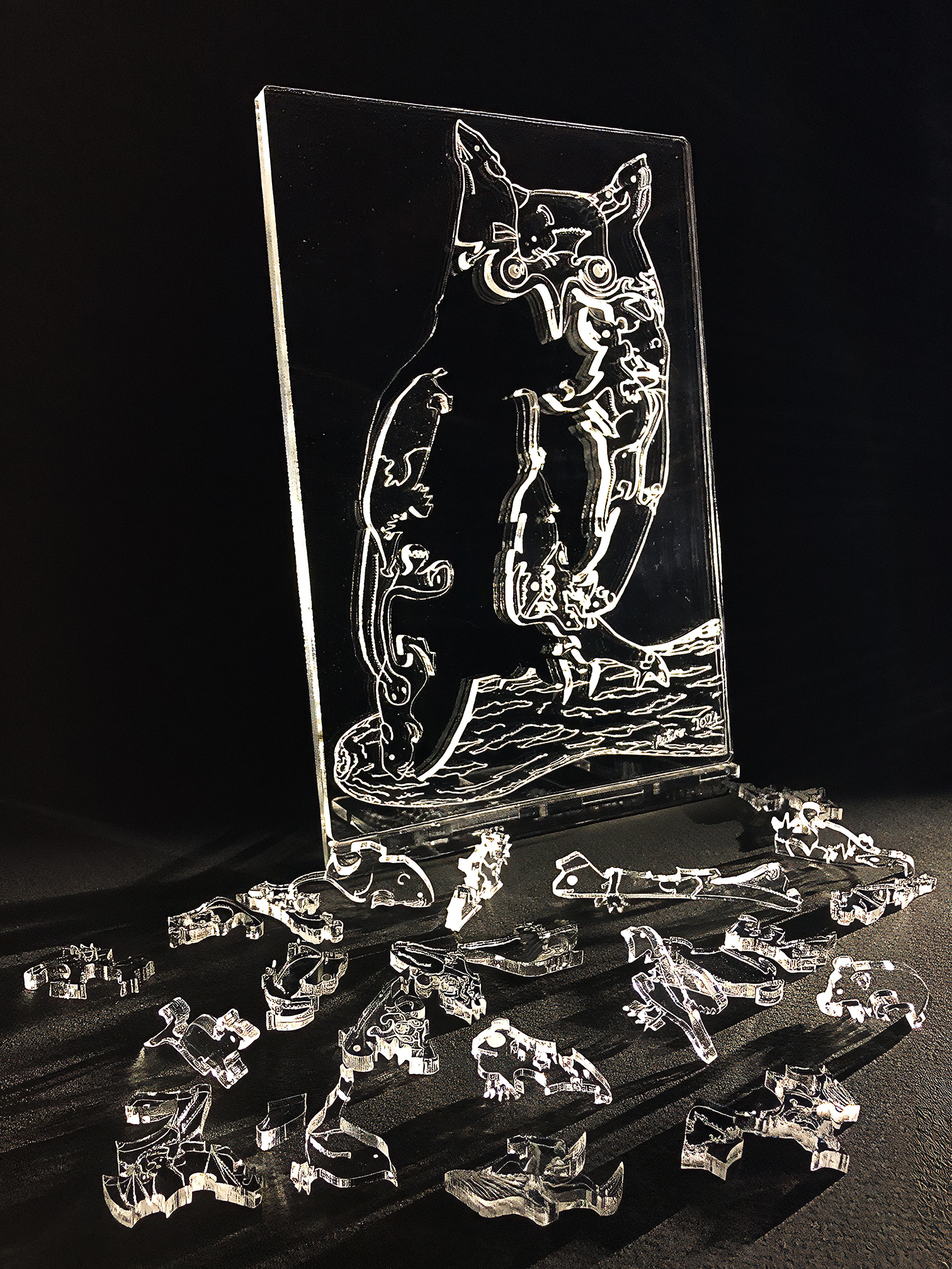
  • Long-eared Owl (You Are What You Eat) – “stained glass” art puzzle & “crystal” stand

    Long-eared Owl (You Are What You Eat) – “stained glass” art puzzle & “crystal” stand

    Artist: Michael Autumn
    Medium: Tinted/transparent/translucent/frosted/fluorescent, and opalescent cast 3mm Perspexยฎ – laser cut & engraved from a hand-drawn digital design (with 3mm and 5mm crystal clear magnetised support panels)
    Size: 19cm (W) x 29cm (H)
    Edition: Unlimited
    Date: 07/2024
    Country: UK
    For sale: A selection of colour variations is available to buy on Etsy – https://michaelautumnart.etsy.com

    TL;DR

    Using coloured acrylics for creating stained glass effects offers a great number of opportunities and there seems to be nothing that cannot be achieved using it compared to conventional stained glass techniques and real glass. I’m very encouraged by the future possibilities of using coloured acrylics, and have several designs already in mind. Watch this space…


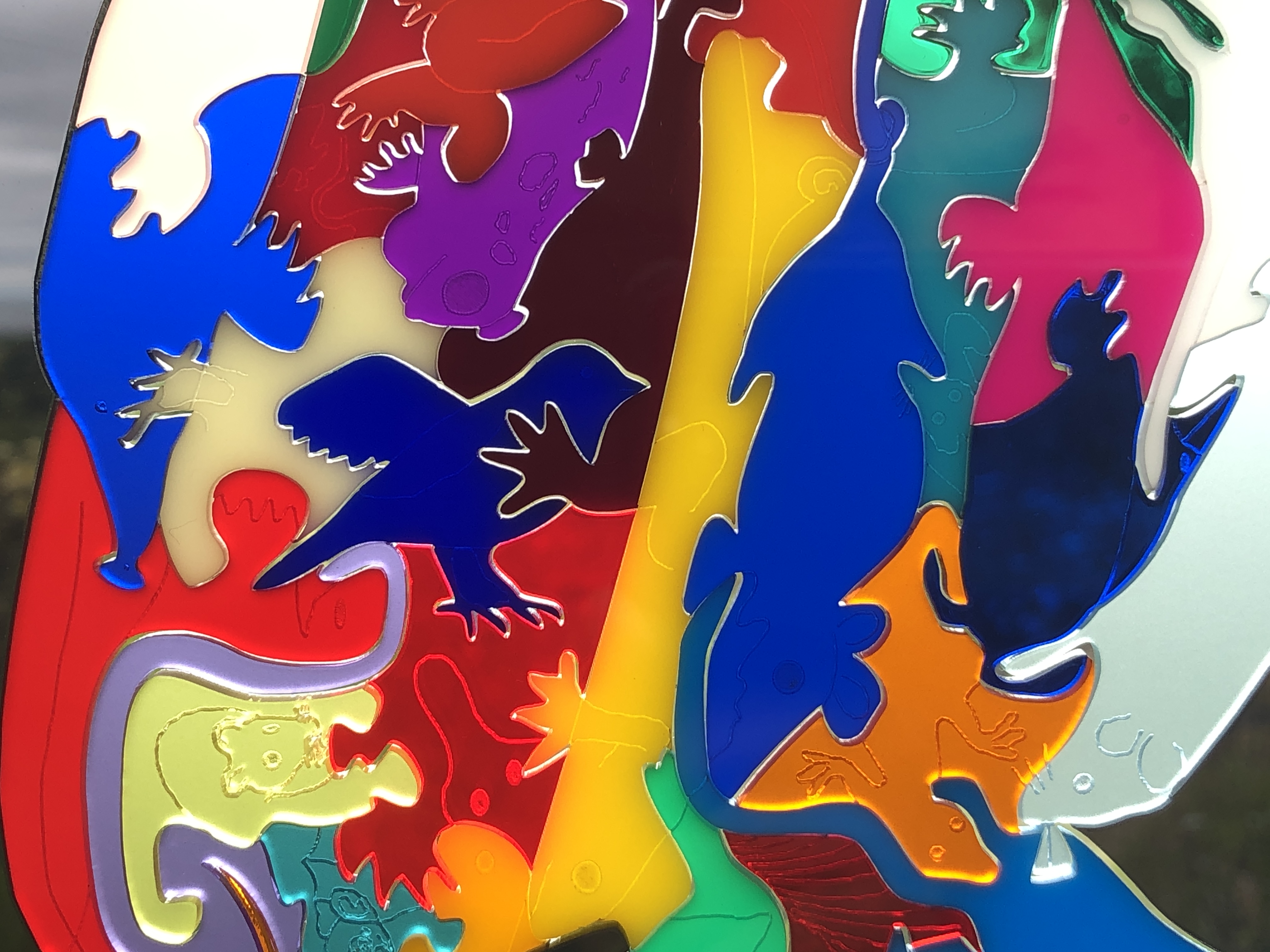
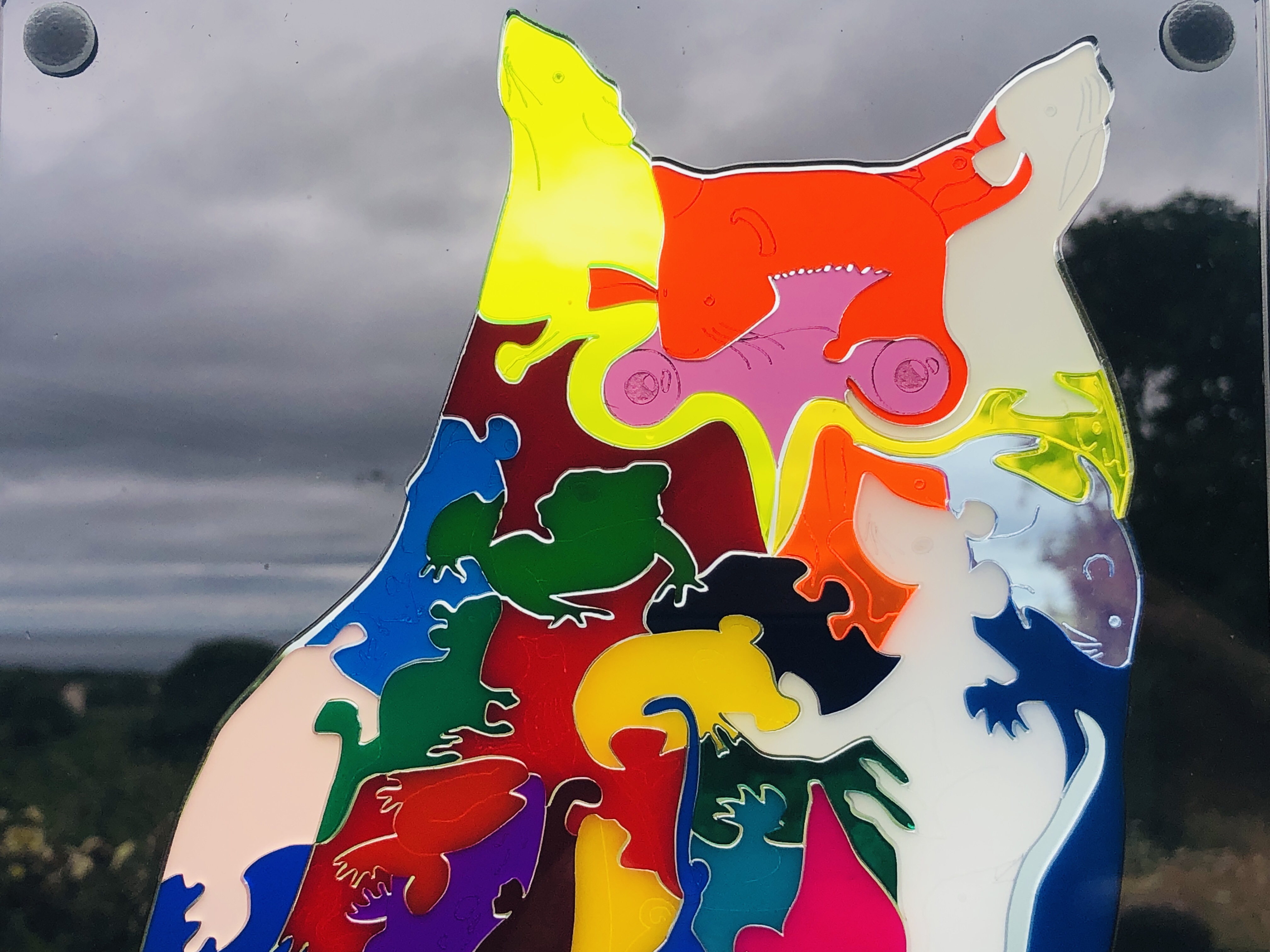
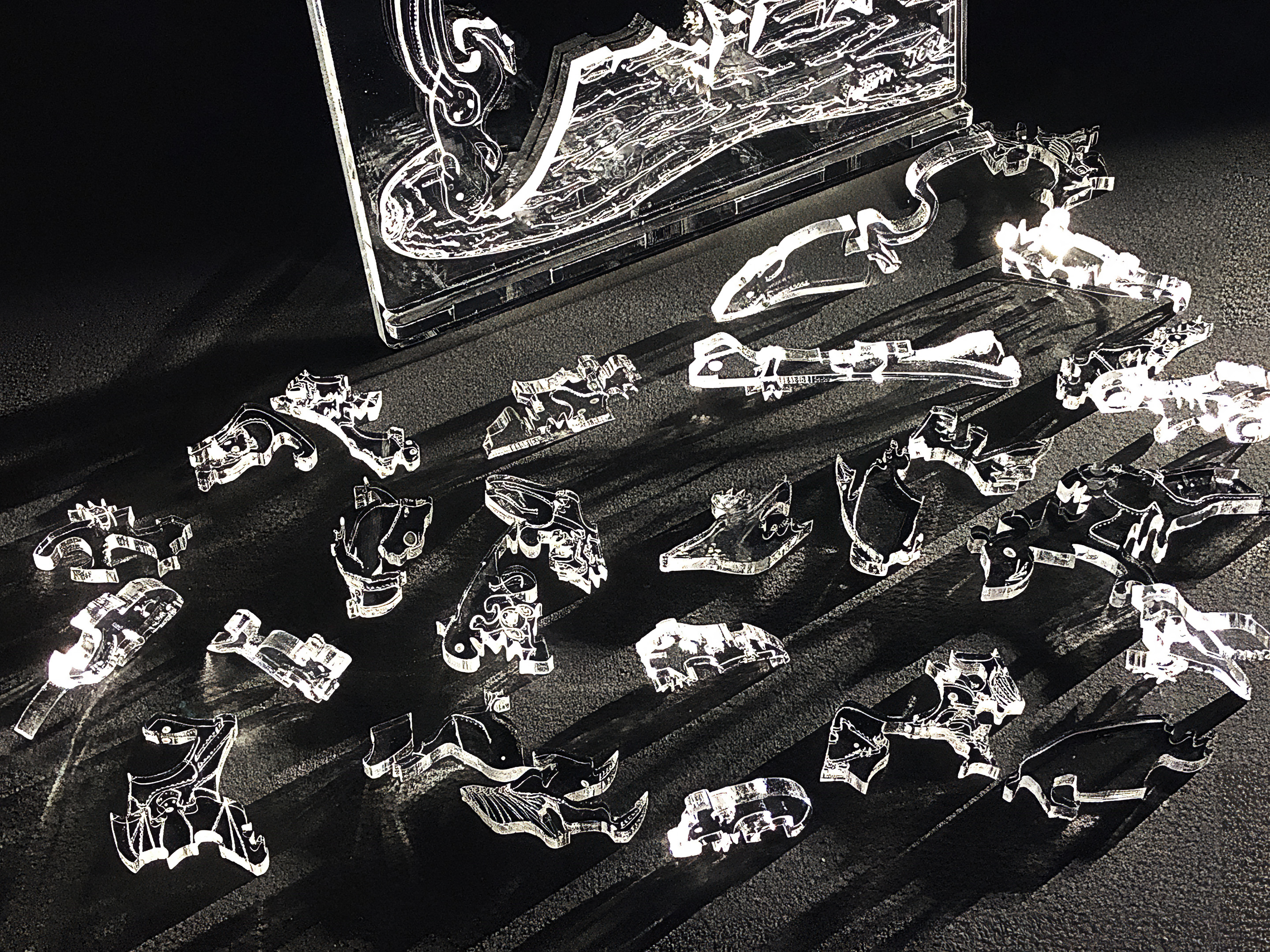
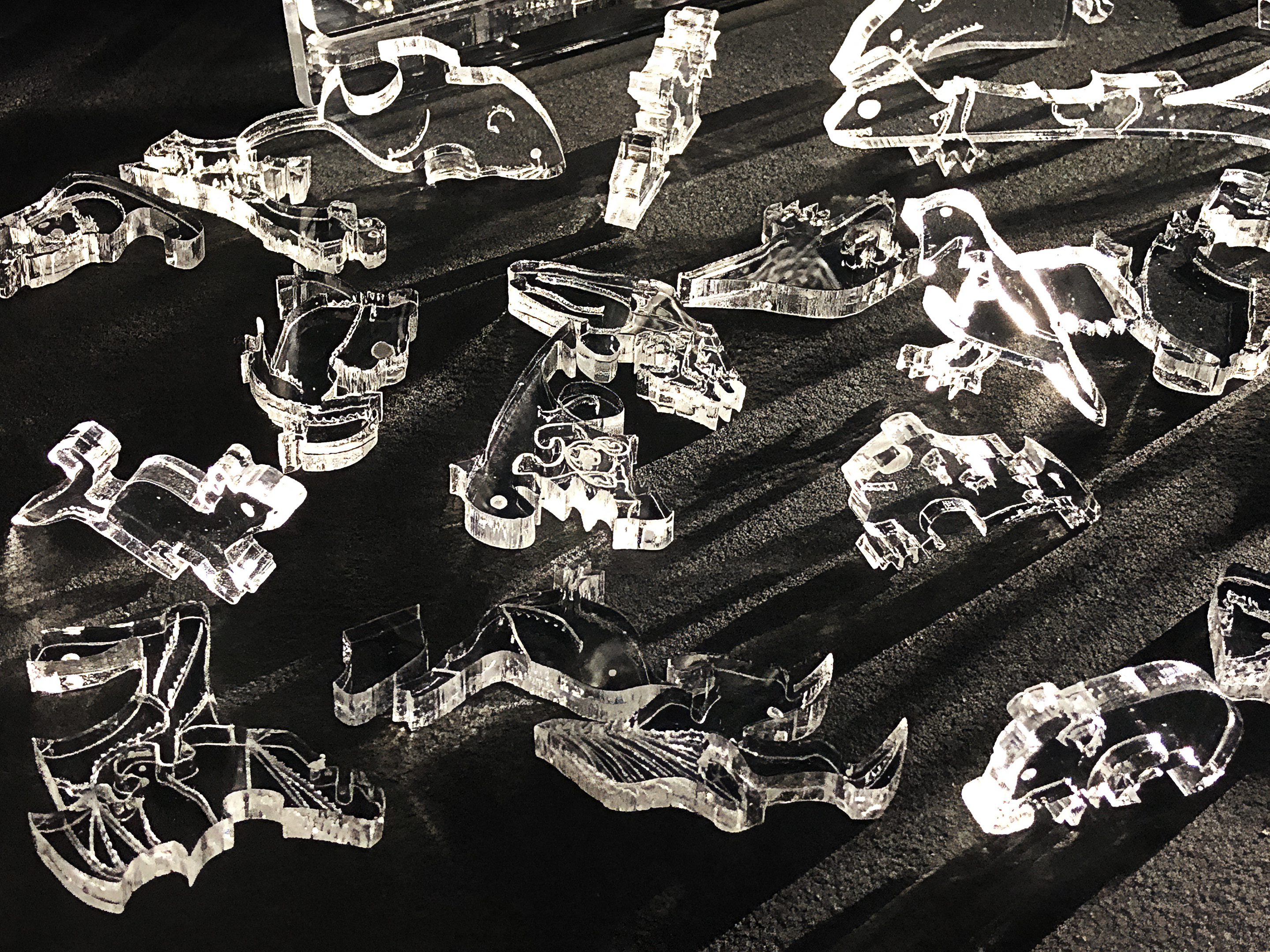
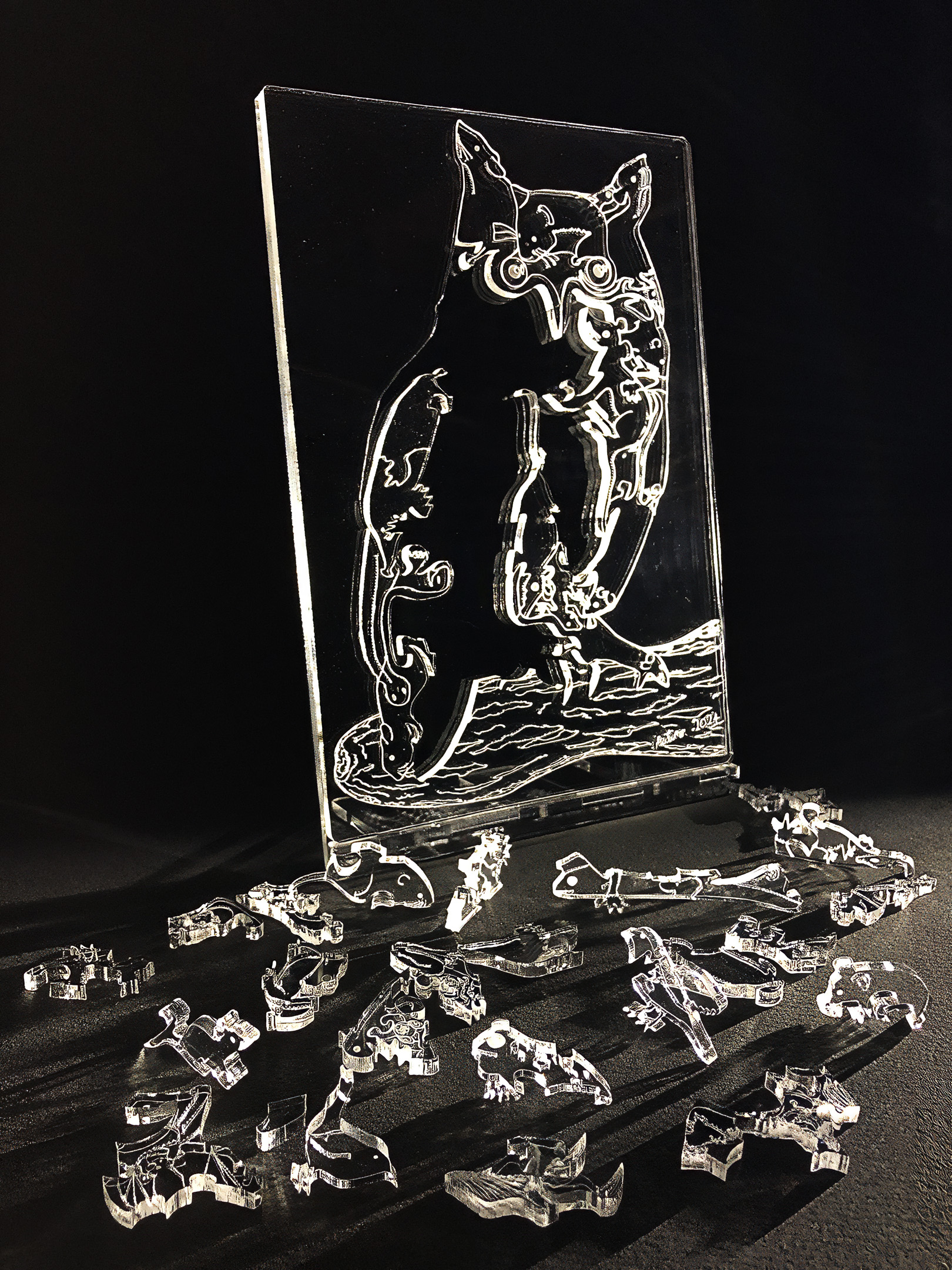
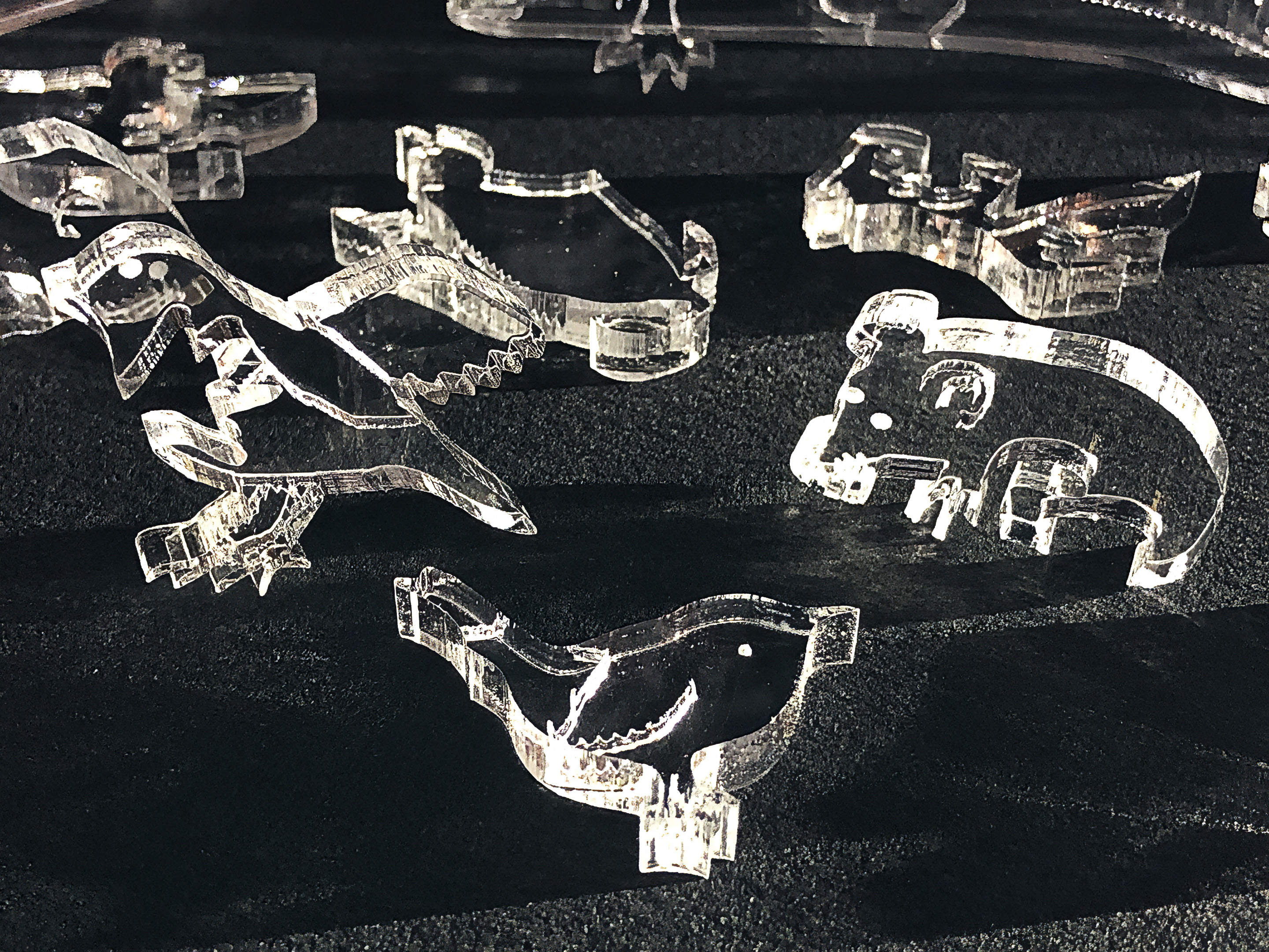
    Description: The idea behind this artwork was to have a tactile, life-sized, long-eared owl, and to toy with the idea โ€“ โ€œYou are what you eatโ€. This is my first foray into using coloured acrylics as a modern stained glass substitute. Stained glass (windows) is a really beautiful medium – not least because, unlike most other art forms, it constantly changes with light and the colour of the (sun)light shining through it. However, just like buildings today don’t have to be made from the same building materials and techniques used by the cathedral-building Normans in the mediaeval period, stained glass windows donโ€™t have to be made with silica, lime, and soda, coloured with metallic salts โ€“ and held together with strips of lead.

    Detail of a 13th-century window from Chartres Cathedral
    By Vassil – Own work, Public Domain, Link

    I personally donโ€™t see the point in replicating materials and techniques that have been used โ€“ and mastered – for centuries. I donโ€™t live in the past; I live in the present. Some artists and artisans of the past can, at best (and with extreme effort), be matched – but it’s exceedingly unlikely that they can be surpassed. Iโ€™m talking about the likes of Grinling Gibbons, Ingres, Peter Bruegel the Elder, Jan van Eyke, Albrecht Dรผrer, Gian Lorenzo Bernini (sculptor) โ€“ not to mention the often anonymous mediaeval stained-glass window artists.

    I can learn from the past, but learning is not the same a replicating. As an artist, Iโ€™m always looking to create something new โ€“ or say something new. And a constant challenge is to create something different โ€“ something that stands out from the crowd, and hasnโ€™t been done before. In my opinion, in the art world it’s a waste of time to do what someone has done beforeโ€ฆ That is what an artisan does โ€“ not an artistโ€ฆ

    The Poor Man's Bible Window from Canterbury Cathedral
    By Template:Unknown 13th century Stained Glass artists – TTaylor, photo 2005, put together from two photos, and ajusted. Wikimedia Commons, Public Domain, Link

    Glass is a truly wonderful, diverse, and lovely material โ€“ particularly with its ability to be coloured (tinted) – but it has its limitations. The old severe limitations of cutting it have been completely overcome by the use of modern day lasers, but itโ€™s very brittle, sharp, and dangerous! This leaves one with the option to work within glassโ€™s limitations, resort to cast moulding (and its limitations), or look for alternative materials that achieve similar resultsโ€ฆ

    Poly(methyl methacrylate) (PMMA) is the synthetic polymer derived from methyl methacrylate. It is used as an engineering plastic, and it is a transparent thermoplastic. PMMA is also known as acrylic, acrylic glass, as well as by the trade names and brands Crylux, Hesalite, Plexiglas, Acrylite, Lucite, and Perspex, among several others (see below). This plastic is often used in sheet form as a lightweight or shatter-resistant alternative to glass. It can also be used as a casting resin, in inks and coatings, and for many other purposes.
    It is often technically classified as a type of glass, in that it is a non-crystalline vitreous substanceโ€”hence its occasional historic designation as acrylic glass.

    Wikipedia

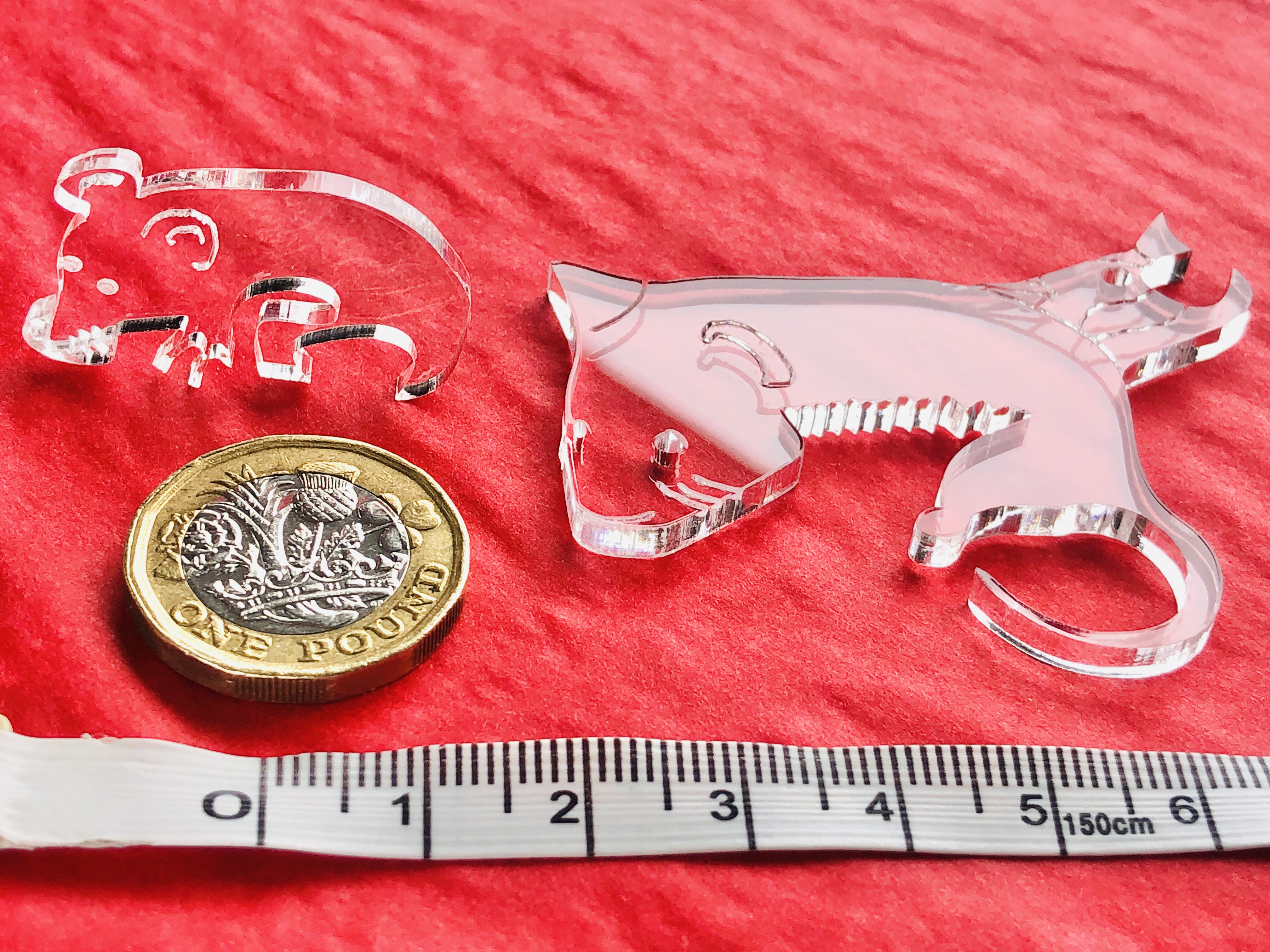
    Clear cast acrylic already matches conventional glass in many respects โ€“ and in some cases surpasses it. Clear acrylic can transmit up to 97% of light passing through it (compared to more like 90% in normal glass), itโ€™s less dense (and therefore lighter for the same volume) than glass (but up to 20 times stronger), doesnโ€™t shatter like glass, is nowhere near as sharp โ€“ and therefore much safer to handle. Acrylic, like glass, can be cut with a laser. This last point is extremely important because the laser literally vaporises the acrylic in its very narrow path. This allows for extremely intricate cutting. Iโ€™ve achieved approximately 1mm wide cuts in a 3mm thick sheet – see below :-

    I do quite a lot of museum-level picture framing, and it’s noteworthy that acrylic glass is the โ€œglassโ€ of choice for practically every museum. Like glass, it can be painted on, and it’s naturally more UV blocking than glass. So the only downside to using acrylic that I can think of is that it’s much softer, and therefore more easily scratched, than glass โ€“ and so it needs to be handled very carefully (but so does glass…!).

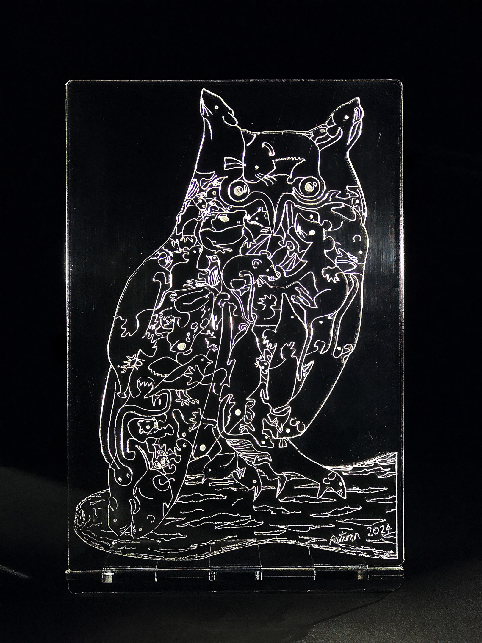
    After successfully managing to very intricately and smoothly cut and engrave clear 3mm & 5mm acrylic in this artwork โ€“

    โ€ฆI thought it would be extremely interesting to try cutting and engraving coloured 3mm acrylic sheets (this is the thickness with the widest range of colours available) โ€“ to see how it performs as a stained glass substitute.

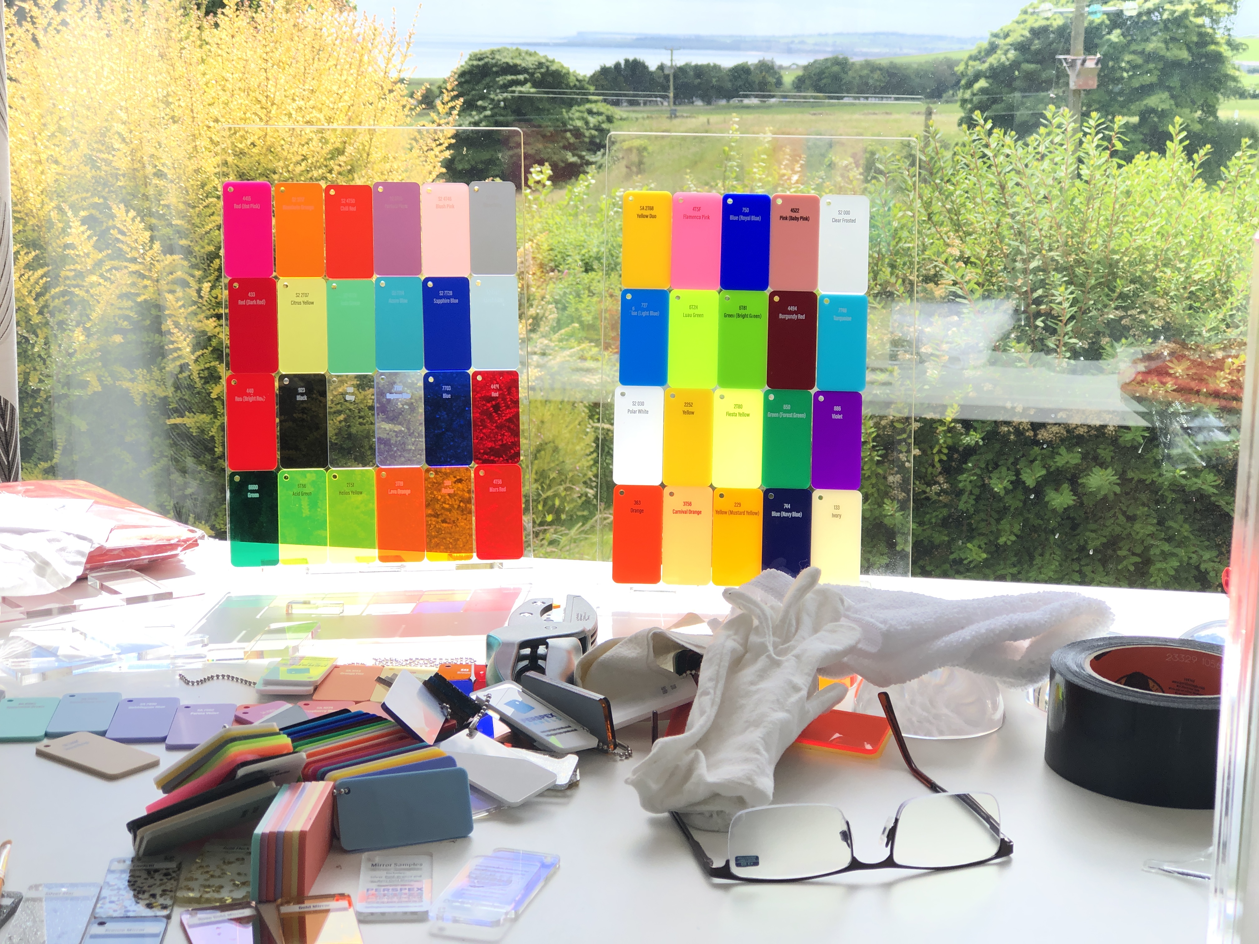
    Most of the range of colours of acrylic available

    I didnโ€™t envisage any problems โ€“ except perhaps that some colours may require more cutting power than others (greater reflectance of bright colours verses albedo effect of dark colours). But this turned out not to be the case, and the cutting was a breeze.

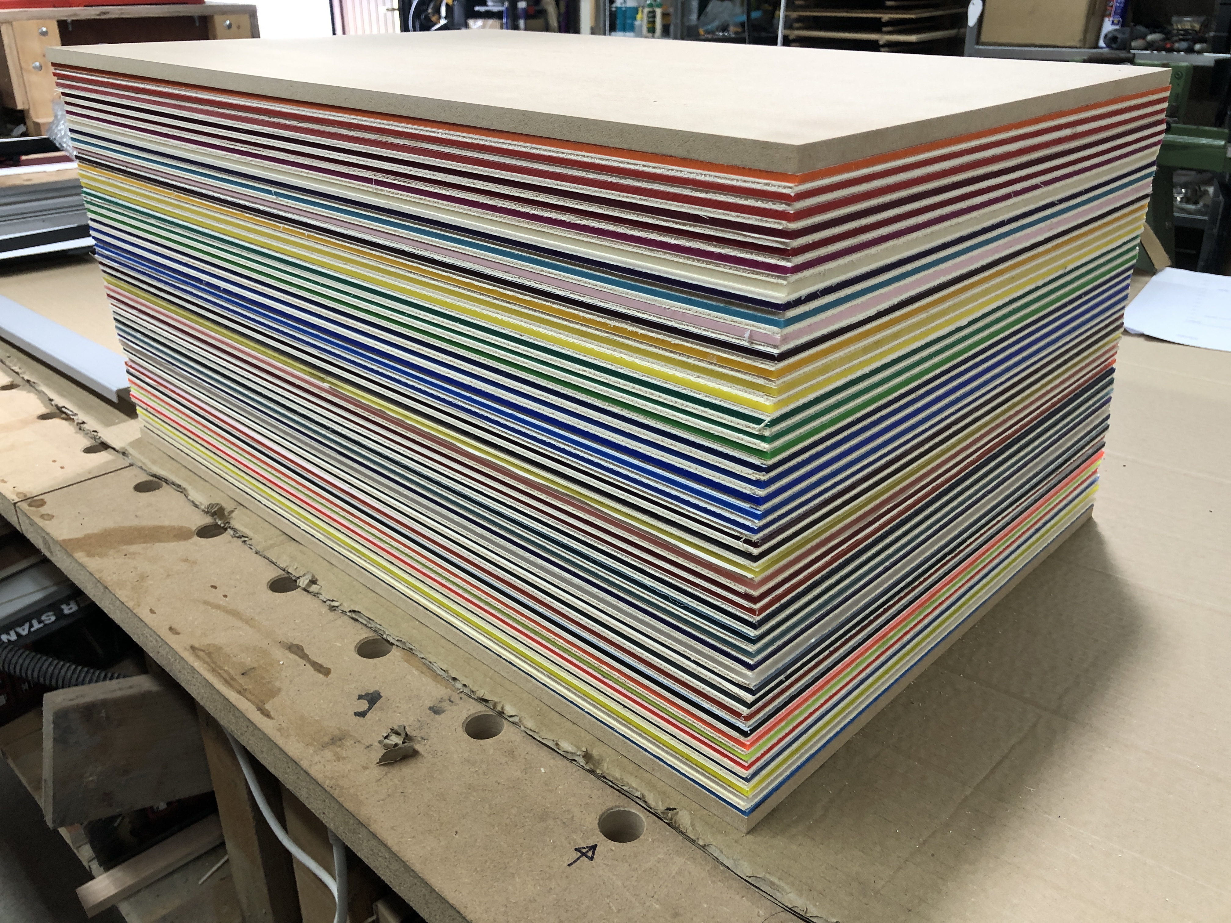
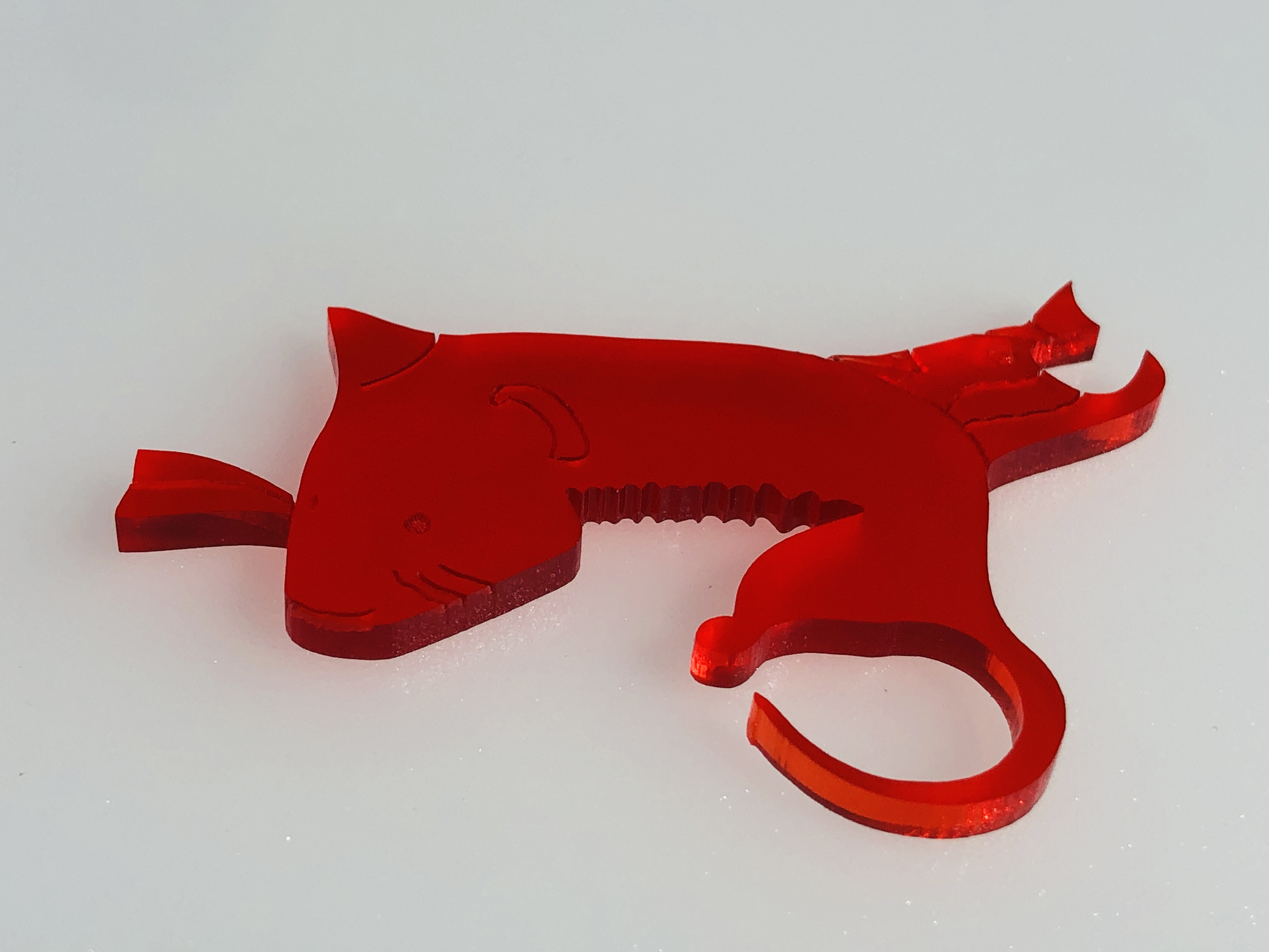
    In fact I was confident enough that cutting coloured acrylic would be doable (having gotten comfortable with cutting 3 & 5mm clear acrylic), that I decided to go full in, and bought 44 different colour/tint/frost/florescence/opalescence sheets (at not inconsiderable expense) โ€“ one for each of the pieces of the long-eared owl art puzzle!

    44 sheets of different colour/tint/frost/florescence/opalescence sheets of acrylic

    I thought it would make a great artwork for each of the 44 pieces to be a different colour and/or opacity. And I would be able to make 44 random-coloured/effects art puzzlesโ€ฆ (I had to make do with some opaque colours because there simply werenโ€™t enough transparent/translucent colours available โ€“ but I thought the variety of translucency in itself could be very different and interestingโ€ฆ)

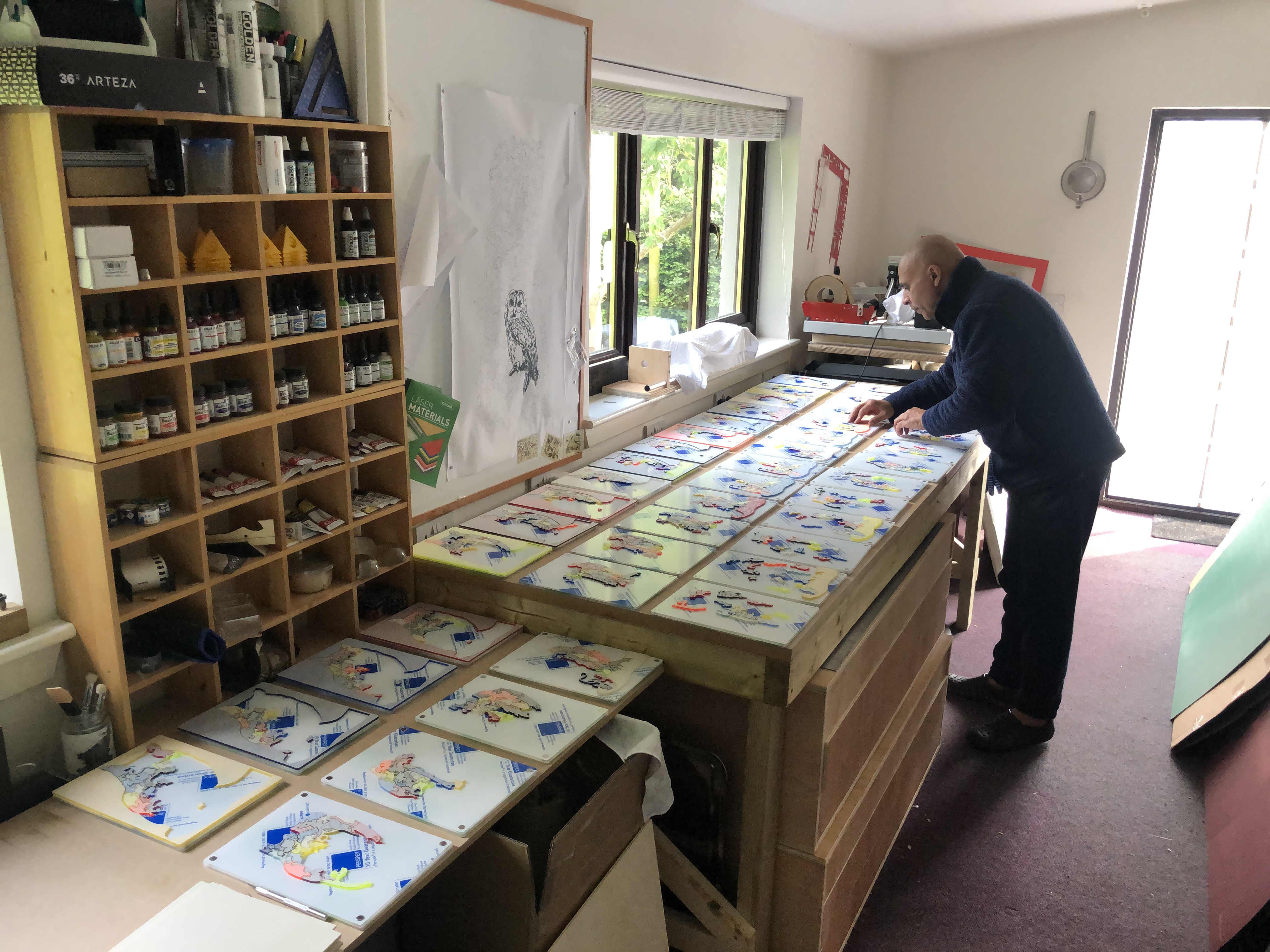
    Assembling 44 different art puzzles from 44 single-coloured puzzles took a long time and was very painstaking…

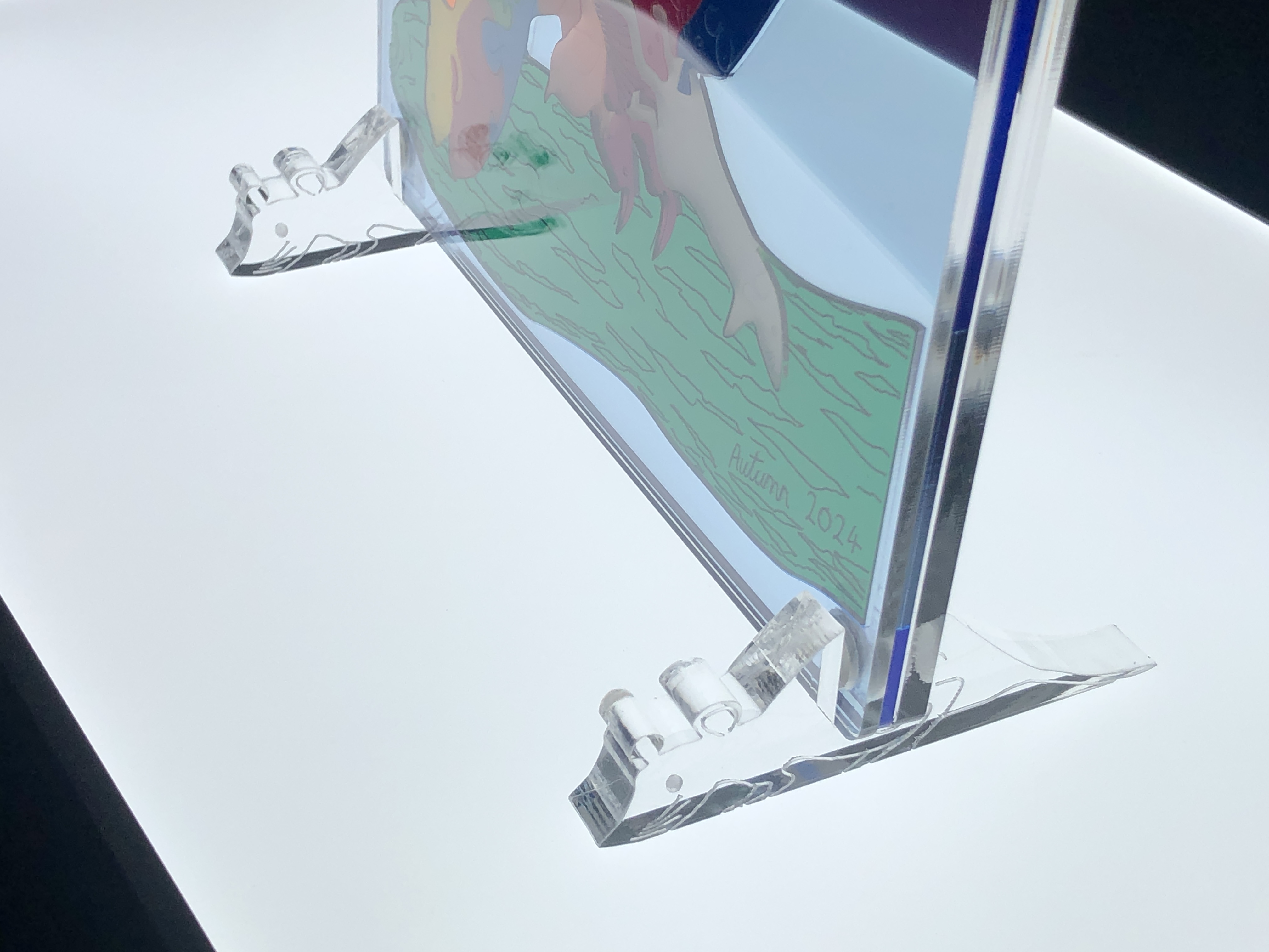
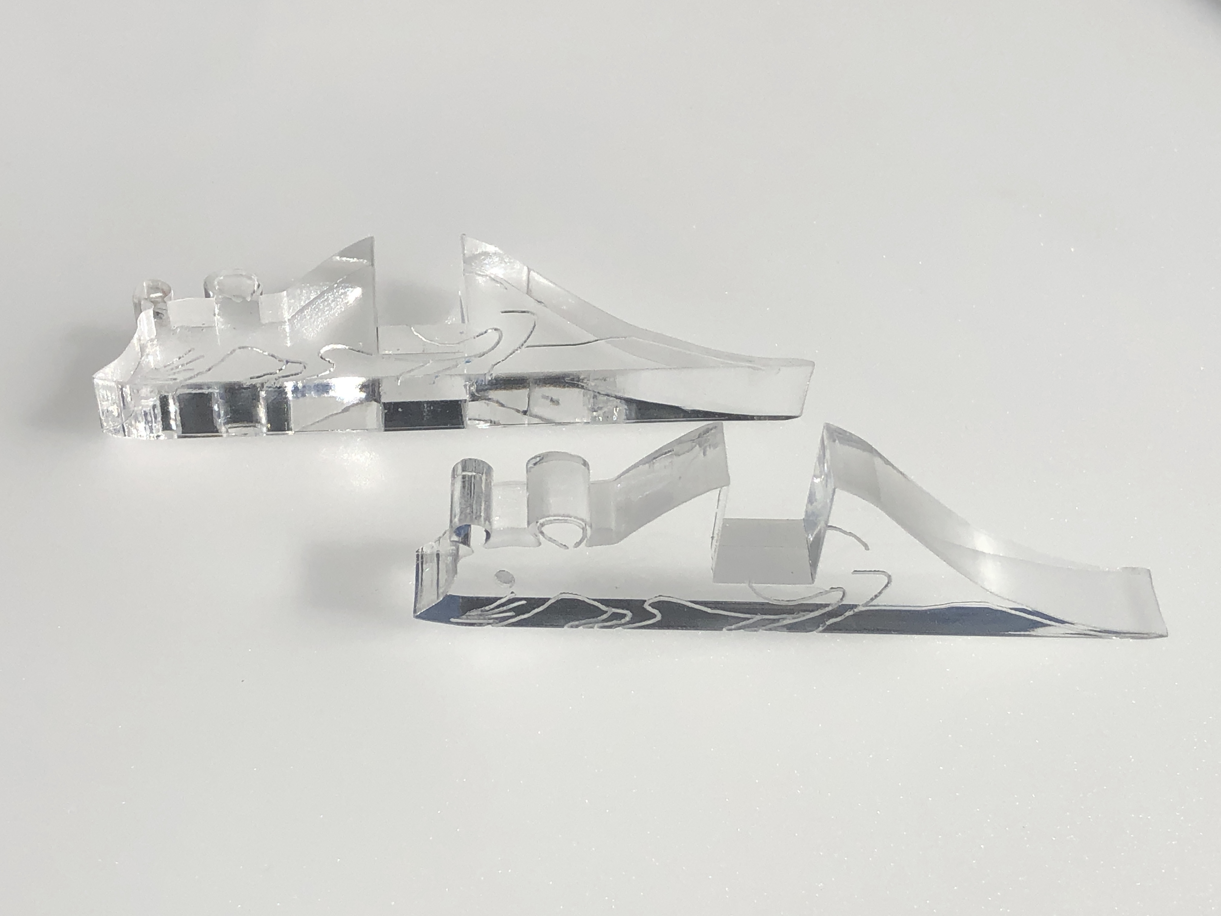
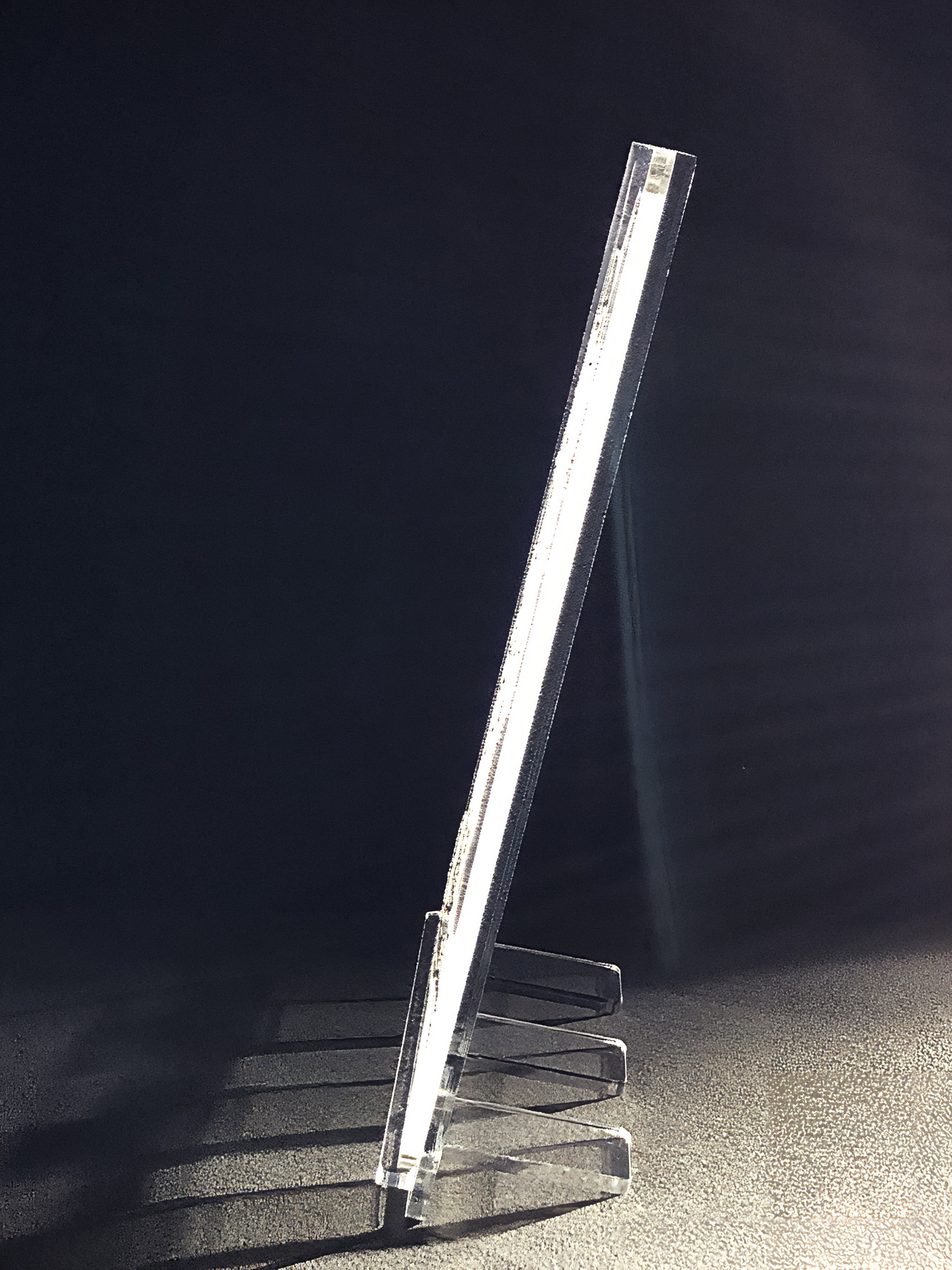
    I envisioned that the โ€œstained glassโ€ art puzzle would look best on a windowsill (or similar), so I planned that the art puzzle(s) should be sandwiched between two sheets of magnetised clear panels (3mm for the front and 5mm for the back โ€“ the latter for greater stiffness), and stood on 10mm thick (for better stability) mice โ€œfeetโ€ โ€“ so I also ordered in enough clear cast acrylic for these.

    10mm thick custom cut and engrave crystal clear mice “feet” to display the art puzzle on e.g. a windowsill

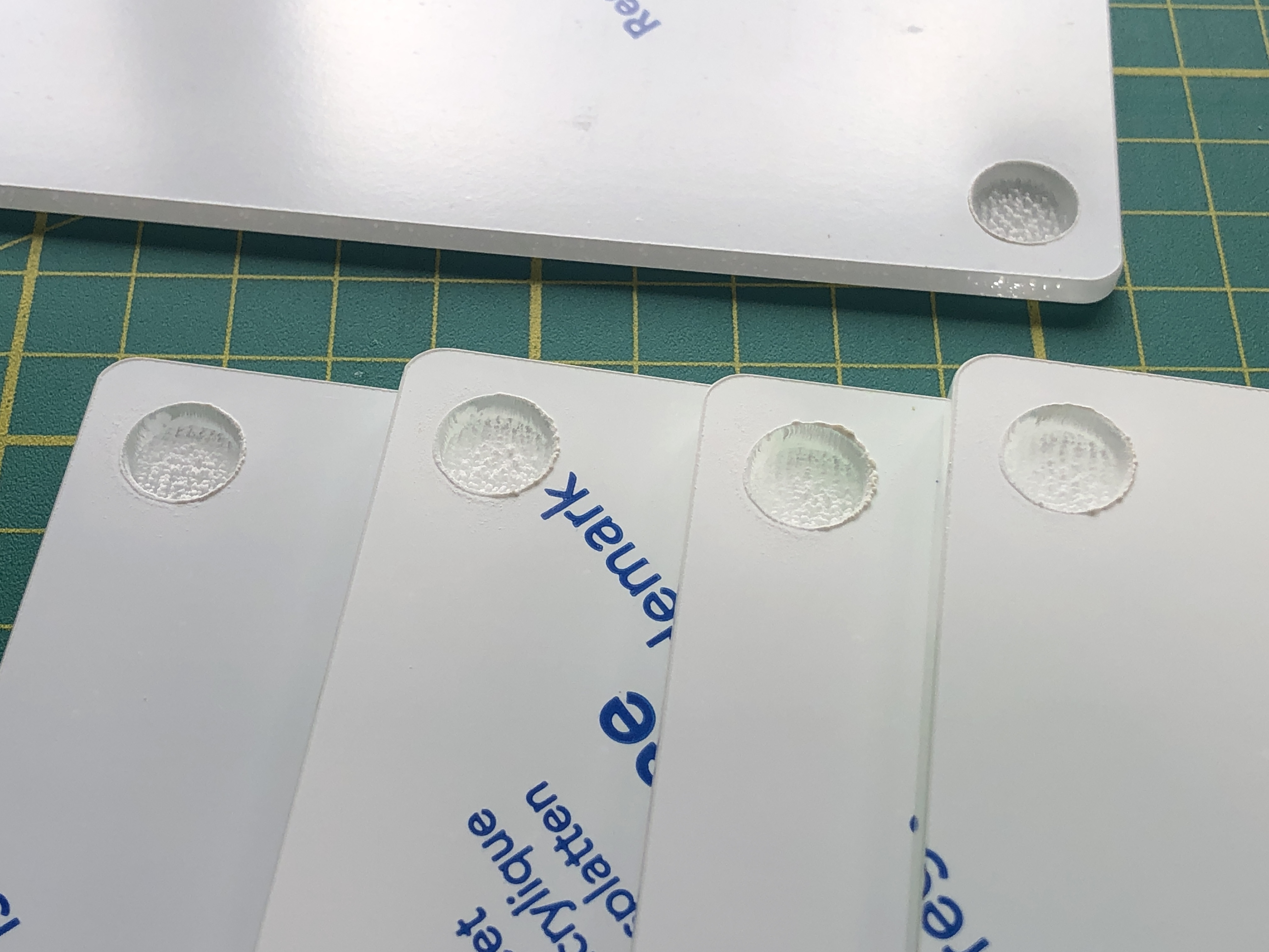
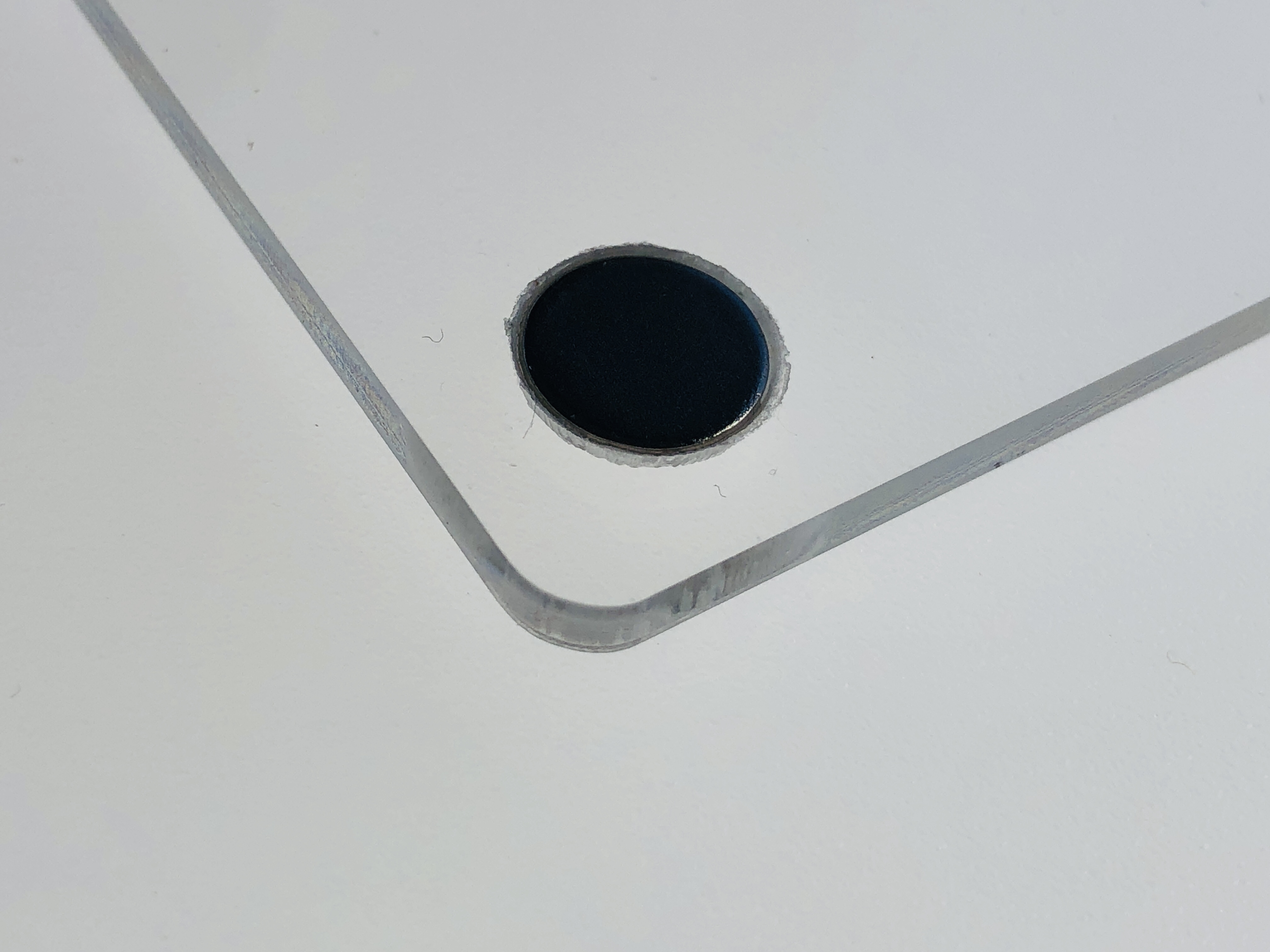
    Cutting the circular recesses in both the sandwiching clear sheets of acrylic to snugly fit the 10mm diameter x 2mm thick neodymium magnets took a bit of working out and experimentation โ€“ particularly given that I was drilling into 3mm material and had to leave 0.5mm for glue โ€“ leaving only 0.5mm material left! I originally tried to use a bench drill and a positioning jig for the acrylic pieces, but that seemed too risky, and with 352 recesses to cut (2 x 4 x 44) โ€“ too time-consuming. I then tried to use a CNC router and a positioning jig. But that wasnโ€™t accurate enough across all four corners โ€“ and getting perfect registration of the sunken recesses across two different thickness of acrylic seemed problematic. In the end I thought the easiest and most accurate way to bore out the recesses was to engrave them with the laser. This took a bit of experimentation to get the correct depth, but I got there in the end. Also, the rough bottoms made a good biting surface for the glue used to fix the magnets in place.

    Recesses engraved into the corners of the clear acrylic support panels to hold the magnets in place.
    Magnet glued into a clear panel such that the top is level with the clear acrylic support panel’s surface

    Conventional stained glass windows have to be strong enough to hold their own weight and withstand the worst weather they are likely to face, and to achieve this there is a great deal of strength built into, and around, them. All the individual glass pieces are welded together in the form of soldered H-sectioned lead strips. This relatively flimsy carcass is supported by being fixed to metal and/or masonry frame/s.

    The Passion of Christ: the Capture and Crucifixion, Saint-Pierre, Limours, Essonne, France (1520).
    By GFreihalter – Wikimedia Commons, CC BY-SA 3.0, Link

    However, the approximately 10mm wide lead H-section strips are what on the one hand give conventional stained glass itโ€™s traditional thick wire-frame look, but on the other hand means the stained glass pieces themselves are very basic and simple shapes. This low resolution can be largely overcome by over-painting, but the pronounced wire-frame effect of the lead strips is a given. Some people may like this effect, and, to be fair, the further away you stand away, the less intrusive it looks.

    Musรฉe de Cluny students at work in a stained glass workshop - assembling glass with came
    By Ariane Corisande – Own work, CC BY-SA 3.0, Link

    Coloured acrylic provides a completely alternative modern approach. The โ€œstained glassโ€ can be sandwiched between two clear sheets of acrylic (or glass), and optionally the whole design can be fixed in a frame and placed anywhere… There is no need for leading – or faux leading – at all. For practical purposes itโ€™s useful to have a small gap between the pieces โ€“ if, for no other reason, to be able to assemble (and optionally disassemble) the pieces. This can be quite advantageous because on close inspection it provides for a halo of a thin gap of light between and around the pieces – see photo below :-

    What’s more, unlike welded-in stained glass pieces, because the acrylic pieces are not fixed in position (they cannot move if supported around the sides), the whole design lends itself to be a (jigsaw) puzzle as well as a decorative beautiful “stained glass” artworkโ€ฆ This simply requires that there be some way to easily open the framed sandwich – hence why I chose to use simple magnets to hold the three panels together…

    Not having leading means literally more light comes through, but, on the positive side, leading more clearly defined the edges of shapes – and so may be preferred for that reason. However, there is nothing to stop you using leading, faux leading, piping, or indeed a purpose-cut lattice of opaque black (or any other colour) acrylic – if a shape-outlining effect is desired…

    In conclusion, using coloured acrylics for creating stained glass effects offers a great number of opportunities and there is seems to be nothing that cannot be achieved using it compared to conventional stained glass techniques and real glass. I’m very encouraged by the future possibilities of using coloured acrylics, and have several designs already in mind. Watch this space…


    Long-eared owls are ferocious predators (as are all owls) โ€“ and will basically eat anything that moves that is smaller than them. They often swallow their prey whole, and regurgitate a large pellet of the undigestible parts โ€“ such as bones, teeth, hair, feathers. Indeed, examining their pellets is how ornithologists know so much about what they eat.

    This is a precision laser-cut and engraved โ€œartโ€ puzzle – directly cut and engraved in premium 3mm coloured cast acrylic from an original digital hand-drawing. The design is a specially modified version of my original hand-cut 40mm thick solid oak artwork entitled โ€œLong-eared Owl (Art Puzzle) (You are what you eat)โ€ (2022)

    Long-eared Owl (Art Puzzle) – 40mm thick oak wood

    (see https://michaelautumn.wordpress.com/2023/05/03/long-eared-owl-jigsaw-puzzle-you-are-what-you-eat/ and https://youtu.be/jWsK6TFEevk).


    Gallery

    I have created a few stained glass designs in the past – using stick-on lead piping and coloured glass inks. At the time I was happy enough with them, but they weren’t very good. The solidity of the colours wasn’t there, and the colours faded over time. I do find there is something magical about transparent materials โ€“ as well as them being beautiful because their appearance changes dramatically from different angles, and by the changing light falling on them.

    Here are a few of the many varieties I have made :-

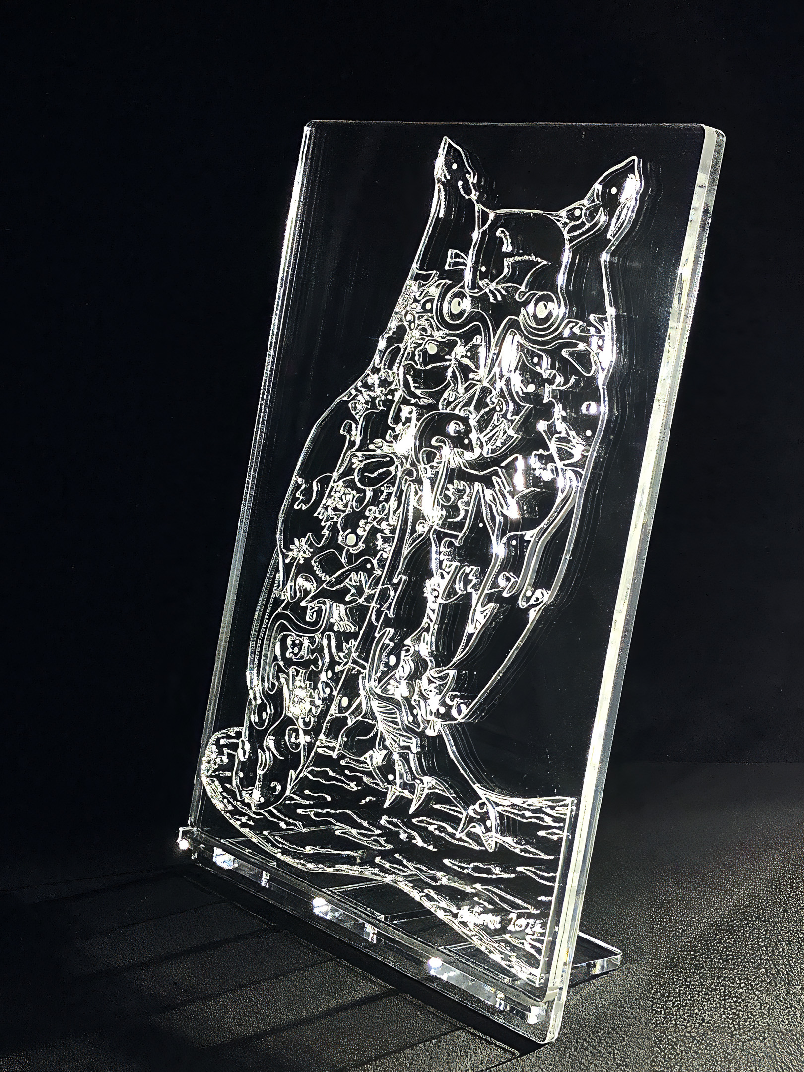
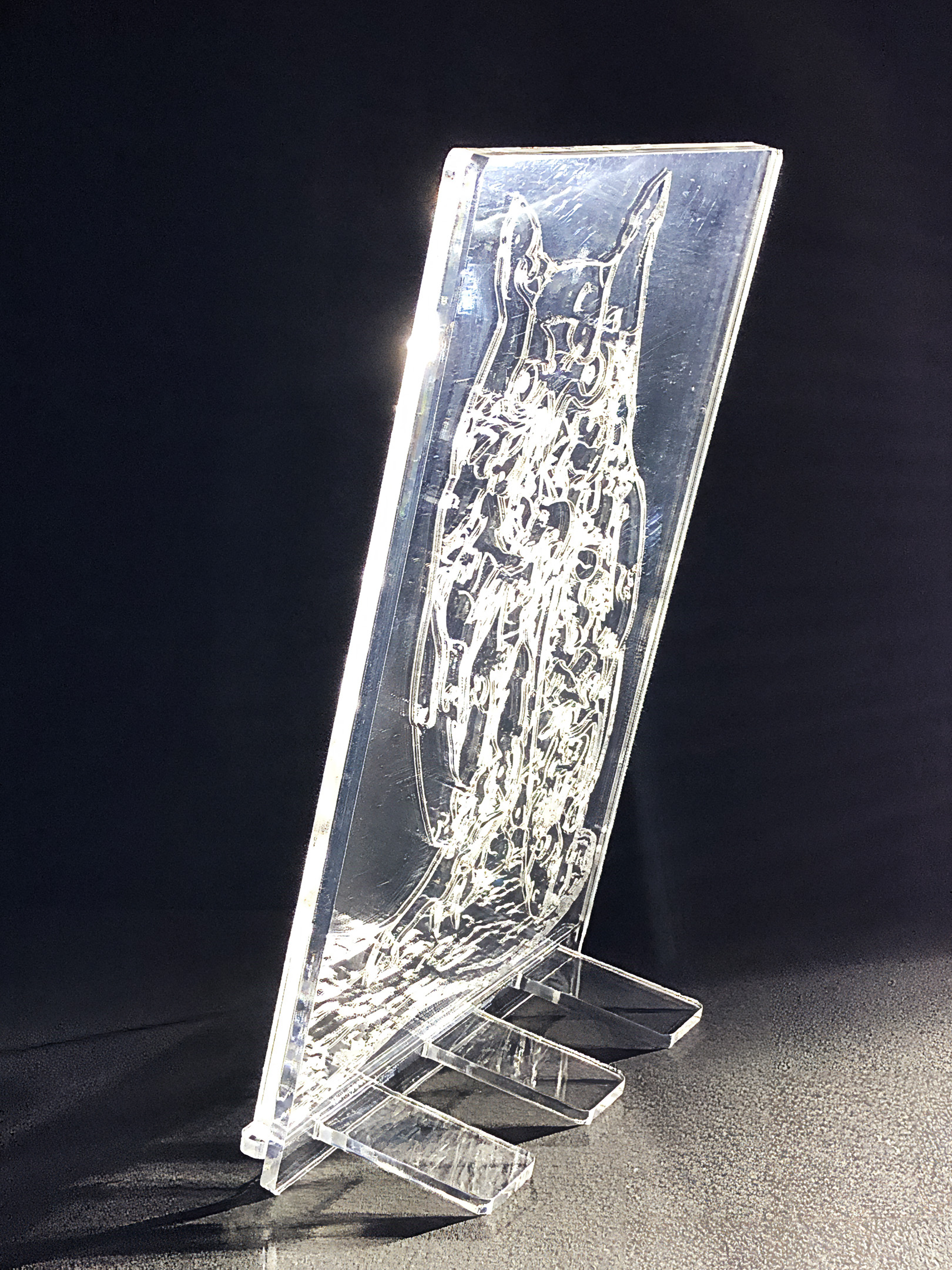
  • Long-eared Owl (You Are What You Eat) – “crystal” art puzzle & “crystal” stand

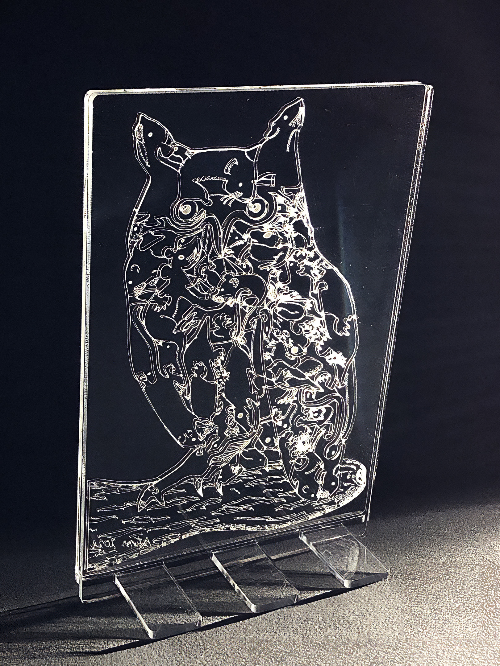
    Long-eared Owl (You Are What You Eat) – “crystal” art puzzle & “crystal” stand

    Artist: Michael Autumn
    Medium: Clear cast 5mm Perspexยฎ – laser cut & engraved from a hand-drawn digital design
    Size: 19cm (W) x 29cm (H) (including stand)
    Edition: Unlimited
    Date: 05/2024
    Country: UK
    For sale: Available to buy on Etsy – https://www.etsy.com/uk/listing/1741855133/long-eared-owl-you-are-what-you-eat

    Description: The idea behind this artwork was to have a tactile, life-sized, long-eared owl, and to toy with the idea โ€“ โ€œYou are what you eatโ€. Long-eared owls are ferocious predators (as are all owls) โ€“ and will basically eat anything that moves that is smaller than them. They often swallow their prey whole, and regurgitate a large pellet of the undigestible parts โ€“ such as bones, teeth, hair, feathers. Indeed, examining their pellets is how ornithologists know so much about what they eat.

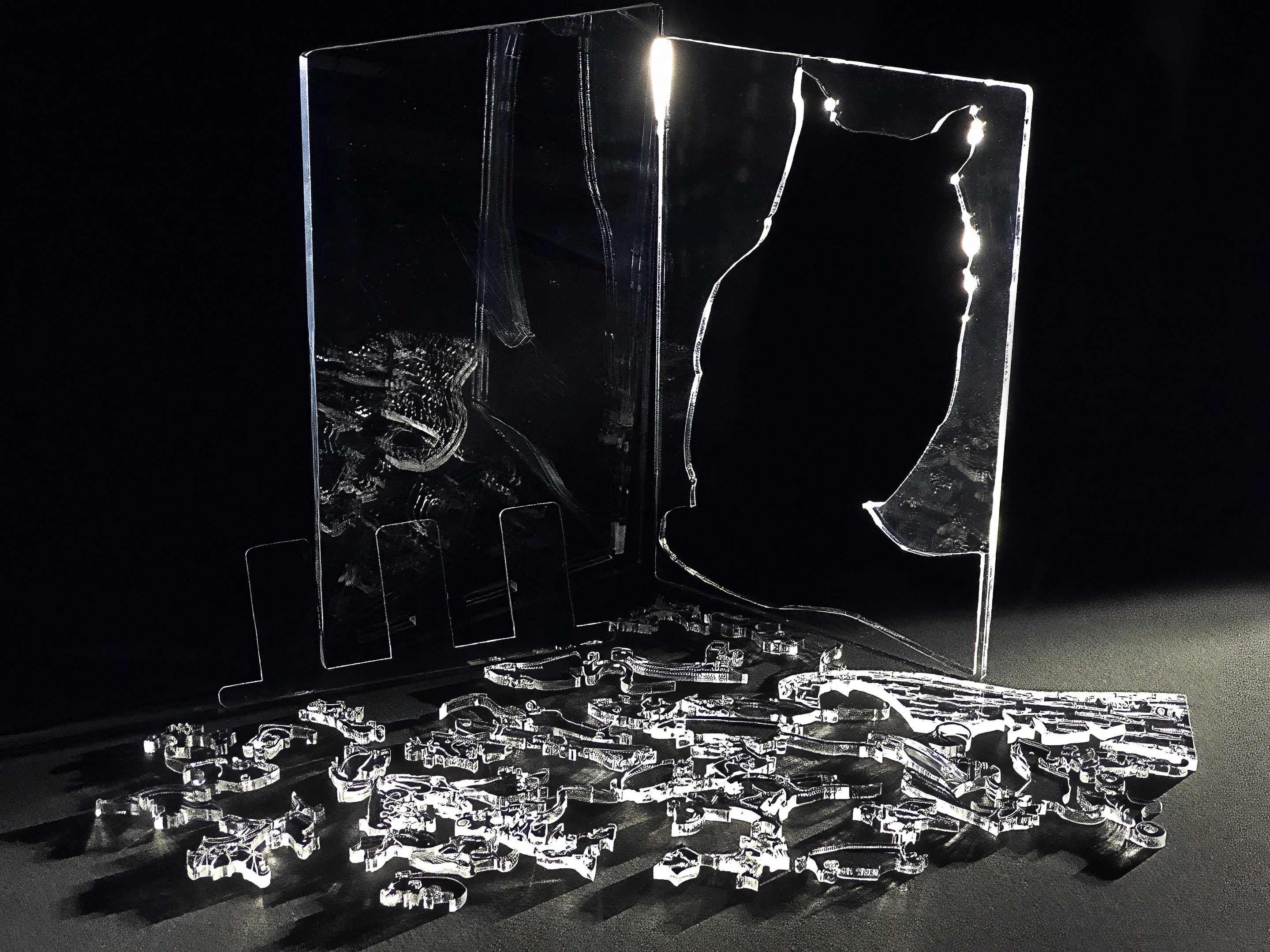
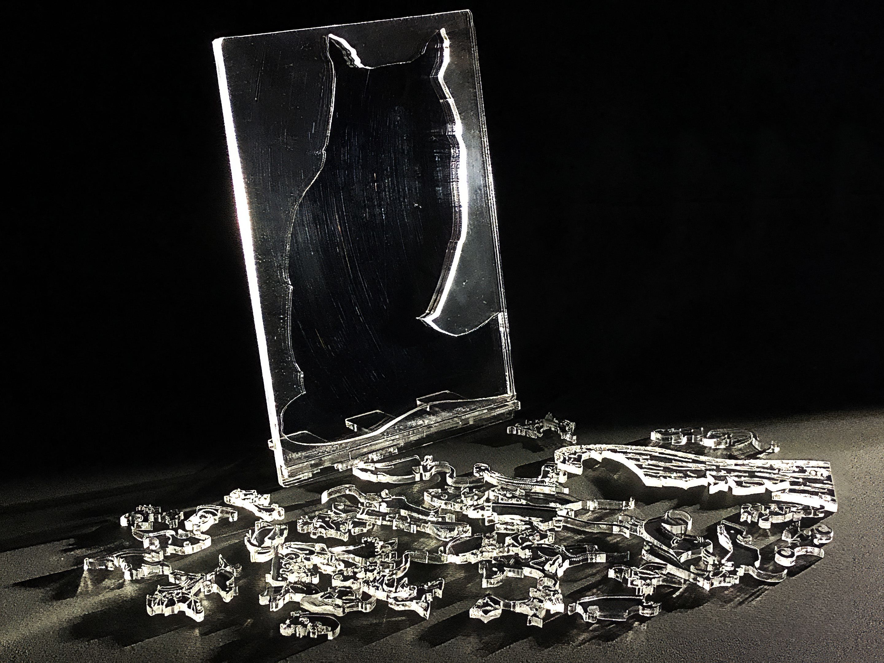
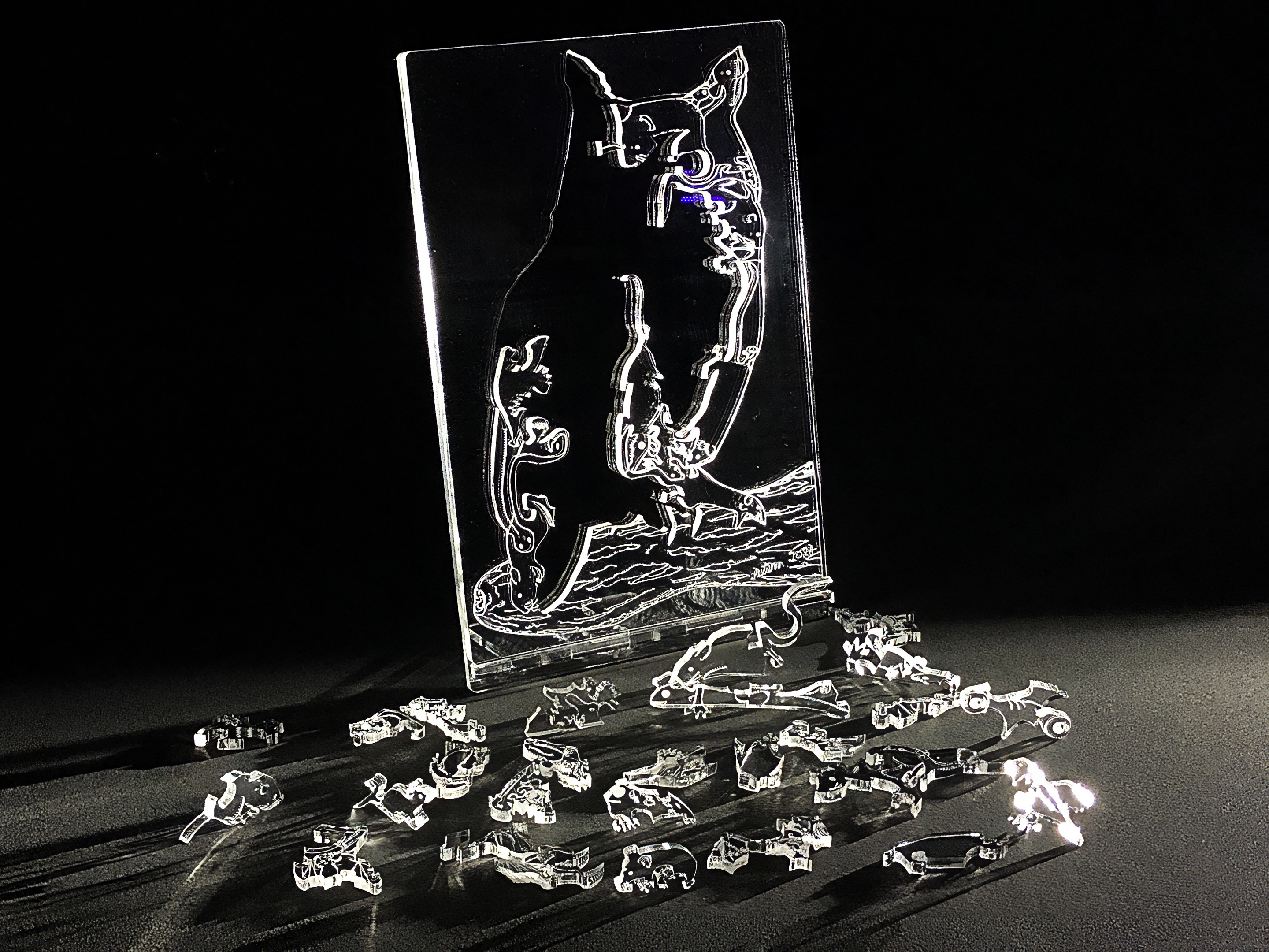
    This is a precision laser-cut and engraved โ€œartโ€ puzzle – directly cut and engraved in premium 5mm clear cast acrylic from an original digital hand-drawing. The design is a specially modified version of my original hand-cut 40mm thick solid oak artwork entitled โ€œLong-eared Owl (Art Puzzle) (You are what you eat)โ€ (2022)

    Long-eared Owl (Art Puzzle) – 40mm thick oak wood

    (see https://michaelautumn.wordpress.com/2023/05/03/long-eared-owl-jigsaw-puzzle-you-are-what-you-eat/ and https://youtu.be/jWsK6TFEevk).


    Iโ€™ve been longing to create something in clear glass or acrylic for many years because I find there is something magical about transparent materials โ€“ as well as them being beautiful because their appearance changes dramatically from different angles, and by the changing light falling on them.

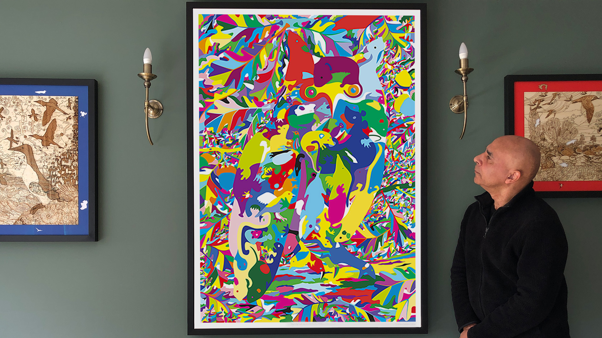
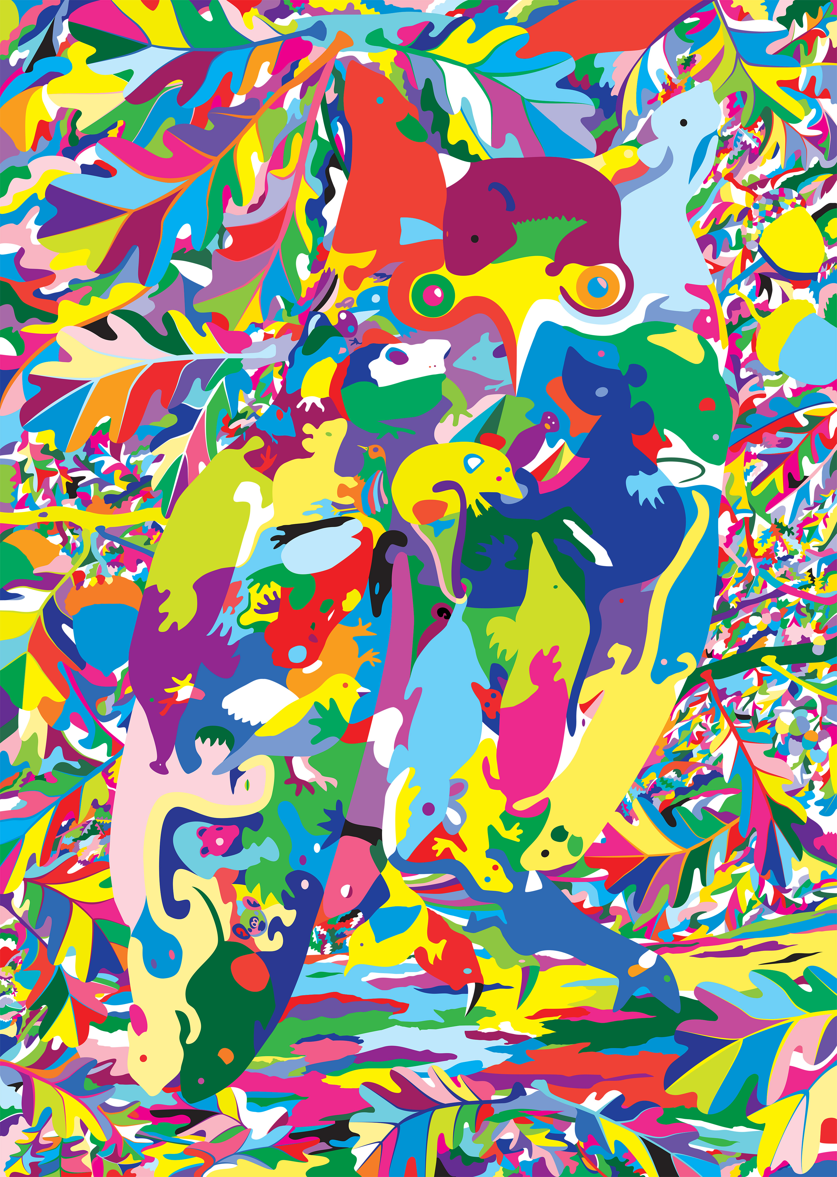
  • Long-eared Owl with Oak Foliage (floral map)

    Long-eared Owl with Oak Foliage (floral map)

    (Very low resolution for copyright reasons)

    Title: โ€œLong-eared Owl with Oak Foliage (floral map)โ€
    Artist: Michael Autumn
    Medium: Hand-drawing with digital gouache
    Giclรฉe archival print on fine 100% cotton canvas (matt)
    Hahnemรผhle Art Canvas Smooth 370gsm + Hahnemรผhle UV protection matt varnish
    Size: 36″ (W) x 50.9″ (H), canvas stretcher 38″ (W) x 53″ (H)
    Edition: Limited Edition of 101
    Authenticity: Hand-signed (front, bottom, far right on white canvas border) with graphite pencil (varnished over with same UV-protective matt varnish as whole) and titled (front, bottom, centre on white canvas border)
    Date: 04/2024

    Just to give an idea of the size the artwork…

    TL;DR

    This artwork is an homage to visual perception โ€“ itโ€™s about how we detect meaning from the millions of individually coloured photons entering our eyes โ€“ and how I, as an artist, can trick you into seeing what I want you to see.

    Owls, like this one, are incredibly well camouflaged – not so much by their colouring, but by their habit of staying completely still, most often in a tree, during their time of rest and sleep (often during the day). So much so, that you could literally walk within feet of them and you probably wouldn’t even realise they are there. Likewise, in this artwork, you have to really look to see the owl…

    And there is a reference to the idiom – “you are what you eat“…

    Long-eared Owl with Oak Foliage (floral map) is the simple colouring-in (albeit very carefully selected and juxtaposed colours) of a flat line drawing I did previously of this art puzzle design (see the photo of that artwork below and this post: Long-eared Owl with Oak Foliage (Art Puzzle)).

    Long-eared Owl with Oak Foliage (Art Puzzle)

    I used this technique to regularly check for line breaks (where there shouldnโ€™t be any), and to get a better view of the shapes of the individual pieces I was designing โ€“ amid a sprawling mesh of simple black thin lines on a white background. This got me to thinking about the difference between the dumb mechanical process of colouring a shape (of a flood fill) and true animal (human) understandingโ€ฆ

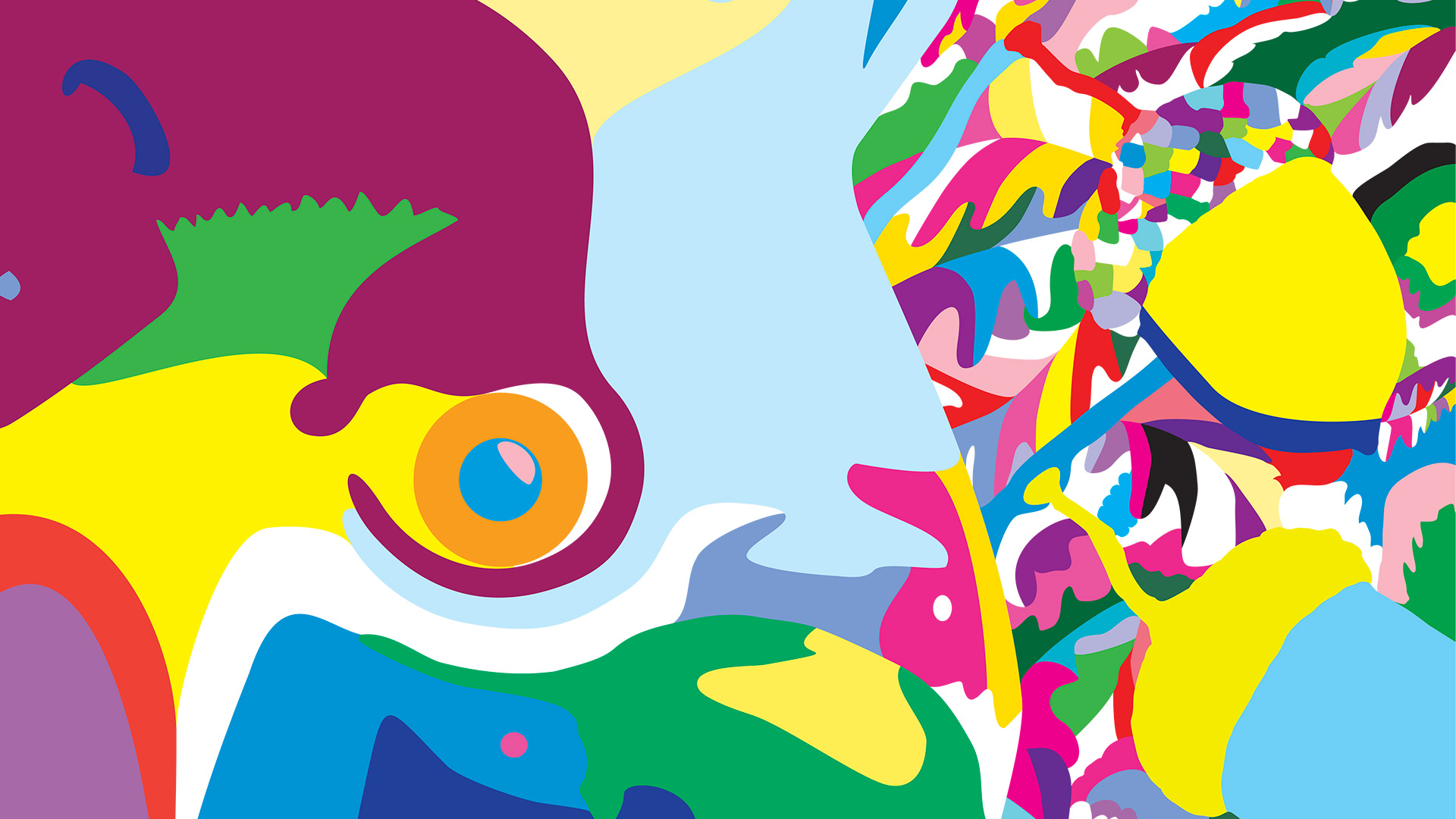
    Detail showing a geographical reference…

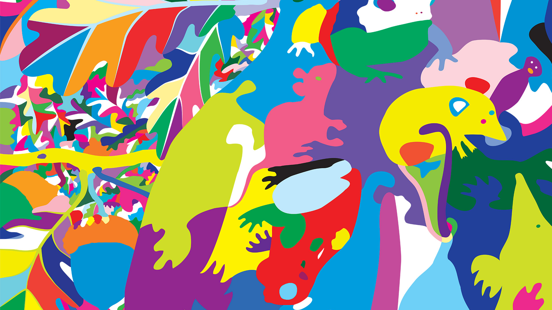
    Detail #2

    This is (obviously!) part of my floral map series. See Guillemot with Egg (floral map) for details.

  • Guillemot with Egg (floral map)- Artwork feelings

    Guillemot with Egg (floral map)- Artwork feelings

    It may be quite common for artists to write about how they feel about their work, but Iโ€™ve personally never come across it. This is probably just my lack of reading (Iโ€™m not a big reader, I usually only read to learn something specific โ€“ which is quite often).

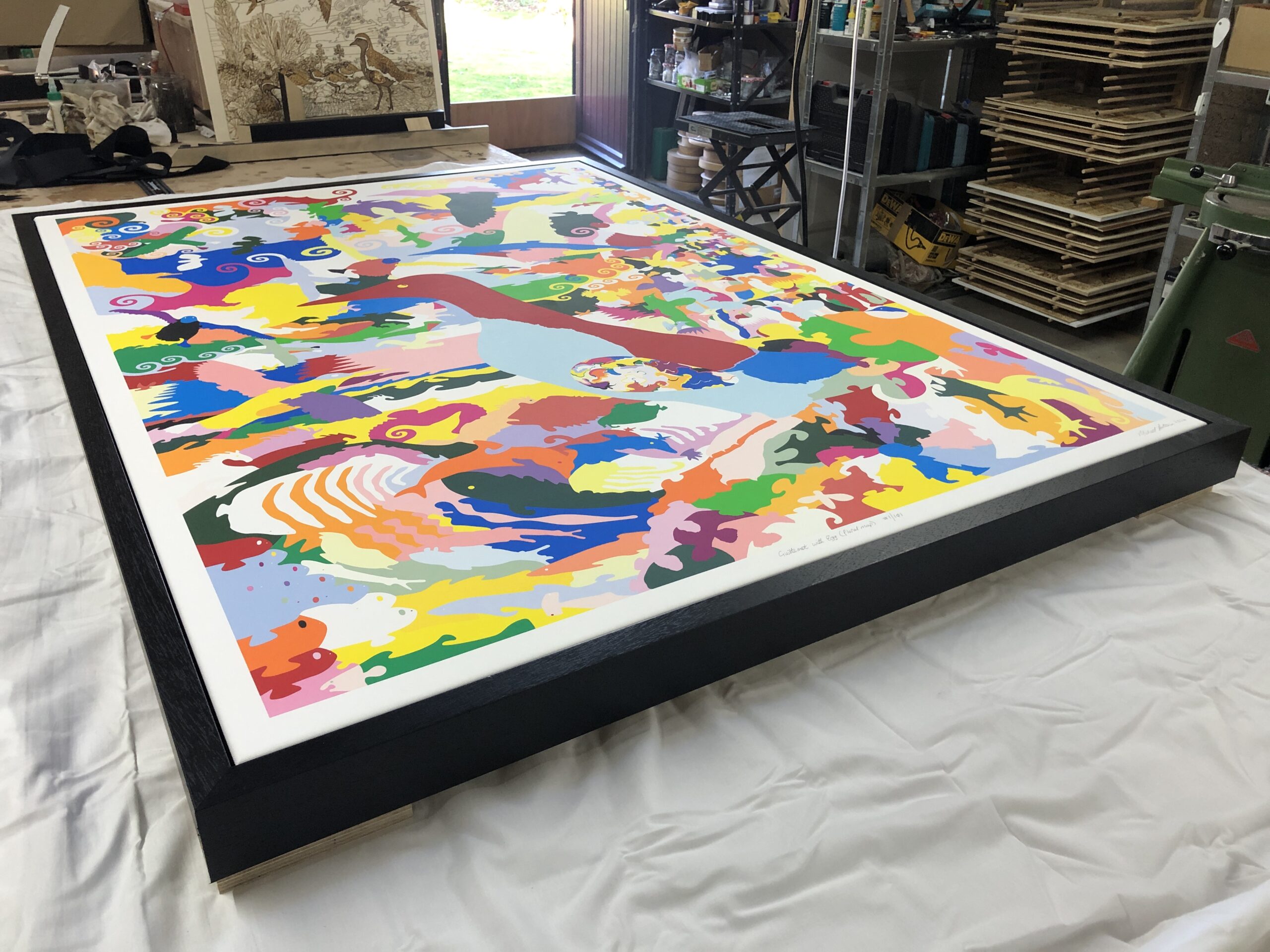
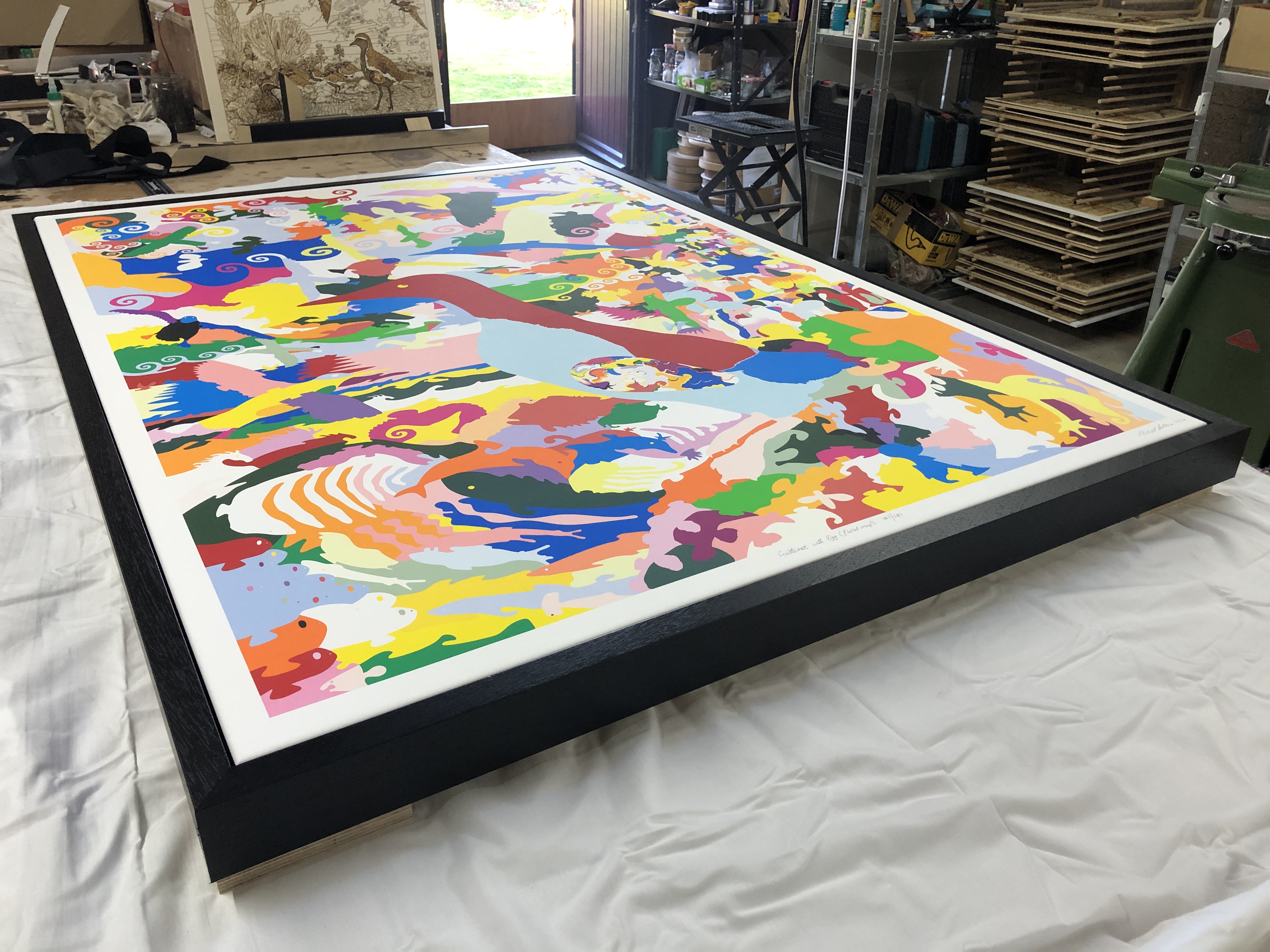
    Yesterday I framed this large canvas :-

    Guillemot with Egg (floral map)

    After working on the back fixings, I turned it over to see the finished work. In all candour, I thought it looked really fabulous. The heavy black tray (float) frame made the colours pop even more, and the whites to appear whiter. I was really moved and felt a great sense of achievement.

    When I think back over the months I have spent on it, the weeks designing it, all the hundreds of hours drawing innumerable curves – that I have meticulously weaved and tweaked; all the colour choices and juxtapositioningโ€ฆ It feels it was definitely worth all the effort – and not inconsiderable cost. It was a truly joyous, uplifting, moment, and I felt very blessed and proud…

    This just reinforces why I cannot part with original artwork – and so steer clear from doing non-reproducible art. Most of my artwork I do primarily for myself: mainly to show and express my gratitude and wonder of Nature. Yes, I love to share my feelings of what moves me โ€“ often to tears โ€“ which is why I have invested so much time and resources into reproducibility (editions as opposed to original art). It is a real privilege that I can produce copies of my artwork, like this one, to a standard that I am very happy with โ€“ and can share with many others (some of whom are fortunate enough to have the resources to own copies)โ€ฆ This is immensely satisfying.

    If this work can give a fraction of the joy it gives me, to other people, then I am truly grateful and blessedโ€ฆ